You don’t have to be a DC fan to recognize Batman and Superman from their logos. Both of these characters are iconic to the comic book franchise and film industry. Their visual designs have also gone through drastic changes. And so have their logos.
It is also interesting to see how their logos have become more elaborate and intricate over the years. Batman’s bat emblem has changed over 30 times while Superman’s iconic ‘S’ and shield symbol has changed over 25 times.
Why does the comic book and film industry modify the logos of its most iconic characters at all? It is usually for these reasons –
- To make them look more polished
- To adapt them to evolving story lines
- To make them appeal to audiences of the time
Previously we revealed Donald Trump’s branding secret. In this post, we will discuss how Superman’s and Batman’s logos evolved over the decades.
- Brian G.Philbin, Writer for Metropolisplus.com
- Barry Frieman, Writer for Supermanhomepage.com
- Julian Darius, Founder of Sequant Organization
- Sidney Fussel, Entertainer and contributor for Tech Insider

Superman’s Logo was Inconsistently drawn at first
Superman’s first logo appeared in Action Comics in 1938. It was a far cry from the diamond shaped symbol that fans are familiar with today. The first logo was shaped like a police badge and had a simple “S” in the middle.
Since Superman stands for truth and justice, the police badge shape doesn’t really come as a surprise. Why was it so simple? It should be noted that this Superman’s first appearance which means that the storyline was pretty basic. So, it’s not surprising why the hero’s first logo had a basic design too.
You can see how different the logo from 1938 is from Superman’s latest logo in ‘Batman V Superman’ –
![]()
Image Source: Maurice Mitchell/DeviantArt
Comic book expert Brian G. Philbin says that the hero’s symbol was drawn inconsistently at first –
“Superman’s symbol has become recognizable all over the world. However, at one time, it was not even very consistently drawn…it went through a great deal of metamorphosis.”

Superman Logo From 1978 Represents His Origins
Superman’s logo changed considerably and became the stylized inverted ‘S’ on a diamond shaped shield in consecutive years. The “S” initially stood for Superman. However, in ‘Superman: Birthright,’ it was revealed that the symbol actually represented the hero’s Kryptonian family crest.
Barry Frieman explains –
“…ask Brian Singer, the director of 2006’s ‘Superman Returns’ and he’ll tell you…that the Superman suit ‘he (Supey) wears is a remnant of that world (Krypton)…’ Singer apparently bases that opinion on 1978’s “Superman: The Movie” in which the costume is Kryptonian fabric and the ‘S’ emblem is a family crest worn by Superman’s biological father, Jor El…While the comic book’s explanation for the ‘S’ is different from the movie’s explanation…Mark Waid’s recent revamp of Superman’s origin in ‘Superman Birthright’ tied the ‘S’ to Krypton, effectively unifying the different media interpretations for the ‘S.’”

1996’s Black Logo Represents A Dark Period In Superman’s Life
Superman’s story took a darker turn in 1996’s ‘Kingdom Come.’ And so did his symbol… This series represented a dark period in Superman’s life, so the black symbol fits.

Founder of Sequant Organization Julian Darius elaborates-
“Set in the future, the story begins with Superman having retired in the wake of a new wave of violent heroes – and Lois Lane’s death….The story really gets going as a group of violent super-heroes irresponsibly pursue a super villain. Cornered, the villain literally tears the hero Captain Atom apart, causing a nuclear explosion that renders much of the American Midwest – including Kansas, Superman’s boyhood home – a radioactive wasteland…Spurred by the destruction of Kansas, Superman comes out of retirement. Emblematic of his new darkness, he changes his chest logo to give it a black background.”

Batman’s 1940 Logo Resembled Himself
Batman’s earlier logos resembled the caped crusader himself as is apparent from the bat logo from1940.
![]()
Why was it designed this way? Remember, this was a time when batman did not have high tech gadgets or armor. Audiences recognized him by his cowl and cape. The artists clearly had this in mind when they designed the logo. All audiences saw was a man in a cowl and cape.
Tech insider contributor Sidney Fussel explains how this logo fits Batman’s earlier image –
“The original ‘batman’ logo resembled a man in a cape. It’s a bit bulky but fit the time period where he was wearing a costume instead of hi-tech armor.”
Another Character Takes On Batman’s Identity In 1993
Future renditions of the bat logo do away with the cowl altogether and featured bat ears, wings and a tail. It became popular with the 90’s spin of animated series. Here is Sidney Fussel’s take on 1992’s version of the bat logo –
“This probably looks the most familiar. This particular design introduced in ‘Batman Returns,’ is well balanced and reappeared a lot during the ‘90s animated spin offs.”
![]()
Here is another version of the bat logo in 1993.The ears, tail and wings are there, but have a more elongated design.
![]()
According to Sidney Fussel this design also fits the story that featured it –
“From ‘Knightfall’ comic series, this logo stands out from the rest because of the radically curved wings. In ‘Knightfall,’ Wayne is succeeded as Batman by Azrael.”
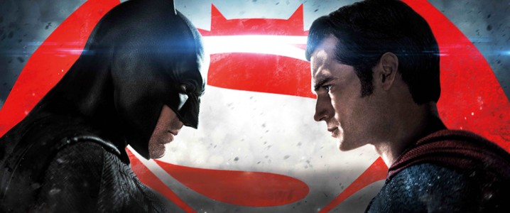
Batman VS Superman – Dawn Of Justice 2016
Warner Brothers combined two superheroes in one logo design in ‘Dawn of Justice’. This shouldn’t come as a surprise since the story pits both heroes against each other.
![]()
Take a look at both of these symbols. Superman’s symbol still retains its original design but the same cannot be said for Batman’s symbol. The bat symbol is clearly bulkier than some of its sleeker and more popular predecessors.
Some fans have noticed this too and aren’t too thrilled with the design –
I’m super stoked for Dawn of Justice…. But I just hate that new bat logo.
— Hey Everyone (@devenxjames) May 23, 2015
The new bat logo for Batman v. Superman just looks like a fat bat who can’t fly.
— Andrea (@x19blakey93x) February 17, 2016
One more thing about Batman V Superman the new Batman logo SUCKS! 👎🏽🚮 The Dark Knight logo is soooo much better @yeehmohammed @IAMPootie206
— HOMZ (@HamiHomz) March 27, 2016
Other fans say that it suits the final look of the logo –
Lol Even the logo for #BatmanvSuperman signified that they were going to team up
— Justin (@JTremond) March 27, 2016
#BatmanvSuperman love the logo hahaha
— Tin Vilela (@tinvilela) March 26, 2016
Superman and Batman are two of the most iconic characters in comic book history. And they are popular because they evolved over the decades. Both the movie and film franchise capitalized on their fame by making their logos evolve as well.