Things change. And so do people’s taste and preferences. What was once in vogue, doesn’t stay that way forever. Brands know this all too well whether it comes to laying out the foundation of a new business or to rejigger the old one. Logo designers also know that adaptability is the name of the game.
The world of art and design is constantly evolving, with new techniques and trends that serve as the microcosm of the times. Logo designs incorporate these new styles and trends, conveying a lot of information from a glance. Visual artists keep on pushing the envelope, which is why new aesthetical styles come into being and enthrall the eyes of the beholders everywhere.
Logo designers, here are some of the most popular logo design trends that are going to be huge in 2015. You can incorporate these styles in your upcoming projects or in your personal portfolios.
Why the change?
Behind every brand there is a logo, a cardinal element that catches the eye of people and helps them identify with the brand. A Logo isn’t just a bunch of visual elements splashed about artistically. It shows more than that. The perspective of the brand. The mood of the brand. The personality of the brand. And that is just the start.
Here are some styles that are taking the logo design world by storm and one that logo designers can utilize in a variety of creative ways:
1. Low Polygon Style – When less is more
If Pixar characters were made in low poly style, they’d be super blocky and flat to look at.
This is a style that came from the use of 3d model designing software such as C4D, Maya & 3D studio Max. This art style relies on using a 3D polygon mesh that has a low polygon count. The end result? An object with sharp surfaces with simple geometric shapes. These shapes are then modified with textures to give them a great visual look. Here are some examples of logo designs made with low polygon style, great for DIY inspirations and experimentation:
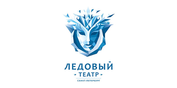
Image: Behance/LogoSet 2014
2. Overlapping Logo Design Technique
Want to give your otherwise simple-looking logo design some depth? Try out the overlapping technique that relies on shading from any two design elements. Introduced by designer George Bokhua, this design adds a subtle touch to logos. And yet for all its subtlety, the logo comes off across as a heavyweight in the style department. Take a look at some awesomely serene designs here:
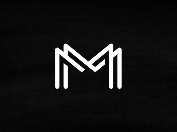
Image: Dribbble/Micheal Spitz
3. Gradient Mesh & Linear Gradients
Are you designing a logo for a web-only brand? Then consider designing a logo that combines colorful gradients with the mesh tool. Many up-and-coming logo designers are relying on this technique because of its sheer fluidity in making eye-catching logos. This technique relies on grid-based painting and linear gradients both, making use of two (or more) color stops.
This is one logo design technique that is bringing back gradients in a big way. Since gradients are pretty much a no-no when it comes to prints, the gradient mesh technique is better suited for web-only companies and logo types.
Check these examples out and make your own:
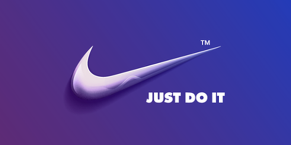
Image: dribbble/AsbeenDesign
4. Thin art or Line art logos
This is an interesting logo designing technique in which graphics artists rely only on the pen tool. And that too with one size setting to make their whole logo design with.
Some people just love the way how much freedom a limited drawing tool can accord them. These logos seem consistent and even. And if you take a look at these designs and get inspired to create your own bold and thin line logos, then the sky’s the limit.
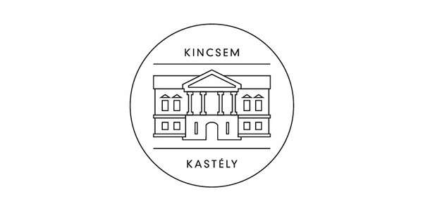
Image: Kincsem Kastely
Let this post serve as a guideline for your design projects in 2015. With these modern designing techniques in your designing toolbox, logo designers wont fail to impress upcoming social media brands and businesses that wish to hire the skills of modern and forward-thinking logo designers today.
5. Lowercase Typography
Generally speaking, a lot of logo designs are made with uppercase letters. This can be due to the fact that logos comprising of lowercase letters were historically perceived to be smaller than those with uppercase letterforms.
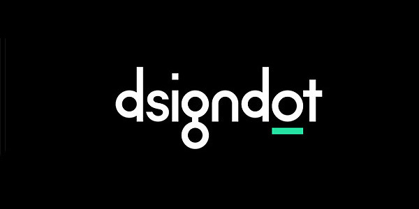
However, the web 2.0 logo design movement changed the public perception on what is considered cool or not. Now, it’s not a far stretch to say that a logo with lowercase letters is perceived to be playful, fun and informal. Today’s designers are experimenting with ways that make lowercase logos look professional and friendly at the same time. Here is an example of lowercase typography working extremely well for a logo:
For more extraordinary results, check out our companion post on emerging logo design trends in Silicon Valley. Happy DIYing with logo designs!


