Routine life is no fun, anybody can testify to that. We need to make it bearable for ourselves by breaking the tedious schedule of our day to day lives. We look to sports, art, literature and movies to help us go through our life, with regular intervals, to make each day a little bit lighter, that much better.
Movies are the biggest attraction for all ages, be they kids in middle school or men and women of middle age, everybody loves movies. They are a form of media that not only addresses issues but provides great entertainment through commercial films that are designed to take you away from your world and create a reprieve for the worn out minds. When a movie is about to be released, there are grand scale advertisements that herald its coming, to attract the cine-lovers, and to grab the attention of the audiences from the word go.
Just as the story is important, so is the title. To have a good name that would make the movie more appealing to the masses is also an important part of the whole agenda. Everything from the color of the poster to the typography used in the writing of the title is equally worked upon, to create the perfect first impression. The way in which the name or the tagline of the movie is displayed depicts the mood and the storyline of the movie even before you have set foot in the cinema, and as an avid internet surfer who selects movies online, I can personally say that a title attracts a viewer to the movie many a times just by the way it looks on the poster. A good designer would know that by taking care of the principles of typeface classification, a mystery can easily be created by the use of a particular typeface, it can be made to look bubbly and fun, or scary with the imagery of blood dripping for a horror flick, or violently angled words for any action packed movie.
A title can create a huge buildup for the fans. Let’s see how typography has been used in the famous movies and how they truly depict the essence of the movie in every genre.
• Action Movies – The Fiercely Bold Typography:
Filled with lots of fighting sequences, cars exploding, guns and rockets blasting entire cities apart or the protagonists being chased around the country, action movies are huge money makers and are loved all around the world by men of all ages. To design a title that would do justice to all the blasting glory of the movie is surely not an easy thing to do. Sometimes, the designer has to design, redesign and even design again. Let’s see a few posters and their typography.
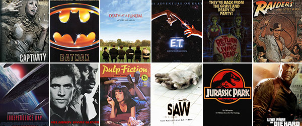
Indiana Jones; Raiders Of The Lost Ark:
Every single movie buff has seen the INDIANA JONES adventures. Its poster is in a class its own with the movie’s full dose of swashbuckling action, foreign devils and a splash of romance. The vibrant colors and the enlarged Raiders all signify the vivacity of the movie and the stoically written THE LOST ARK delivers the seriousness of the story. All in all, it is a hugely captivating title, done in a hugely captivating style that perfectly suits the tone of the movie.
 >
>
Source: IMDB
Lethal Weapon:
As the name itself tells the story, this movie is all about fighting the crime, with Mel Gibson’s style of heroics in large doses. The tagline that goes with it, justifies the title and its writing style further, and the bold lettering projects the no nonsense tone of the cops in the movie. They mean business and you can feel that just by the look of the title on the poster.

Source: IMDB
DIE HARD 4.0: Live Free Or Die Hard…
One of my personal favorites from the Die Hard series is where the title and the tagline ensure the full throttle butt kicking Bruce Willis in action. Its big bold typeface gives off the feeling of power of the unswerving message of the story, the gritty action sequences which include everything from man to man fights to blowing off bridges with a plane. You look at the name and you know you’ll be thrilled to the bone in this one.

Source: IMDB
• Sci-Fi Movies – Typography of the Non-Earthly Grace:
Hollywood has been enamored with the outer space and Aliens far as far as one can remember. The attack on planet earth by green things is a story that has been done to death. But the real kicker comes when you see a movie with this theme, trying a new angle, and the poster making it appear new. How to give off the eerie feeling one gets when flying saucers come to mind? Let’s see what we have found.
E.T.:
That’s it. That is the name that the designers of this movie’s poster had to work with, and you have got to hand it to them because they did a fantastic job. The electric glow in the words and the uncertainty that is projected through these shimmering two letters is enough to drive a fan of the extraterrestrial to the theatre.

Source: IMDB
Star Wars:
If I say that the era of the Sci-Fi really landed with this movie, I won’t be that far off the mark. This is the movie that later got itself done again and made a franchise, that really made its mark with its outer space theme. The typography is done in bold block letters, with the glow from behind making it look otherworldly. It gives off the strong feel of the movie effectively, like it is really talking about the war for survival.

Source: IMDB
Independence Day:
Independence Day
The movie title, done in block letters and red color, delivers the feel of a doomsday kind of a story. Accompanied in the poster with giant UFO’s, the title appears to deliver the feel of an amazing fight for survival of this planet, and completely grabs the attention of a viewer.

Source: IMDB
• Comedy Movies – Typography with a Humorous Edge:
To make a comedy movie is hard enough but to deliver its first impression as such is even harder. If it were an animated movie it wouldn’t be that much of a problem but how does one make a movie poster that says ‘comedy!’ from its title? Let’s see what we have found.
Pulp Fiction:
This is a classic in its genre, and may not be considered just a comedy but an action/comedy movie. But the way its poster is designed gives off nothing of its story or its theme, you might imagine it to be a number of things by the red background and Uma Thurman sprawled in the poster. The title is written in the style of an old sign post, brush painted with the strokes visible, which delivers the non-serious feel of the movie.

Source: IMDB
Death At A Funeral:
This movie is a hilarious story about the funeral rites conveyed of a dead man by his sons and how they find out his life’s secrets. Its typography done on a scenic peaceful background of blue sky with red lettering that look disjointed, broken pieces are an imagery of the story within the movie. It doesn’t make you laugh, but it surely tells you this isn’t a sad story either.

Source: IMDB
• Comic Book Movies – The Superhero Typography:
Batman:
The famous story of the life of a rich kid/ vigilante who takes care of the Gotham City in the guise of a Batman, this movie’s poster did it justice. Just the name written in bold typeface, with the golden light making it glow delivers the message loud and clear, batman is here.

Source: IMDB
Batman; The Dark Knight:
This sequel to the batman stories deserves a mention. the brilliant display of the movie’s name, again in capital letters to maintain its official feel is classic, and the superb way in which movie’s tagline is portrayed, words dripping with blood written by the Joker’s hand ‘why so serious?’ really gives you jitters. A job well done!

Source: IMDB
Transformers:
Larger than life robots fighting all around, isn’t that amazing? For a comic fan of transformers it’s a dream come true to watch his favorite robots on the big screen. The typography is done in the same formal bold block lettering to give off the feel of it being assembled, not made. The multiple colors depict the transforming quality of the machines.

Source: IMDB
• Drama – The Intriguing Typography:
This genre of movies has a million and more choices to choose from, because all of them have a strong story that carries the movie with no necessary guns and bullets, and no heroes to make it click. But still the first impression of the movie should be enough to take you to the ticket booth in the theatres.
Jurassic Park:
Not sure if all will be with me on this one, but there was a lot of chaos and tragedy and terror in this one to make it a drama. The simple way in which the title’s typography is done in this poster is in exact contrast to the real complexity of the movie. It tells the name without telling anything more.

Source: IMDB
Shawshank Redemption:
Here is another example of a typography that builds up the mystery of the story, by looking at the name alone one cannot guess what the movie might hold, but the entire poster with the picture of a man standing with his arms raised in the rain gives off the feeling of tremendous hope.

Source: IMDB
Unforgiven:
Like the words of the title, the typography is as straightforward, and appears just as harsh, just as unforgiving. It is written in block letters and gives off the vibe of as unwavering as the man who is shown with his hands behind his back with a gun.

Source: IMDB
• Horror Movies – The Typography on Fire:
For the thrill lovers, the horror flicks that show creatures and the undead and the terrifying animals is a surefire way to get a kick out of life. Screaming and shouting alongside everybody in the theatre, the posters of a horror flick are supposed to inspire a similar reaction in their audience. One look at the poster should be enough to take you to the cinema, and there are many ways a title can be done creatively when it comes to creating that kind of special effect.
Saw:
This horror movie franchise is perhaps the most horrific in the movies i have seen. And one look at its poster will make anybody cringe, that for sure. Written in black color, with the W dripping blood, it appears as if the word itself has been sawed. It is a perfect typography for the poster as there could be.

Source: IMDB
The Return Of The Living Dead:
This movie looks to be completely filled with dead bodies and a total zombie galore. The typography is impressive, as the title is portrayed on a tombstone, glowing in the dark with red color, possibly of blood… What else could it be? But it looks scary!

Source: IMDB
Captivity:
This movie has a poster that makes you want to run for cover. The way in which the title of the movie is written; the white color, the rustic impression of the paint like it’s been chalked in desperation give the perfect feel of the movie.

Source: IMDB
• What Do You Say?
A good title will give your film some credibility and life to begin with. Viewers recognize these efforts and even though they might not say anything about it, they do engage to it. The title sequence usually sets the tone for the rest of the film, so if some quality work is put into the title, the same effort will usually follow in the film. First impressions are essential and nothing else sets it better than an accurate typeface!
What say you, my friend!?…


Disagree on your critique on “Jurrasic Park” in that it accurately defines the theme park as *the* main theme whereas the silhouette of the T-Rex bearing its formidable rows of threatening teeth at least suggests the threat to come. Perhaps you are suggesting that it should’ve been more illustrative of the bloody mayhem to come.
Simple, have the silhouette teeth bloodied or would you have it be more blatant like the iconic classic blood red scrawl of ” Apocalypse Now”? Always has been a personal favorite of mine.