When the eyes of the world were riveted to the Rio Olympic opening ceremony, the popular sandwich chain Subway decided to make a subtle distraction with a brand new ad campaign that threw the avid customers in a sudden disarray.
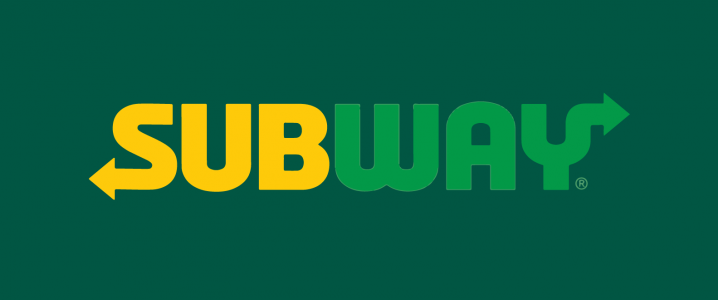
As ‘Two spots’ presented a reinvigorated logo to complement its new chain (since the “best way to stay fresh is to never get stale”), Subway also jumped on the bandwagon and is debuting a new logo to revamp the face of its brand; the first time it has expressively altered the key element of its visual identity since all the way back in 2001. Perhaps the brand decided it was high time it ditched the italic identity and treated itself to a facelift!
![]()
Something Old, Something New, Something Borrowed
While the old logo we have come to identify utilized a thick, bold font, the new logo appears more inclined towards minimalism. However, the signature arrows on the “Y” and “S” are here to stay. In order to design a memorable logo, the Sandwich chain has also announced a new symbol, similarly capitalizing on the arrows to retain a vestige of the brand’s former identity. The arrows are supposedly intended to denote the choices patrons find at Subway. In its defense, the orangier yellow and lighter green go great together and the new font does a more consistent job of exuding a sense of pathways. As to the design credit, this was a cross-functional project led by subway’s creative team, working in collaboration with an array of design partners.

#SearchforBetter; Subway Logo Goes To Spotlight
The new logo has already been employed in two ads, directed by the US agency MMB and premiered during the Olympic coverage. The new brand spot, “Clean Slate”, portrays vignettes including a female teen partaking avidly in a co-ed football team, a man inspired by his daughter exercising to extend his life, a disabled man pumping iron, and a family adopting a dog from a shelter! The message: “The search for better is one of our greatest traits as humans. It’s a new commitment. A bold move. Even a fresh start.”
Greener Horizons For Subway
According to Subway, the logo redesign is the next step in the brand’s evolution, ensuing the addition of a plethora of premium menu items, such as the rotisserie-style chicken and carved turkey breast, in addition to the launch of Subway Digital, the company’s tech-focused division. This reminds us of the logo redesign at BBC Three! The sandwich chain has also turned over a new leaf and redefined its nutrition goals, such as eliminating preservatives, artificial flavors, and colors at North American restaurants by the end of the next year, and a promise to revert to cage free eggs within the next 10 years.
The ability to position the brand as an affordable, nutritious, and delicious choice for the discerning consumers of today, and to reach across myriad channels, are at the core of these changes. The new symbol and logo, in conjunction with the additional visual assets, will roll out to all Subway digital experiences, communications, and restaurants, worldwide beginning in early 2017.
According to Suzanne Greco, Subway’s president and CEO,
“We are on an exciting journey to meet the changing tastes of our guests. The Subway brand is recognized throughout the world, and this new look reinforces our commitment to staying fresh and forward-thinking with a design that is clear and confident without losing sight of our heritage.”
Subway Subjected To The Scrutiny Of Twitterati
Similar to when Netflix revamped its logo, this logo makeover has ruffled some feathers in customers as well. While some seem to be awed by the new look of the brand, others are not as receptive to the overhaul. A few ruthless ones even accused Subway of basing its new symbols off Waste Management. Here’s what the Twitterati has to say about the refreshed logo facelift:
Subway’s new logo clearly rips off waste management pic.twitter.com/Q5NKHEsOIt
— Ashley Lutz (@AshleyLutz) August 5, 2016
Subway has a new logo for the first time in 15 years https://t.co/wuoKbnkIIh #logo #design @SUBWAY pic.twitter.com/3QghHzp6sU
— LogoMiner (@LogoMiner) August 5, 2016
What do you think of subway’s new logo? Simplifying the logo promotes staying fresh and forward-thinking #branding https://t.co/jObrn1EZrD
— Rebecca Probets (@RProbets) August 10, 2016
Subway unveils redesigned logo and new symbol – It’s Nice That
new one is better, but old one has more emotion https://t.co/ga5VMltxht
— mon2014 (@mon2014sr71) August 9, 2016
New @SUBWAY logo is a work of art. It perfectly communicates the two ways its sandwiches exit a human body. 👏 pic.twitter.com/xgj7jQXIqc
— Greg Leuch (@gleuch) August 8, 2016
Has Subway been browsing LogoArchive?https://t.co/63gzOtJ8cp pic.twitter.com/AaoPSND2m6
— LogoArchive (@LogoArchive) August 8, 2016
So Subway’s new logo looks a little like Waste Management’s logo. Totally appropriate. Their food is garbage. pic.twitter.com/gz99R59osv
— Jay Carr (@AstrosTracker) August 5, 2016
New Subway logo. An improvement, but still could use some help. https://t.co/K4J1EtgbkN #logodesign #graphicdesign pic.twitter.com/t4Q4hAgyzO
— Designed By Jimmi (@DesignedByJimmi) August 9, 2016
Much needed. Love the logo, but HATE the symbol. It looks like it belongs to a cheap software company! #truth https://t.co/S26Rq29BZh
— Chris Craigman (@chriscraigman) August 5, 2016
Not sure I like the new @SUBWAY logo. Poor color choice IMHO. What do you think?#branding #marketing https://t.co/bBSH7aFSfY
— Steven Howard (@stevenbhoward) August 5, 2016
While the Twitterati have already passed their verdicts, our panelists for today discuss how adapting a new icon for their brand identity is going to fare for Subway:
- Armin Vit, Co-Founder of UnderConsideration
- Kristen McMahon, Spokesperson for Subway
- Kate Taylor, Food and Beverage Reporter at Business Insider

Caution: Sharp, Dull Turn
Most people still have the old Subway logo stuck inside their heads, since that’s what they are accustomed to seeing across all stores; a stripped-back version of the original logo, devoid of the stroke and employing a single color that is a classier take on the original logo. The arrows decking out the “Y” and the “S” have always appeared dopey, rendering an unflattering appendage to both letters, but at least the italic, condensed typography kept the logo looking dynamic and contained. The new logo transforms into a geometric-ish, non-italic wordmark that is completely bereft of motion and appears akin to a light Brutalist structure that makes it feel sluggish, static, and heavy.

Image Source: Underconsideration
According to Armin Vit, Co-founder of UnderConsideration:
“The new logo design accentuates the appendage feeling of the old logo, with the arrow of the letter “Y” extending far beyond its visual area and making a sharp 90-degree turn. This “Y” is my new most-hated part of the logo; it makes me really upset. The one in the “S” is a little less annoying but only because it’s less prominent. The new symbol is actually clever in hiding the same “S” in the new logo between two large arrows and, in turn, forming a larger, graphic “S”. I can see this becoming highly recognizable, relevant, and successful as it becomes the social media icon — which I’m guessing it will.”
The logo redesign hasn’t come easy on the public, since it is hard to dissociate Subway from the prevalent logo we have seen everywhere, for years on end. As usual it’s a challenge to accept change at first but even after due deliberation and rational thinking, it is still difficult to see the improvement beyond a step in to the realm of today’s minimalist trend, and the fad of reverting back in time to a former rendition of the company’s logo; Armin sees the new logo as the evolution of the pre-2000s logos. However, he hopes that the application will make a better case for it. Fingers crossed!

A Waft Of Freshness
The new logo stands confident, bold, and tall, perfectly embodying the true essence of the brand in a contemporary, refreshed look. Whereas the old design seemed to hint that the sandwich chain was a bonified Fast-food joint, the newer version has taken the health game up a notch as it makes the chain appear rather like an established brand with class.
.@SUBWAY‘s clean slate: Eating even fresher and adopting a new logo https://t.co/cTRqeYOpYj pic.twitter.com/aUPGxDBHOH
— Ad Age (@adage) August 8, 2016
According to Subway, the rebrand aspires to render “a contemporary, renewed look” to the brand with the vibrant colors “optimized to live and work seamlessly across all channels.” The newly designed icon “narrows down the arrows into a simple mark”, thus forming a smaller, and more usable icon for social media.
According to the Subway spokeswoman Kristen McMahon:
“The new logo is a reflection of the colorful array of fresh vegetables and other ingredients at a Subway shop. The yellow-green is a way to refresh our look while remaining true to the brand’s roots by using the vibrant color palette of the mid ’60s when we were founded.”

Clutching At Straws
The Subway logo redesign is one change in a series of bigger developments in the brand’s attempts at improving its sales after two consecutive years of lower revenue. The new logo design is a feeble attempt at rebranding light. In addition to equity marks and ads, Subway has launched the #SearchforBetter campaign, which it intends to use across TV advertisements. This is a relatively softer pivot from the notions of “Fresh is what we do”, and “Eat Fresh” themes it has adopted before. However now, the brand seeks to present the same ideas in a more subdued, softer fashion, which is far less memorable than the comic Jon Lovitz and Felon Jared!
According to Kate Taylor, the Food and Beverage Reporter at Business Insider:
“Subway has struggled to fight it out with the competition in the past few years, and has been losing ground in the fast food game that it once led after it lost its most famous pitchman, Jared Fogle, when he pleaded guilty to child pornography charges last year. The company’s sales dropped 3.4% in 2015, while rivals such as Arby’s and Jersey Mike’s grew, according to reports by Food Business News. Now, the chain hopes to get a fresh start.”
While the highly unfortunate Jared Fogle situation was an utter calamity that may have entailed a fresh start for the brand, the refresh should have come more aptly in terms of a brand face; defining what customers will eat and what they are when they eat at Subway. It will definitely take more than a high-end lettering upgrade to propel Subway to the top of the sandwich business again.
Classic Branding Or A Desperate Measure?
After hours of deliberate speculation, we came to the conclusion that the new Subway logo is not all that bad, and the icon is in fact a clever take on negative spaces, which could make it much more memorable. The news of the Subway logo is quite gaining traction since it also relates to the brand’s new digital division that will focus on leveraging technology to boost brand loyalty and customer engagement. However, while the new logo does appear stylish, we can’t help but think that it’s much ado about nothing. Subway could have done so much more with its brand and it really should have listened and gone all the way!
Do let us know your opinion on the logo redesign in the comments section below. Adios!


My first thought was the Safety Kleen logo (shape obviously, not color). Seriously though, I create ads for Subway print direct mail magazines … what’s the name of the new font they’re using?