| All brands need a logo. Many opt later for a redesign but most of the customers prefer a design that is not too drastically different from the one they have made an emotional connection with. Nevertheless, many famous brands choose to rebrand completely and give their enterprise a new makeover. | |
Related: 5 Famous Brands that Peeled off their Logos in 2013 |
|
| Sometimes, when a brand is too famous, many logo design enthusiasts re-imagine their concepts and make fan logos with different design styles. Their random logos showcase a creative display of various perspectives. Some designers focus more on the writing style; others use their ingenuity to find new icons and symbols in order to experiment with the brand’s corporate identity. Some apply one famous style over the identities of many others. No matter what technique they use or what component they alter, it’s always interesting to see their results. | |
| The logos that are typically experimented with are of Microsoft, Apple, Firefox, Twitter, etc. At times, their logo reproductions are so amazing that one begins to like the alternative more than the original logo. At the very least, this exercise provides creative content to inspire other logo and graphic designers. Here is a set of five famous logos which have been recreated with different icons and color adjustments. They have been transformed to achieve a new look. What if famous brands were really as different as the following logos? | |
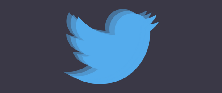
1. Twitter |
|
 |
|
| We are all familiar with the harmless, innocent, and happily chirping Twitter bird that soars upward. Have you ever thought of achieving that same innocent impression with the use of actual features and expressions? What if the Twitter bird had puppy-dog eyes? What if it were resting on a branch of tree and not always in the flight mode? This is how it might look like: | |
| But, Twitter logo is not the only logo with wings available out there. What if Twitter wasn’t that innocent after all? What if the bird was angry – really angry!? | |
2. Polo Ralph Lauren |
|
 |
|
| This happens to be one of my personal favorites. I have not only been a fan of their brand for a long time but also of their sporty logo design. The logo is somewhat similar to that of the U.S. Polo Association logo with silhouettes of two polo players but, for some reason, I find the Ralph Lauren one rather graceful and majestic because of the handsome horse and player. Let’s imagine, for a moment, though: what if that horse was replaced with a…wait, a what!?… | |
| Ha ha, terribly funny, isn’t it? Now, something that might retain the ‘handsome’ part a bit… | |
3. Lacoste |
|
 |
|
| René Lacoste introduced the unique crocodile identity in the 1920s, which is also considered by many as the first logo identity to be displayed visibly on a garment. There is an interesting story behind the establishment of this icon, but today, it holds true that there is a possibility of not thinking of the brand Lacoste when you see a crocodile, but the animal invariably comes to mind when you speak about Lacoste. | |
| Would you be impressed if Lacoste was represented by an animal like this? | |
| Okay, the Lacoste Company might have to end their apparel and fragrance line for women. So how about something more agreeable to all sexes? 🙂 | |
4. Apple |
|
 |
|
| Source: Andrew Keir website | |
| Apple has, perhaps, one of the most well-known symbols of representation in this day and age. A single image of an apple can be interpreted in so many ways; yet, Steve Jobs was able to personalize it with just a small bite. Let’s think for a moment, what can be a better substitute for their world-famous brand identity. How about an Eggplant, eh? | |
| Or, perhaps, a Pumpkin? Er, I’m not much fascinated by the idea. Let it be an apple, please. 🙂 | |
5. Puma |
|
 |
|
| It doesn’t get any better than this, really. Puma has one of the most targeted logos in the world which logo enthusiasts keep meddling with. But the original Puma icon is still too well-established to be confused with anything else. It’s simplistic and powerful. How about a symbol that is equally simple yet defies all power? | |
| Oh, or better yet, something simple and even more powerful? | |
|
Let us know which logo transformations you enjoyed most here? Also, which other logos would you alter if you let your imagination loose? |
|
Transformation of Famous Brand Logos -