- SALES / SUPPORT : 855-752-5503
In order to process this theme of using the symmetry and the grid in logo design, we first need to briefly explain what the concepts of symmetry and the grid mean.
"Symmetry or symmetrical balance occurs when the weight of the composition is evenly distributed in relation to the central vertical or horizontal axis. Under normal circumstances it means identical forms on both sides of the axis." – David Hatchard
"When symmetry appears as a similarity, but not as an identity, the forms are called approximate symmetric." In addition, it is possible to create a composition which is in balance with respect to the central point, that is, radially symmetrical." - David Hatchard
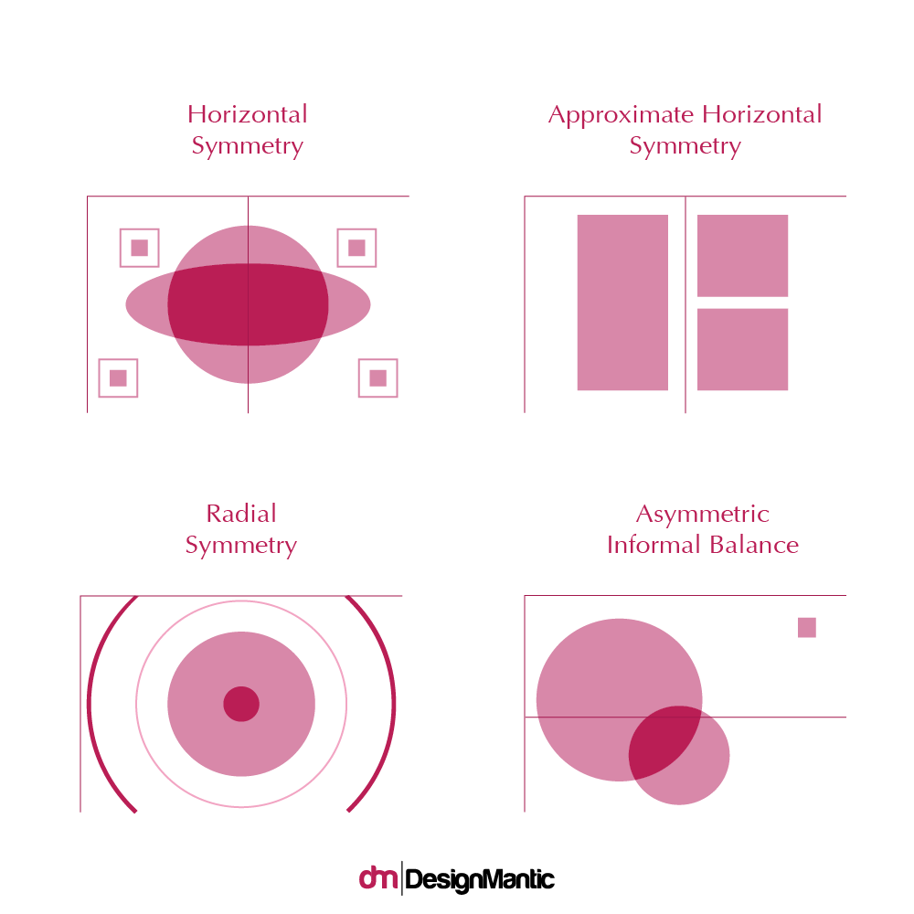
On the other hand, "the asymmetric balance occurs when the weight of the composition is not evenly distributed around the central axis. It include arrangement in the composition of objects of different sizes so that they balance each other according to their visual weight. Often there is one dominant form that is moved in relation to several smaller forms." (David Hatchard) In principle, asymmetric compositions tend to have a stronger visual tension. The asymmetric balance is also known as the informal balance.
Logo design can also be based on both principles. There are scientists that claim symmetry is more acceptable to a human eye because it is present everywhere in nature and that by looking in symmetrical shapes, people feel safer and more calm because of its balance. That is the reason why a square logo seems to be solid as compared to an abstract logo. That is not to say abstract designs should be avoided
In fact, there is a lot of asymmetry in the art, especially in logo design. One of the reasons that asymmetry is popular in logo design and in some form of visual arts is that it attracts an observer’s attention. When something is off balance, the human eye is automatically stuck on it and that is one of the desirable features and purpose of the logo. To attract attention.
The best way to achieve the balance between symmetry and asymmetry is by using the principle of the Golden Ratio. Source
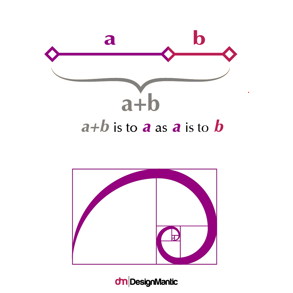
"In mathematics, two quantities are in the golden ratio if their ratio is the same as the ratio of their sum to the larger of the two quantities." Source
The golden ratio has been used in design since ancient times in architecture, painting, design and all forms of art. The artists have always been inspired by shapes of nature and used them in creating artworks. Source
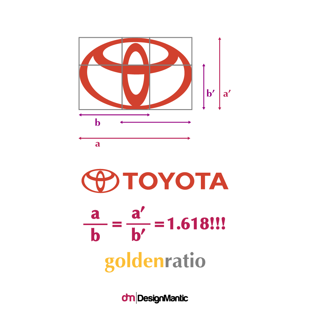
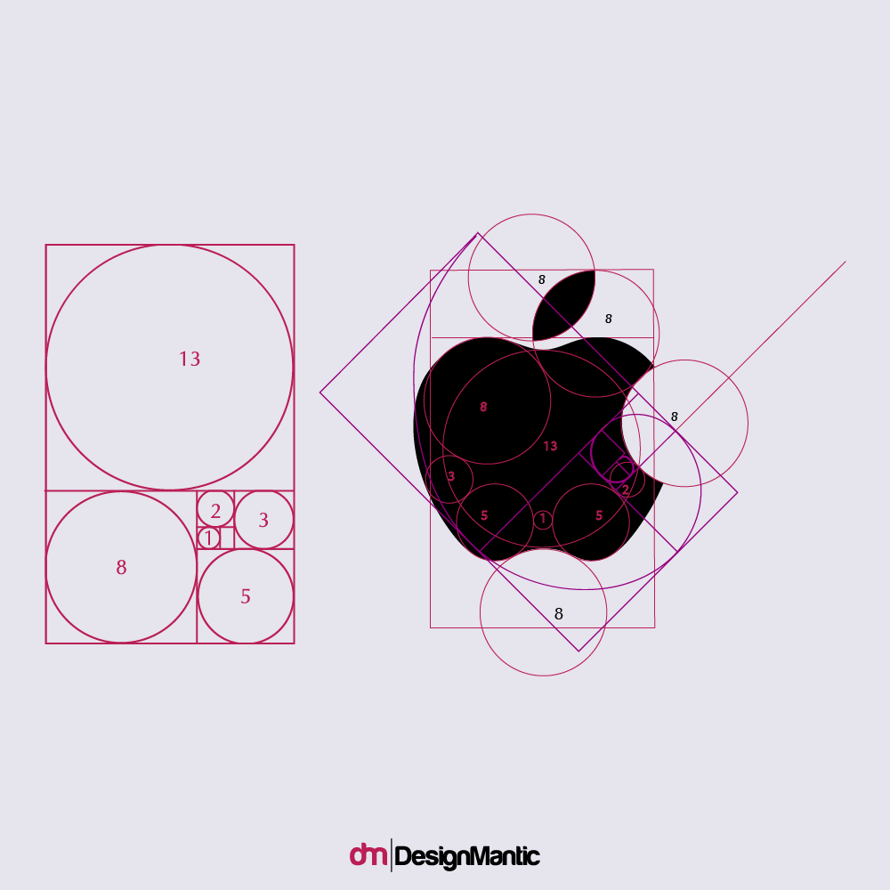
Some of the most famous logos in the world today are made on the principle of golden ratio. Source
The use of the golden ratio principle in creating a logo design is recommended because it gives the impression of symmetry to the overall appearance, but some elements can be slightly displaced to break the monotony and attract the attention of the observer. Did you know Apple the brand created it's famous apple logo using the golden ratio?
Symmetric logos are firm, reliable, stable, and give the impression of security while asymmetric possesses an element of uncertainty, more playful and more mysterious. When accessing the process of logo design, these things should be kept in mind, because in some cases, the nature of the job for which the logo is designed, can also suggest whether to approach a symmetrical or asymmetric logo design. Source For example, if you are designing for people with autism, you may want to keep your logo symmetrical and clean to avoid any confusion or stress.
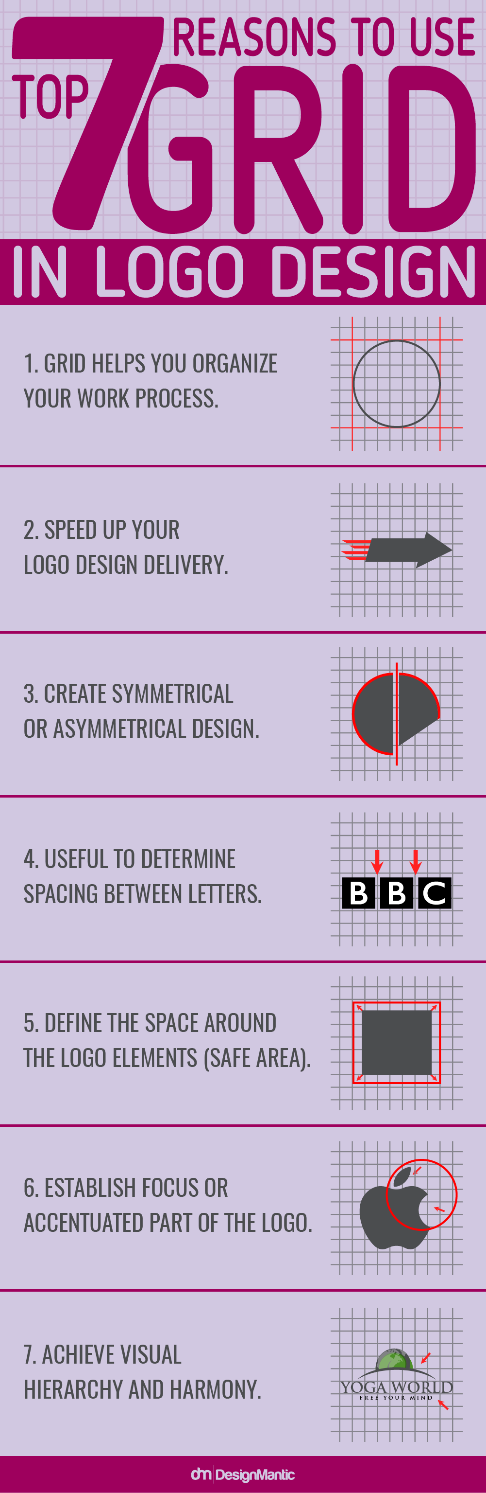
When a decision is made to create a logo design, first step is sketching. It is advisable to draw the sketch on paper that already has a grid.
In order to achieve symmetry or asymmetry in the design process, a grid is used.
Grid is a tool that consists of the vertical and horizontal lines equally distributed according to which the geometric graphic or letters can be constructed later. Paper with grid makes it much easier to draw the correct shapes and makes it possible to use the angles correctly.
One of the best video clips used by the grid in the logo design was released by Yahoo.
Grid provides help in creating symmetric shapes, but it also tells us where we can set up an object or element to break symmetry and make the logo more eye-catching Source
Also one of the best examples of using grids when creating a symmetric timeless logo is at Raymond Loewy's logo design for Shell Oil.
When sketching is complete it is time to transfer art into digital form. There are two most common computer programs that are used for creating vector art. Adobe Illustrator and Corel draw. There are other programs but these 2 are most appropriate for logo design. Getting vector logo is necessary because of ability of vector files to be enlarged indefinitely without losing quality. Every logo should be vectorized either it will be used for print or for web design. Both of these 2 programs have an option of switching grid on or off. Many designers create logos instantly on screen, without sketching on paper and by doing so turning grid on is very handy.
So, the next time when you begin your logo design process, think of grids and the 7 reasons why they’d make your logo design stand out