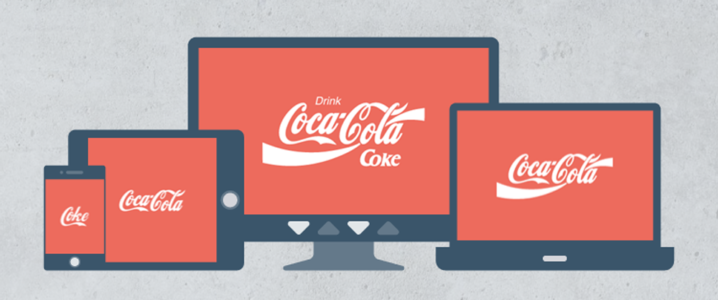
Since coined in 2010 by Ethan Marcotte, the Word “Responsive” has become somewhat of a buzzword. Marcotte described how the myriad elements on a webpage can alter their layout dynamically to better cater to capricious screen sizes. However, with the proliferation of digital devices touting different screen sizes today, the responsive design is comprehensively integrated into the web. It has evolved with businesses cashing in on the principals of developing flexible and mobile optimized websites. While businesses over the globe are jumping on the bandwagon to adopt the fad and circumvent the wrath of Google, the true essence of responsive design has been lost somewhere in the journey. Although layout is still considered as one of the most imperative factors of ensuring responsiveness, responsive design goes beyond simply arranging content or media.
Responsive design is also about context. Thus, simply streamlining or shrinking content on a page doesn’t suffice. Smaller and more intricate design details, such as the logos and icons, should be molded to follow similar contextual principles to ensure a truly responsive system. While individual web elements are designed to impact and adapt to varying constraints so that they cater to a medium, the most prominent brand element, the logo, is hardly designed with an air of digital awareness. Even though the medium calls for greater strategy and flexibility, websites have continued to implement their logos in a restrictive way. However, with Google breathing on the necks of businesses to go mobile-friendly, it’s impossible not to be apprehensive of how even the slightest of mistakes could earn your design the unsavory title of “unresponsive”.
Related: 5 Snafus of Responsive Web Design to Banish
Since mobile-friendliness has taken the web by storm as we approach 2017, web designers aren’t the only ones fretting over incorporating mobile-friendliness into their designs. Logo designers also have their hands full with making their vectors adapt to any and every user’s screen size, so that the rendered logo isn’t stripped of its essence or inherent meaning due to rendering on myriad screen sizes. The art of crafting a memorable logo now incorporates other dimensions unheard of before.
The Digital Implications Of Adapting Logos For Myriad Web Devices
Logos are construed as communication “touch points” in the business world, linking stakeholders to the companies. As a promotional tool, the logo is one aspect of intentional formal communication (Ashworth & Kavaratzis, 2009). Stock (2009) identifies logos as a direct application of branding tools, while Hildreth (2010) considers them to be identifiers. A company’s logo, as the vital identity component of functional brand, should be effortlessly applied to various promotional platforms and easily recognized across any user device, either in the digital or physical environment (Kotler, 2003). Not only does it boost the visibility of brands, it also allows stakeholders and consumers to come across and better perceive intended stimuli, such as the logo colors, styles, typography, and shapes, when interacting with brands (Kelly, 2016). This translates into the fact that the visual elements of a logo should be correctly created and rendered to ensure popular and lasting brand associations with customers (Philips et al., 2014).
According to Milton Glaser, logos are gateways to brands, and their main functions incorporate playing a major role in the place-branding process, creating first-hand associations, triggering perceptions, and establishing a quick form of communication(Kelly, 2016, p.8-9). Snyder explained that logos describe visual signatures for brands, and are responsible for maintaining and building the personality of a brand (Zakia & Nadin, 1987).
Thus, employing a flexible logo identity promotes enhancing and strengthening brand position. This seeks to unite communication strategies visually. Since all contemporary businesses will be enveloped in a highly developed digital surrounding in the upcoming year, it is mandatory to consider creating responsive logo designs for all brands. Logo visibility is further supported by ensuring a flexible identity. This can be accomplished via myriad design applications beyond the basic principles of logo design that dictate how a common logo can be used.
A successful brand should aspire to remain comprehensive by everyone and amicable at all touch points. The rise of digital portable devices further stress on a continuous and complete process of adaptation of logos for different marketing initiatives purposes. Digital platforms like social media and smart phones encourage logo adaptation, so that the rendered logo doesn’t appear distorted, blurred, or stripped of its essentials in the rendered versions. (Kelly, 2016). This is gravely important to achieving the highest levels of flexibility and brand visibility. Thus responsive logo design must be diligently applied in favor of boosting brand identity and image.
Integrating Flexible Logos With Responsive Web Design
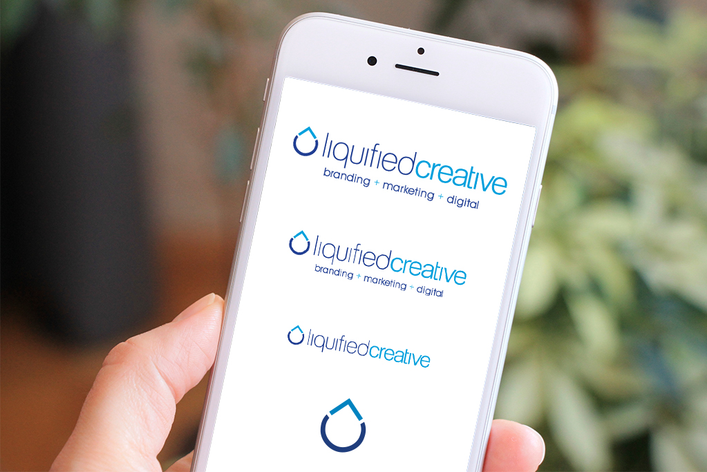
Image: Liquified Creative
What comes to mind when you think of your business logo? The tiny and simple image embodies the spirit of your business and represents something as significant as your organization. It is the mark recognized by your customers and is the focal point and inspiration of all your visual branding. Everything from the color palette, to the typography, shape, style, and symbols of your logo were chosen meticulously to encode the message of your brand. Therefore, as a rule, your logo should never be changed. Right?
Not Always!
As responsive design has prevailed over the modern web, responsive logos are interpreted by some designers as the ultimate design solution for guarding the meaning, detail, and clarity of a logo when viewed on different display sizes. Logo designers working around context have always permitted the brand symbols to be portrayed in myriad different, yet semantically identical, ways. Peruse through the business strategy of any successful company to unearth diverse iterations of their corporate identity according to its diverse usage. In the responsive era heralding 2017, brands which fail to comply will face dire consequences. Yet, we see a lot of brands continuing to simply shrink their symbols and make them illegible and messy in the process, instead of creating them responsively in the first place.
Related: Tips to Stop Your Brand from a Decline
Fortunately, some big brand names have taken their classic iconic emblems and subjected them to their responsive steps gradually. They have made sure their brand symbols behave like all other elements of a responsive website, and become easily adaptable to various screen sizes. Instead of only tailoring the shape or size of a logo, they simplify their logos by losing words and eliminating all redundant details.
Redesigning The Logos Of Famous Brands To Incorporate Responsiveness
Joe Harrison, a freelance designer based in London, has presented one of the most stunning portrayals of responsive logos or icons. His project, known as responsive logos and responsive icons, go into details about creating “future-proof” and scalable logos and icons, which seamlessly integrate with the modern web. According to Harrison, the most viable type of logos and icons is that which achieves the “perfect balance of simplicity in relation to screen size”.
Harrison’s concept of designing responsive or scalable logos depict how popular brand logos can be considerably and effectively reproduced on a mobile friendly environment, and serve as inspirations for brands looking to scale.
In each of Harrison’s responsive logo re-designs, each company’s logo undergoes a series of ‘shrinking stages’, shedding details along the way and becoming more abstract, ending with a fresh logo lock-up every time the browser window size is reduced. For each subsequent reduction in the browser width, the new minimal logo stays true to the essence of brand identity, its message, and its values.

By the time we reach the smallest screen width, we are left with the Heineken red star or the Disney “D”, or to put it in a nutshell, the bare minimum needed to render the logo recognizable on an emotional or a subconscious level. This brings to mind Scott McCloud’s discussion of iconic abstraction in understanding comics. This is an excerpt from a relevant passage:

Image: Scott McCloud/Understanding Comics
Adapting Logos To Survive A Highly Responsive World In 2017
If you reminisce a brand such as Adidas, its logo is the first thing which would pop into your mind. However, did you picture the entire logo; the customary word Adidas in Avant-garde Gothic lettering underneath the three famous stripes? Perhaps just the name or the stripes, or the whole trefoil logo? The fact of the matter is that you can show any part of the logo to a brand-conscious person and they would instantly tell you that the logo belongs to Adidas. The same can be extended for most logos. Logo recognition based on a fragment of a logo is second nature to us, as famous logo quiz apps would have you know!
The notion of having different versions of logos for different contexts has existed long before the dawn of responsive era. For instance, Nike has been seen using their “Just Do It”, the full name logo, and the swoosh mark interchangeably without having the brand look watered down. However, in the mobile driven age, brands with tall or flat logos would benefit manifolds from using a suite of logos that are designed to adapt automatically to best accommodate the device resolution of the user.
Infographic: Roundup Of The Famous Logo Redesigns
Using responsive logos in 2017 will ensure that logos are more readable at smaller resolutions without restricting them to an ultra-minimal style even when rendered at a larger size. In terms of legibility across myriad screen sizes, responsive logos will allow designers to fine-tune icons to represent the sweet spot. Depending on the screen resolutions, different logo versions can display varying levels of details. In addition, the fluid nature of responsive logos will guarantee that your logos are prepared to meet the challenges of future devices.
Using The Initials
Instead of cramming the entire wordmark together at smaller resolutions, sometimes using the initials of the company name is a more discreet option. On smaller screen sizes, the Microsoft Word designed logo of Urban Outfitters narrows down into a thrifty “UO”. While only well-known logos can be abbreviated like this and still make sense to the audience, this seems to be the best option in the absence of a logomark.

Dropping The Wordmark
Big brands such as Domino’s are seen dropping their wordmarks when displayed on a narrower screen size. Since the logo icon of Domino’s is just as famous as its name, scaling down to the simple logomark in the scarcity of screen space still lets the logo be recognizable. Since the name of the brand is conspicuous in the site URL, using a single icon is less obtrusive and allows users to concentrate more on the experience and content provided; the major players in driving conversions and acquiring customers.

Ditching The Logotype
If you want to keep the main logo intact while minimizing and removing the logo slightly, let go of the slogan text to make sure the logo is clearly visible and highly legible across medium sized displays like tablets. Brands whose straplines are integrated within the logo will generally suffer no ill from dropping the strapline altogether. Details such as fine lines and lettering can get lost and distorted on smaller screen resolutions. For instance, Penn State university logo has its size expanded horizontally and the logotype removed from it to make it readable on smaller screens.

Creating A Simplified, Alternate Version
If you must retain a complex logo for your branding ventures, it’s prudent to create an alternate version for the responsive site. For instance, Disney adapted and conjured up one of the more versatile logo marks ever created, decades before the inception of digital devices. In most marketing applications, the full “Walt Disney Pictures” logo is displayed, usually before a Disney movie begins, but narrows down to just “Disney” on its website, while retaining its unique handwritten font. We have come to associate this identity system that gave birth to the alternate logo, which has been simplified in both conceptual content and form for more versatile applications.

Vertical Stacking
Depending on the type of your logo and the level of detailing you are willing to part with, vertically stacking a lengthy, horizontally positioned logo makes it fare better on smaller screen resolutions. For instance, the Exclusive food store Fortnum and Mason has gone big on the whole responsiveness talk. At smaller resolutions, their logo switches to a type-based stacked design!

Sticking With Text Only
While brands are seen sticking with logotypes and shirking the logo icons, as might seem instinctive, Pizza express has gone the other route. On smaller screen resolutions, the logo switches to just text. This is because the logo icon is quite intricate on its own and would have turned to a grey, dreary smudge at lower resolutions, had the brand chose to part with the text.

Changing The Logo Shape
If the shape of your logo hinders scalability, sometimes it works to alter the shape of the logo at smaller resolutions, especially if it allows you to retain other more pertinent elements. For instance, the A.V Club’s logo switches from a proud, round shape to a minimal rectangular block of text at smaller size. Retaining the round shape would have rendered the text barely legible, while the original shape would have squandered too much of precious space on a smaller screen.

Future Of Responsive Logos
Given the constant escalation of digital devices, logo designers of 2017 will establish a model for responsive logos that will implement these for raster and vector images in a multi-layer image file format, supporting further meta-data. This will guarantee that the responsive logos are employed complying with predefined rules and be rendered automatically on their own. Not only will this result in a plummeting degree of errors when applying the logo by third parties, but also ensure that the logo is readable at any device size the future may have in store for us.
References
- Ashworth, G., Kavaratzis, M. (2009) beyond the logo: Brand management for cities. Journal of Brand Management 16(8): 520–531.
- Stock, F. (2009) Identity, image and brand: A conceptual framework. Place Branding and Public Diplomacy 5(2): 118–125.
- Snyder, A. (1993). Branding: Coming up for more air, Brand week, 34, December 6, p. 24-28.
- Kelly, M. (2016). Analyzing the complex relationship between logo and brand, Place Branding and Public Diplomacy 1–16., Macmillan Publishers Ltd. retrieved in March, 2016 from palgrave-journals.com/pb
- Philips, J.B., McQuarrie, F.E., Griffin, G.W. (2014). How Visual Brand Identity Shapes Consumer Response, Psychology and Marketing, Vol. 31(3): 225–236.
- Kotler, P. (2003). Marketing Management. New Jersey: Pearson Education.
- Zakia, R.D., Nadin, M. (1987) Semiotics, advertising and marketing. Journal of Consumer Marketing, 4(2), p. 5-12.


Today when most of the online users are surfing internet on mobile devices, it’s no more a luxury to go responsive but it’s actually the need. Some of the great examples posted here. Interesting and informative post, thanks for sharing this.
Thank you, Soumya.
I agree, responsive design is not just a luxury or a fancy feature anymore. It has become a necessity due to myriad of devices people use.
It’s really helpful for newbies.You describe most of the logo category by part to part. So it very simple for understanding responsive design.