Firefox has amassed millions of users over mobile devices and desktop but most remain oblivious to Mozilla’s educational and advocacy work. The brand has frequently struggled to discern itself from its famed products to channel attention to other lesser-known projects it is involved in. The company has decided to rebrand in an attempt to tackle this, and has collaborated with the London-based creative agency, Johnson Banks, to develop a new positioning and identity following a seven-month “open design” process documented on its blog, as opposed to clandestine rebranding foray of subway.
One idea links all we do: the Internet should be a healthy, global public resource, open & accessible to all https://t.co/zMS9tRnwSw pic.twitter.com/efe89Gvlc7
— Mozilla (@mozilla) January 18, 2017
The previous logo identity was typeset in FF Meta, the Helvetica of the early 2000s, which became a viable visual identity of the golden dot-com era. However, despite the ubiquity of the font, the Mozilla logo wore it with grace; neatly spaced and simple, balanced out with a funky name to render the wordmark memorable. While the simplicity of the predecessor is carried over in the new logo, named the “protocol”, a subtly nerdy visual component has been thrown in for just the right reaction; Gen-X will recognize the :// as something pertaining to the internet, we engage with it pretty much every day, while die-hard coders will deem it a common denominator and an appreciable depiction of the if-then-gobbledygook they write to eke out an existence!
The Internet is at the ❤️ of Mozilla, so we’ve designed the language of the Internet into our brand identity: https://t.co/VA1CE8nhbh
— Mozilla (@mozilla) January 18, 2017
Unless a viewer has a complete lack of willingness to adapt or even a tad imagination, the new logo is just as legible as the one they had been accustomed to; “moz://a” reads just as fine as “Mozilla”.
According to Tim Miller, who leads the organization’s Creative Team,
“At the core of this project, is the need for Mozilla’s purpose and brand to be better understood by more people. We want to be known as the champions for a healthy Internet. An Internet where we are all free to explore and discover and create and innovate without barriers or limitations. Where power is in the hands of many, not held by few. An Internet where our safety, security and identity are respected. Our logo with its nod to URL language reinforces that the Internet is at the heart of Mozilla. We are committed to the original intent of the link as the beginning of an unfiltered, unmediated experience into the rich content of the Internet.”
Custom Type For All
The final typographic result of the logo features a funky slab serif that’s neither too crispy nor corporate. A bespoke font, Zilla, was designed by Peter Bil’ak of Dutch type foundry Typotheque for the wordmark and accompanying copy. The custom-built font draws from Courier- the default font used for coding- and its journalistic feel echoes the internet advocacy work of Mozilla. The open-source font will soon be available to download for free. The company chose Typotheque due to the foundry’s propensity for creating fonts in diverse languages and its expertise in “localization. In addition, the logo design leans away from the current trend for sans serif fonts, adopting something rooted in the visual language of the internet.
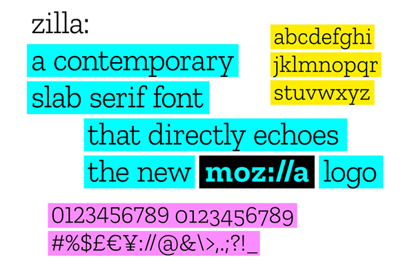
Image Source: Mozilla.org
Dynamic Imagery
The creative brains behind the project weren’t too happy with just one option when it came to developing the imagery for Mozilla’s new look. As Murray and his team scrutinized the elements of their brand identity, the notion of one icon or image representing the entirety of the Internet and the whole of Mozilla, seemed anachronistic. Since imagery is a direct reflection of the richness and diversity of the Internet, the creative team of Mozilla incorporated it as an indispensable component of the system.
According to Murray,
“In digital applications, ever-changing imagery represents the unlimited bounty of the online ecosystem. Dynamic imagery allows the identity of Mozilla to evolve with the Internet itself, always fresh and new. Static applications of our identity system include multiple, layered images as if taken as a still frame within a moving digital experience.”
As the brand develops, Mozilla aspires to invite technologists, designers, and artists to contribute to an ever-expanding imagery collective where the team intends to code still images, animations, and curated GIFs to flow into mozilla.org and various other digital experiences pertaining to it. Mozilla intends to engage new design communities and contributors through this open design approach under Creative Commons, and make more imagery available to all. Mozilla is seeking out input from creative communities to aid them in molding and expanding this idea.
Changing Colors
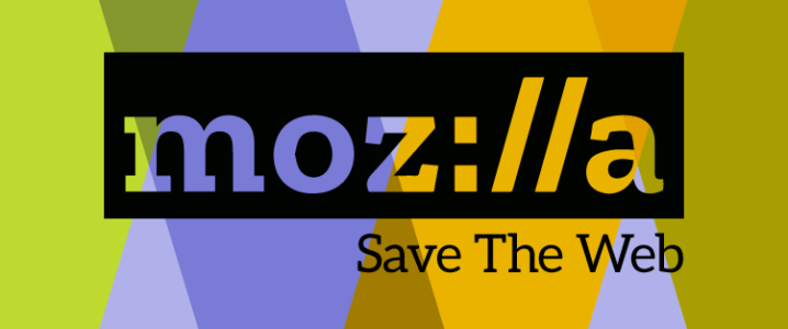
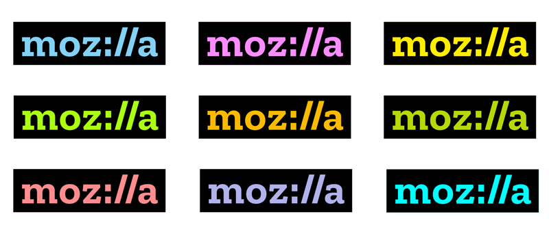
A key building block of the logo is the black box surrounding Mozilla’s logo, which alludes to the way type is highlighted in web programs and toolbars. A proposed color palette takes after the colors used by myriad browsers and will vary depending on the context in which the logo is used. As the style guide of the brand is further developed, it will define the guidelines, intensities, and color pairings.
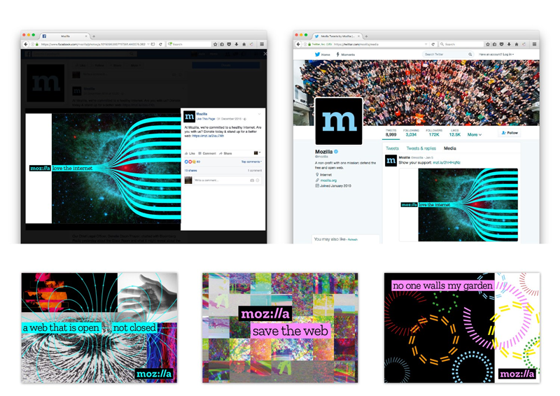
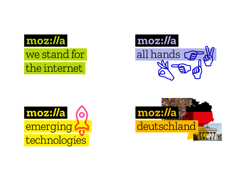
The boxiness of the new logo is justified by the brand extensions, creating a system of stacked bars, putting the logo at the top always, followed by secondary bars designed to accommodate any kind of location as well as initiative. The imagery is loosely positioned to render a quirky side to the system that relieves it from appearing like it’s trying too hard!
According to Murray,
“It will now be easier to know that something is ‘from’ Mozilla and understand how our global initiatives connect and reinforce one another. The system enables Mozilla volunteer communities across the globe to create their own identity by selecting color[s] and choosing imagery unique to them. Meanwhile, the core blocks of our system, bounding boxes and typography, will provide the consistency.”
This unprecedented endeavor of Mozilla was bound to stir the avid internet aficionados into heated debates. While we are absolutely smitten by the branding foray of Mozilla, the internet tells a different tale when put to the scrutiny of Twitterati.
What do we think of Mozilla’s new logo? https://t.co/9SNDNA0ifI pic.twitter.com/NVYKxMhstA
— The Verge (@verge) January 18, 2017
Mozilla’s new logo is kinda :// https://t.co/0n9LJsUzN3
— Engadget (@engadget) January 19, 2017
Mozilla unveils new logo, font, and design https://t.co/VHUhxSyMLp Clever design!
— Dries Buytaert (@Dries) January 19, 2017
That new Mozilla logo is pure genius. pic.twitter.com/gNow7kihqf
— ma//:as (@mattiasgeniar) January 18, 2017
While the twitterati has passed their verdict, let’s see what our panelists for today have to say:
- Racheal Steven, Senior Writer for Creativereview
- Angela Natividad, Writer at AdWeek
- Peter Bright, Technology Editor at Ars Technica
A Clearer Voice
Mozilla is a non-profit organization founded in 2005, which develops free-to-use, open-source software including the programming tool Thimble Code Editor and the popular web browser Firefox. However, lesser known are the myriad educational programs Mozilla runs to enhance internet literacy, hosting coding clubs and Maker Parties around the globe, and the advocacy work even fewer know about; it launched a campaign in 2013, demanding a full account of the NSA’s monitoring of communications and online data, and only just supported campaigns defending net neutrality. Since, in the past, the brand has frequently struggled to differentiate itself from its famed products to channel attention to the wealth of other low-key projects it is involved in, the end result of the rebranding process aims to better communicate the brand’s purpose and role.
According to Rachel Steven, Senior writer for Creativereview,
“The work on the rebranding project is still underway, but the proposed elements lend a much clearer and stronger voice to Mozilla on the whole. The wordmark, coolers and Courier-inspired font, in conjunction with the idea to develop a constantly evolving bank of visual assets, makes more sense for a web-based company harboring open-source technology at its heart.”
Flipping The Branding Process On Its Head
In the June of 2016, Mozilla announced an intent to rebrand in collaboration with the London Design agency Johnsonbanks, but with a twist that had the design community doubling back in thrill; the rebrand process was touted to be brought out in the open, inviting critique and discussion from the sprawling global Mozilla community along the way.
The unparalleled experiment was conducted in response to the malicious state of online logo criticism accompanying any major rebrand. Rather than defend itself, Mozilla posted a series of proposed logo designs by Johnson Banks online on its open design blog where anyone could comment. During the five month long project, the creative team reviewed around 3,000 comments! While these comments didn’t factor in as votes, they did serve to influence Mozilla’s decision to use this design.
Michael Johnson of Johnsonbanks told CR that Mozilla’s rebrand hadn’t been that different from any other rebrand. The project kicked off with a research stage, trailed by a bout of initial concepts, developing into more detailed ideas, culminating into the development of a final route. The most obvious new and unprecedented variable has been the public airing of each stage of the process. In addition to the feedback of 20 people client-side, the brand had to contend with the views of another 3,000 or so Mozillians as well.
The logo might not be the most interesting thing about Mozilla’s experimental approach; it’s how well it seemed to work! People were diligently poring over and writing detailed essays about the pros and cons of the seven design approaches. One can scroll through the comments on any design approach, and be ambushed by a wide array of well-reasoned, polite, and often differing opinions.
The final mark even incorporated fragments of the gathered feedback. For instance, some people from the design community were enraged that while the URL code uses all lowercase letters, the original design draft of the “protocol” logo used a capital “M”. As a result, the “m” in the final mark is switched to lowercase. Another school of commenters rallied against the idea entirely, deeming the whole URL snippet a primeval artifact of the web. While the creative design team acknowledged those comments, they didn’t heed the remarks as you can’t possibly please everyone, especially on the internet.
According to Angela Natividad, writer at AdWeek,
“Things often go wrong when you ask people to help you out, in part because it’s usually a lazy way to source creative intellectual property. Mozilla was careful in explaining it wasn’t going to make the same mistake. By and large, it’s an identity that matches the brand—and its philosophy of an open web—while remaining in step with a space and culture in states of constant disruption. The attention and planning that went into incorporating external input, without losing control and falling victim to social schadenfreude, are also admirable.”
Branding Only A Nerd Could Love
Mozilla has a lot of work to do for its flagship product, Firefox, with its current market share in the doldrums at just 12.22 % according to the most recent Net market share figures, so making it the ultimate fodder for mocking by every tech journalist is not going to help matters.
According to Peter Bright, Technology Editor at Ars Technica,
“I’m pretty sure I’ve seen a similar treatment of the colon-slash-slash in youth-oriented TV shows to show just how with it and Internet-savvy a person or company is; a kind of nerd shibboleth. The whole thing feels like it would have been bold and clever in the early 1990s—an intellectual counterpart to the stupidity of Yahoo!’s embedded exclamation mark. In the year 2017 it feels like a throwback, not least because Chrome, Edge, and, yes, Mozilla’s own Firefox all suppress display of the colon-slash-slash when visiting non-secure URLs. The branding is built around a nerdy detail of the way protocols are written in uniform resource locators, a detail deemed so unimportant that there’s no point even cluttering up the screen with it.”
Open-Source Rebrand? Yey Or Ney?
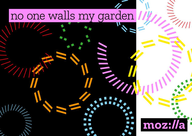
What makes this project seem so enthralling to us is how the creative process seemed to embody the “open, not closed” philosophy at its core, inviting influence and input on different routes as they evolve, and taking place so publically. Fortunately for Johnson Banks and Mozilla, it is a successful, audacious, and brave experiment that turns the trend for post-release public criticism of rebrands on its head, involving people in the process itself from day one. Not to forget, the Mozilla rebrand incorporates positional taglines that put Mozilla confidently against its competitors; declaring “no one walls my garden”, and offering “a web that is open, not closed”! Definitely a stroke of genius by Mozilla!





What does “moz://a” mean actually ? Are they somehow connected with the Moz ? If not, the logo is really an unwise concept. Because people would think it’s Moz or relating Moz.