- SALES / SUPPORT : 855-752-5503
The time has come to put together a company flyer, perhaps for a sale that you’ll be running at the end of the month. One of the big perks for a business owner with a creative bent is that there are tons of opportunities to exercise your natural creative eye. But when something is going to be put out in public, and it has your company’s name on it, you definitely want to make sure that it looks professional.
If you don’t have the design skills or experience for this, don’t panic.
Often, the trick is to use websites that offer easy-to-use and readily adaptable templates for whatever piece of graphic design you happen to need. This is a really important thing to know, especially if you happen to be a business owner without design experience.
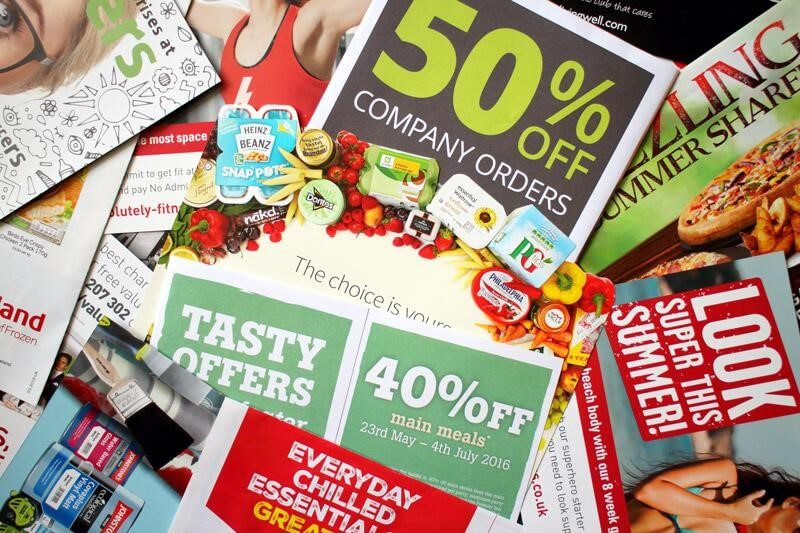
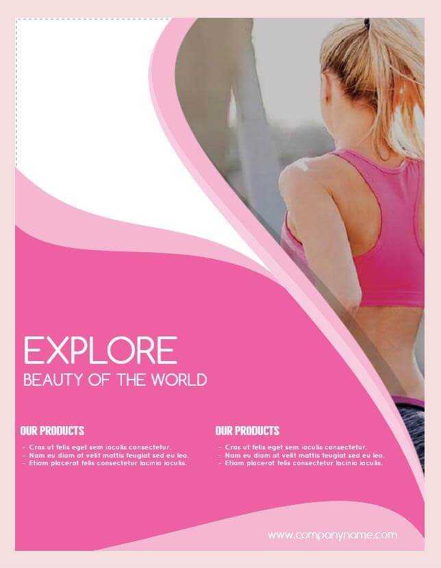
Image Source: iStock.com/Thinglass
This article is going to take you through some of the basic aspects of flyer design, and point you in the right direction to put together your own professional piece.
Everyone knows what a company flyer is. So let’s talk about their range.
Flyers are extremely versatile. Basically, it is any piece of paper or digital marketing that can be circulated for promotion purposes. If you want to announce to the world that you’re having a twenty-five percent off sale throughout the month of January, a flyer would be a great way to do that. If your company has been voted as a “Best Of” by the community, a flyer is a great way to acknowledge the honor, thank the community, and rub it in the face of those who were not even nominated. If your hand-crocheted bikini business is branching out into rattan Speedos, guess what you should use to let people know? Yep. A flyer.
Flyers are very handy little pieces of marketing that can say a great deal in a smallish space. They can be cheap to produce, cheap to get in the hands of your potential customers, and, let’s face it, they can be a lot of fun to put together, if you’re a creative type of person.
Even if you’re not, there are sites that can help with that.
The flyer, not your lack of creativity. With that, you’re on your own.
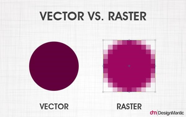
Although flyers are often full-sheets, they can come in different sizes, so re-sizing and printing without losing image clarity is a consideration. You may also need to give a little consideration to the style of design you opt for. Specifically, for the purposes of this heading, vector vs. raster. Both of these boil down to image types and the technicalities of editing and design.
Raster images, to put it as simply as possible, are dot matrix images and revolve around editing pixels. They are digital images that can be created or captured, such as a scanned or digital photograph. With reduction or enlargement in size, the quality of the image is going to change, sometimes quite significantly if the size variation is considerable. The level of detail tends to be larger than that of vector images, and therefore the file itself will be larger.
Vector images are composed of paths, which are edited through lines and shapes (or vectors) rather than pixels. They can be reduced or enlarged without losing the quality of the image, and are the go-to choice for a lot of graphic design because of this.
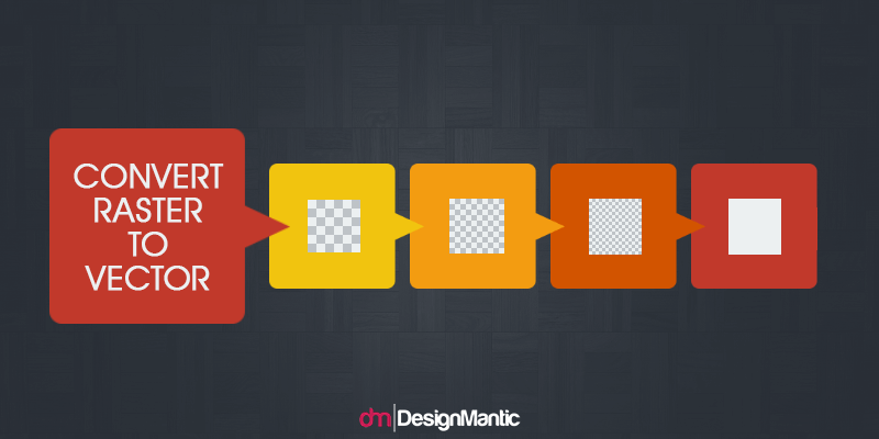
If you opt for an additional step in the design process, you can convert a raster to a vector, though it will probably change the look of the image.

As with any piece of design, there are some technical details that need to be considered when you’re putting your design together.
One aspect to keep in mind is the bleed. If you’re not sure what this is, don’t worry. We’re not talking about the inevitable paper cuts that come from working with paper-based design rather than digital. Bleed refers to the portion of the design that overruns the available space. It can be cut off when the flyer is printed and distributed, and if it isn’t accounted for in the original design, this can result in either loss of vital information or just straight up awkwardness. Neither of these is things that you want for your awesome business flyer, which is just trying to do its job and doesn’t deserve this sort of abuse.
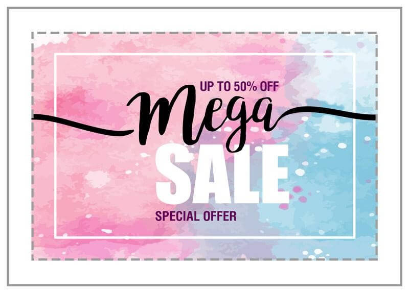
Image Source: iStock.com/94clover
When taking bleed into account, you should also consider the folds. Are your flyers going to be flat and one or two-sided? Or are they going to have folds? The layout of the design will likely change depending on how much information needs to go onto the flyer. All of this will need to be reflected when you’re setting the margins for bleed.
You can also consider whether you want a one-page or two-page design. Keeping in mind your audience and how they’re going to see the flyer can inform your decision in this respect. If your flyer is going to be mailed out, two-sided design makes sense, if you have that much information or even just simply want to carry your design over just for the look of it. If your flyer is more likely to only be seen on things like bulletin boards, or other places where your audience may not have ready access to both sides, a one-sided flyer probably makes more sense
Font sizing, graphics placement, and other general layout considerations should all be sorted out beforehand. It’s a good idea to play around with the layout a little, to ascertain what will work best for you, your message, and the aesthetic you want. Most flyers tend to be vertically placed, though horizontal is also perfectly possible, if that works best for your flyer.
So if you have a basic idea of what the layout of the flyer should be, what are the details of the design?
As mentioned, flyers are typically put together for a very specific reason. That reason is going to influence every aspect of your design, from the mundane little details of the aesthetic, to the information that is included, to how you distribute your flyer to your audience.
If you’ve ever looked at any articles on graphic design, you’ve probably seen a plethora of rundowns on what basic aspects are included. No matter what you’re putting together, these are design elements that are involved pretty much across the board.
Font: Your choice of font is going to be influenced by a number of factors, including readability, available space, personal preference, company aesthetic, and possibly what fonts you may have used before. Though it’s common to use a follow-through font, one that has been incorporated in other marketing materials, you may opt for a new font for your flyer, depending on what the occasion is. If, for example, your flyer is to notify your clients that your company is participating in a charity fun run, you might use a light, playful font that you would not normally include in your straightforward marketing materials. If you’re setting out to advertise a rock concert, your font choice is probably going to be a little more quirky and out-of-the-box-y than a straightforward advertisement for a product or service would be. Just remember that you want your audience to be able to clearly read your flyer, and get the point of the message.
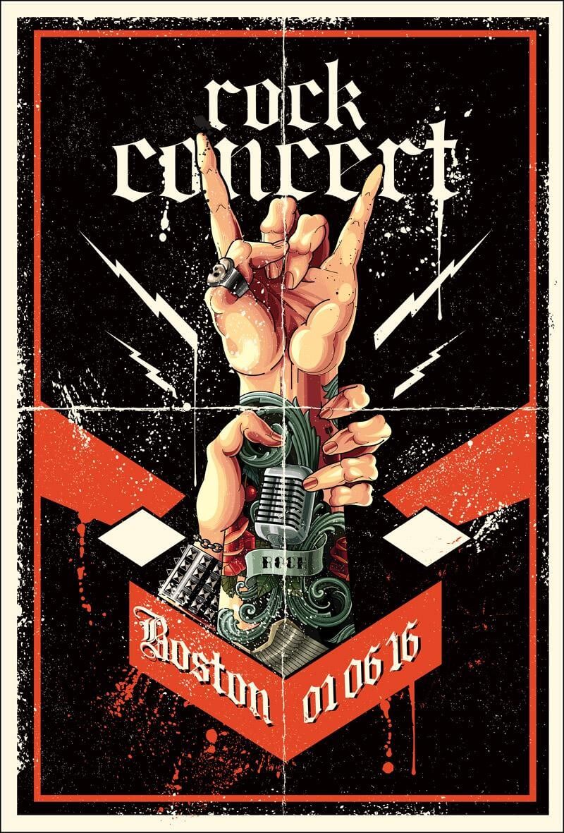
Image Source: iStock.com/Man_Half-tube
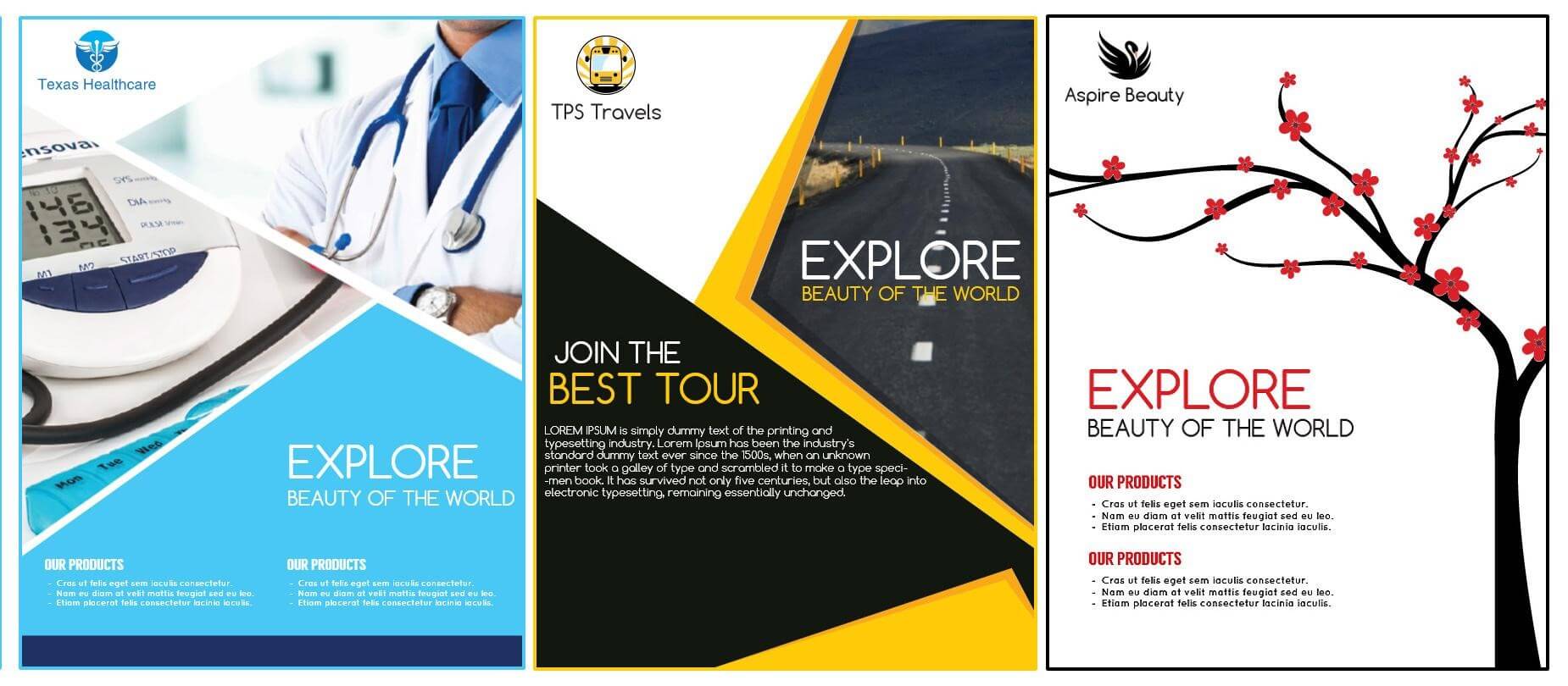
Color: The color palette may be influenced by your company colors, especially when it comes to the portion of the flyer that includes your logo or company details. But this is very dependent on the type of design you opt for. If you choose something basic and classic, such as banner-based design, for instance, your colors could be very straightforward. Other types of designs may call for more gradients and a bigger palette. Alternatively, you may end up going with a simple black and white. Whatever you choose, colors, like other aspects of design, should ultimately be based on your audience and your message. If you’re putting together a sale poster, for instance, a brilliant, attention-grabbing red is more likely to jump out at the viewer. Your colors can function as part of your call to action, if they’re chosen wisely.
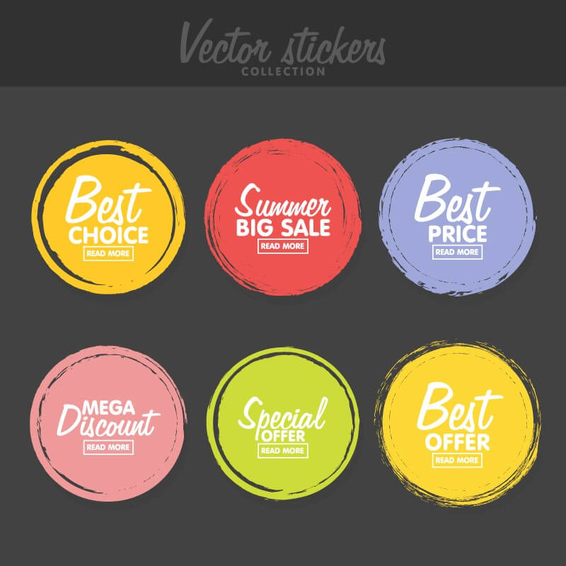
Image Source: iStock.com/vectorplusb
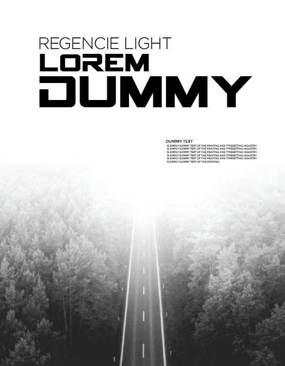
Graphics: There are a lot of options to go with here, since you have the space to play with on a flyer. It’s probably not a good idea to attempt to stuff in too much in the way of graphics, as you can overdo it and overwhelm your client, distracting from the information and message that the flyer was created to impart in the first place. That being said, it’s good to create a dynamic, memorable overall impression with your choice of graphics, and the style in which they are done.
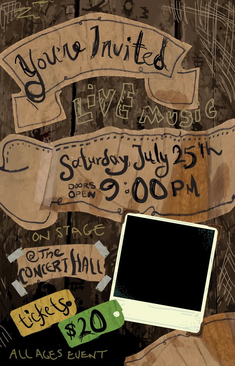
Image Source: istock.com/JDawnInk
Logos: Since your company flyer is, after all, a marketing option, it’s probably a good idea to brand it with your company logo. It doesn’t have to be front and center; rather, let the flyer’s message take precedence, and include the logo somewhere like the bottom of the page or the corner, where it is still clearly seen.
Along with these basic elements of your design, there are a few other things to be considered and included. Again, go back to your reason for producing this flyer. It’s really a good idea to have that reason clearly in mind when you’re writing the copy for it.
Image Source: istock.com/johnnyscriv
What do you plan to do with your flyer once it’s produced?
Anywhere that can handle marketing can handle your flyer. So plan ahead, and make a list of your marketing goals. Think outside the box, too. Flyers can reach their audiences in a number of ways, such as snail mail, inclusion in newspapers, email, social media, bulletin boards, paper airplanes, and balling it up and throwing it at passersby on the street, though this last one is not recommended.
Know your audience, know your customers, and know where you will most likely be able to reach them. That’s what good marketing boils down to.
Now that you know everything that could, should, and might be included on a company flyer, what should you do with that information? Putting a flyer together would be a great way to practice what you’ve learned.
So where do you go for tutorials, templates, ideas, and walkthroughs?
Looking at examples of graphic design is always a good idea. This can help you to pinpoint what you’re looking for and what aspects you want to include, and can also assist you with the brainstorming portion of your design. Since you already have a handy list of what needs to be included on the flyer, the next step is putting it together in a way that is easy to read and understand, as well as being aesthetically appealing and on-message.
If you don’t have experience with design, a simple, easy-to-use flyer maker like DesignMantic.com would be a great place to start. It has a variety of read-to-go layouts, as well as simple color and font options that will help you to put your flyer together quickly.
Again, mocking up several different design ideas and options can help you end up with a flyer that you really like and that does the job it is design to do. Flyer design assistants like the one on DesignMantic are a great way to get past the frustration that comes with not having the experience, and just have fun with putting a piece of graphic design together.