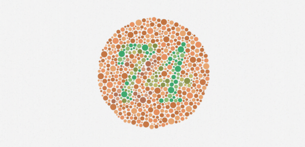
Look closely. What number does the circle of dots represent? While all unaffected individuals would see the number "74", those suffering from color blindness might see the number "21", or even nothing at all. You can take your test here to find out if you are also suffering from the condition.
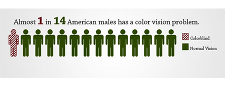
4.5% of the population are color-blind, according to Colour Blind Awareness. If males make up most of your audience, the percentage soars up to 8%. Since most designers are not color-blind, it’s not uncommon for them to overlook the design needs of the affected. While color-blindness comes in various shades, it generally boils down to the inability to differentiate between certain colors, getting colors mixed up, or not seeing colors clearly. When it comes to the web, this problem could be aggravated by the environments people use websites in. This includes sitting far away from a television screen, tiny mobile screens, screen glare, and low-quality monitors among other factors.
Accessibility in web design is already making big waves, since it is indispensable to cater to the needs of this wide demographic, who could potentially experience varying degrees of difficulty using your website if not designed the right way. Solely relying on color for affordance and readability makes it difficult for a color blind person to use the website, ultimately compromising sales and readership. This article covers some useful tips to help designers solve a plethora of dilemmas color-blind people experience when using websites.
According to webAIM, in the eyes of individuals suffering from Protanopia, the cones or the color receptors are not sensitive to long wavelengths (the reds). To these people, reds seem darker than the actual hues and appear more beige like. Shades of green are often confused with reds.
According to Colormax, cones in the eyes of people with Deuteranopia are insensitive to greens and the sufferers mainly perceive hues of blue and yellow. While the condition is more or less similar to Protanopia, reds do not look as dark in this affliction.
Tritanopia is marked by the absence of blue cones in the eyes of the sufferers. In general greens and blues can be confused in this condition, and yellows appear as lighter shades of red or disappear altogether.
These UX Design Tips to Maximize Conversion Rate would help you design a better web experience for your color blind audience and facilitate ease of use for them:
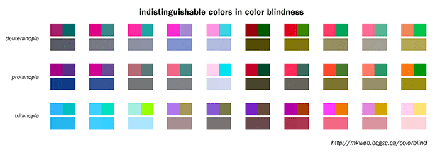
Some color combinations are especially hard on color blind individuals and thus should be omitted from your designs. The site wearecolorblind.com offers plenty of insights for designing with the color blind in mind and has deemed several color combinations unsuitable for these individuals, including Green & Black, Green & Grey, Blue & Grey, Light Green & Yellow, Green & Blue, Blue & Purple, Green & Brown, and Green & Red.
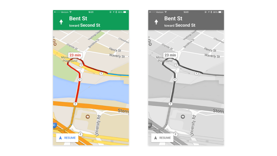
One of the most definite ways of avoiding issues stemming from color blindness is to employ multiple shades of a single color rather than using multiple colors in your design. After all, minimalism is the new sexy, isn’t it? Colors having too similar a hue or having the same temperature are hard to tell apart. Nobody’s asking you to create a black and white website but viewing your website in greyscale mode helps you envisage how it would appear to your color-blind audience. Google Maps accomplishes it perfectly as it uses colors of different hues, in addition to using green for no traffic and red for busy, to allow color blind people to see the differences.
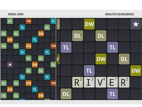
Color blind people are able to perceive differences in brightness, saturation, and hue, as well as contrast. Web designers can leverage this to their advantage, since a plethora of people afflicted with this condition fare better with bright colors than dim ones which have a tendency to blur into one another. For instance, the game Word Feud only uses those colors for its tiles which are easy to distinguish for individuals with color deficiencies. Go MediaZine has a good article replete with examples on good and bad contrast.
People with a mild case of color blindness are often able to see a color if there’s ample “mass” of it. Therefore, a less than sufficient thin line of color won’t show up as the right color to them. Even better, it’s more prudent to use texture instead. Especially in infographics and maps, texture can be used in addition to color to distinguish between myriad objects. For instance, if we run the image above on the vischeck simulator, a Protanope or a Deuteranope would easily interpret it.
WCAG 1.0, WCAG 2.0, and Section 508 all stress upon the fact that color shouldn't be the sole medium to convey information. According to Section 508 , Web pages shall be designed so that all information conveyed with color is also available without color, for example from context or markup."
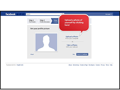
Color shouldn’t be relied upon to convey a message, for instance, color blindness may impair a person’s ability to decipher common red error messages, such as "watch out", "warning", and "bad". As a good measure, designers should add in symbolic elements in addition to color-coded text to get the point across to a diverse audience and capture their attention. The error messages attached to Facebook's form fields are great examples of this technique.
In addition, color-coded text can be supplemented with descriptive text to help such individuals make sense of the text. Gap is one such brand which solves the problem of using color to portray myriad options available in a product by adding a text label beside each color.
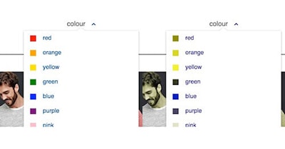
Color filter with labels is easy to use, especially as seen by someone with protanopia. This helps individuals with normal vision as well, since some colors such as navy blue and black are hard to tell apart on a screen. Adding text labels makes it hassle free to differentiate similar looking colors and takes the guesswork out of it.
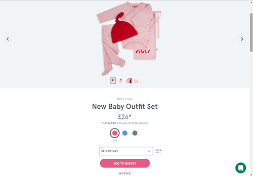
Similarly, often primary buttons are presented with color alone. Instead, consider leveraging icons, borders, contrast, boldness, placement, and size, within the confines of your brand guidelines, to help detection. For instance, Kidly uses iconography, color, and size to accentuate its primary buttons.
Another option to identify interactive elements is to wean off color and introduce some other visual change between their different states. For instance, while we are accustomed to buttons that change colour on hover, buttons with borders fare better, such as above. Changing the appearance of buttons make them stand out and shows users which elements are interactive.

Similar to altering contrast, tweaking the brightness, saturation, and hue of colors allows designers to show definition and help end-users differentiate between various elements without using a plethora of different colors. By using one color, or even a small set of colors, changing either the hue, brightness, or saturation can reveal a distinguishing contrast within samples of the same color. This technique lets designers incorporate color throughout their designs as if adding a new color to the mix each time, without compromising the aesthetics. Each sample of the color is then perceived by the color-blind visitors as a different looking part of the design. For instance, we started out with the same color below but turning up the hue a notch produced the color on the right.

Links on a web page should be easy to spot for everyone, including your color blind audience. Thus relying on color alone is not the best option.
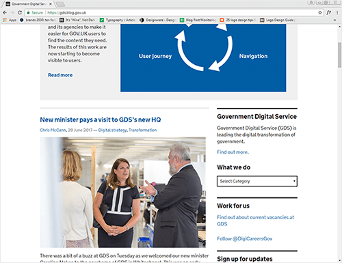
The screenshot of the UK Government Digital Service (GDS) website above shows how someone with achromatopsia (the inability to see color at all) might be left scratching their heads when trying to find links on a web page. The only way left for these users is to hover with their mouse at every word, waiting to see if the cursor would indeed change to a pointer. This becomes even more difficult on mobile as they have to resort to tapping on text to make a page request. Links should be underlined, or even better incorporate icons, to ease navigation.
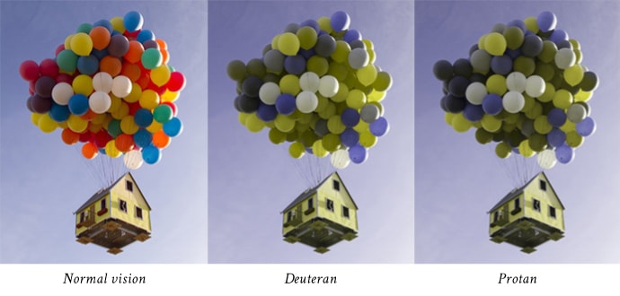
Depending on the type of color-blindness, a lot of original problematic colors are automatically replaced by other hues. That is, for Protanopes or Deuteranopes, greens and reds become brownish, with greens being a tad lighter than reds. For Tritanopes, blues appear lighter and yellows appear pinkish.
Now imagine a scenario where you have picked exactly these colors for your design’s color theme, namely blue, pink, yellow or brown, green, red, and then placing such colors side by side would inadvertently create a "blending effect", with greens or reds melting into shades of grey or brown, and the greys and browns retaining their original colors.
Even worse, if such colors are combined by themselves as the color of background and superimposing text, or in graphs to convey information, it would be the height of reckless design decision. When designing for a color-blind audience specifically in mind, not using such problematic colors is the best option.
Designing for the colorblind is not often a bed of roses for designers who aren't colorblind themselves, and thus cannot actually comprehend the struggles of their less fortunate end-users. However, designing for the color blind audience in mind is indispensable now a days as color blindness doesn’t only affect a handful of people but actually a dilemma plethora of your end users have to contend with day after day.
Web designers should strive their utmost to take the needs of these visitors as best as they could. Even if color is capitalized on, it shouldn’t be a problem in terms of aesthetics or readability when used in conjunction with a well-organized layout. However, an important question remains: How can designers take accessibility into account when they cannot fully comprehend the condition at hand?
Fortunately, web is replete with myriad accessibility "simulators" where your web page is rendered in a certain way so that you can literally put yourself in the shoes of your color blind audience and view the webpage from their perspective so that you can identify problematic areas and tweak accordingly. For instance, "Colorblind Web Page Filter" filters your web pages as if viewed from the eyes of a color blind person, Color Oracle is a color blindness simulator for Linux, Mac, and Window, applying a full screen color filter to your designs, while Check My Colors gives feedback on an existing website, pointing out areas that can be improved. Such Simulators can help designers make informed design decisions and make UX pleasurable to use for people suffering from the condition.