- SALES / SUPPORT : 855-752-5503
Tackling online engagement can be the bane of any business owner's life. You've got the site, you've got the products, it all looks great, but your site traffic is negligible and your conversion rate is in the tank - so what's a company to do? Well, chances are that you're being squeezed out of the market by bigger competitors with large marketing budgets. And this is a problem that lots of companies face, so we'll be going over a few steps that will help you boost your engagement, and catch some traction in the market. The process will always be slow, and gradual, but being on the right track is more than half the battle.
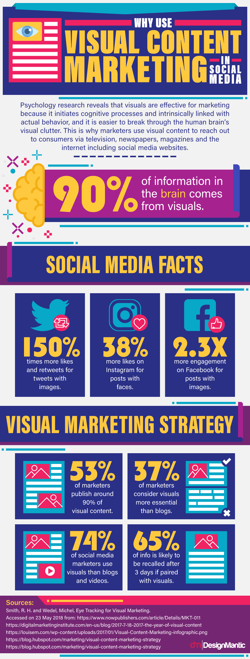
While text is the best way to boost your SEO rankings, either by keyword optimization through product descriptions, or by running a strong blog packed with useful information, it's not the best way to catch serious traffic. They say that a picture is worth a thousand words, and they're right. Pictures are far more appetizing to the casual eye than a big block of text, which is why you should be using pictures wherever possible. When you're thinking about engagement, you need to be focused on the places that people will be seeing your brand, and aren't taking note - and then trying to make sure that they do take note when they see it. For the most part, a great way for businesses to boost their engagement with visual elements is through social media images. Both paid and organic advertising provide a massive opportunity to engage clients. Because of the way that the feeds work on social sites, a convolution of all the pages, people, and groups you follow, the posts that command the most digital real estate are those with images in them. When people see images, they engage much more than they would with text alone. Some pretty hard hitting statistics show that if you don't use visuals for your marketing, then you're shooting yourself in the foot… And the other foot, and both knees too, apparently.
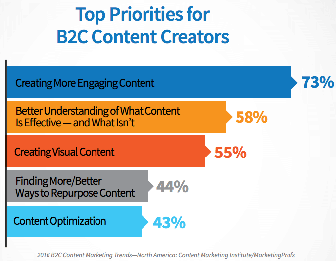
Twitter says that nearly 75% of social media marketers on their site use visual assets in their social media marketing, alongside blogs, which is just below 70%. And, with the mobile-device market share continually expanding, it becomes difficult to read large bodies of text on a small screen, which is another major reason why social marketing is done with images. People are used to seeing them on their phones, and more importantly, are able to better remember them. Only 10% of people who read information remember it three days later - compared to 65% who remember that information when it's paired with a relevant image. Sounds like a no-brainer.
And, if that wasn't enough, Twitter says that tweets with images receive 150% more retweets than those without. Let that sink in for a second.
Facebook too advises that posts with images get 2.3x more engagement than posts without. That's more than twice as many people clicking your ads, links, or blog updates.
And when it comes to solely image based platforms, like Instagram, photos with faces in them get 38% more likes. Whether this will affect what content you put out there, who can say - but, as a marketer, it's your job to know this sort of stuff, and heck, more likes never hurt.
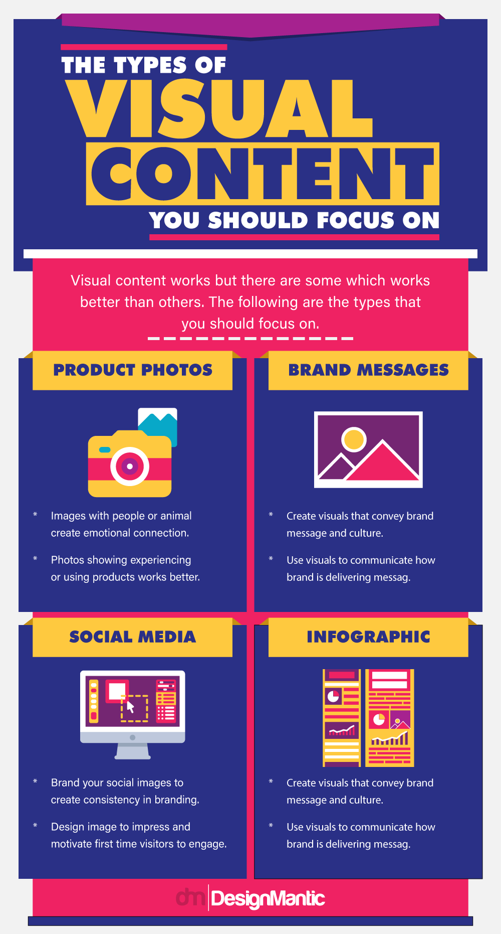
Big glossy photographs that show off amazing products with your logo design, images that focus on conveying brand message, and graphics designed to deliver concise information about your company, services, or products. These are the three types of images you’ll want to focus on to begin with.
As for the photographs - well, in essence, photographs convey information that is true to life, meaning that what someone sees on a photograph is out there somewhere in the world. Will a photograph of a cute puppy help sell a dog collar? No, but a picture of a cute dog wearing the collar you’re trying to sell might. You can rant and rave about the quality of the leather and the aesthetic impact that it has, but without a picture of it that makes it look great, you'll never sell a single unit.
Because photographs have a true-to-life promise, companies can rely on this and use it to their advantage. Photographs of people eating at restaurants, for example, never show the patrons looking unhappy, do they? They’re always bursting with fits of laughter of languishing in the glorious taste experience of a chocolate pudding. It's because the image carries contextual weight. If a plate of food looks good, it looks even better when there’s someone enjoying it.
So, when you’re posting a photograph of your product, always try to make sure it's pictured in a way that will convince people to buy it, and not just admire it. When it comes to these sorts of images, it pays to have a photographer on board. Whether they’re an employee or a freelancer is your call, but professional photos, edited with a professional photo-editing software to bring out the best in your photographs - like Photoshop or Affinity Photo - will blow something snapped on an iPhone out of the water. The reason it costs so much to hire a great photographer is because they’re good at what they do. Investing in great product photos will likely help sell more units. Business is about investment, and if you don’t believe in your products enough to bet a little money on them, then what’s the point at all?
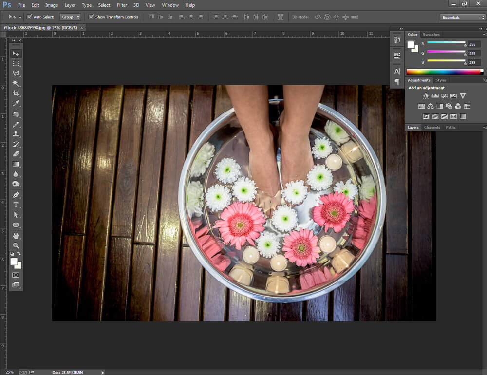
Image source: iStock.com/andresr
When it comes to brand message, what we mean is that you should be putting out images that go some way to telling your users or customers who you are as a company. There's a lot of focus these days on companies being more like families or communities than simple corporate hierarchies, which is why on a lot of websites now, you'll see pictures or graphics of community, that don’t scream 'professionalism'. Instead they make the company seem like it’s made up of real people, like you, or me.
A great example of this is Abacus Marketing, an established firm in London. One glance at their website will tell you exactly the sort of company they are. Though their site is shiny and high class, it's also super approachable and fun. Their brand message is conveyed perfectly with a collection of comedic images. And a further look at their Twitter feed tells you that they truly believe in visual marketing. Every post has an image stuck to it, and it seems to be working for them:
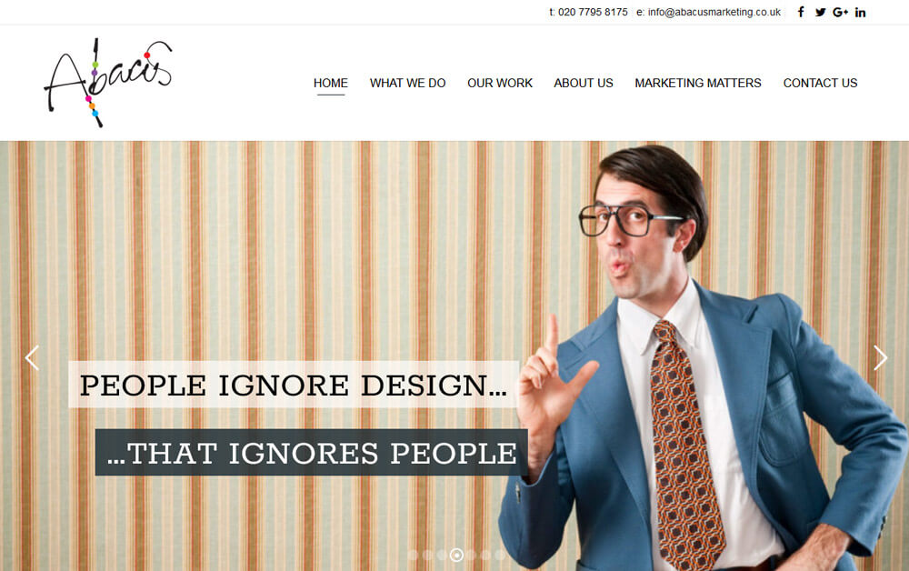
Image Source: abacusmarketing.co.uk
These sorts of photos can be tricky to take, unless you have a photographer on board full time who can spend their days running around snapping anything to get that wacky mid-meeting shot that shows everyone that your company is human. What we recommend is that you leave it to the guys who do that for a living. Studios all over the world intentionally fake those beautiful, crazy images you see all over the web. They’re called stock photos, and you can pick them up from Stockport, EyeEm, Gratisography, Unsplash, and lots more. Though, these are paid, so beware of just snagging them without checking out first. If you’re looking for royalty-free images, then you’re probably more inclined to check out Pixabay, Life of Pix, ISO Republic, Picjumbo, Death to Stock, Negative Space, or Kaboompics to name a few.
Though, if you want our top tip to enhance brand mood, then keep reading, and we'll help you make all your images look nice and congruent - and you won’t even need photo-editing software, which is good news if you're without a budget for a pro photographer. Both brand message and product photos will find a lot of traction on sites like Instagram and Facebook, where there's this habit of quick-scrolling and liking on a whim. You're more likely to catch someone's attention with beautiful photo than with a fact laden infographic - but don't worry, they have their place too, which we'll come to next.
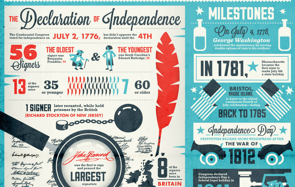
The third type we're looking at is infographics. Why are infographics important, and why do they command such attention from sellers and buyers alike? Well, sometimes, an image just can't express the exact message you want to. That’s why promoting an infographic are so important, because they can do both. They can present text as an image, and capture both the visual attention and focus of the viewer. The innate ability of an infographic to present otherwise dry or complex information in a visually pleasing and simplified way can really clarify things that would be both time consuming, and long-winded to explain. For example, this graphic that tells the viewer all about the Declaration of Independence.
People would likely have tuned out the teacher relaying these facts in our American History classes, but somehow, in an infographic, they’re fun, and digestible. The same goes for this infographic, which tells you all sorts of fun things about technology in the future:
While they may be costly to produce in comparison to grabbing a photo of your products, they’ll help to get across key information that you want your users to know.
If you want to get someone on board to do these, hire a graphic designer for custom design is the way you want to go. If you want to give it a try yourself, either Adobe Illustrator or Affinity Designer are great all-round heavy hitters, though if you want to just use an online tool, there are some good ones around, though they’re not as powerful as dedicated software. Visme, and Piktochart are some of the most powerful, and in our experience, robust.
For infographics, your main portals are likely to be your Facebook Business Page, LinkedIn, or your Twitter feed. They can make great pinned posts, and will help to catch people who visit your page, get swept up by your pretty cover photo (which we’ll come to next) and then begin scrolling down. A great infographic can trap their attention once they’ve had their attention piqued, and using photos and infographics in combination like this can be an effective way of trapping engagement.
Another thing to note is that on top of content, you also need to have a great static media. These are the images that continuously appear on top of your social profiles, and on your website. Once people get caught by an ad, or redirected by a search link or retweet, they’ll land on your profile, and at that precise moment, the die is cast. Often, based on the visuals they’re greeted with, at that moment, they’ll decide if you’re the sort of company that they’ll like. That’s why it’s super important to start your visual design at home. Designing a great social media cover can be tough at the best of times, and depending on what sort of enterprise you’re marketing for, you’ll have different goals in mind.
If you’re selling something that’s aesthetically driven - like hotel rooms, cars, clothing, or otherwise, then you’ll want to utilize high resolution images that show off your product in the best light possible.
If you’re selling a service, like real estate agency, then you want to use your real estate logo with images that sell the brand message, and tell people about the sort of company that you are. An image will convey so much when someone sees it first, so you need to make sure it strikes the right note, which we'll come to in a moment.
Image Source: sketch.io
If you want to know more about social media cover design, then head over to our blog specifically on that, as well as covering DesignMantic's own bespoke social media cover design editor which works right from your browser.
So, by now you're probably thinking gee, I should really pad out my marketing strategy with some great images. And you’re right, you should. But, you should also know that too much of a good thing can be bad, too. As such, you should make an effort to make your portfolio of images diverse, incorporating all three types, at least in part. A company that's selling products will need visual images to entice customers like a catchy poster design, but also to convey brand message through a unique clothing brand logo, so that buyers know that the company is reliable - and that same company might want to let their customers know that they source all their materials ecologically, which is where an infographic would come in. And, in this mode of thought, it’s really important to make sure that your tone is congruent throughout so people’s perceptions of the company are continually bolstered, and not confused.
Mood-matching is a simple concept that will help you keep you images nice and even. The style, voice, and general content of most of the posts need to fit together so that nothing feels out of place, regardless of where your images pop up.
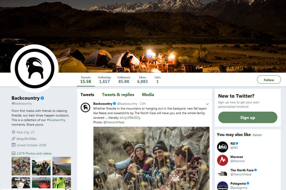
Outdoor clothing company Backcountry are a great example of congruent tone. Their images are all distinct, but have a really strong tone. Photographs with the color flattened ever so slightly, featuring a person or people in nature. They’re always wide shots of beautiful vistas, with a person sporting their clothes. It’s not hard to get caught up in the grandness of their pictures, which only goes to show how important properly chosen images are for a company’s engagement rates.
If you've got a million images - some taken by you, some stock images, and some snapped by your friend at an event, or by one of your employees at a team-building day, then you’re likely to suffer with differences of style and mood. But, fear not. A lot of companies employ simple tactics to make all of their photographs and images look like their shot by the same person. If you have any sort of photo editing software, you’ll be able to do this in a snap. Otherwise, you can use an online tool like sketch.io to do it. It's pretty easy - you ready?
Image Source: sketch.io
Brands like Supra Footwear or Crew Clothing edit their images ever so slightly to give them the right feel. Supra overlay theirs with a near-transparent layer of black to bring down the color vibrancy and make everything seem a little edgy. See if you can notice the whites that are just off-white. And Crew push their contrast down a touch, and their brightness up to make everything look drowned in sunshine.
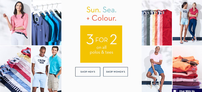
Image Source: Crew Clothing Company
Other companies may employ a very subtle sepia tone, or push the contrast and saturation up to make all the colors pop. These are all common tricks that companies will use to make everything look coherent. If you're suffering from brand incongruence, then try it out. Think about what you want your pictures to say, and then tweak the basic settings - brightness, contrast, hue, saturation - or overlay with a near-transparent layer of color to give it a bit of a tint.
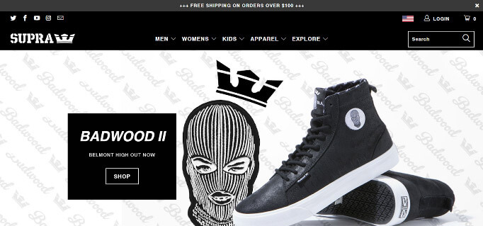
Image Source: Supra Footwear
Though, take note of this, because it's very important. Less. Is. More. Trust us. Less. Is. More. Small tweaks will make a bigger difference. Changes that aren't noticeable to the untrained eye will have much more of an effect than making your images look fake. It's all an illusion, and for an illusion to be effective, it needs to be subtle.
If you're not using images, then you should be, and hopefully this guide will go some way as to illuminating how you should go about choosing the right ones for your company, because it's a great way to get noticed - and without them, you're sure not to.