For one in five Dyslexic individuals, reading can be nothing short of exasperating. Letters may appear to fuse together, rotate, flip, or even switch dynamically as they try to grasp the text in front of them. Victor Wedell designed the simulator below to make people put themselves in the shoes of Dyslexics after his friend explained how he experienced difficulty in comprehending the swapping letters on the page.
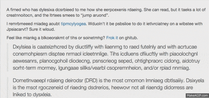
It's really hard to fully comprehend the day-to-day embarrassments and frustrations experienced by a Dyslexic person until you are in the same boat. This is what Daniel Britton wanted to communicate when he designed his extremely viral typeface ; what a dyslexic individual experiences when trying to read.

The typeface isn’t a portrayal of how Dyslexic readers view letter shapes, but rather to convey the difficulty level for comparison. According to Daniel,
"What this typeface does is break down the reading time of a non-Dyslexic down to the speed of a Dyslexic. I wanted to make non-Dyslexic people understand what it is like to read with the condition and to recreate the frustration and embarrassment of reading everyday text and then in turn to create a better understanding of the condition.” Even in such a small copy of text, you can appreciate the staggering struggle.
Dyslexia has been dubbed a “hidden disability with neurological roots”, since you cannot tell if someone has Dyslexia and neither can they. However, statistics reveal that it is pretty proliferate for a hidden disability, with approximately 10 to 17.5% of the population of the United States suffering from this cognitive disability. This percentage is quite significant and entails designers to understand the design needs of disabled users and come up with new ways to make words and letters seem more comprehensible to their audience with special needs.
Since not all typefaces are created equal, some fonts might be more accessible than others for readers with Dyslexia, visual processing disorders, and even visual impairment. This is because the design of letters vary from typeface to typeface, including their shape, weight, and height. Other factors such as the background and text color, text size, lines and words on a page, and spacing between letters can all have an impact on the overall readability of text. Such factors are the reason behind how typography can play with your mood as well.
Especially for school going students, it is indispensable to work with easy to read text, particularly when it comes to working on a computer. With Dyslexia, fonts with unnecessary visual noise can interrupt reading or cause stress, or similar looking letters may be confused. This is why educators aspire to garner dyslexia-friendly fonts that address the various conditions linked to Dyslexia to help such individuals alleviate the struggles of reading text.
A study by G. E. Legge, J. S. Mansfield, and Beth A. O'Brien, considered the effect of altering type size on the readability of text for Dyslexics. The report founded that in order to achieve their maximum reading speed, Dyslexic children require 32% larger type sizes than what their non-Dyslexic peers need to achieve their maximum reading speeds. This scientific finding is especially useful for E-readers on smart phones and tablet computers, which allow readers to resize type.
In the Research Paper titled "Shorter Lines Facilitate Reading in Those Who Struggle," Schneps discovered that Dyslexic children are able to read texts displayed on hand held devices (iPad, iPod) 27% faster when the text lines featured smaller number of characters, somewhere ranging from 16-18 characters per line in contrast to 60 - 65 characters per line, characteristic of customary print book typography. This technique is easiest and most cost-effective to implement on E-readers, including pad computers and smart phones, and can be effortlessly applied across any typeface.
In the paper titled "Extra-large letter spacing improves reading in Dyslexia", Marco Zorzi found conclusive evidence that incorporating additional letter spacing in texts helped improved the readability of text for Dyslexics. Legein and Bouma also provided supporting evidence in their paper titled "Foveal and Parafoveal Recognition of Letters and Words by Dyslexics and by Average Readers." According to the paper , a phenomenon known as crowding strongly hinders the recognition of letters in Dyslexic readers more so than normal readers. The number of letters a reader can recognize in a fixation, known as a visual span, is smaller in Dyslexic readers and thus an alleviated visual span translates into slower reading for those readers as compared to normal ones.
• Use generous leading/line spacing
• Steer clear of justified text
• Say no to Italics
• Pepper generous letter spacing in your text
• Use larger text size
• Develop a habit of using sans serif faces
• Use concise, clear writing
• Offer plenty of contrast for the benefit of the eye
In the Research paper titled "Good Fonts for Dyslexia," a team of Spanish researchers used eye-tracking to determine which fonts were found the most readable by Dyslexic Individuals. 48 Dyslexic subjects ranging in age from 11-20 were made to read 12 texts written in 12 different fonts. According to the results of the study, Roman, Monospaced, and San-serif fonts resulted in the best reading performance. The study also concluded that the use of Italic fonts greatly impaired performance in Dyslexic readers.
Of the 12 fonts, researchers included Times and Ariel because they frequently appear across printed texts and screens, whereas Courier is one of the most common monospaced font. Specialized font Open Dyslexic was chosen for its touted ability to assist Dyslexic readers. The study included both the regular and Italic forms of these three typefaces. In addition, a sans serif face ‘Verdana’ was included because it is often recommended for enhancing readability. Other fonts included Computer Modern Unicode, a typeface common in scientific publishing, Myriad and Helvetica, both of which are proliferate across graphic design, and Garamond due to its notably strong legibility.
The research measured both fixation duration and reading time using eye tracking data to determine readability of text, while the test subjects diligently read selected 60-word paragraphs. Subjects were also encouraged to rate each font on a scale of 1-5. Surprisingly instead of the specialized font Open Dyslexic, the study participants showed an inclination towards Helvetica or Verdana. Based on the findings of their study, the researchers cautioned against using Italic fonts and recommended Computer Modern, Verdana, Arial, Courier, and Helvetica, based on both subjective preference and reading performance.
According to designers, Dyslexic readers fare better with:
• Ample letter spacing, for instance in some typefaces, 'r' and 'n' written close together could read as 'm'.
• Good descenders and ascenders; t, l, h, f, d, b, and all Capitals; y, q, p, j, and g.
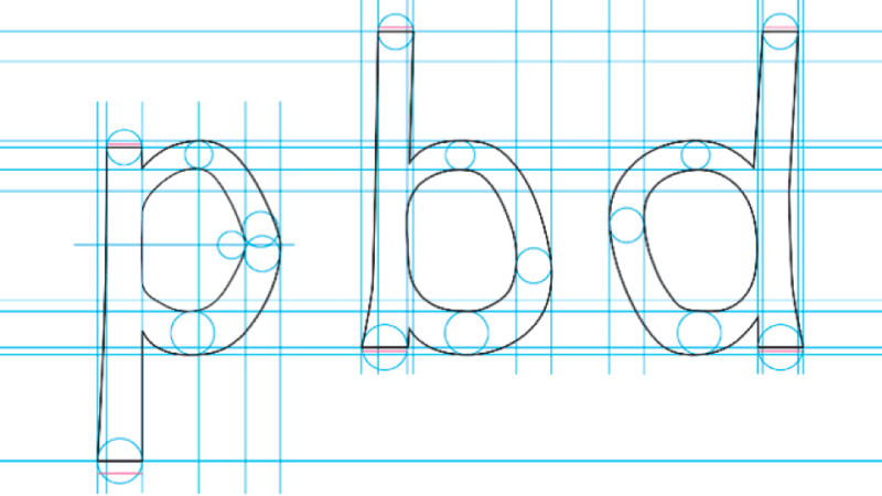
• Easily distinguished letters; for instance, p' and 'q' and b' and 'd' should not be mirror images.
• Rounded 'g' in handwriting. While rounded 'a' is also preferred by many Dyslexic readers, it might be confused with 'o' in some typefaces.
• Different forms for digit 1, lowercase 'I' and capital 'l'.
While a wide chunk of Fonts are designed with aesthetics at the forefront, some Dyslexia-friendly alternatives are being created with functionality in mind. Dyslexic readers often experience difficulty in discerning certain letter pairs, but altering the center axis, weighting, and height of a letter can make the letters appear different. In addition, adjusting the empty space or putting it on a slant can also help differentiate the letter as a shape. For instance, extenders, or bits that go down or up in certain letters, can be lengthened for letters that are built out of circles and wider openings can be thrown in for added distinction.
By rendering each letter unique, the chance of mistaking one letter for another during reading can be greatly alleviated for Dyslexic readers. This is especially beneficial for mirror letters such as ‘p’ and ‘q’ and ‘b’ and ‘d’, rounded letters like a/o/c and f/t, the number 1, and the letter I. Similarly, Dyslexic readers often confuse certain letter combinations for a single alphabet, such as ‘r’ and ‘n’ written closely together could read as ‘m’. However, by adjusting the width of ‘r’ and changing the curve of the arch, designers can greatly diminish the likelihood of this error occurring. Some fonts render punctuation and capital letters in bold to boost their visibility manifold. These adjustments can also come in handy for students suffering from visual processing disorders.
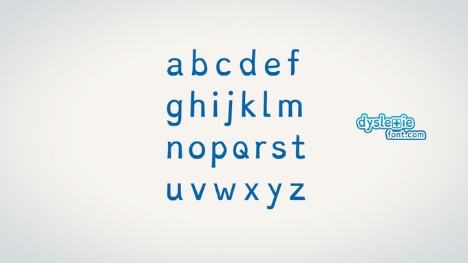
Designed by the young Dutch designer Christian Boer, Dyslexie font is a new font intended to augment the reading skills of individuals struggling with reading difficulties. Dyslexic readers often mirror, rotate, and switch letters unconsciously in their minds while reading and traditional fonts can further exacerbate the condition. The typeface makes reading fun and simple by breaking the age-old rules of typeface design. You can download the font here .
The shape of each character or letter is unique which makes it easier to recognize and distinguish. This makes sure that the readers are prevented from twisting or flipping the letters while reading. Capitals are larger in this font, letter openings are wider, a bolder letter weight is added to the base, and spacing between words and letters varies, so that Dyslexic readers view words and letters the right way up.
Such alterations greatly enhance the processing of texts and words, and sets a heavy baseline which makes the font look like a chubby-ankled cousin of Comic Sans and prevents the letters from being flipped upside down in the minds of the Dyslexic readers. In the name of diligent anatomical refinement, Boer’s typeface tends to distort each letter, enlarging the openings and slanting the descenders and ascenders to render them harder to confuse.
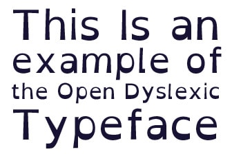
This typeface mainly focuses on increasing the weight added to the bottom of letters to make the letters easier to process by implying a typographic direction. Consistently weighted bottoms serve to strengthen the line of text. The shapes of letters are slightly more unique to help readers differentiate them, and prevent confusion through swapping and flipping. The font incorporates features based on actual studies, such as extra space between letters. However no studies have so far been conducted on the font itself, as is duly noted on the font website.
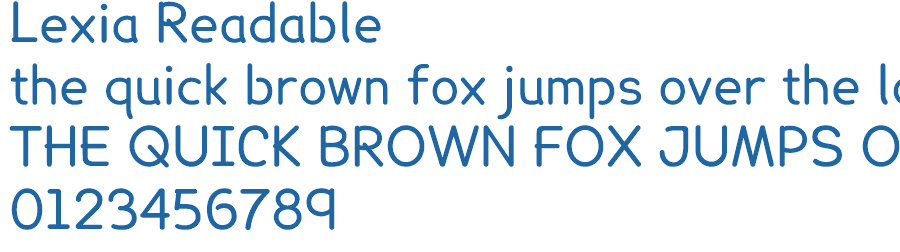
Lexia Readable is a mature comic sans font designed by Keith Bates at K-Type to be suitable for older readers and not just reserved for comic books. The font is prudently designed to be legible at even small font sizes, as low as 8 points. Long descenders and ascenders combine with asymmetrical lowercase d and b and generous letter spacing to help distinguish letters- the most redeeming features of Open Dyslexic and Dyslexie. The font is available for download at the website of K-Type .
Also created by Christian Boer, the designer of Dyslexie, this Dyslexie font , aims to make letters even easier to distinguish by reducing the symmetry between letters. Similar to Dyslexie, the base of each letter is much heavier than other typefaces, serving to orient the letter the right way up.
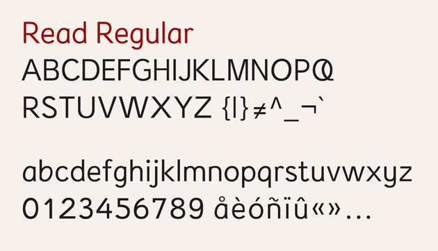
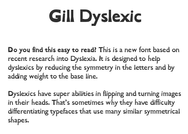
Read Regular, a font designed at the Royal college of Art in London by Natascha Frensch, works by avoiding symmetrical mirroring just like Gill Dyslexic. The font does not appear to be on sale and is definitely not open source yet. Each character is designed with the next in mind so that it can work together with its next or previous character and stand out on its own as well. To ensure maximum distinction, descenders (g, j, p, q, and y) and ascenders (b, d, f, h, k, and l) are kept longer than most fonts. 'G' and 'e' are prevented from closing in visually and spacing within the 'u', 'a', 'e', and 'o' is enhanced.