Graphic design is crucial to the visual world, aspiring to communicate a wide array of messages, some of which articulate emotions, feelings, or directions. As Rick Poyner, an esteemed graphic design writer, says, “graphic design is the communications framework through which these messages about what the world is now and what we should aspire to. It’s the way they reach us.” (Hustwit, 2007, 2:38)

From Visually.
The nature and role of graphic design, whether concealed or overt, affects all and sundry. Typography is one such element of graphic design that has a significant role to play in determining and enhancing the overall aesthetics of visual communication. Typography is vital in creating logos, advertisements, print copy, and other documents. (McCarthy & Mothersbaugh, 2002).
According to Byrne (2004), Typography is the “arrangement of words and letters that conveys meaning and information.” In advertising, typography can add to a document’s personality, reinforce or communicate messages, and even influence emotions. While Childers and Jass (2002) refer to typography as “the subtle art of designing communication by means of the printed word”. Broos (2001) further elucidates that “typography is defined “as the deliberate use of letters”, helping to make a case for typography as a valid discipline of study with parameters and rules to follow, rather than an ill-informed application.”
Eliciting Emotions With Typography

Can something as simple and innocuous as a typeface alter the meaning and implication of your words and the design in general? Of course! A typeface can add a new level of meaning or emphasis to your message. A diligent study of typography can help brands connect with users and set the tone of the entire project. The wrong typeface can leave a design feeling disjointed, flat, and even give users the wrong impression about their products and brands. Be it expressing yourself with kinetic typography or a more static one, designers are fast jumping on the bandwagon to leverage the power of words.
Typefaces go beyond the apparent written meaning and communicate more than what appears to the eye. Featured in 2007’s documentary ‘Helvetica’, Neville Brody, a prominent graphic designer stated, “The way a message is dressed is going to define our reaction to that message in the advertising. So if it says, ‘buy these jeans’, and it’s a grunge font, you would expect it to be some kind of ripped jeans or to be sold in some kind of underground clothing store. If you see the same message in Helvetica, you know it’s probably on sale at Gap”.
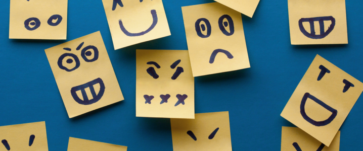
This insinuates that typefaces elicit an emotional response, employ visual cues to set expectations about the product, help to communicate a product’s underlying meaning, and complement products. Therefore, scrutinizing the emotional responses to typography has become a necessity.
The way in which an everyday item, a logo, an advertisement, or a sign is presented in a particular environment can have a great bearing on a person’s emotional response. When different typefaces are used in a seemingly infinite number of ways, they elicit a wide range of emotional responses from the readers. Graphic designers can take the same message and exhibit it in multiple typefaces, and the immediate emotional response expected will vary.
According to Michael C. Place of the graphic design studio Build, one of the greatest achievements of graphic designers is to elicit an emotional response from a piece of visual communication. While a viable design for a piece may prompt a response, it can be augmented when the design is paired with optimal typography.
In addition, the emotional response to a type is construed to be at a subconscious level of the consumer. According to Will-Harris, “type is emotional on a subliminal level because of the connotation it conveys”. He suggests that rather than conveying emotions explicitly, the reader’s associations of prior experiences with a typeface can aid them in recognizing the typeface in another setting and what really matters to them is that they have seen that typeface before.
Tobias Frere-Jones of Hoefler and Frere-Jones, a typeface design firm, also asserts that a reader can be affected by a typeface without conscious consideration. This is akin to a situation where a miscast actor in a role affects the viewer’s experience of a play or movie that they are watching. While they will follow through the plot, they are bound to be less affected or involved in it. In the design realm, the designer choosing typefaces is a casting director, and Typography is the actor that can determine the level of involvement of the audience!
“No matter what you do with your typography, it always has an impact.”
Manipulating Reactions And Feelings With Typography

Errol Morris, a film maker and writer, conducted an experiment titled “Are You an Optimist or a Pessimist?” published in New York Times. During the experiment, Approximately 40,000 participants were exposed to a brief passage, followed by the question that “Is it true that we live in an era of unprecedented safety?” Participants were asked how confident they were in their choice.
However, Errol Morris was more interested in discovering whether different typefaces made the facts more believable, or influenced the answers of the respondents. The passage appeared in different typefaces to different readers: Trebuchet, Comic Sans, Helvetica, Georgia, Computer Modern, and Baskerville. According to the results, Comic Sans and Helvetica failed to inspire confidence, while statements in Baskerville got the most nods of approvals. Unsurprisingly, Comic Sans gleaned the highest rate of disagreement!
Watch this video to find out how typography affects readability of text:
When designing with type, the visual language established not only brings emotions into play, but also factors in physical responses. By changing the visual language of a message, one can achieve highly dominant control, in addition to the emotive and varied effects, while presenting the same verbal language.
If you look at the illustrations below, the first image portrays a bold single large word, closely kerned and set in lowercase. Due to the positioning in the frame, the word is rendered loud and dominant, and the message comes across as confident, friendly, and jovial. It’s like a person who is pleased to see you coming towards you with a big smile plastered on their lips.

However, despite featuring the exact same greeting, the second illustration provides a dramatic contrast to the first. The positioning, color, scale, case, and font all suggest a considerably more hesitant and distant greeting. In fact, the reader can even go so far as to construe that the person speaking would have preferred to ignore them completely or even wanted to acknowledge them in the first place.

Reading these illustrations aloud would help you appreciate the different effects of visual language instantly. The first example reads out as a loud enthusiastic call that radiates openness, friendliness, and delight. On the other hand, the latter illustration would be delivered in an almost hesitant voice and a much quieter tone, lacking the joy and assurance of the first. The infinite range of typographic alternatives help achieve dramatic or subtle changes in tone of voice and volume.
| Positive Type Associations | Negative Type Associations |
| Rounded lettering | Letters with harsh lines or strokes |
| Serifs with thin strokes | Thick strokes |
| Modern typefaces | Shaky strokes or messy handwriting |
| Type styles with flourishes or log tails | All caps lettering |
| Novelty typefaces | Old-style types or Black letters |
| Open lettering | Tight lettering |
| Fancy scripts | Ransom lettering style (using mixed typefaces) |
| Positive space associations | Negative space associations |
| Consistent leading for type | Poor alignment of objects |
| Open space | Tight space |
| Use of a grid/Organization of elements | Elements that are too large or small in context of other items |
| Element spacing and Common text wrap | Broken spaces between text that render text illegible |
| Contrast between negative and spaces and other elements | Lack of order and organization |
| Plenty of margins | Elements that bump against one another or Overlapping elements |
Moods Of Fonts

Rosalind Picard and Kevin Larson presented their findings on the effects of typography on cognitive performance and reader moods, in their paper titled ‘The Aesthetics of Reading’. 20 participants were divided in groups of 10, and given a specially typeset issue of The New Yorker on a tablet device to read for 20 minutes. One group got a properly typeset version, while the other got a badly typeset version (with spaced out words using Courier). Participants were interrupted at random during the study and asked to conjecture how much time they thought had passed since they started reading. People having a positive mood experience underestimated the amount of time that had passed and found their task amusing. Needless to mention which group that was!
Learning from the experiment, good typography has a significant impact on the moods of the readers. People reading a well typeset page find that time flies faster since they are more immersed in the experience. In addition, the research has shown that positive mood enhances creative problem solving. Since typography has been known to influence mood, by extension, it is also possible that good typography has a direct impact on cognitive productivity.
Each emotion that we feel incorporates a gamut of feelings, and these can be portrayed typographically as well, in the absence of a physical voice. Psychologists Julie Gross and Samuel Juni requested 102 New York University students to peruse a New York Times satirical article. Each student was given the reading randomly printed in either Times New Roman or Arial. When the students were asked to rate the article, those who were given the post in Times New Roman, reported it as being angrier and funnier, than when read in Arial. Needless to say, Fonts have a mood of their own, and the same message can be contorted or blown out of proportion by using the wrong typography. Advertisers would do well to remember the tone they are trying to convey across to their audience, and the right font to accompany it!
Injecting Personality And Character In Designs With Typography

It’s imperative to comprehend that typography is more than just a tool; it has a character of its own. The visual character of a type imposes on the text almost as much as the tone, cadence, and voice of a person influences the reading of a speech. Since we are able to perceive personality in things and nurture relationships in our minds based on that personality, we can use typography to communicate personality.
In order to do so, the following considerations should be heeded:
- Defining the tone of voice and giving just one personality
- Select the main typeface carefully if you are worried how the font will look, so that it can lend personality to your design.
- Fitting in with the context.
Only this way can you capitalize on typography to forge a strong relationship and interact consistently with your audience. Here are a few personalities that brands have imbued in their designs using typography:
Personality #1: Heartwarming, Human, And Personal
The feelings you want to evoke in this case are authenticity, friendliness, and spontaneity. Fonts used for this purpose are handwritten or script typefaces.
Tim Horton’s

In order to lend their cover photos a bit of personality and warmth, the Canadian based Coffee shop Tim Horton’s, has gone the chalkboard route with beautifully hand-sketched snowflakes, and big hand-written heading to adorn this cover design, greeting the visitors and spreading a feeling of holiday joy. Since the brand cares about tradition and quality, you get the same feeling looking at their cover as when peering at a blackboard in a bar. That feeling is construed as comfort. The spontaneous, imperfect look of the design is part of its charms and what makes this design appear human, compared to if slick graphics had been employed.
Marie Guillaumet

In order to personalize the portfolio, the designer has employed handwritten typeface beautifully to give a sense of the personal involvement of the designer in the production process. The typography establishes a sense of uniqueness and individuality connected with the designer, and her works in turn. Hand-drawn icons perfectly complement the handwritten type, adding an element of character to the website design. Looking at the design gives a feeling of peering into the visual diary of Marie Guillaumet herself, which is appealing for prospective clients.
Personality #2: Fun, Quirky, And Informal
When you want your design to appear informal and fun, a wide range of typefaces fit the bill. However, the important thing is fitting in the typefaces with the context. The feelings you want to evoke here are exuberance, joy, humor, and happiness.
WakWaw

Keeping their tone of voice humorous and fun, ‘WakWaw’ website aims to portray their passion about interactive media and out of the box thinking which has added to their credibility and popularity over the years. The tone and the design elements seem to complement their creativity perfectly, and the company knows that people in a positive mood are more likely to perform a desired task. Using a wide array of colors and font sizes, the designer has given movement to the page, enabling a hint at humor, yet maintaining a homogenous look and feel, such as consistent W’s and E’s throughout the design.
Donguri Music

The website design for this music website couldn’t have been more playful and inventive. Just looking at the creative use of typography, we can see that they are a bunch of people who love what they do and are quirky to the bone! The homepage of Donguri Music incorporates an eye-catching slogan constituted of typography in the form of colorful moving shapes. The incorporation of musical notes and euphemism into this typographical slogan is a refreshing touch!
Personality #3: Functional, Formal And Professional
When you aspire to inspire feelings of credibility, professionalism, and seriousness from your designs, refrain from using more than two typefaces in your design, and that too the classic ones; sans serif and serif.
Nate Navasca

Nate Navasca aspires to instill feelings of reliability and trust in the audience. Since their audience is a diverse amalgamation of demographics, they play it safe by leveraging a traditional young, bold sans serif font for the headline, and a more traditional serif for breadcrumbs and body text. The designer has focused on simplicity, professionalism, and functionality here, and it has paid off.
Nitwinski

This is a wonderful example of how typography can make your design appear serious, and no-nonsense professional. It’s interesting to see how the designer has used the thickness of the circle to the left to reflect the thickness of the serif type, while the circles below the text match the thickness of the font they encompass. These unified elements render a very refined and proficient look to the design.
Personality # 4: Walking Down The Lane, Creating Memories
They say typography can narrate an entire story. According to the Greek Philosopher Aristotle, people can easily commit to memory stories if they recognize a main plot, a start, and a conclusion. Thus, if you want to create a unique experience and enhance memories, you need a sophisticated font that helps the audience reminisce something else through association. In this case, the feelings that you want to evoke are that of interaction, desirability, and engagement. The choice of fonts can run the gamut from a simple sans serif to more intricate scripts.
The Black Sparrow

Image: The Black Sparrow
The website for Black Sparrow has been given a vintage look. The wide array of typefaces employed in the design help to establish a rustic, eclectic feel in the design. For this drinkery and lounge, the theme is inspired from the writings of Charles Bukowski, reflected in its old typewriter-style logo and literary elements. Looking at the website, one is transported all the way back to the 1930’s, and the black and white sparrow illustrations further fortifies it.
Ride For The Brand

The Ride creative agency is telling an entirely different story. Old style pictures, ink drawings, and white and black flourishes adorn the entire design. However, what really rings a bell and transports the audience all the way back to the Old Wild West is the use of myriad hand-tooled and chiseled typefaces. Since the Ride is an agency based off Texas, the association is pretty conspicuous throughout the design. The design is extremely inviting and fun, while being decorative.
Typography In Advertisement

A tangible relationship exists between advertising and typography. A brief glance at any poster, newspaper, billboard, or any other advertisement provides a concrete proof that the right use of typography to articulate the information the advertiser aspires to communicate, is possibly the most imperative part of advertisements of certain types. The key message that the business entity is seeking to communicate often appears highlighted, colored, enlarged and bold to ensure no reader inadvertently passes it by oblivious. This becomes so attractive and appealing that the target audience is automatically lured towards the visual aspect of the advert. (Bohn 2001, 20-22).
Even the type of font used goes a long way in determining the impact of the text. According to the US designer Mark Simonson, certain fonts act as “novice magnets”. He says that most fonts look more or less the same to an average person. But, a typeface calls attention to itself if it possesses a strong flavor and personality. Not only does it become easy to recognize, but when the people do recognize it, it makes them feel like they know something about fonts; making their documents look “special” when the font is employed.
Brands Upping Their Typographic Game

Image: Victors And Spoils
This artistic advertisement by the AD agency Victors and Spoils, takes a fresh perspective on typography. Instead of the usual practice of honing type on the computer, the agency hand created letters out of the very material they are marketing. Not only does the type really make a bold statement, but it is so strong that the need of any extra visuals is omitted.

This creative AD for Chupa chips is an interesting take on 3D text, taking its letterings and transforming them into the product it is advertising; a lollipop. The sweetness and the sumptuousness of the candy is complemented well by the candied appearance of the text and the tagline, ‘impossible to take out of your mouth’. By 3D rendering the type, the advert appears much more awe-inspiring than simply displaying the text alongside the product.

This print ad is ingenious in its use of typography, by lending visual meaning to text. Since the advertisement seeks to insinuate the importance of balancing work with leisure, half the text is written in a perfectly professional, san serif font in a somber grey, while the other half is a kaleidoscope of colors, patterns, and creative imagery shaped into the letters. What a stroke of genius.

The key to successfully executing an advertisement that capitalizes on technology is to lend visual meaning to it. Since a language school is being promoted in this ad, it depicts the visualization of refreshing a language that a person was once familiar with, yet the joy of learning it again.

As part of a campaign for a complete ban on landmines, the ad features illustration of how when you lose a leg, you lose much more. Shaped as a leg below the stump, the designer has creatively employed typography to depict the things that a person is devoid of when they lose their leg.
References
- Hustwit, G. (Producer and Director) (2007). Helvetica [DVD]. New York City: New York: Plexifilm
- McCarthy, M. S., & Mothersbaugh, D. L. (2002). Effects of typographic factors in advertisingbased persuasion: A general model and initial empirical tests. Psychology & Marketing, 19, 663-691
- Childers, T. L., & Jass, J. (2002). All dressed up with something to say: Effects of typeface semantic associations on brand perceptions and consumer memory. Journal of Consumer Psychology, 12, 93-106.
- Will-Harris, D. (2000). Choosing and using type. Retrieved on July 13, 2008, from will-harris.com.
- Bohn, Willard. 2001. Modern Visual Poetry, Cranbury, NJ: University of Delaware Press.
- Emotional response to typogrpahy: the role of typographic variations in emotional response to advertising by kevin l. Guthrie, University of Florida, 2009
- Isen, A.M., Daubman, K.A., Nowicki, G.P. (1987). Positive Affect facilitates creative problem solving. Journal of Personality and Social Psychology


Its very useful and interesting. Thank you