“Logos are graphic extensions of the internal realities of a company.” Saul Bass
We, the consumers, form our initial opinions about a brand through its logo. What does it make us feel? What do its colors say? Does it look professional, is it clever, is it cheeky? Can we imagine a persona in our head for this brand, looking at this logo?
A real estate logo, like any other, carries enough elements within to use each as a representation of a certain aspect of the brand’s identity. The shape can be used to portray company structure, colors can represent the personality, and fonts can talk about values.
Or any other way you want to go.
The fact is, with fonts you have too much choice at hand. Enough variety that you may feel overwhelmed when you have to make the final decision to whether to choose a classic or modern real estate logo look. Through this article, we hope to make that decision somewhat easier to arrive at.
As a rule of thumb, consider your real estate brand identity as your compass needle. As long as you are consulting it from time to time, you won’t wander away too far.
Now let’s jump straight in and discover the process behind choosing the most perfect font for a real estate business.
Think about who you are?
1. Reserved. Exclusive. Rare: Dala Moa, GT America
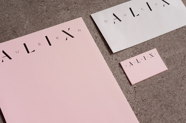
Image Source: Queen Alix
To launch and promote the brand identity of its newest and most exclusive real estate address, Queen Alix project, the Canadian real estate company Maitre Carre landed on Dala Moa and GT America for its word-mark logo font.
Dala Moa font is distinctly suitable for minimal and clean design as it reveals the basic structure of the letters, eroding the surfaces. It is a sans serif typeface which merges supremely well with another sans serif, GT America.
For a real estate brand that’s called the city’s ‘well-kept secret’, the chosen combination of typefaces brings class, elegance, sophistication, and a trendy aspect to its unique real estate developer logo. The type combination’s minimalist personality is appropriately suitable with a brand that is for an exclusive market.
Some other font styles that go with minimal real estate logos for high-end, luxurious and elegant real estate addresses: Comfortaa, Marcellus, and Regency Alt.
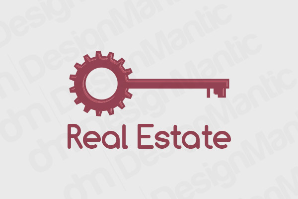
Key real estate logo in Comfortaa font
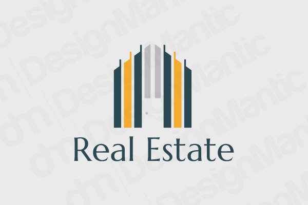
Commercial property logo in Marcellus font
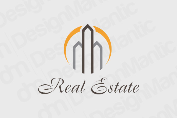
Real estate logo for apartment building in Regency Alt font
2. Playful. Eclectic. But Professional: Ostia Antica
Modern real estate is incomplete without projects, addresses, realtors, and customers who are more into trendy and eclectic than stark sophistication and colorless elegance. For these playful projects and friendly customers, you want a brand that is more down-to-earth, authentic, but still extremely professional.
Related: How To Use Golden Ratio To Design A Balanced Residential Real Estate Logo?
To bring these two worlds together, you want a logo that is out there but not whacky. Something that looks playful without being childish. This feat was achieved with Ostia Antica as the prime typeface choice for London’s Netil Market logo and branding.
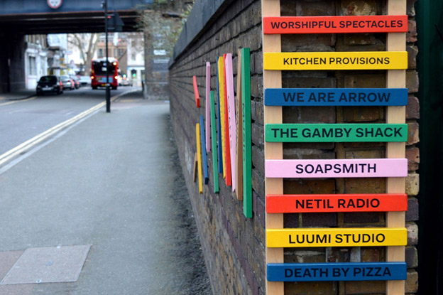
Image Source: Netil Market
The font is clean, trendy, and fun. It also offers high readability due to its wide proportions. This feature also prevents the type from becoming too serious or official. The off-kilter letters keep the style trendy and modern. Few examples of similar fonts used in real estate logos: Arapey, Quicksand bold, and Alcubierre.
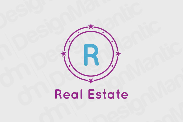
Round vector logo in Quicksand Bold
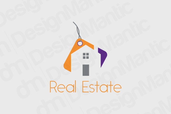
Negative space logo for realtors in Alcubierre font
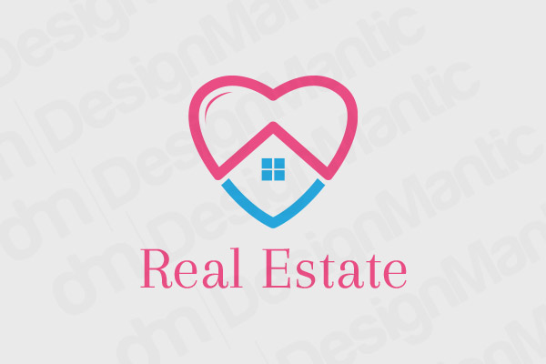
Real estate logo with heart in Arapey font
3. Real Estate + Architecture: Grotesk
Real estate and architecture are two sides of the same coin, and perhaps that’s why so much of the present real estate market comes with architectural services included. Especially some of the most and up and coming realtors are on-hand with providing architectural services for easy home restorations, modifications, and rebuilds.
If you are also operating such an enterprise, consider Grotesk for your realtor brand logo. It is a popular font in the retail industry with its bold and confident strokes that inspire trust and clarity. It’s also simple, functional, and highly sophisticated. It offers the professionalism of Times New Roman without being too stark.
Real Estate logo with rooftop scale with Aktiv Grotesk font
Blue real estate home logo in Trajan Bold font
Real Estate logo with nail in Oregan LDO font
4. For Classic Real Estate Logos: Gabrielle
Fonts that will give the perfect finish to a classic real estate logo are mostly the cursives. A classic real estate logo will suit a brand that deals with the sale and management of family mansions, ancestral homes, and will most often have a clientele that goes back generations of loyal patronage.
For such a real estate business, you want less pizazz and more stability, confidence, and trustworthiness. Qualities that Gabrielle incorporates in its shapes. It is cursive without being decorative. The letters also have enough space in-between to offer easy readability. Along with Gabrielle, a couple of other font choices that look similarly appropriate are Velocity and Trajan Pro.
Lock and keyhole real estate logo in Gabrielle font
Real estate logo with old mansion in Trajan Pro font
Green home logo made with Velocity font
Related: 5 Right Colors to use For Your Real Estate Logos – Top Choices!
5. Farmland Real Estate Logos: Marienda
Real estate dealing in the sale and purchase of farmland properties is a whole other breed. It is a highly selective market for niche clients. Most customers in this market are ranch owners, farm owners, and people dealing in organic produce, fresh farming, and increasingly, employing ecological preservation in their farmland practices. The same eco-conscious mindset drives other specialized markets, from tiny house for sale Maine to off-grid properties, where buyers seek sustainable living with minimal environmental impact.
To attract these clients to your business, your logo needs to keep the land front and center in the design. The colors need to be fresh, and more importantly, the font must carry its weight. You want a font that is light, relaxed, and fresh. And in our opinion, Marienda fits the bill. Its strokes are light and fresh, more brush-like. It’s attractive and elegant without being strictly official or reserved.
This openness and organic structure of letters are also found in few other fonts such as Existence Light and Nueropol.
Real Estate Logo Made of Leaves in Cursive Font
Real estate farm logo in existence light font
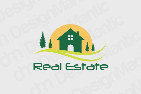
Real estate land and farmhouse logo in neuropol font
Few Words Before We Go …
We will leave on the thought that we started with. Keep your values and unique brand identity at the center of your design choices – especially font. With so much choice available, it is easy to feel overwhelmed or too excited and end up making mistakes. But if you are keeping your brand in your mind every step of the creative process, we promise you won’t stray far.
If you have any questions or suggestions, drop a line below.
Use Our DIY Logo Maker Tool:


