- SALES / SUPPORT : 855-752-5503
Everyone uses social media now - and for more than just finding friends or playing FarmVille (if that’s still a thing). Being businesses themselves, Facebook, Twitter, Instagram, and all the other big social hubs have capitalized on their huge user base and collection of personal data, and allow businesses to as well.
But, to create an effective page for your business on these social platforms, you’re going to need an eye-catching social media cover - you know, that big image that straddles the top of your page. The importance of a social cover has never been higher, and it’s up to you as a company, or the designer for a company, to make sure that yours is attractive and effective, helping to boost your brand identity and sell your services or products.
We’ll go through some vital steps below that should help you create a bold and attention-grabbing cover, letting you stand out from the crowd.

Image Sources: Sharpie, PlayStation Facebook Pages
To effectively catch someone’s eye with your social profile, which is what designing great social covers is all about, you need to understand the fundamentals of visual hierarchy.
Visual hierarchy, according to Interaction Design, in its simplest form, is the order in which people view the elements of your designs. There are many different thing which influence the visual hierarchy of your images, and as such, there are many different ways that we can influence where a person’s attention will be focused when they look at your designs.
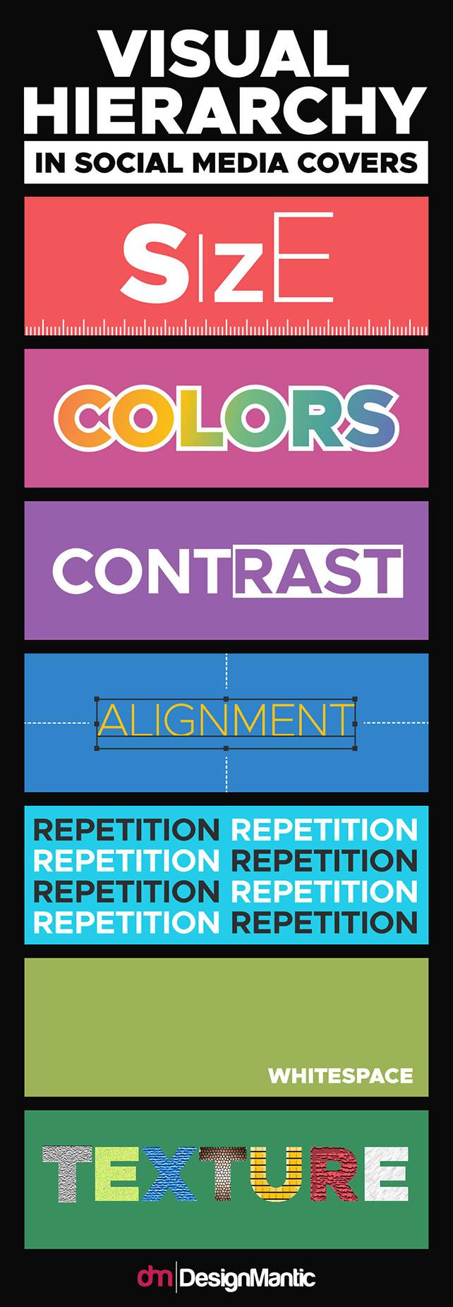
Using these simple ideas, designers are able to exploit the ways that our brains naturally process visual information, and create visually pleasing social covers and profile pictures that catch (and hold) the eye.
It’s only when we break down an image into its singular elements and choices that we begin to uncover why it’s such an effective piece of art, and why it yields results among so many other social covers.
When it comes to selecting a color for your designs, you’ve likely realized that selecting one is hard enough. So, where a lot of designers go wrong, is by sticking to one they like, and using varying shades of it. Now, this can be the fast track to dull and flat designs, but fear not - we have a solution.
If you’re really struggling, then you can utilize the color wheel and the rule of three. It basically states that using a very pale shade of grey, and a dark shade of grey will provide a good contrast. And then, all you need to is choose a vibrant color to provide your three colors. Many color palettes for websites and social cover designs use this rule, like these
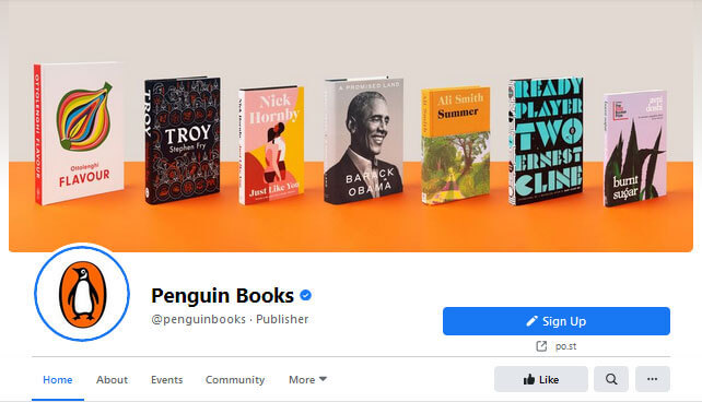
Image Source: Facebook covers from JCB, Penguin Books
They all utilize a black and white, dark and light base, interspersed with color. It easily encompasses a lot of the steps outlined in the first part of this blog to catch and hold the attention of the viewer. Though, if you want to experiment, then take a look at this color wheel, as well as take a look at these excellent tools which will help you choose some great colors for your designs: coolors.co or paletton.com. Here are some great examples of how color palettes can function:
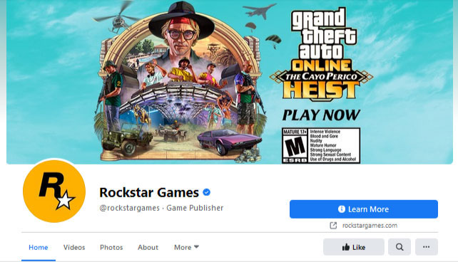
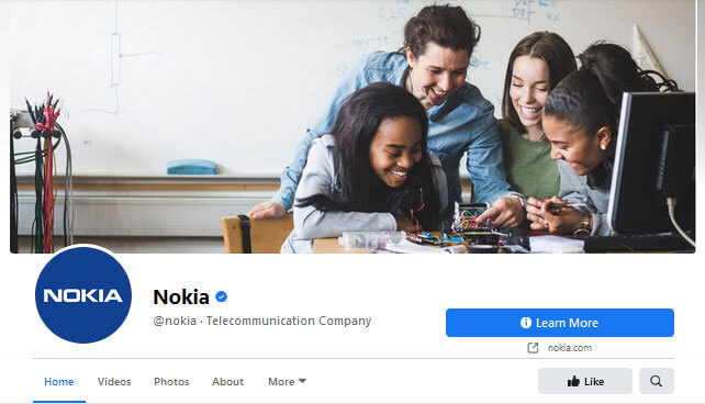
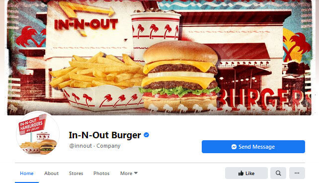
Image Source: Facebook covers from Rockstargames, Nokia, Innout
Way back when computers were slow and graphic design tools were primitive, we’d be forced to use either a mangled line drawing or a grainy picture. But, now in a world filled with amazing design software and high-speed internet, we’re no longer limited by the shackles of technology. So, with that in mind - the sky being the limit, which should you opt for in your social media covers? Rasters, or vectors?
When it comes to Raster images (those being photographs and other images made up of pixels), you run into a few problems. Namely, their versatility. A photo is as it is, and while a skilled photo editor can muddle with the colors and vibrancy, overlay it with a colored screen, or otherwise, you’ll always be stuck modifying that image. Now, they can be used to great effect - Raster designs, and choosing something that’s visually pleasing and brand congruent can definitely be a plus. And sometimes, there’s an absolute call for them. For example, if you’re running a hotel’s page, you’re not going to waste the most front and center image by not showing off a high res shot of the hotel. The same goes for anything that’s going to require photographs to sell. Like Levi’s jeans, or a Wendy’s burgers.
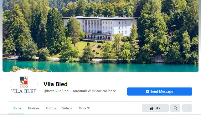
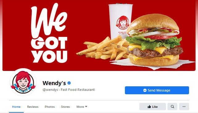
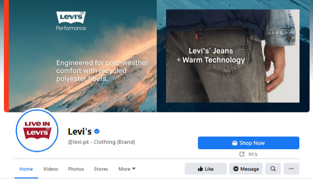
Image Source: Facebook of Hotel Vila Bled, Wendy’s and Levi’s
Using raster images is the way to go if you want to get across something tangible to help sell your brand. Using a simple picture can say everything it needs to about what you’re selling, but when it comes to less tangible things - like services, for example, or brands that need to diversify themselves from a single product, and want to convey a brand message with their cover, then it’s likely that a Vector image, or a combination of the two, is the way to go.
The beauty of vector images is that they’ll always stand out. They’ll never look like photographs, but that can be used to your advantage. They’re scalable, malleable, editable, and versatile. Whereas with photographs, you’re always trying to capture something that looks like what you want to convey, with vector graphics, you can design it however you want. This blend of background vectors and rasters is becoming ever more popular, and is being used to highlight the important aspects of brand message.
A designer will never resign themselves to one, or the other if the best solution is both. If you’ve got a glossy image that you want to take precedence, then why not ask yourself how you can accentuate it to make it pop even more?
Something as simple as taking a photograph and adding some contrasting text, as HTC has done, can work.
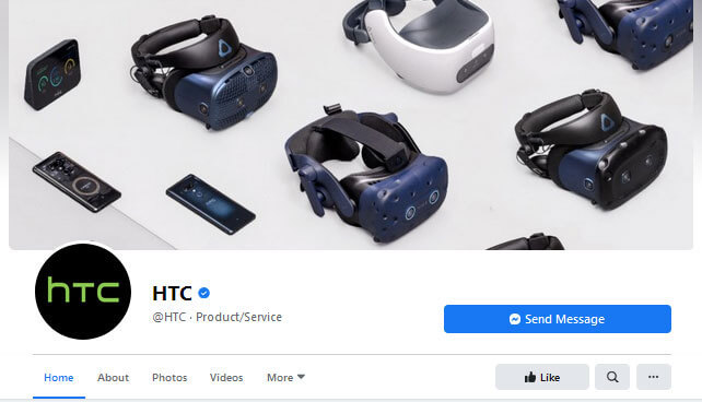
Image Source: Facebook HTC
Or, adding some vector text to a slideshow of high res gifs might do it, like TripAdvisor.
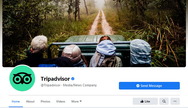
Image Source: Facebook TripAdvisor
Whatever you decide to do, you can utilize both raster and vector to make the most of your cover images, and you should be considering it.
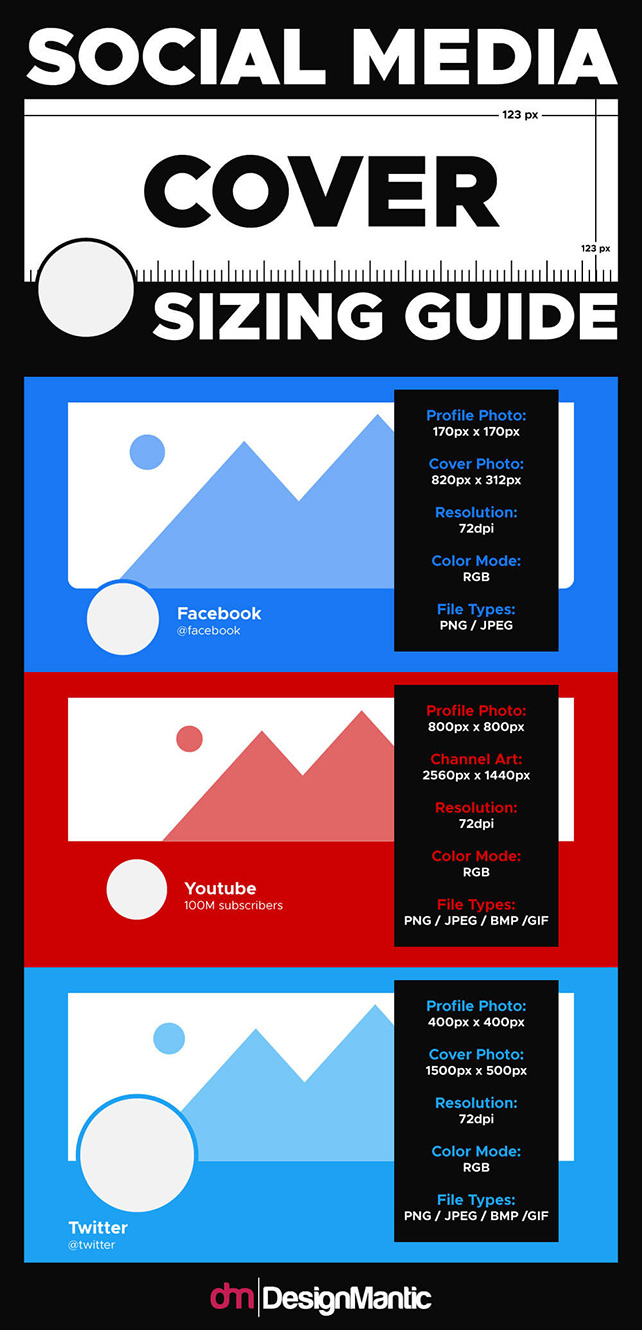
If you don’t really know where to start, then think about what you want your cover image to convey. You want it to be eye-catching, but beyond that, you can use that prime digital real estate to further your message - to tell your visitors what the company is about before they even delve into your content. It’s the first thing they see, so make it count. If you apply the visual hierarchy rules we outlined above, and take a leaf out of the books of the companies we’ve shown off here, then you’re not likely to put a foot wrong. Use the sizing guide below to help you make sure that everything fits neatly, too, because despite vector images being scalable, you’ll still have to rasterize them to save, and you want to make sure everything displays in its native resolution to stay crisp and pretty.
If you’ve not done a lot of design work on social media cover images before, fear not. DesignMantic has an awesome cover design tool that will not only help you put together something gorgeous, but it’ll let you do it quickly and without hassle, too. Their free to use service lets you design until your fingers fall off, and offers a huge array of options and templates to choose from.
Their intuitive editors lets you design right in the browser, and makes it easy to create something that’s the perfect mixture of raster and vector, style and substance. It’s a powerful tool that lets any computer-savvy hand design something that a dedicated designer would be proud of. It allows companies to frequently update their cover photo without having to pay out for continuous design work.
And the best part of all is that you only purchase the design if you like it. If not, then just cast it aside and start over. In a world where people spend no more than seconds looking at things, it’s up to you whether you can afford to not catch their eye for just a little while longer.