- SALES / SUPPORT : 855-752-5503
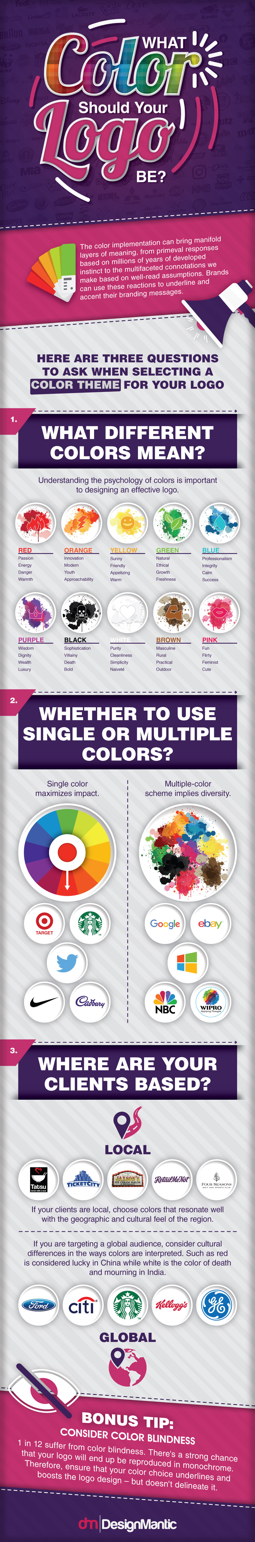
The human brain perceives color as a mode of communication, just like any other medium. A common example of this is the example of traffic lights, where color is used as a means to impart important non-verbal information. This is possible because different colors bring different meanings to the surface –they have a language of their own which is intuitively realized by people all over the World. When it comes to design, color psychology dives deep into this language of colors, and lays bare the rules which can help you effectively use them in visual designs. So if you’re wondering how to select effective colors for your logo, color psychology is going to help you form your plan!
Like we said, effective logos cannot be designed without understanding color psychology, because this is what will help you determine appropriate colors for your brand and its message. Have you ever wondered why finance logos are mostly rendered in blue? Why feminine brands make use of pinks and pastels, say in their beauty salon logos, and why automobile company logo creators make use of black, red and gold? The reason is rooted in color psychology – different industries make use of a set palette of colors for logo design because it works effectively for their intended message.
Colors help people instantly identify the industry the logo belongs to, the sort of objectives the company has, and the kind of audience they cater to. This works because the colors are selected on the basis of these very questions. When the designer is defining a color scheme, he keeps in mind the industry, the target audience, and the brand personality and messages.
For example, a teen fashion brand logo will be rendered in bold and energetic colors such as red, orange and royal blue or purple, whereas a brand targeted towards the older crowd, will have more sophisticated and sober colors. Similarly, fast food companies logos make use of red and yellow because these are colors which signify appetite and desire, and danger signs are rendered in yellow to strike out and grab attention. If graphic designers randomly select colors, without keeping these intended messages, or target audience in mind, the final results will be very different. Try imagining some of the famous logos as entirely different and you will see what we mean. For instance a biohazard symbol is a yellow and black triangular logo but if you change the colors to green or blue, it won’t cause the same sense of urgency or attention. Similarly if you take KFC’s red and white mascot logo and change the colors to pink and blue; it is not appetizing at all!
If you’ve been wondering what colors to use for your brand, let’s look at some common colors and their color psychology. Understanding these messages will help you define the most appropriate color scheme for your company logo.
BLUE - The color blue is one of the most used in logo designing and is often paired with other colors to have an attractive color scheme.
Stability and Dependability - Companies such as Samsung and Pampers use this to portray that their brands are durable and reliable.
Secure - Social media websites such as LinkedIn, Facebook and Twitter also use blue to give out the message of security of information and privacy. Blue also denotes honesty.
Trusted - Brands such as Walmart, Gap, and Citibank etc. use blue to show the level of trust and reliability they have towards their customers. This is quite noticeable in many institutions around the world.
BLACK -Black is either paired with another color or most of the times is used with shades of greys and whites. Black stands for many things.
Style and Sophistication - Companies use simple black logos all the time. This is because even the basic use of text and color defines sophistication, simplicity and elegance.
Luxurious - Black is a color that defines luxury and premium styles therefore there are many apparel and fashion logos that use it to represent their logo designs.
Somber - Companies such as WWF and Wikipedia are using black to represent their logos to show the seriousness and the formal brand they represent. This also shows the seriousness in terms of the objectives and the goals which they want to achieve. The authority color is used in many other brands and these were only a few to name.
RED - Red is a combination of many feelings but they all revolve around aggressiveness and fierceness such as love, excitement and strength.
Bold and Bright - or any logo design to attract attention, red is the best bet that you have. A simple tint of this color guarantees head turns so the next time when you take a walk on the streets notice what color sparks the most attention and is the most vibrant amongst the others.
Hunger and Appetite - Many food brands and restaurant logos use red to signify hunger and appetite. This is actually true in many ways because as you see red, it evokes craving for food. Fast food companies and snack brands use a lot of red in this way. Hardees, McDonalds and KFC are excellent examples of this.
Entertainment and Excitement - Virgin, Nintendo and Netflix along with many other entertainment company logo designers use red to promote the exciting entertainment they have to offer. There are other lifestyle and clothing brands logo such as H & M and Levis which combine excitement with boldness and passion through their red logo designs.
YELLOW - This is a vibrant color that requires no other color to support or combine it with. Yellow just like other colors has a lot to offer in terms of color psychology.
Playful - There are logos for gaming and toy companies which opt for this color because of the instant noticeable results. Children usually would notice and want to visit such stores.
Logical and Optimistic - Brands such as IKEA and National Geographic have super simple logos where the yellow color speaks volume of their genuineness and straight away solutions.
Creative - Logos for travel agency as well as real estate and transportation company logos also tend to incorporate yellow in their logo designs because of the sense of awakening and proactivity in the color.
Caution - Yellow also represents caution and safety care. Biohazard symbols and radioactive signs also use yellow to highlight that the substances require extreme caution when dealing with them. Similarly when looking at the ‘floor is wet’ sign is a quite representation of yellow’s caution message.
Orange - Orange is a friendly and happy color which compels viewers to take some action or get active. Most call-to-action symbols on the website, the buy now or add to cart symbols all fair examples of this. Although the color belongs to the family of red which is known for its excitement, orange is more towards being cozy and energetic in the safest way. Ranging from food companies, automobiles, television channels and other online selling communities all use orange to create an aesthetically pleasing logo design that defines what their brand stands for and how well it is recognized in the market.
Enthusiastic and Joyful - The color is quite bright and evokes feelings of joy and happiness in the viewers. This can be seen in media company logos like VLC Media player, Nickelodeon, Blogger and Walkman
Social and Friendly - Being a safe and happy color, orange is also used in places where connectivity and comfortability are the messages to be communicated. The color is usually used in the fashion industry to increase connections between the customers and to engage with clients.
Green - Green is a global color to promote peace, growth and environment. There are many symbols which use green to promote different messages based on their business principles and the industries they represent.
Eco-Friendly and Environment - There are recycling companies and non-profit, government organizations which take up cleaning projects and recycling activities in the city; these nonprofit organization logos use green to stimulate the concept of environment friendliness and cleanliness.
Organic and Fresh - Farm fresh fruits and vegetables, organic foods and drinks all use green logos and icons to symbolize freshness, and to promote clean and pure food. Green also denotes growth for plants and the Earth therefore it is safe to use to design greenhouse and gardening brand logos as well as for landscaping company logos.
Food companies such as Subway also use green and yellow to communicate their use of fresh veggies and fresh ingredients when they prepare customers’ food. Similarly, Starbucks coffee logo exude freshness and naturalness in many ways as it also promotes environmental message to keep clean and stay fresh.
Harmony and Freedom - Animal Planet has a green colored logo which symbolizes life and harmony. Similarly energy and eco friendly companies also incorporate green into their logos to display the sense of environment friendliness and activeness.
Adventure - Green is also the color of adventure and freedom. A clear example of this can be the oval logo of Land Rover which is an automobile company but represents action and adventure on the roads with off the trail highways and a high action packed journey out on the roads.
Purple - Purple is all about royalty, creative and uniqueness. It is a difficult color to use in logo design as its different shades denotes different meanings and connotation.
Royalty - Deep purple stands for royalty and distinctiveness. This is usually used by brands which want to communicate the message of luxury and eliteness like in the chocolate company logo Cadbury’s.
Fun and Creative - Logos for computer technology companies specializing in creativity, people networking, and/or advertising use purple as their color. This is one of the best possible choices for brands which are in the business of creating something different and unique for their audience.
Other colors such as yellow and blue when paired with the right shades of purple look quite majestic yet fun.
Other than these specific colors, logos can be made up of combination of colors which can look nice depending on your business and the kind of brand message you want to promote. On the other hand, it can be a disaster if you are incorporating too many colors in one logo design.
The selection of color for a logo also depends on the company’s industry such as a legal logos cannot have use too much of oranges, pink and greens. It will look better with hues of blue and white. Multi colored brands also have a meaning, they stand for easy going, flexibility, agility and fun but that is not always the case. Brands such as eBay, Google, and Microsoft use multi colors to display the multi-disciplinary and multi-product nature of their businesses.The idea is to research and look around and see what works best for your company.
When customizing the logo design for your business and selecting its colors, it is hardly a matter of choice, but a calculated estimation of brand message, visual attraction, cultural connotation as well as the brand’s industry. For this reason, graphic designers and business owners would do well to refer to a color wheel to make informed decisions.
A color wheel is a circular wheel divided in sectors which shows the relations between colors. This wheel is used to figure out successful color combinations that produce well balanced graphic results. Designers may figure out the base color they want to work with but selecting the right shade, tone and blend can be tricky. A single dark shade or light tint can make or break the entire logo. A trick to master this art is to experiment with various combinations till you land on the right one!
Complementary Colors – Any two colors which are opposite each other on the wheel are known as complementary colors. These pair with each other really nicely while creating a balance between the overall logo design and its visual impact. The 7Up and Hallmark logos’ use of the colors purple and yellow, green and red are great examples of complementary colors which are opposite to each other on the color wheel.
Split Complementary Colors – This is a 3-color combination which is based on any color plus the colors which are beside its complementary color on both sides. This scheme gives designers a wide range of possibilities and harmonic colors with which they can experiment. Green, blue and orange of Fanta’s logo and Tide’s use of yellow, orange and blue are examples of split complementary colors. Even though the colors are quite opposite and different in tones, but they are presented together in such dynamic schemes making the logos appear lively and vibrant.
Triadic Color Scheme - Colors which form a triangle on the color wheel are known as triadic colors. In the reference images below blue, yellow and shades of orange or red are presented as illustration of triadic color scheme. Both the logos are taken from two different industries; one from a very well-known fast food restaurant and food chain while the other is one of the famous Internet browser company logo. The colors used are almost the same, but the designers have completely changed the output making each of them suitable for their industry.
Analogous Color Scheme - Colors which are beside each other on the color wheel are known as analogous colors. These colors are in combination of three’s. These harmonious color schemes of violets, blues and green are presented together with each other on the color wheel. Designers usually use analogous colors in logo design to create depth and multifaceted aspects of the brands message.
Choosing the right color in logo designing is thus an calculated process which is known to many designers, and now you can do too. It is not picking up random shades and experimenting with colors. The entire process consists of a detailed analysis of the target market and the industry and then implementing the color theory on the overall design.
Created: 28-Nov-2018
By: Evan Brown