- SALES / SUPPORT : 855-752-5503
For any graphic designer, font pairing can, and always will be a nightmare. Every business, every client, and every situation demands a different style and tone, and with no less than a quadrillion fonts to choose from, it's pretty easy to lose an hour (or ten) to mindlessly scrolling through fonts for that perfect one.
But then - the sad realization hits you that you don't just need one, but two! Because heck, the client won’t be happy if their headline font and their body font is the same. They need to be distinct but congruent; contrasting yet complementary; bi-tonal yet both on-message. A veritable Catch 22. If only there was a guide that told you exactly how font pairing worked, and what the steps to perfect font pairings were…
Well, funny you should ask.
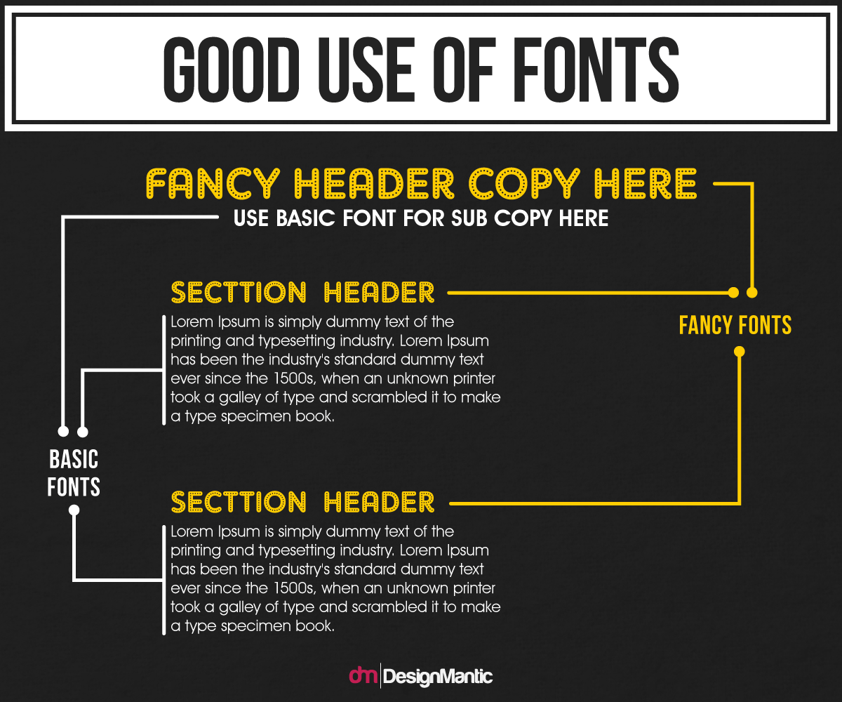
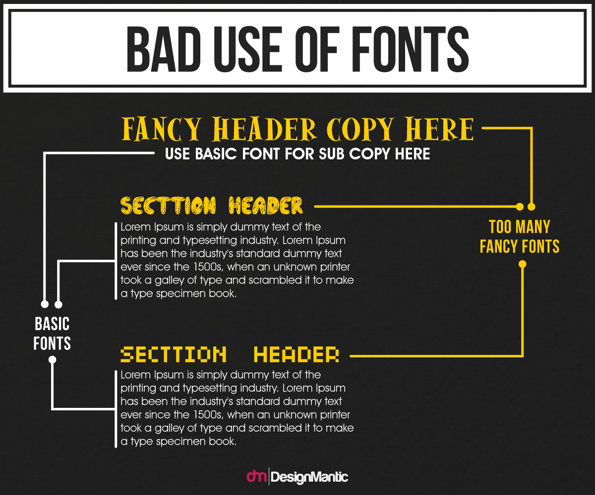
Apart from being the bane of every designer's life, font pairing is the term given to the use of two fonts in congruence with any corporate identity. Font pairs are used as Header and Body fonts for companies or organizations. One font is always used for designing logos, titles, logos, or anything that needs to stand out - the Header font. And the other is used for subheadings and bodies of text, be it articles, blogs, website copy, flyer design and ad copy, or anything else that isn’t a single line or word.
You’ll see a lot of companies simply use the same font for heading and body, but this is a big mistake, and tends to indicate lack of graphic design knowledge on the part of the designer, or the company themselves. To someone who doesn't know its importance, it’ll seem trivial, but to the trained eye, it can mean the difference between losing a lead and a conversion.
To get to the heart of why font pairing is such a big deal, we need to talk about graphic design in its totality. It's all about fluid transition. The eye needs to be able to sweep across an entire design without being halted or thrown off kilter. Everything needs to function in unison - meaning the color system in design, fonts and typefaces, the style and tone of the illustrations, the abstract symbols, the effects, the brand-message, and everything else. But, beyond that, it needs to do it all without giving it away. It needs to be seamless, and it needs to be effortless. And this poses a problem, because fonts are tricky at the best of times, and even a slightly off font choice can throw an entire design into disarray.
Further to that, a designer also needs to consider not only what font will work well as a header, or logo font, but also what sort of font will work well for body text. Often, gorgeous creative fonts for logos are horrible body fonts. The idea with a heading font is to draw the eye and force the reader to stop and take note of that specific message - how you have chosen a company name, or branding slogan. But, when it comes to body text, it’s the opposite. We want our readers to become engaged to the point where they can't stop. Using the same font for both will likely either make the reading of body text difficult, or will tire the reader out because the aesthetics of it are all too similar. Design, by its very construction, can make a reader stop, or carry on seamlessly. It’s their gift, and their curse, because if they get it wrong, then it’s often a costly mistake.
You'll probably be glad to know that there are in-fact [near] foolproof font combinations. So, if you're in charge of putting together a new content guide for a company for their web content, then you can certainly stop and take some notes at this point to help get you in the zone so to say. Or, if you just want an easy go of it, shamelessly pilfer some of these tried and tested combos and get off on the right foot to begin with.
Pro tip: any designer worth their salt needs to be aware of a site called fontpair.co, which showcases a lot of common and effective pairings. If your company is looking for something distinct, then make some notes, but otherwise, feel free to head to Google Fonts and download these pairs.
Serif/Serif - A lot of people say that you need a different typeface for an effective font pairing, but they've obviously never done a lot of experimenting (or reading). You can certainly pair the same typeface together, you just need to be careful about it. These are some popular choices from this same typeface.
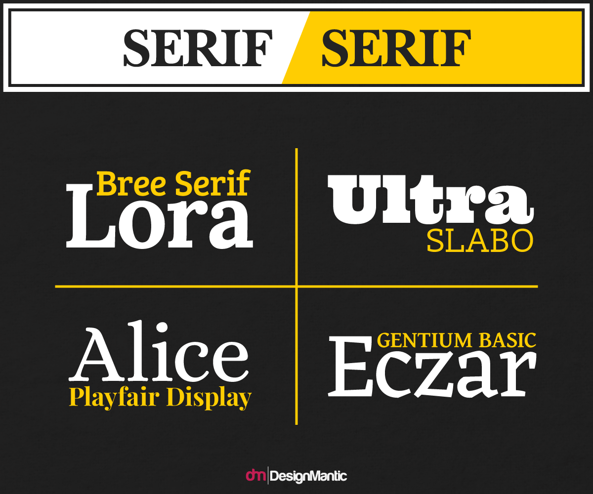
The general rule with two typeface-matching fonts is that they need to differ in their style. You can see from the Playfair Display and Alice example that Playfair Display, despite being a Serif font, has some of the hallmarks of a display font. It's big, it's bold, and it allows for the eye to settle there for a moment before moving into the normalized body text. This bold heading and regular body combo is reminiscent of a newspaper headline and article, and gives a respectable and traditional look, and as such would be suitable for serious articles or a respectable publishing platform.
Sans-Serif/Sans-Serif - When it comes to two sans fonts, then again you should be airing on the side of caution, making sure the two fonts are distinct.
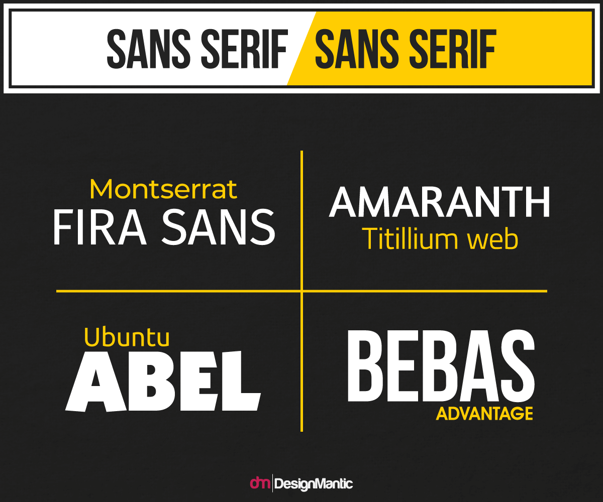
You can see that these fonts share a much more similar shape, and as such, need to be separated by both size and proportion. But, this is a dangerous game, as putting together two similar fonts that are both tall and narrow, or two utterly distinct fonts where one is narrow and the other rounded, can create a sense of tedium or dissonance respectively. These pairing work well for modern company logos and branding, or if the platform is publishing less serious content. A bit more of a "we're approachable…" vibe is created here.
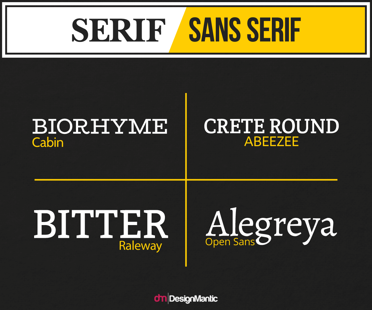
Sans-Serif/Serif - This mixture of style often creates a duality of voice for the brand, making the headline seem casual, and the body authoritarian. You'll often see this combo on less prestigious news platforms. The sans header connects the reader and publisher on a human level, and the serif font provides that reliability for them as they take in the information.
This combination is simple, and effective. It allows the designer to create a sense of camaraderie, but keeps an authorial tone. This is a common sight online for a lot of websites that are delivering spun news, that being facts presented with an agenda or aim. As such, beware that if you go with some of the more common pairings, you may find your company creating a tone that overlaps with other sites that may not be branding material you want to be associated with. Do your research here before going with any of these common choices.
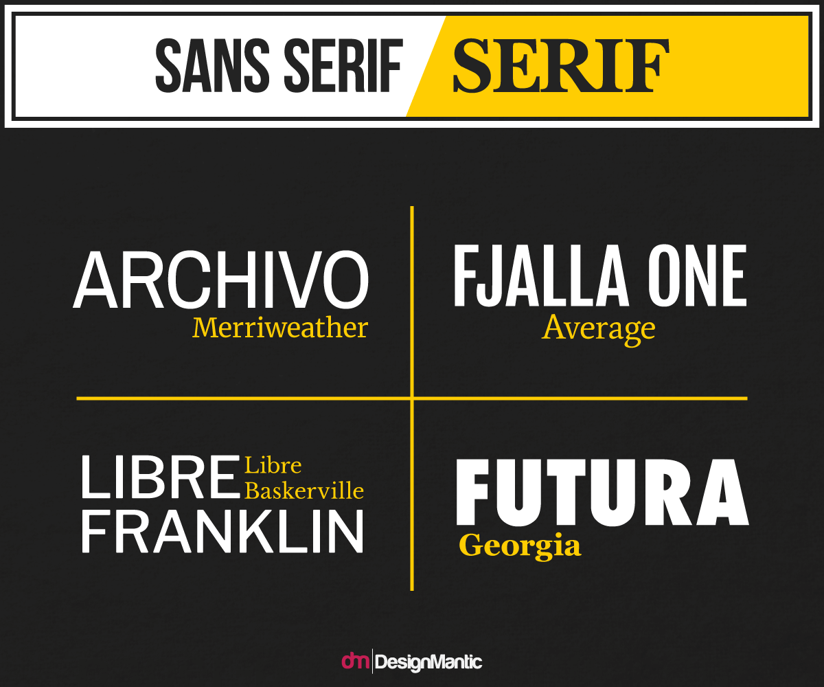
Serif/Sans-Serif - Again, a common sight online, especially in WordPress blogs and other self-run sites. These authoritative and immediately reliable headings grab the attention and make us feel like we're being told the truth. But then, as we ease into the sans body, we gain a sense of familiarity. You'll see this paring a lot on sites where there's a strong following of a specific writer - i.e., popular blogs, and the like. It's because the individual writer needs to sustain a friendship-style relationship with the reader as they deliver their spun prose.
Because of the advent of display-esque serif fonts, they don't always feel boring and old-fashioned. But, those little flicks from the ends of letters conjure a familiarity and untapped nostalgia that harks back to a time when newspapers rules and what we read in them was gospel. As such, a lot of new companies trying to gain a following rely on this combo to bring a sense of reliance paired with approachability.
Display/Serif - This is perhaps the most common pairing that we'll see online, and for good reason. Display fonts are lucky in that they can traverse the serif boundary and be either. Display fonts draw the eye in a big way, making us linger for longer, and as such, become a popular choice of header for click-baiters and spinners. Those people who are trying to drag traffic in through ads, social media headers, and crosslinks are prone to this choice. The display font might say something shocking that makes us take note, but then the serif font assumes an air of authority, and makes us feel confident in the information we're reading.
Spin sites and politically charged blogs/news sites often sport this combo for a quick and convincing one-two combo.
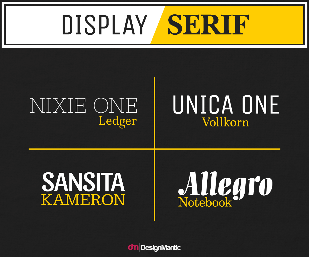
Designers thinking about this combo will have a lot to consider as often times display fonts carry a lot of contextual weight. As such, sites and companies with specific goals in mind will likely opt for this pairing, and only when the display font directly reflects the feeling they're trying to create - but, we'll come to that.
Display/Sans-Serif - We're cool, we're fun, and we're modern. Every tech start-up, fun-content heavy blog (quirky reviewers, travel bloggers, photo blogs, etc.) and modern company will be heading to this section first, because it's the accepted norm. Abril Fatface is a common sight, paired with a low-key, lean body font for that cool yet sophisticated, approachable yet reliable look. Beware of common combos, because the word ‘common' probably doesn't go far enough. Do your research here before using these.
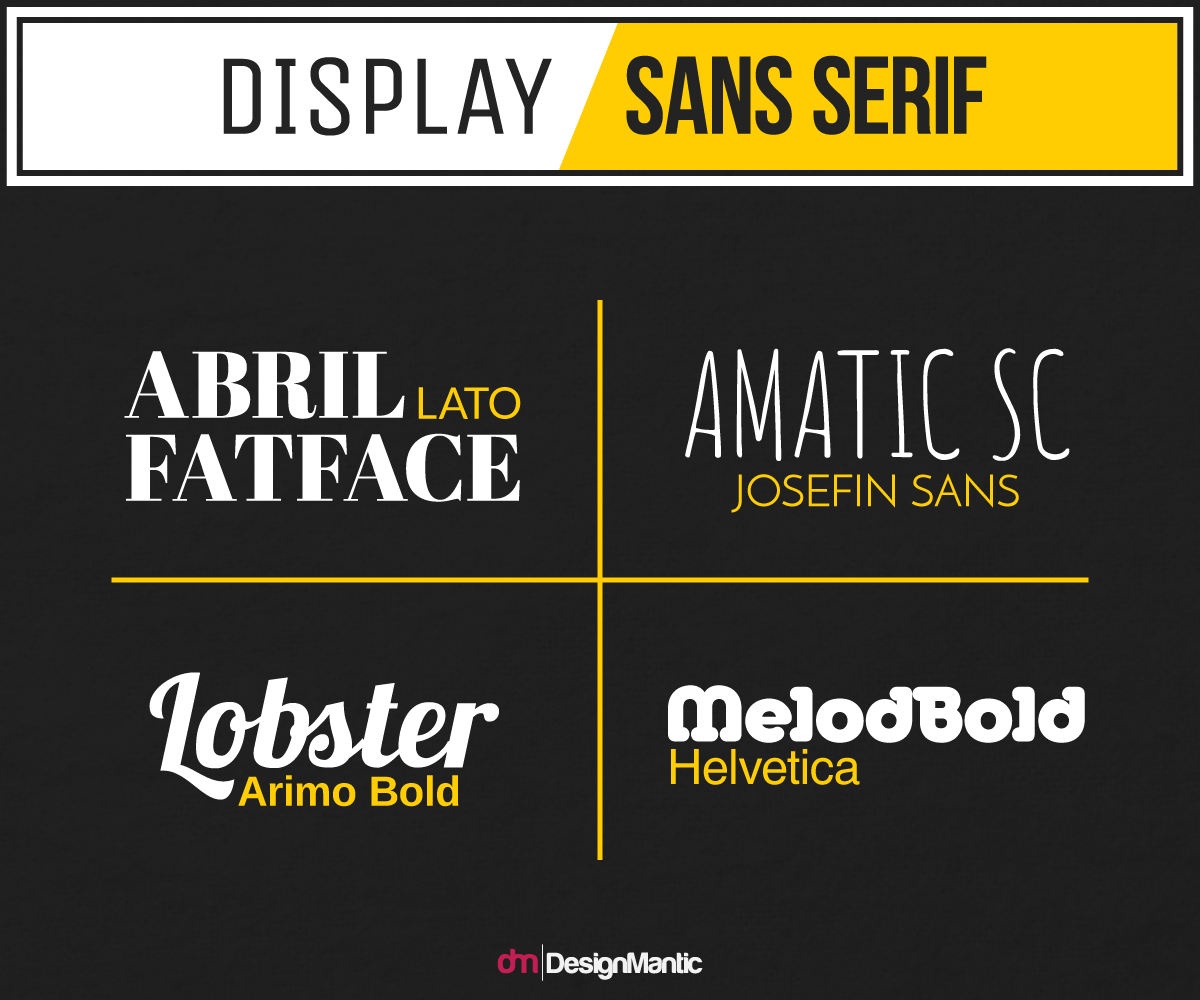
Beware the curse of Wix and WP too, here. Their pre-programmed themes will often carry these combos, and since its advent just a little while ago, Lobster has become the ubiquitous font. It's everywhere, and tells your viewers one thing - that you let some guy sitting at a glass desk in California choose your fonts for you. Tread lightly.
Monospace/Serif - Monospace fonts are characterized by their slightly wider tracking and general dislike of being close to anything. Tech heavy sites, how-tos, and any site going for that ultra-minimal look web designs will often sport a monospace font. Because of their similarity to some sans and serif fonts, it can be tough to spot them, but often if they look like they've been pulled out of a typewriter, they'll be monospace. You'll be able to spot them because the space between each letter will be identical, as though with every key stroke, the paper has shifted across by a set amount of space to accommodate every letter whether it's an ‘i' or a ‘w' - hence monospace.
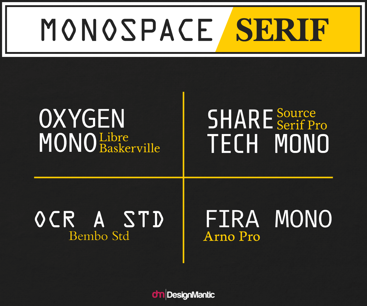
While not as popular as other combinations, you can definitely speak with a duality of voice. We're modern, yet authoritative. We're plugged into current affairs, yet view them with a clear and erudite perspective. Tech news sites, anti-establishment blogs, and anything pro-net neutrality is likely to go for this combo so check out what affiliations you might inadvertently create before leaping on these combos.
Monospace/Sans-Serif - Delving even further into the tech-sphere, this combo is likely to crop up on logos of technology company blogs, how-tos for anything tech driven, or on most tech-startups. It's a nostalgic nod to the roots of their industry, brought back to the modern by the sans body. A trend of eight-bit style header fonts has begun to emerge now, giving a feeling of ‘we know where we came from, and we thank you for it, but still - we care about your eyes, so here's an easy to read body font.' Consider this pairing if you're trying to go for that feeling, or if you're in the tech sector, but beware that it can look cheap if executed poorly.
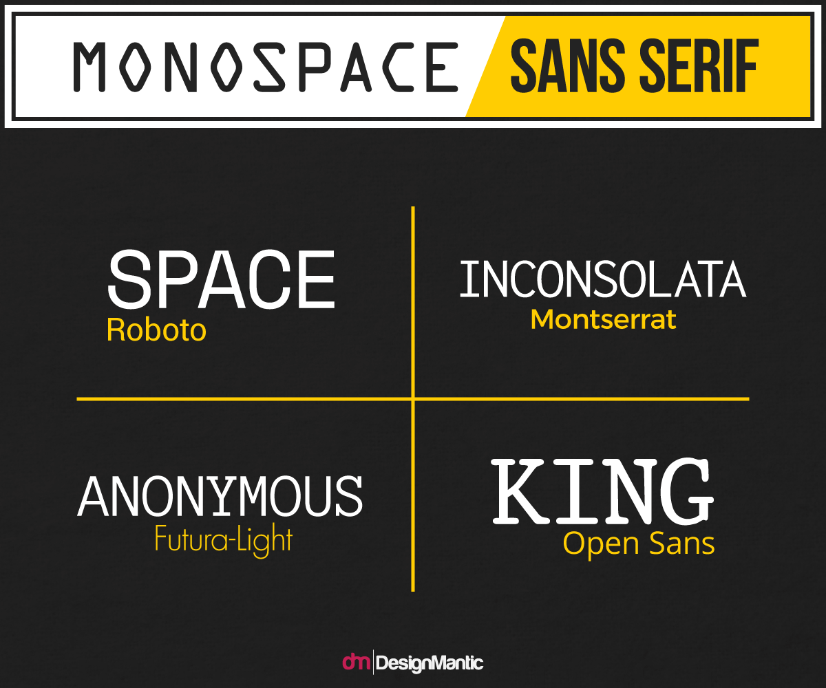
If you're doing the pairing for a modern company and they want to make themselves appear approachable, yet tech-driven, then this is a fair choice. Beware of the lack of distinction though, as many monospace fonts can look similar to sans. This is a hard pairing to get right, so spend some time looking at competitors to see how they're doing it, and whether the desired effect is being achieved.
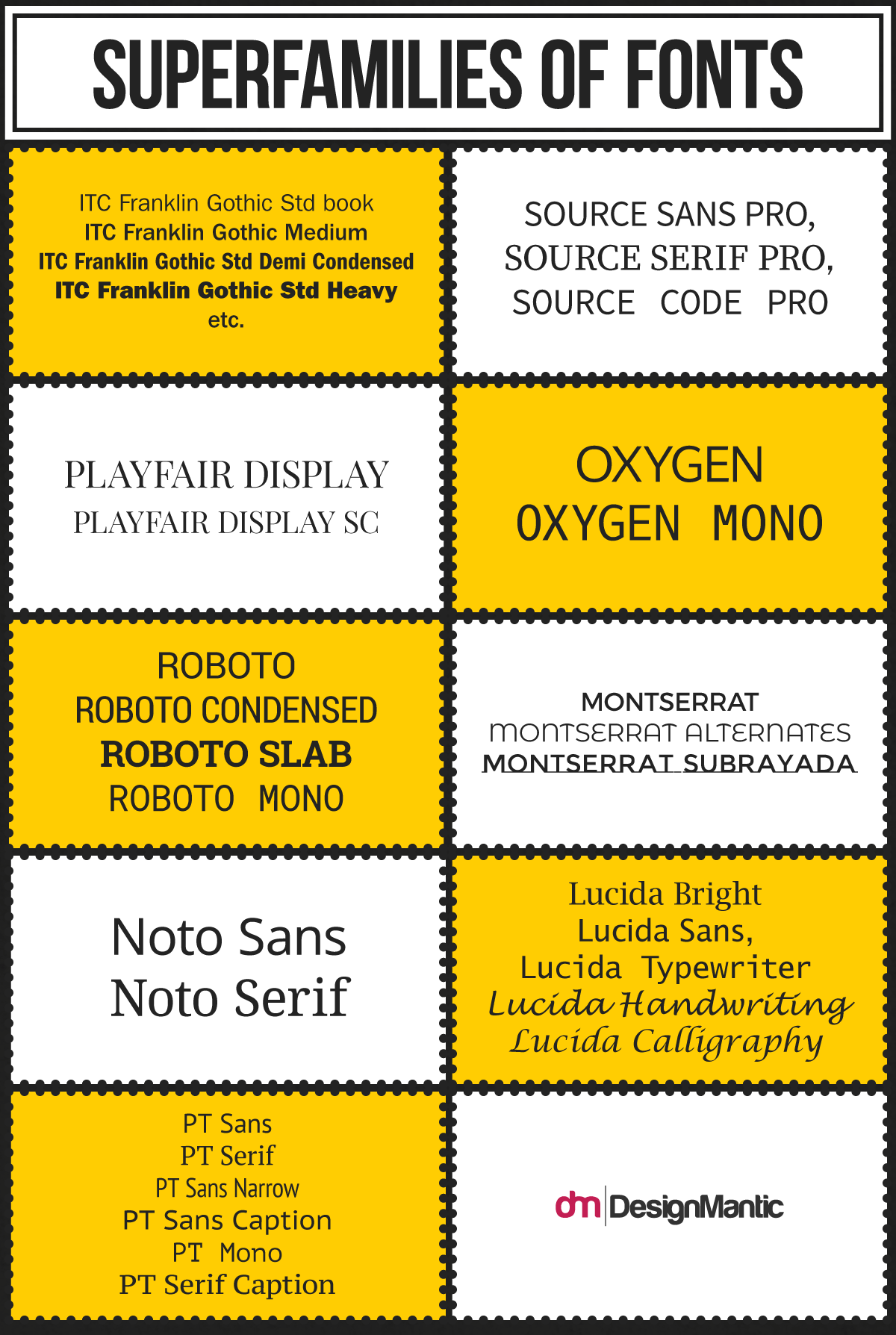
Luckily, we live in a world where font creation has become fairly straight forward, and one where, it seems, those who create fonts actually get addicted to it to the point where they create lots of them. Superfamilies are a great way to shortcut your designs to a perfect pairing. Superfamilies are families of font that transcend and span typeface. That means that the family contains fonts from different typefaces. But, because they've been designed by the same person/team, they'll be [usually] congruent in tone. That means that you can use one of their serif for your header, and their sans for your body (or vice versa), and you'll be left with a really nice pairing. Superfamilies, however, are a common route for designers and companies who do a lot of design for a lot of clients to travel, so make sure you're not stealing a competitor's choice before you decide on one of these superfamilies.
While it's not a hard and fast rule, a lot of the time choosing two fonts from the same family that both share a major trait - be it their tracking, the thickness of the lines, the shape of the letters, or any other defining feature - often will look too similar. You should want readers to stop and take a breath after the heading before they launch into the body. As such, it's often a poor choice to use the same or similar fonts for both. You can use this rule of thumb to rule out a lot of combinations before wasting your time trying them. Use some paper (gasp), and make a list of your favorite fonts from each type family, then see how they fit together. If you choose some from the same family, notice, if they look awful together, why that is. Probably because they're similar, right?
It's also important to think about how your text is going to be laid out, what color it'll be on what background, whether it's going to be overlayed on flat color or over a picture, what line spacing will be used, and whether it's going to be a large block, or broken up. You can likely risk a slightly more aesthetically pleasing font if it's going to be in small bursts intersected by pictures and breaks. If you're overlaying it on a busy picture, then you're probably going to need a thicker font to stand out. If you're using it in white on a black background, like a luxury fashion logo, consider a more minimal font as the contrast can be harsh if there's lots of black and white. Line spacing can be a big game-changer too. Sans serif fonts can often be rendered dry by a large spacing, and similarly serif fonts can be difficult to read in close proximity. Too many tails and loops, maybe. So, if you've got a pairing you like but can't figure out why it doesn't look right, try muddling with the size and shape before condemning it all together. You'd be amazed at how good a serif font will look in columns versus how it looks spread across the page. Each family will have a perfect environment to display in, and it's up to you to figure that part out.
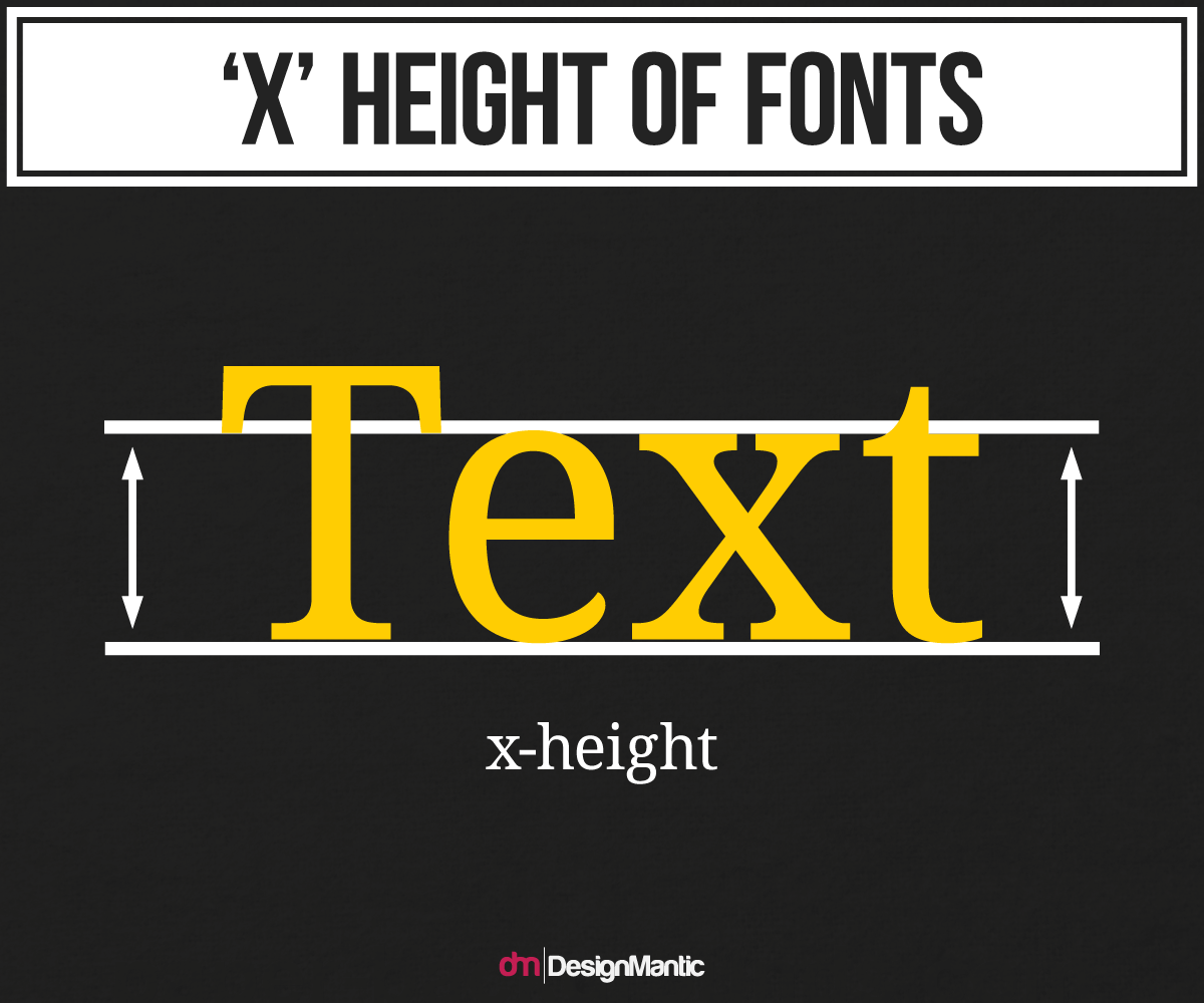
The ‘X Height' rule is another pseudo-law of font pairing. It's not a complex thing, and stats that if the height of the 'X' in the header and the body font are similar, then they will pair well. Of course, the size of the font needs to be the same as perceived by the computer, but otherwise, it's a rule you can try out. It works for lots of them, but for some, it doesn't. So if you don't see that they're a good fit, then trust your get, not the X Height. Still, it's a good place to start, and another tool to use to narrow down the field before you begin honing in on your perfect pairing.
The feeling factor is the unperceivable. It asks what feelings and emotional responses are elicited by a font. It's common for serif fonts to feel traditional and for sans fonts to feel modern, but beyond that - what does the font say? Are you a cool company? A drab and matter of fact enterprise? Are you trustworthy? Anti-establishment? Are you fun? Are you a no-nonsense law firm brand identity? Is your private school monogram represent a respectable establishment to which parents will want to send your kids?
Font pairing is by no means a perfect science, and when you think about how a font feels to look at, then you can begin to delve into the realm of the unsaid. You can adopt that duality of tone and voice and present with two messages and voices. If they are opposing voices - fun yet business driven, or respectable yet joke obsessed, safe yet dangerous, then you'll find a dissonance in your fonts. But, if you think about two feelings that are complementary - approachable and trustworthy, knowledgeable and easy going, technologically savvy and inclusive - then you can create more than just a nice looking combo - you can say something about your company or client without writing it. Fonts speak louder than the words they carry.
Remember that and apply the 'Feeling Factor' to your decisions, and along with the other tips and steps outlined here, you should have no problem tracking down and putting together a killer font pairing for your client or company.