- SALES / SUPPORT : 855-752-5503
Quick! Name one aspect of design that doesn't involve lines.
A little like trying to come up with a complete sentence that doesn't use the letter E, isn't it? That's because lines are extremely fundamental, basic parts of design — and most everything else, really, when you come right down to it — and it's very hard to come up with something that doesn't use such a simple aspect of graphic arts.
In Graphic Design Solutions by Robin Landa, lists line as one of the four formal elements of graphic design, along with shape, color, and texture
Visual Grammar,a graphic design primer by Christian Leborg includes lines, along with surface and volume, in its rundown of basic abstract objects that are used in graphic design. It defines lines thus:
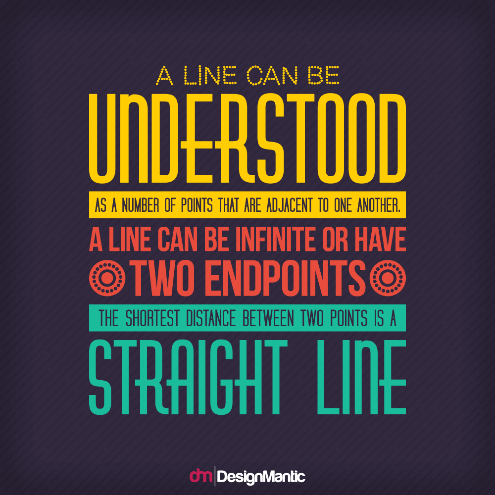 Source: Visual Grammar by Christian Leborg
So does that tell you how important this basic design component is? Yeah, probably not.
A Primer of Visual Literacy, however, puts it a little more poetically.
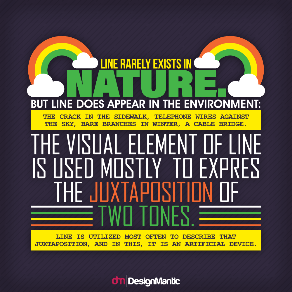 A Primer of Visual Literacy
In other words, there's a lot that lines can do. Classically, however, in and of themselves, they most often are used as a dividing point. But that isn't all.
The JRC Agency states that lines can be used to "add style, enhance comprehension, create forms, and divide space." There is even more to it than that, of course. Starting with lines as a basic way of delineating (de-line-ating) a portion of your graphic design is a good beginning, but there's more to the humble line than that. Think punctuation, emphasis, mood, direction, and tone.
All of that in one little line, or a series of them.
Powerful, right?
Now that we've been thoroughly humbled by the power of the line in design, let's break this basic element down to make sure we can get the most out of it.
Obviously, with a basic element like this, it can go in a lot of different directions. Quite literally, too.
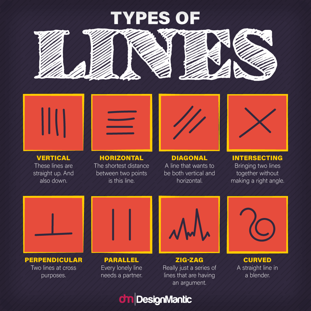
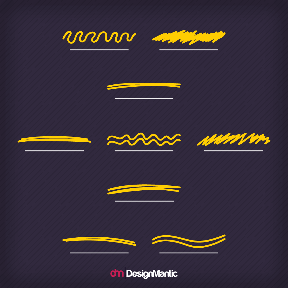
So here we have a very simple set of these literal directions, including vertical, horizontal, diagonal, and the lines that work together: intersecting, perpendicular, and parallel. Adding the zig-zags and curved lines gives this basic element a little bit of extra flair.
But these simple directions aren't all that the line has to offer.
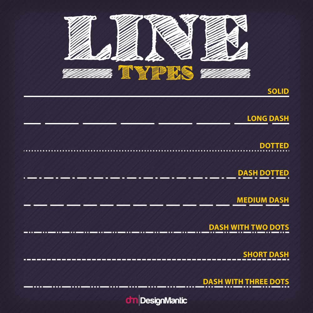
Breaking it down even further, a combination of line elements can deliver an unusual texture, a abstract geometric shape, the perfect font type, or the dotted line denoting the path that the kids take in The Family Circus. Basically what we're saying here is that lines are the building blocks of the universe. At least, the universe of graphic design.
So what are you going to do with your lines?
Well, what are you intending to get across to your audience with your graphic design? What message do you want them to receive? What mood and tone do you want your piece to have?
Any given component of graphic design will deliver, along with itself, a bundle of messages and tones. Any line, for instance, will have intrinsic aspects of direction and quality. Graphic Design Solutions says the qualities of a line in design can be "delicate or bold, smooth or broken, thick or thin, regular or changing, and so on."
So what are lines saying to your audience?
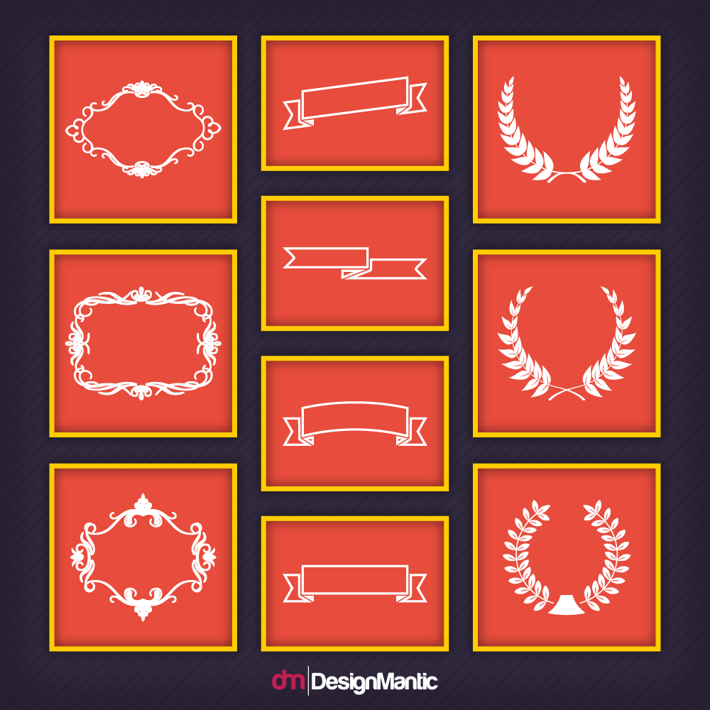
Well, let's just take one aspect of line design: borders. Consider the difference between a piece of graphic design that has a border, for instance, and one that doesn't. Graphic design with a border may give a more polished, finished, sleek feel to say logos with lines.
Of course, since most graphic design is still going to include a line of some sort, this may not always be the case. But lines used as borders can definitely give a finishing touch to a piece, as in the case with a frame logo or symbols within shape logo designs.
Lines can also be used to differentiate between internal tones, inside a specific piece.
This can be really helpful if you're wanting to create a logo design or graphic art that has different messages and emotions, while still keeping it homogenous and in-sync.
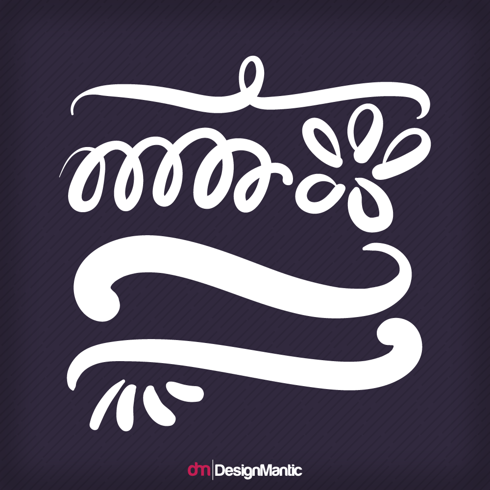
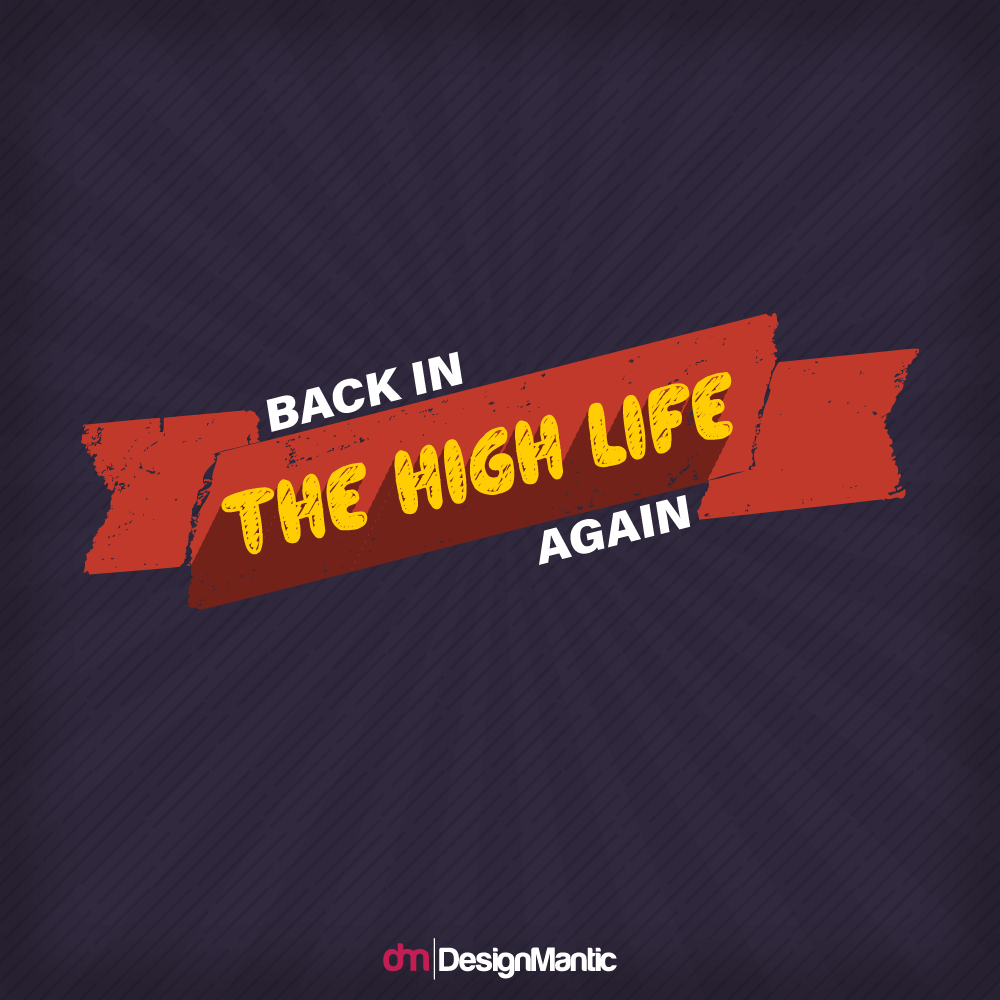
As always, having a clear idea of what you intend your message to be is of vital importance before you start sketching your design out. That way, you'll know if you want the regal tone of the flourish —
— the informal, slapdash feel of the swoosh —
— or even the hand-made, vintage-y feel of an uneven dotted line.
Lines can be very simple tools to use when it comes to creating an iconic, memorable logo that stands out from the rest. Just ask Adidas about that.

Three dense, thick parallel lines make for a striking parallel lines logo that is easily recognizable, easily rendered for everything from products to advertising, and easily remembered. Lines make everything so easy!
What about Vaio?
This is also a deceptively simple, easy logo, though it might take a minute to decipher it, which is something to consider when using extremely non-detailed, simple logos. Also, talking about mood, message, and tone, this design is a great choice for a laptop and tech company logo. The very look of the logo is very tech-y, and also a little bit like an alien language, which just gives it another level of nerdy cool.
Banners are a fun way to make your logo or other piece of design stand out.
They're also, if you really take a close look, made up of lines.
Much like borders, banners can give a really polished, finished look to your graphics, no matter what sort of piece you're working on. Think about it. Bakery logos with banners are more preferred because they give the traditional yet classic look that shoppers search for when they are out for a snack.
Just like with any other aspect of design, websites are going to use a lot of basic elements, such as lines, to make up their composite aesthetic, tone, and mood. This is pretty easy to see if you've ever attempted to put together a website on your own, using something like DesignMantic.
Sites like these provide ready-made web templates for your pages, and judicious usage of lines is a hallmark of most of these templates.
Another aspect of line usage that is on the rise with current on-trend website design, according to an article on Envato.com is off-kilter diagonal lines. These create a dramatic abstract aesthetic, and have a practical note as well. It “draws the eye across the whole composition,” leading the viewer deeper into the site, and makes "natural breaks in page content,” giving a "gridless feel to the layout.”
Whether the line in website design is off-kilter and diagonal, vertical, horizontal, or any of the other options, this basic element is clearly one of the important features of web design.
Pretty much everything these days ends up on social media, at least in some aspect or iteration. Sure, it may take several different versions of your edited photo before it actually gets posted to Instagram, but that doesn't mean that it won't make it there eventually.
So what do lines have to do with social media images that get posted?
Well, social media is more than just photographs, of course.
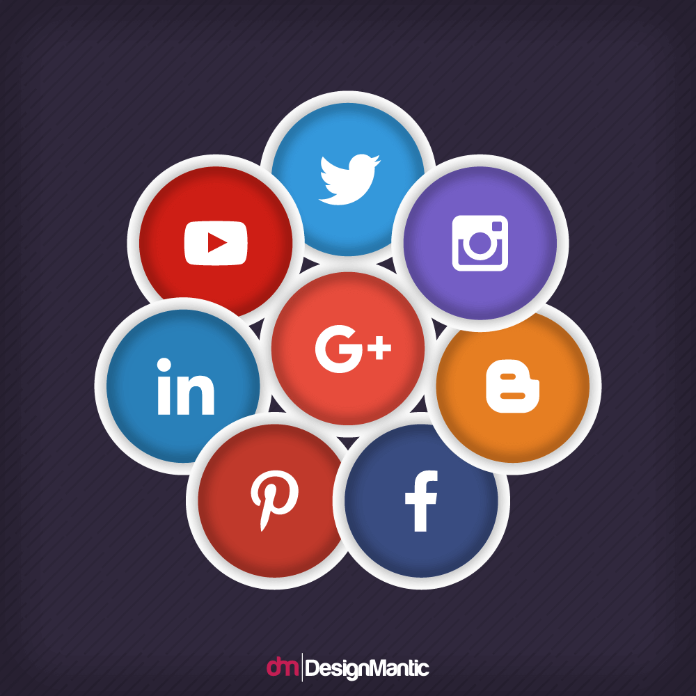
Everyone's had the experience of going to their Facebook page and seeing it inundated with re-posted pieces of content. It may tell you something about the friend that posted it, or it may direct you to a website, or it may share a piece of information that you didn't have, or maybe even tell you a story. And the odds are, it's going to say, "Like if you..." at some point. Or ask you to share it on your own timeline, just as approximately eighty thousand people have already done.
This makes it sound a little cynical — okay, more than a little — but it is in fact a great marketing tool.
Lines here are going to play an important role, as well. Especially when it comes to giving a real impact to your social media piece, and making parts of it stand out above others. You have only a brief period of time to really reach your audience on social media, just as you do elsewhere. Make sure you make the most of any element that can give extra punch, emphasis, and enthusiasm to your piece and message.
Basically, what it boils down to is that lines are fundamental components of graphic design that cannot be overrated or ignored. Whatever your sketch is for your piece, and whatever the finished product ends up being, and no matter who your audience is or what you're putting together — lines are going to be a very big part of the design, no matter what you do. And even as you're putting your components together, don't forget that a line on its own can be very simple and effective.
Lines, in short, are powerful; and with great power, as we all know, comes great responsibility. Use lines wisely and well, and as you start your graphic design journey, remember: there are great things ahead, somewhere on down the line.