- SALES / SUPPORT : 855-752-5503
Designing a company’s brand identity is somewhat like creating a first impression on customers which is important for purchase decisions, attitude towards the business and trust etc. For instance, when passing by a store we take a look at its name and logo and that is all it takes for us to make a quick decision. It depends on the color, the size and the type of font included in the text which helps us create an impression of the company and what it has to offer.
A monogram logo is a symbolic abbreviation of the company’s name. This doesn't mean that the logo is written in a normal writing form but uses proper and professional typography to create an insignia which can be easily remembered by their target market.
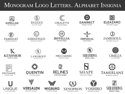
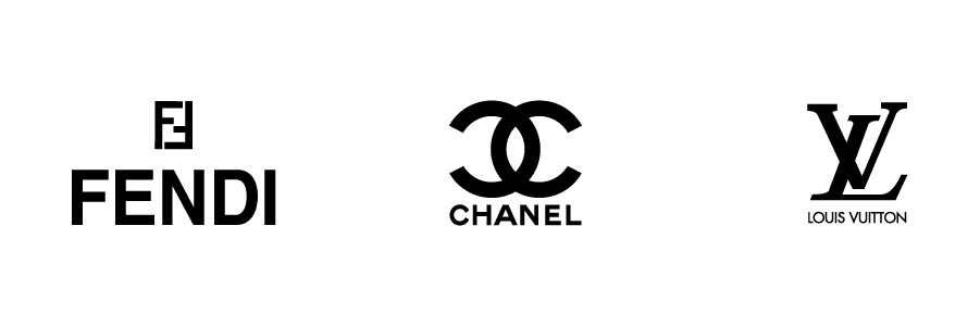
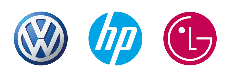
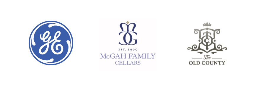
A monogram logo is also called a letter mark logo as it uses the initials of the brand and crafts a logo which is similar to a motif design. This shouldn't be confused with a word-mark logo which has the entire name of the brand such as Coca-Cola, Tommy Hilfiger and Canon or Disney. Some examples of monogram logos are as under:
The ancient Greeks started the monogram logos to represent their symbols and traders’ names. These logos were used in their signatures, architecture and in various other industries. The reason why the ancient Greeks used these monogram logos was that they were easy to replicate and were adaptable – meaning that the designs could be remade on seals, documents, art and other such areas. Later on, they became mainstream fashion and apparel logos and identities for government related organizations using similar design format.
A monogram logo is not suited for all industry or every business type. Designing a monogram logo thus requires extensive research and skills which should be carried out by professional designers and company decision makers to understand the related basics of designing it.
Understanding the brand - This is the initial stage for everything that designers will begin with. Understanding the logo requires understanding the brand. If a designer is aware of the dimensions of the company and what it can and how executes business, it becomes easier for the him/her to start with the concept. This is the stage where the designer get to feel the objective of the brand, business, and target audience.
Preliminary Research - After a thoughtful session with the business owner or decision maker, it is advised that designers do some research work on their own. This preliminary phase can also be called the drafting phase where you can highlight the monogrammed initials and play around with ideas in your head. This phase answers to all the other phases which are in monogram logo designing process. Creating the color scheme, focusing on what the company produces or sells and how to incorporate your idea into a logo so that it highlights the brand identity concepts and meet the company’s business objective to impact viewers.
Suited to the business - Monogram logos generally follow a formal and clean approach. However, there can be certain inexperienced designers who for the sake of adding vibrant colors and shades just add more to the logo than necessary. A monogram logo looks good when it is less cluttered so keep in mind to take out, rather than putting more into the logo design.
Flexible Designing - Whatever you opt to create it has to be simple and versatile. The simpler the design the better it is to create a monogram logo. Consider designing a monogram logo which pairs initials and with the company’s name to create remarkable design.
Creating Balance - Monogram logos are all about balance. If a designer uses a typeface or creates a graphic design and pairs that with the initials of the business then that has to be balanced. The entire structure of the logo should look symmetrical or asymmetrical, and not overwhelm the viewer at any point. Space between the elements, colors, placement, angle etc. are other general attributes which should be noted in balancing a monogram logo design. It is critical to consider balance because your monogram logo will be used in multitude of materials and surfaces such as packaging, lining, packing, social banners, doorways or embossed etc.
Settle to be different - It is one thing to research and get inspirations from existing monograms online but settling for the same logo designs and just making basic changes is not advisable. Therefore it is important as a designer you should try something which is different and does not already exist. A design has certain rules but if you keep on playing by them then you will have predictable results at the end. As graphic artist you can experiment with monogram logos by looking at thousands of examples available online and how each has been made different from the others. Or you can use a free logo maker tool like DesignMantic to get ideas.
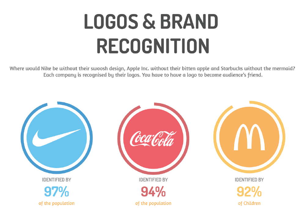
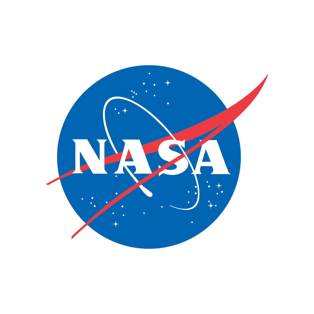
Furthermore, observe how big and reputed companies have used a monogram logo to make a well-known marketing and branding strategy for their brands. An example of this is NASA – people hardly know that it stands for National Aeronautics and Space Administration because we use the monogram logo which is so widely recognized.
Color Scheme - The color scheme of a monogram logo is a significant factor in which many graphic artists tend to make mistakes. It is not necessary that a logo has to be in the combination of all the colors which are generally used in a business. Designers can stick with 2 basic colors or use the accent colors. The idea is to make the monogram stand out through its design uniqueness rather than cluttering it with too many colors.
Appropriate Fonts -It all depends on the type of business and nature of industry the business is in. Appropriate fonts refer to fonts which suit the logo design. A professional designer’s work is far more in detail, where they look at each and every angle and curve of the font and if they find it necessary they make certain changes in that too.
A font should create an overall balance between all the elements and shouldn't disturb other parameters of the logo. Whether you select between bold or thin font styles, it should be well paired with the monogram you are working on and the overall industry it reflects. As an example; a wedding planning company can go with something light and subtle which can be in italics. However, a construction company logo cannot adopt the same policy and therefore they need to be more towards a straight and bold typeface.
Monogram logos are distinctive in that they create a uniqueness that cannot be expressed by other logotype. For example; designing companies and top-notch style brands use monograms to symbolize elegance, minimalistic design and high quality products. These monogram designs have their own advantages which are as follows:
Alternatives to long company or brand names – Victoria and Albert Museum, NASA and Giorgio Armani and Sarah Appleby use monogram based logos so they can work with the brand initials instead of mentioning the entire name. These designs are unique and exclusive which can make people recognize their insignia logos even though the names aren't mentioned.
Simplifies designs – Monogram logos give you a small window where you need to create the entire design. It doesn't require any extra graphics or fonts which can clutter the entire symbol. Try observing some monogram symbols and see how short and precise they are made.
Easy replication – These designs are easily added to other marketing designs and branding ideas. They can be added to letterheads designs, watermarks, business cards etc. For that matter these symbols are adaptable and adjustable.
Monogram designs are a used because they can be easily added to a company's badges designs and office stationery instead of getting the name printed. Similarly a monogram design can be used for packaging materials and business cards too because of the convenient designs and the easy adaptable options. A simple and sleek emblem design can also be used in embossing to create a stylish way to promote and brand your products. This saves the printing costs and you get your company's logo in an embossed or stamped product too! Monogram logo designs are not suited for all industries. A clear example of this is a theme park logo which will go with a graphical representation filled with yellows, blues, reds and greens. They will keep the logo happening and very vivid for the audience to be attracted. The target market of a theme park are mainly teenagers and young adults. Using these colors and a fun-filled graphical symbol will attract the same target market. Alternatively, if a designer creates a monogram logo for the same industry, it will look formal and official and will not be able to create the mood of the business theme to match their target audience.
Monogram logos are used in universities and reputable educational institutes logos to create formal seals and official insignias. Many universities print badges and stickers for their president bodies where logos are of monogram style.
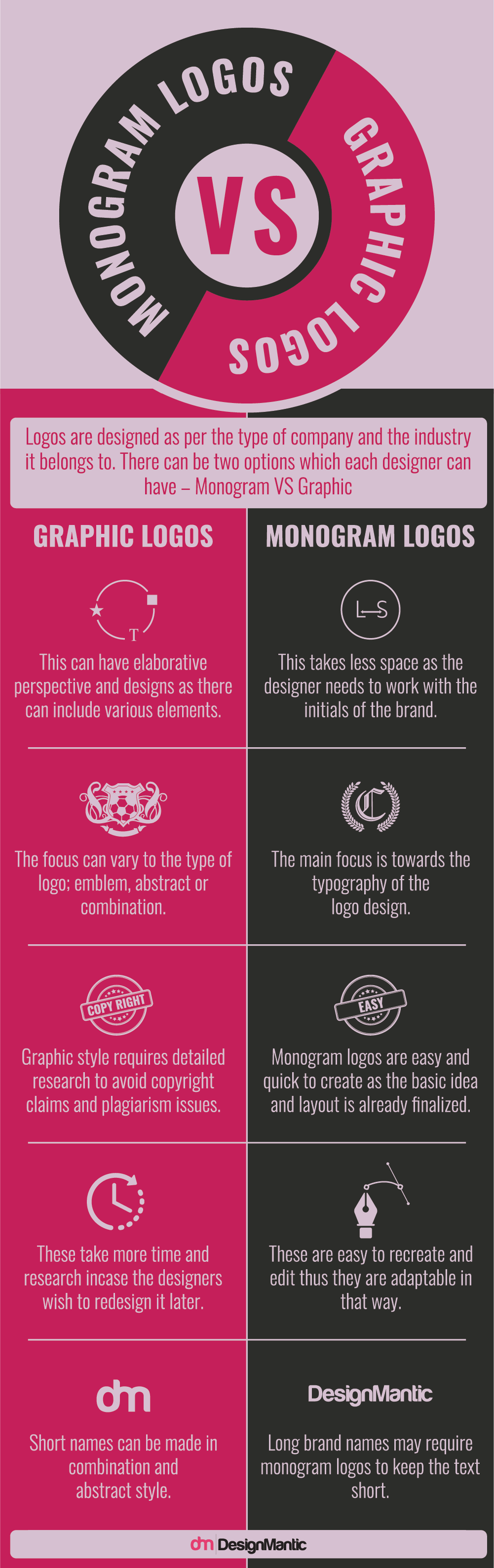
To differentiate the differences between a logo and a monogram here's a list of attributes that you need to look out for.