Colors convey meaning, direction, appeal and a whole lot more in logos. Quite a lot of thought goes into what colors to use for that logo design of yours. Over the years, these logos acquire an iconic and permanent status in our collective psyche. Any efforts to change them are met with cries of derision or even appreciation, depending on how people end up viewing it in a social media world.
But as goes the maxim of life, change is the only constant and sooner or later, you’ve got to get on with the times. In this respect, we break the trends by recoloring today’s biggest brand logos, swapping that iconic (and in some instances over-stayed-their welcome) color palettes in them. But make no mistake, all those changes aren’t merely cosmetic.
We show you why a color change would benefit that brand, its customers and its position in the market in different ways. So lets take a look at them here:

• Burger King
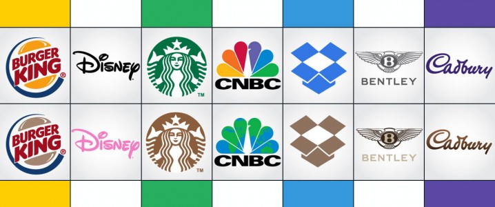
When your brand is about America’s favorite staple food, you’ve got to keep the audience focus on them puffy burger buns. For Burger King, substituting those sunny yellow buns with a more natural brown color in their logo makes perfect sense for the brand.
• Jelly Belly
What color do you get when you spin that color wheel? A crystal clear white, which is we think that Jelly Belly logo would be a nice play for it since jelly beans come in all shapes and colors. Pretty nifty ‘spin’ to a classic logo right?
• McDonald’s
In a parallel universe, where McDonald’s might have figured out to keep those carbs at zero and their menu with that same great flavor, a green colored change to its iconic logo would be welcomed due to its diet-friendly focus.
• Sun Chips
Some like it salty, and some like it hot. Sun Chips could target an entirely new demographic of customers who like their chips to be spicy and flavorful with an orange-y update to its classic logo.

• Disney
Disney is making movies about its old IPs, especially about those Disney Princesses in a live-action setting. Disney’s world famous logo, with a pink color change, can put those old IPs left, front and center for a new generation of children who haven’t seen the classics.
• Nike
Caitlyn Jenner, John Amaechi, Kwame Harris are some of the sportspeople who point to the world being a diverse and tolerant entity. As part of the change of ushering in diversity in sports, Nike would do well to change its ubiquitously black logo to one representing a multitude of colors. A diverse brand for a diverse sporting polity.
• Motorola
Tech companies are Motorola aren’t content with being seen as engineering icons. They are bringing the cool factor with them as evident by the Moto X smartphone, the Moto 360 smartwatch and more. What better way to signal this shift in the company’s vision than by trading in the traditional black color for a cool blue in their logo design?
• ABC
As one of America’s well-known tv networks, ABC has incorporated a variety of different genres in their programming and slate of tv shows. To better reflect its internal change of diversity and choice, ABC can trade in their black color for purple in order to portray a bold new direction for the company.

• Starbucks
The Starbucks logo is instantly recognizable. But you know what would be more better to make the company and its product as a unified entity? A logo color change from the presently green color to a coffee brown one. Talk about making that perfect brew!
• Roots
A natural-looking logo is perceived to be the best one in consumer’s mind. For Roots, making the animal that’s present in their logo go from green to dark brown would give the brand a more attractive appeal.
• Tropicana
A tropical drink brand deserves a, shall we say, an equally fruity tropical logo makeover. Somehow we think that orange is the best fit for a brand like Tropicana.
• Irish Spring
For fresh, minty and cool brand like Irish Spring, you need a color that personifies those very same things about the brand instead of the standard green. A splashy tinge of light aqua blue is exactly what would make the brand stand out.

A globally renowned tech company like Google sure does like to flaunt its global credentials. And what better way to accomplish that than by having its logo custom-tailored to country flags?
• Ebay
eBay seems like a company that could benefit with a singular focus. The colors that it employs in its current logo makes the company come off as an informal entity. As one of internet’s e-commerce giants, we believe that a blue color makeover would align the company and its position as a market leader.
• CNBC
CNBC, as it current logo colors illustrate, is a world-renowned TV network. However, wouldn’t it be better to have a logo color choice burnishes its credentials as a reputable news network globally? The above color change to a blue and green colors reflects that very transformation.
• Microsoft
A Microsoft that makes products for a variety of different platforms and customers can benefit by splitting its branding. Since Microsoft has 3 dedicated areas of focus, namely Moblie, Office, Windows, we believe that having one color for each is the way to go.
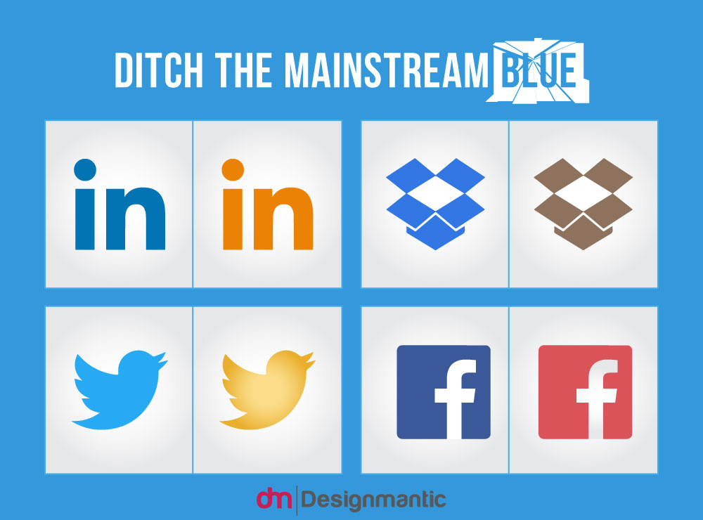
Linkedin is the world’s premier social network for professionals. Now with a thriving community of professionals, Linkedin is hoping to target students so that they can gain insights about the industry they want to pursue their future career in. A change of logo colors from blue to orange can easily make it relatable for today’s students.
• Dropbox
Now that Dropbox has succeeded in becoming one of the most popular tools for cloud storage, perhaps its time for the Dropbox brand to attract more mainstream customers by making its logo go from blue to brown.
Twitter is having trouble attracting more users to its service. Maybe its because the company’s logo color choice makes people (erroneously) perceive it as a Facebook-clone? In order to differentiate itself better, the company can go for a golden color, like a phoenix that’s rising from the ashes.
As it turns out, the female demographic happens to be the most staunchest users of Facebook. To convey its appreciation for its biggest fans and users, perhaps a pink colored logo by Facebook would be in order.

• Bentley
A premium brand like Bentley is perfect the way it is. However for a more premium and decidedly vintage impression, perhaps a change of color coating from silver to Brown and off-white would rejuvenate the brand.
• Lexus
The Luxury arm of the Lexus car brand can invoke a feeling of royalty and regal-ness if it opted for a royal purple logo makeover instead of the current silver.
• Honda
Talk about going for gold here. Honda is a technologically-forward car brand and we think that a golden logo would be pretty much an ace in the hole for this Japanese carmaker.
• Jaguar
When it’s about putting the premium with the performance, the Jaguar logo needs a shot in the arm to arouse that feeling of strength and cutting-edge performance. We believe a fiery red change to its current logo can capture that wild aspect of its personality much better.

• Yahoo!
Yahoo has been using purple for its brand since its establishment. If it wants to be considered as the hip new kid on the block like the rest, then a yellow-orange color combo would be exactly what you need to revamp the brand.
• Cadbury
What better for a brand that’s associated with sweetness and the best chocolates on the planet to play up its core strengths? How about a chocate-y makeover to the classic Cadbury logo? Seems appropriate if we say so ourselves.
• AVID
As a media company, what would you like your users to do when they first see your logo? They want a sleek media player interface that’s a treat to use, a feat that can be accomplished by using an attractive color combination of red-black colors strategically.
• Hallmark
According to proven studies and statistics, the greeting cards giant such as Hallmark has more female customers for its products than males. Again here, there’s an opportunity for the brand to cater better to its most loyal customer base by going for a pink-tinged logo design.


Is this a joke?
Purple is the new gay? You’ve lost all credibility with an offensive and unprofessional statement like that.
I agree with your point that we need to expand our color horizons when it comes to branding, but all you did here is make literal color associations. Coffee = brown, chocolate = brown, moving box = brown, orange juice = orange and green, and soap= bubbles.