Visuals are everywhere and the commandments of visual communication serve as the complete guide to the art of designing. Visual hierarchy on the other hand, adds beauty and order to your design. It offers to your eyes visual assistance, suggesting to them, what information to linger on to, as your vision glides through it. It lays down a path for the data to flow in, to get absorbed into the brain smoothly. It guides the human eye from one element of the data to the next, like an invisible pointer moving through the data, to keep the reader free of any visual fatigue. Hierarchy allows you to simplify social media design by muting the useless noise and clutter present everywhere else on the page.
Below, we have outlined, the “15 Golden Principles of Visual Hierarchy” in order to dish out for you the various ways in which one can implement visual hierarchy in one’s data and reduce the noise. These are equally applicable to graphic design as well as in the construction of a web design, while some principles like the Golden Ratio and Visual Triangle, offer immense help when learning how to create a memorable logo design.
Additionally, these principles can be especially useful for those looking to buy Instagram followers — ensuring your visuals are both attractive and effective in capturing the attention of your audience.

- Focal Point: Need to lay maximum strength on a particular aspect? Go focal.
- Movement: With this one, make your audience move with the flow.
- Golden Ratio: Need to add beauty to your work? Go Golden.
- Balance: Play safe with balance. A little balance never made anyone cringe.
- Repetition: With repetition, make sure no one misses your callouts ever again
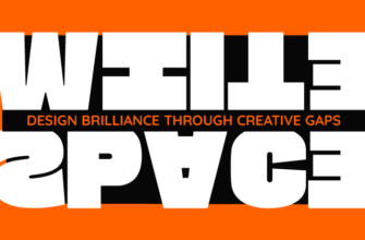
- Whitespace: Add sophistication with whitespace where less is more.
- Visual Triangle: Works best for limited data. Makes sure no one misses a point.
- Texture: Add texture to refract negative space.
- Types: Say it loud and clear with a typeface. Leave no one in doubt.
- Random: At times, an absolute lack of symmetry makes an impact.
- Rules: Deal with the clutter, stick to some rules.
- Alignment: Alignment clears up the mess. Never makes anything appear cluttered.
- Lines: Go linear when you need to make a point straight! Savvy?
- Contrast: Contrast shouts for attention. Use it wisely!
- Rule of Thirds: Need to lay equal stress on each element? Go with the rule of thirds.


Thanks.
informative infographics,
Informative and meaningful…
I like the way you present the information. And Simplicity gets my heart.. Great Work
This was amazing, thank you