Infographics are what appetizers are to a great meal on a date night. They are easy to consume, have a chat over, and they get you in the mood to try more on the same topic. Easy to grasp, remember, and quote – infographics are the bite-sized pieces of content that everyone loves.
If you are a startup blogger or a marketer just learning the ropes, infographics may seem complicated to master. How do you decide which data to include? Which type of infographic is best for what you want to say? How to apply visual design principles to infographics? And, how to come up with infographic ideas that go instantly viral?
We will tackle all these –and more – in our conversation today.
Infographic Design Ideas
You can call these infographic examples, but really, these are the different ways you can design your infographic. Each design serves a unique purpose and data format. Some of these ideas are more suited for educational purposes while some are better for marketing. Your purpose and data are not the only basis on which to choose your design, but we’ll talk more about that ahead in the article.
Let’s first see what the most popular and effective infographic designs are to get your point across.
1. List Infographic
It’s the most simple and your basic infographic design. It’s also the most popular. You get a list of things that you want to talk about and you simply add them on your IG in a categorical order. It usually contains a numbered list, text explaining the data, and some relevant pictures.
These infographics are best when you simply want to mention things and your purpose is not a further exploration of the topic. A good example would be a list of museums around the world that use art logo designs to represent their identities.

2. Single Chart Infographic
There are multiple types of charts and when you choose a particular one for your infographic, it becomes a single chart infographic. This could be a pie chart infographic, a flow chart infographic, a bar chart, or any other.

3. Mixed-Chart Infographic
As you can gauge from the title, this type of infographic design uses more than one kind of chart to illustrate the data. You can use a pie chart with a bar graph, a flow chart with a line graph or a scatter plot with a mosaic. You can also think of any other combination or even combine more than two in a single infographic. It depends on the wealth of your data and the kind of your data.
For example, you can use a pie chart to compare data and then use a flow chart to outline a process.

4. Timeline Infographic
It is also called a historic infographic. The idea is to show the evolution of a process, trend, or concept over time. Timelines that chalk how a famous logo has changed over the decades are a great example of a timeline infographic.

5. Geographical Infographic
This kind of IG design is used with geography. Do you want to show which parts of the world use the mobile internet the most? You’d probably use a geographical infographic to visualize the numbers. This kind of presentation almost always uses a map to highlight the point of the data. In some cases, though, you’ll see location-based data shown in bar graphs or other forms of charts.
![[INFOGRAPHIC]: The United Fonts of America](https://www.designmantic.com/blog/wp-content/uploads/2014/07/US-Map-Font-Changes.jpg "[INFOGRAPHIC]: The United Fonts of America")
6. Hierarchical Infographic
When your content calls for data illustration that highlights the categorization or the organization of a phenomenon, you use hierarchical infographics. These designs are used to showcase different levels, groups, or categories of data that are sorted based on some kind of hierarchy.

7. How-to Guide
The how-to infographics are one of the most popular kinds of IG designs you’ll find out there. Most marketing companies that usually churn how-to guides or different kinds of tutorials use these infographics to distill the information. It’s great for readers who may not want to read a lengthy blog post.
![]()
8. Comparison Infographic
For side-by-side comparisons of two or more ideas or concepts, we use these designs. As a graphic design and marketing company that predicts and defines industry trends, we do a lot of comparisons and contrasts. The good vs. the bad, the in vs. the out, and then vs. now. You can also do a lot of Dos and Don’ts in a comparison-based infographic.

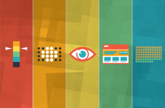
9. Photo Infographic
These are somewhat similar to list infographics but here, the design is more graphic. These picture-based IG designs are heavy on the image and low on the text. You’ll see a lot of icons here, images, and symbols.

10. Numeric Infographic
These infographics come heavy with numbers. Consumption stats, engagement numbers, population data, totals and correlations, and any other kind of numeric-based info that you can think can be accommodated here.

11. Lettered Infographic
We’ve all seen infographics where the data is showcased using the alphabet. Sometimes it could base on a brand name – sometimes the whole alphabet is used for the task. Infographics that talk about typography usually incorporate a letter infographic template to demonstrate their ideas.

12. Anatomical Infographic
Many times an infographic design will be used to highlight various areas or sections about a topic or a subject. Think of a labeled diagram to understand this design. The idea is to pinpoint particular areas about a topic and share important information about them.

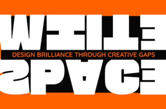
13. Mosaic Infographic
Mosaic infographics use color tiles to organize the subject matter. They are more visual and without listing down the numbers or categorizing them with letters, they get their message across in a more optical way.

14. Interactive Infographic
Very few marketing companies, including DesignMantic, are making full use of interactive infographics. These are unique types of IG designs. They invite the user to interact with the design. Just take a look at the example below. Roam your cursor over different parts of the infographic. You’ll see icons coming to life and displaying more information when your cursor moves over them or even guide users to create a free QR code to enhance interactivity further.
Interactive infographics are a more active form of communication that makes the user a part of the conversation.
15. An Infographic Mix
It is a design approach where the infographic is a mix of different designs. It can be a numeric design but also contain elements of charts and graphs. Or it could be a timeline but then also contain a list of step-by-step guides.

3 Cues To Pick The Best Infographic Design
You have a data sheet teeming with important information that you want to share with the world. You have decided that an infographic will be the best way to present that data. Which type of infographic design should you choose? Let’s find out.
– Your Purpose
Why do you want this data to be out there? What purpose does it serve? The core purpose behind your intent to visualize the data should define your design. For example, if you only want to share tips, tricks, and tidbits, a list-based infographic should do the job.
If you want to share an origin story or narrate history, a timeline infographic is your MVP. Likewise, if you want to highlight the conflicting sides of the coin, none other than a comparison infographic will suffice.
So, take a look at your purpose in creating the infographic and let it guide your design idea.
Similarly, if you’re looking to make your infographic interactive and easily accessible, creating a free a QR code can enhance engagement and usability.
– Your Audience
The audience of a football blog versus a makeup blog is very different. When you bring your audience into the equation, the dynamic of what is the best infographic design for you may completely shift.
As a startup blogger, you won’t have a loyal following in the beginning. You are in the process to create such a following. So choose meaty data but present it in the simplest formats. Lists, numbers, and charts. Avoid combining too many designs in one IG and keep things simple. So even those who’ve just accidentally stumbled on your blog or are just there to casually check it out can consume it effectively just by skimming it.
– Your Data
Sometimes your data is going to dictate the kind of IG design you should choose. If it’s number heavy, a numeric chart is the most obvious choice. But sometimes, things may not be so easy. What if you want to present a single stark idea with not much fanfare? Look at this infographic by the World Health Organization on global mortality rates by drowning.

It is just one idea, a few key facts, and a striking image.
So, let your data have a say on the best visual form it’d like to take. Explore a few different options before you set on one.
5 Trending Ideas For Viral-Worthy Infographics
Topics that go viral are always one of these three things:
- They answer a burning question (they talk about a current, alive topic)
- Are controversial (they spark a debate)
- Or are of human interest (they are funny, sad, interesting, you get it)
If you are unsure which topic in your field is more likely to go viral, explore it from different perspectives till you find one that is worth a shot. And trust me, you will always find at least one angle from any topic on god’s green earth that people would find extremely interesting. Also, it doesn’t always have to be intellectual, it can be something light, even ridiculous, but if you present it well and tell a story about it, it stands a chance to create a sensation.
– Address A Current Need
A few years back, in 2015, we could see a lot of conversation taking place around how to master user interface design. The best practices, rules, and techniques. So, the team at DesignMantic came up with a nifty infographic “The 10 Commandments of User Interface Design”. The post exploded on the internet. It is viewed more than 100K times and was featured on Entrepreneur, CreativeBloq, and many other places.
So, look around your market. What’s everybody talking about? Do you see an area that could do with a bit of visual presentation to put things into perspective? If so, well, turn it into an infographic.
– Talk About Anomalies
Have you stumbled upon a survey finding or an obscure fact that is interesting as hell but is not part of the official/popular discourse? Make an infographic about it!
You could also choose to focus on one popular fact/data/number and present it as a standalone piece. Remember, an infographic does not always have to be long or extensive. Things that make the most impact are sometimes the most brief and to-the-point.
– Challenge The Norm
This idea is very close to the myth-busting strategy. You take something that people understand as a norm and you challenge it. It could be a perspective, a status quo, or a popular opinion. Flip the thing on its head and make a killer infographic about it.
– Narrate The History
Origin stories, concept evolutions, and how-it-came-to-be tales are what all human beings love. We are a species whose cultures and societies are created on fiction. As a startup blogger, make your mark by sharing interesting origin stories about popular concepts, entities, and ideas in your field. Tell people how those took place and evolved.
– Spice Up The Bland
If you have a document at hand that you want everyone to read but you know nobody will – annual reports, anyone? – using a visually spicy data presentation can help your cause. While boring company numbers may not go viral on the internet, no matter how pretty the package, using visual hierarchy will allow you to communicate the gist of the subject to business execs in a more engaging way.
Over To You
Now you know what infographics are, the different ways you can design them, and what could be some great ideas to create an infographic that instantly launches you as a guru. So, keep mining the data, lay it out in front of you, and tell your visual stories!