Take a look at any graphic design piece near you – a logo, a poster, a product packaging – and squint. What are the details that leap out at you, things you can still see? It is what they call the ‘squint test’. This test demonstrates that the design elements that are still visible or discernable to you even after squinting, act that way as the result of visual hierarchy.
Visual hierarchy is the system of strategic placement of design elements in the order of importance. Designers use the knowledge of perceptual psychology to create a flow of attention in their work. Elements are scaled, sized, colored, and placed in a way where the human mind – very naturally – looks at the most stand-out object first and goes from there.
Keen decision making goes into the process of placing different design elements at strategic places for them to stand out from the rest. This decision-making is based on the principles of visual hierarchy.
These principles are a set of guidelines that help us determine the best way to inject hierarchy in design in a very visual and very appealing way. The roots of the visual hierarchy can be traced to a specific branch of science: the Gestalt psychology.
What Does Gestalt Psychology Have To Do With Visual Hierarchy?
Gestalt is a German word. Without having an exact English translation, in psychology, it is often translated as ‘pattern’, ‘shape’ or ‘form’. Our friends over at Britannica explain that according to Gestalt psychology, the human brain tends to perceive objects in patterns and forms. For instance, even when you create your AI character in a design, it can be perceived based on these principles.
Things that are closer and similar etc. are perceived by the human brain as belonging together. And what doesn’t fit the pattern of majority stands out.
This is what visual hierarchy is all about: making something stand-out.
To do that, a form of contrast is applied to the object so the brain can perceive it as ‘different’ from the rest. This contrast can be in the form of size, scale, color, alignment, and different other features.
In today’s discussion, we will be exploring the 10 most popular principles of visual hierarchy that add meaning and attention-flow to our designs.
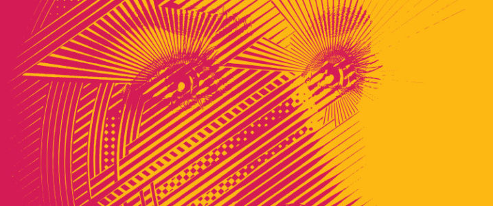
1. Size & Scale
Let’s start with the most obvious.
Size is the most prominent way you can make something stand out from the rest. On any given layout, our focus is poised to set at the largest and biggest element the first. To take advantage of this innate tendency, designers place the hero-element front and center, with nothing else competing for attention.
It is the easiest, most impactful, and bold way to attract the viewer’s attention. It lets your audience consume your product with no distractions.
But sometimes you want your audience to appreciate just how larger-than-life your design element is.

To do that, you need something next to it as a form of reference. With nothing to compare it to, size can sometimes mean nothing. Therefore, the scale also becomes an important principle of visual communication. You can show the scale of your hero-element by comparing it to a smaller shape, a smaller font, or even a muted color.
Placing your main element on top of another element can also help the audience appreciate the scale of your main design feature.
Keep in mind, though, that while size may be the most impactful form of displaying hierarchy, it is also the most obvious. If you are striving for subtlety, perhaps color contrasts could be a better tool. And this brings us to our next point.


Image Source: Behance

Image Source: Behance
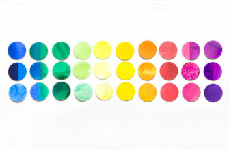
2. Color Contrasts
Colors that contrast with each other add a form of hierarchy in design that is both sophisticated and layered. This type of hierarchy not only tells you which design element deserves your most attention but may also contain the answer to ‘why’.
The reason is color psychology. Because colors have a psychology of their own, they are important carriers of visual communication. Think of Coca-Cola’s red logo. Not only the red emerges as the main feature of Coke’s logo design, completely overpowering the white, it also immediately tells you that this is a brand that’s lively, exciting and absolute fun.
Not only shapes but color contrasts play their role in typography, too. Consider a line of text. If a portion of it is present in bright shades, your attention will snap to that portion instead of the whole sentence. And that works better with brighter shades than with muted hues. If you pick two shades that clash with each other dramatically, you create the most contrast. But a gentle lavender with a rose pink blush will not make the same statement.
Therefore, using colors that create the most contrast – but not in a garish way (unless that’s what you want) is the most effective way to introduce color contrast in design.

Image Source: Behance

Image Source: Behance
3. Alignment
Where an item is placed on the graphic layout also makes a statement. Even when things look randomly placed on a design piece, you can bet your soul that it is never random. Elements that look strewn about, things that look out of place, serve a very important hierarchical purpose. They take the ‘pattern’ out of the equation and disrupt the design. Now you are looking at the design with even more concentration to find out which is the prized piece.
But to pull off such a design, you need to know where’s the line before the design will become too much, too distracting, and thus annoying.
In most graphic design work, things are aligned rather neatly, though. There are three major patterns of alignment that we see in graphic design today.
F Pattern: This pattern is most common in Western media. We read from left to right so most design pieces start from the left and go straight ahead. Our direction is then brought to look at the left column of the work before we once again look straight horizontally to skim the rest of the content.
Z Pattern: This is usually employed in logo designs. Our attention is diverted from the top-left to straight ahead, then brought down diagonally across the page and continued straight ahead once again to consume the content fully.
Central: This alignment method is popular world-over. Something that is center-aligned will receive our most and undivided attention. By adding size and color contrast features to it, you can make your central element pop out even more.

Image Source: Behance

Image Source: Behance
4. Placement
This one is closely related to the point above. Placement is different from the alignment in a way that it is less about the right and left margin and more about the placing of different elements with other elements.
Take the MasterCard logo as an example.
The orange circle looks bigger and more prominent as it is placed over the red circle.

Image Source: Wikimedia
Or consider this logo below:
The tree looks above the blue circle and therefore, even though the circle is front and center, we recognize the tree as the more important element of design.
Similarly, if something is placed a little closer to the image, it looks bigger and we perceive it as being nearer to us. This is what the rule of Proximity from the Gestalt theory tells us. It is also called depth perception. It is a fascinating study of how our brain perceives distance and how those tendencies help us in understanding the stimuli in our environment.

Image Source: Behance

Image Source: Behance
5. Typography
This is perhaps the most common form of visual hierarchy that we come across every day.
Recall the last blog post you read today or the last online news article you consumed. The heading comes at the top of it, in the biggest size and the most prominent font. The rest of the text is segregated into sections, in order of importance. All the subheadings (H1, H2, H3, and so on) follow distinct rules of size and style of type.
Then the body is present in a wholly different style of font.
These distinctions help us understand which part of the article is the heading and which the body. In the absence of it, we’d just have a large set of text that will look too lengthy and too unorganized to be bothered with.
Blog posts, articles, news items, and other text-heavy content uses typography-based hierarchy to organize itself and create a flow. It is also visible in all the other forms of content that use a bit of text in it: landing pages, print ads, taglines of logos, and even logo design themselves.
One part of the brand name will be in one font and the other in a wholly different one. These font pairings are used to create contrast in typography and help guide viewer focus.

Image Source: Behance

Image Source: Behance

Image Source: Behance
6. Adding/Removing Space
Visual relationships between design elements are also created and balanced through the use of white space. Increasing or decreasing the amount of available white space in a given design helps create organization.
You increase the white space (also called ‘negative space) between elements when you want to portray differentiation between elements. You do the opposite when you want your audience to perceive something as a group. The visual hierarchy that’s dependent on white space is a staple of minimal design too. The right amount of it makes your layout look neat and organized but too much of it and your design may look blank or vague.

In addition to creating visual relations, white space is also useful in making solitary elements stand out more, patterns to emerge, and silhouettes to form.
Take a look at this logo below.

Chef logo with a hat
The white space has been added to the design in a very strategic manner. Instead of looking like a void, it looks like a part of the logo.
Strategic use of it not only helps in the visual organization of the content but also works as a unique feature of the design itself.

Image Source: Behance

Image Source: Behance
7. Repetition
You want people to notice something? Splash it everywhere.
Repeating an element in your design helps in two ways:
- It increases its quantity in the design and thus makes it appear more important or as the hero-element.
- It teaches your audience to expect more of it, to look out for it, and associate it with your particular design/brand/business.
Repeated exposure helps in brand recognition as well as brand recall. And you can choose to repeat whatever element you want. Use a single, distinct font to highlight all the important phrases in your landing page copy. Repeat a certain shape to emphasize how vital it is to your brand. Repeat a color throughout your design to claim it as the featured color of your graphic design piece.
Repetition of an element prevents you from repeating the whole design everywhere. instead of plastering your full logo on every page, you can pick a single element – the main font or color – and repeat it throughout the thing.
It still works and looks more professional than cramming your entire logo into tiny available spaces.

Image Source: Behance

Image Source: Behance
8. Texture
Though not a major feature of visual hierarchy, texture helps in emphasizing the point. It helps you reiterate the organization you are trying to create by padding it with more design, without making it bulky.
Instead, textures add personality and character to the design. A splash of it here and there makes your design look exotic and authentic. And we aren’t even talking about textures that are specific to any culture or country. Take the silk texture, for example. Adding it to a logo design can make your logo look instantly rich. You can add this texture in such a way that the most important element of your logo can look richer and more under the spotlight than any others.
But don’t overkill with textures. Too much of anything is bad but with textures, it can be downright ineligible. So, tread with caution.

Image Source: Behance

Image Source: Behance
9. Lines
Lines, bars, strips, and strokes – they all represent movement. If your lines are pointing in a certain direction, the meaning becomes more obvious. Design briefs that are looking to create clear movements in design use lines to do the trick.
Lines also help organize the visual elements in sections and compartments. Using Gestalt laws of proximity, similarity, and closure, etc. you can create lines that segregate or combine different sections of your design.
Lines do not have to be straight or narrow to work for visual hierarchy. The rings inside a tree trunk, for example, use uneven and raw lines to show the passage of time. The strokes of different color gradients as the sunsets are another example of how you can use lines to create movement and passage in your design.
Find out more here on how you can use lines and other design features to create stellar branding assets, click here.

Image Source: Behance

Image Source: Behance
10. Grid
Consider the grid a container or a boundary wall that helps structure your design. The grid allows you to organize your design in ways that not only look pleasing but are better for the technique, too. Most importantly, the grid lets you work with the rule of thirds.
The rule of third guides the composition of visual elements in graphic design and other mediums. It is a simplified version of the Golden Ratio and provides the near-perfect composition that you get when you apply the Golden Ratio.
The rule of thirds consists of two horizontal and two vertical lines with four intersection points. This gives us nine parts to work with. When we position our focal elements on these intersecting points, we allow our design to organically adjust itself to the layout.
This natural composition not only attracts attention but makes it look appealing, too. Designers use various techniques with grids to make them work to the design’s advantage. Some of these tricks include modifying or breaking the grid to make the maximum impact.

Image Source: Behance

Image Source: Behance
What Happens When There Is No Visual Hierarchy?
The absence of hierarchy means there is no order of importance. In other words, the organization is random or flat. The randomness – in some cases – can enhance a design but mostly it makes the design look amateur or trying-too-hard.
But when the organization is flat – it just does not work. You are giving a flavorless and energy-less blob of shapes and words to the audience and expecting them to give it their attention. They won’t.
By creating organization in design or adding visual hierarchy to it, you are taking charge of the story you are trying to tell. You tell the audience what’s the plot and who they need to root for.
So, use these techniques well and tell the best story possible.


