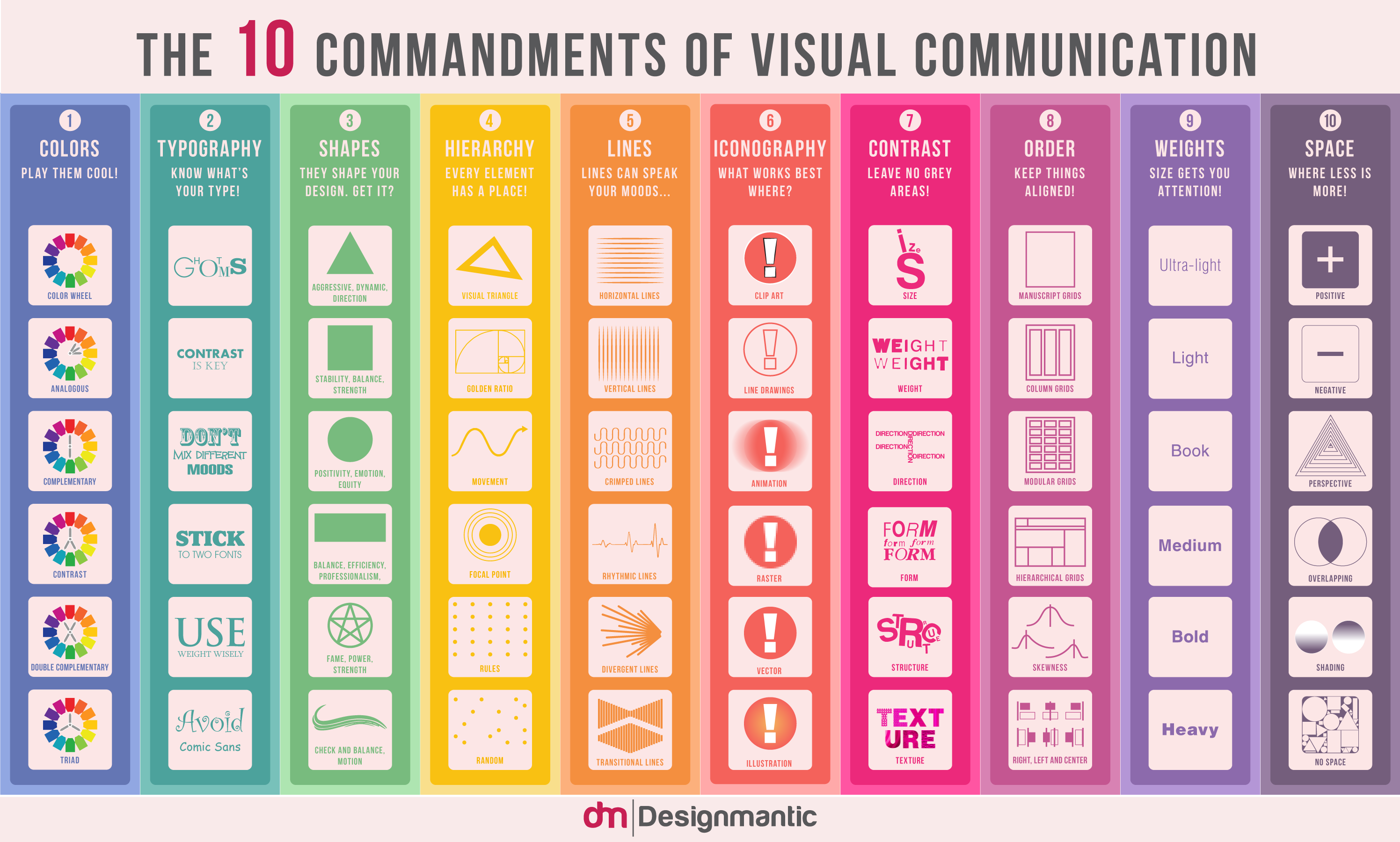
Visuals are everywhere. Since the last decade, the art of visual communication has boomed by leaps and bounds and is, to the date, on a marked rise. Today, one cannot imagine the internet without all the GIFs, infographics, and memes floating it.
With visual data on the rise and most of us being immensely fond of it, everyone now seems to be creating their own versions of it. Turns out, it has brought out the designer in all of us! So, in case you, too, are a part-time designer with little know how of the golden principles of visual hierarchy, below is an infographic that would work as a layperson’s handbook of visual communication.
1. Colors – Play Them Cool!
Get familiar with the color wheel. Understand analogous, complementary and contrasting color schemes to practice them in communication design.
2. Typography – Know What’s Your Type!
Do you know GHOTMS? Don’t mix different font moods. Get familiar with Typography terms and font families. And ideally, use no more than two fonts.
3. Shapes – They Shape Your Design, Get It?
Different shapes convey different moods such as circle strikes positivity and emotions, square depicts stability and balance and triangle gives a sense of direction.
4. Hierarchy – Every Element Has A Place!
Hierarchy is the key to great design. Grasp visual triangle, golden ratio, movement, focal point and rules/random alignments to make your communication clearer.
5. Lines – Lines Can Speak Your Moods…
Lines set the mood. There are horizontal/vertical lines, diagonal lines, crimped lines, rhythmic lines, divergent lines, transitional lines and more.
6. Iconography – What Works Best Where?
There are all sorts of icons from vector to raster, animated and illustrations. Learn to use icons to complement the visual communication and add spark to the message.
7. Contrast – Leave No Grey Areas!
Contrast comes in various forms. For example: Contrast of size, the contrast of weight, the contrast of direction, the contrast of form, the contrast of structure and contrast of texture, etc.
8. Order – Keep Things Aligned!
Keeping things in order is utmost important in design. Without order, the design is chaos. Use grids to keep elements aligned. Get to know different types of the grid to design better.
9. Weight – Size Gets You Attention!
From ultra-thin to black bold, weight can be used to put emphasis to a part of the message. Scaling weights to meet the need of design helps make the content more legible and simple-to-read.
10. Space – Where Less Is More!
Always, less is more about space. Use space generously to ensure clearer communication and give your visuals a room to breathe.
It outlines the various aspects of visual communication and sums them all up to perform as a complete guide to the art of designing, be it generating a creative logo design or developing a user-friendly website interface. he layout of the infographic lists typography, color, shapes, hierarchy, lines, iconography, contrast, order, weight, and space as the 10 commandments, and gives out the different applications of these w.r.t. design and visual presentation.
Let us know how you like it!
PS: Also snoop into our prequels to this infographic, “The 10 Commandments of Typography”, “The 10 Commandments of Color Theory” and “The 10 Commandments of Logo Design”.


Contrast – as you put it – is one of the 10 commandments of visual communication. Constrast is also readability: it is very difficult for the human eye to read bright yellow or green on pale pink. It seems your infographics breaks the first rule of contrast 😉
Can we post this in the classroom? It would be a good visual for talking about design.
You have a great design website.
Awesme infographic
It should be “principles”, not “principals”. Principle = rule, principal = head teacher of a school.