It is true that the beauty of typography lies in its endless options, convenient variations and its colossal nature and that typography knows no boundaries and it’s like yet another galaxy out there waiting to be explored and known. Even though typography is open ended with a lot of creativity to it, there are some deadly sins of typography that every designer should avoid. Hence, it is always good to know the tips to design cool logos, web interface or packaging, in order to save yourself from the trouble of experimenting too many fonts on your design.
Now, we shall explore the much interesting topic of typography in the field of communication design.
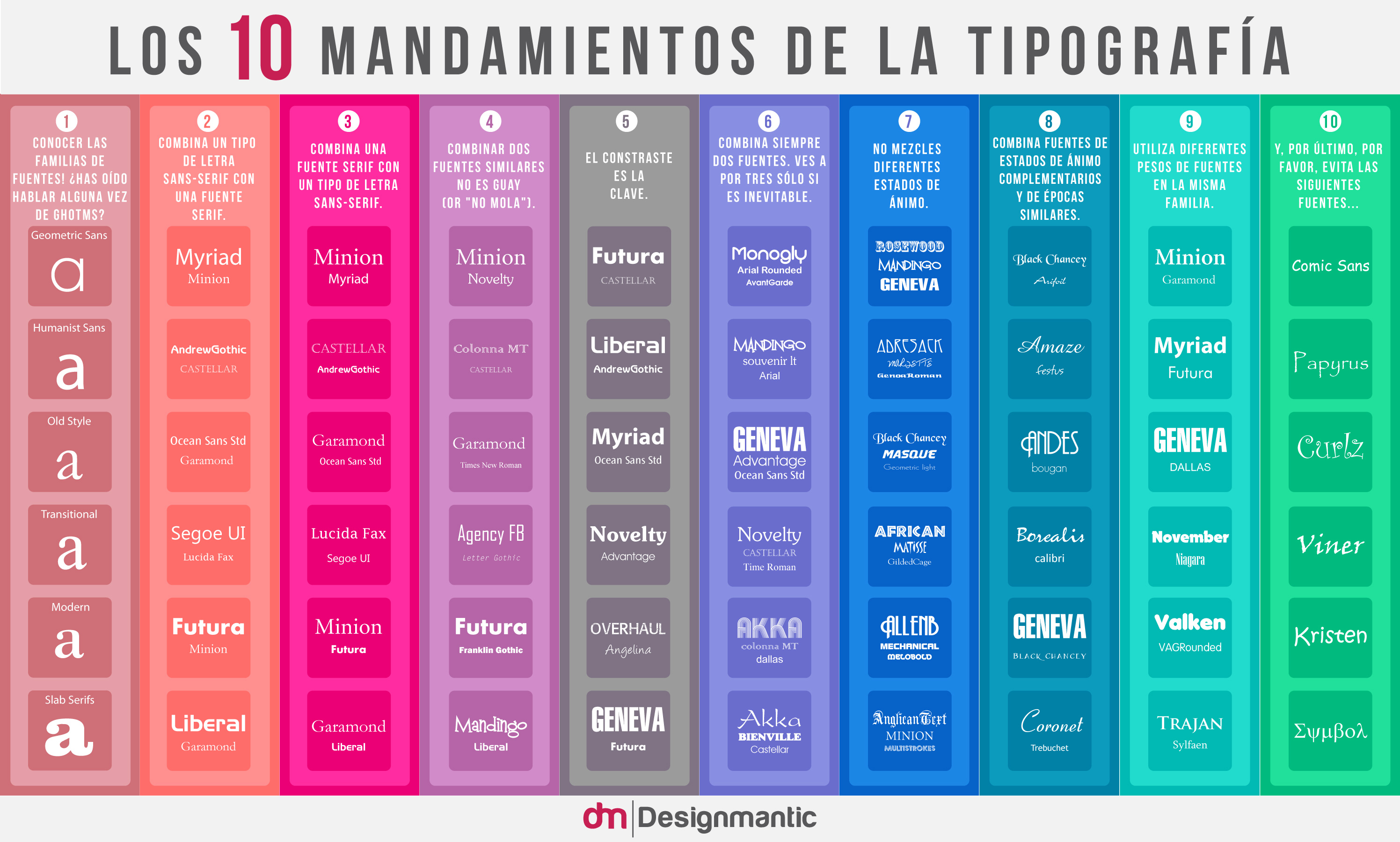
Combining and choosing fonts is an art. Fonts do not come easy, but once you pull off the right typeface, it can make your graphics stand out and, who knows, that type may even come out as the most powerful element in your design! The infographic below illustrates the, “10 Commandments of Typography” that could be followed as quite the basics when it comes to selecting fonts. Even though typography is an art and art is supposed to be subjective with minimal parameters, these rules can still be applied in order to save time and too much experimentation! Consider the following 10 statements as the best practices of typography:
Embed in your site:
• Update – The Spanish Version:
[Infografia] Los 10 Mandamientos De La Tipografia
Recognizing the interest of diverse communities in our Infographic, we have created a Spanish version of the ‘10 commandments of Typography’. Checkout and let us know what you think in the comments below. [Note: Thank you Ana, Franrome, C. Sandes, Santiago, Marcos and all those who contributed for your invaluable feedback, you guys are awesome!]
Embed in your site:
Brands can use fonts and typography to gain competitive edge over their competitors. It can be a great tool to add depth and character to the message. In our latest video, we have covered hows of building a great typography system for brands to stand out and shine. Check out!


No es fácil encontrar material bueno sobre el uso de fuentes ¡Gracias!
It’s interesting for me to find what fonts to avoid. I always seem to gravitate to them when designing things where they be appropriate, but for some reason I end up using another font. It’s as if I like the idea of the font, but once I use it I don’t find it pleasing to the eye. Who knew? Thanks for this useful info.
Hi Evan, thanks for the info!
A couple of notes though: The infograph is a bit confusing, the color code does not provide other function than distinction. Mixing positive with negative statements without a call out is somewhat confusing. Also the statement could be more clear: e.g. ‘Use different weights of fonts in the same family’ and the fonts displayed are from different families.
Best,
D
It’s a good start – but –
I have to be honest – 2 & 3 are the same. 5 uses fonts in some of the examples that ARE similar (not contrasted), and 9 should actually demonstrate the weights within the family (rather than show contrasting weights of different families). Oh and most importantly you forgot Brush Script in #10.
#10 is inaccurate. it’s missing Hobo… one should NEVER use Hobo.
10th one is the best
Also Brush Script!
This is great! Beautiful and helpful. Thanks!
Where does one research what fonts belong to what era?
I was recently forced to break rule #10, because a client INSISTED on using Papyrus for their book design. I hate myself, but sometimes you have to give them what they want.
I had to do that, too, when a client insisted on using Mistral. I hated it even when it was brand-new trendy.
Mistral begs for overkill and there are plenty waiting to oblige.
Excellent.
This is very silly one. 8 out of 10 of what is supposed to be the 10 Commandments of typography are about mixing fonts. That’s like 8 out of 10 Commandments of architecture is about bricks.
Also note that Liberty is a knock-off version of Handel Gothic, which is far less appropriate than Papyrus in the sense that we should be using the authentic ones, not a pirated version. Speaking of those “never use” fonts, there are plenty of meh fonts until the 9th rule (Arial, Masque, which is probably a free knock-off based on the NASDAQ logo, Novelty, a Souvenir knock-off, Ocean Sans and African, ripoffs of Stone Sans and Neuland respectively, and the list goes on…). The choice of fonts and their combination is quite random I have to say.
How is Arial not on the “avoid” list?
10 Commandments of Evan. Not Heaven. And mostly subjective.
Evan, this info-graphic sums up so many important typography rules, and answers a ton of questions that I get asked daily from my 20K+ followers on YT and my blog. I have already shared this out on all of my social networks suggesting each person print one and keep handy.
I gave a talk at the Portland Design Festival called “Foundations in Type.” One of the questions was “Do you have anything to say about font pairing?” It stopped me cold. Not that I didn’t have anything to say…I just didn’t want to inflict it on the audience.
Geneva over futura, I’m in love witchoo.
This is very simplistic. It assumes that typography consists only of choosing fonts. But I’ve even heard colleagues say things like: “which typography did you use?”, when what they meant was “which font”. I agree with the poster who said it’s like saying “architecture is about [choosing] bricks”.
Further, I wouldn’t ask “what font did you use,” when discussing design, I’d ask about the typeface. I’d ask about the font if we were talking about software (e.g., “which font was causing the conflict?).
This infographic is very ironic, considering that your logo was made with Harabara
What about the biggest mistake made by so many people – Never use caps alone with display fonts.
This would be “never use scripts in all caps.”
This would be true of all scripts, from blackletters to modern informals. There are display faces that look great in all caps (and some are only available in all caps).
One of the rules should be “Type is intellectual property. Pay for a licensed copy.”
Can I use it for my blog please?
_Ed Vega
Excellent.
Commandment 11: Always check your spelling, especially Complimentary/Complementary
This is great! We are sharing this with our Easel.ly audience because it’s so valuable. Thanks so much for the advice Evan!
I love this graphic. Is it ok if I use it in a blog post that I am writing. I am adding the link you provided and adding your name to the post. Awesome work.
Awesome awesome infographic 🙂
Thanks for sharing this.