Our tendency to look for inspiration in the same places is what keeps us stuck in creative ruts. However, the world is sprawling with creativity, abundant with beauty, and replete with art, and there is never a lack of inspiration to be sought out! While logo designers from around the world have varied approaches when it comes to design, one thing is irrefutable; good design is always in vogue! Even when you are unable to comprehend the calligraphy, symbols, and meaning behind a logo, you can always separate good design concepts and decisions from the bad.
Appreciating art goes beyond geographical and cultural lines, and is a universal feeling. Revel in glorious logo design trends from these 10 countries poles apart in culture and traditions, and see the diversified world of art unfurl itself:
1. Switzerland
According to the Swiss designers, the most viable way of showcasing your logo designs is to go back to the basics. As such, Swiss logos conjure up words like “minimalism”, “clean”, and “modern” to mind. The uniformity of white and black is also a formidable, chic, and classy tool of Swiss logos.
On the other hand, some Swiss designers walk the opposite road and have mastered the strategic use of color to craft memorable logos which delight the eye, while remaining minimal and uniform. The Swiss logos also incorporate plenty of white spaces to allow for some breathing spaces within the logo design. Swiss logos also capitalize on shapes to create continuity across different design elements or highlight a specific item within the logo design. The Swiss designers go to painstaking lengths to incorporate typography as a design element, especially to foster continuity between design elements.
And finally, for all the structure, minimalism, and clean lines, some Swiss logo designers don’t hesitate when it comes to showing personality along the way; sometimes with witty humor, sarcasm, or a sly wink to the brand they are representing. Overall, Swiss logo designs are eye candies! Ich wünsch Dir e schöne Daag!
2. France
France has always prevailed as a trend setter and a tastemaker around the world, and their logo designs are no less. Contrary to the refinement or minimalism of Swiss logos, French don’t allow functionality or commercialism to rain over their creative parade. With the right blend of sophistication, opulence, finesse, artistry, and ingenuity, French logos challenge their audience intellectually, emotionally, and visually. Pictures and icons play a big role in French logos and often narrate a visual story rather than convey a coded message to engage the audience.
French logo designers know how to break the glass ceiling and avoid clichés. With the use of avant-garde imagery, artistic typography, and distorted images, French logos are a piece of art, incorporating visual concepts to challenge their audience intellectually.
French graphic designers aspire to foster a connection with the audience by inciting an emotional response. The French are known at large for their intellect and passion, and they work diligently to create logo designs that create a dialogue to win the hearts and minds of the customers.
3. Mexico
Mexico is a zestful blend of Spanish, American, and English cultures. Despite this, their unswerving sense of national identity permeates every nook and cranny of the country; including its logo designs.
Deeply rooted in traditions and national heritage, Anthropomorphized animal motifs are a common feature witnessed in Mexican logos. Native wild and domestic animals, such as jaguars, donkeys, and roosters can be commonly found in logos.
Native Imagery in Mexican Logos
In addition, cacti icons are all the rage these days, becoming a key feature of most Mexican logos.
To render their logos a traditional, human feel, gritty textures and hand drawn elements are leveraged by Mexican logo designers. In addition, imperfect stylized hand lettering is often employed to inject a fierce personality into your designs.
Stylized Typography & Loud colors in Mexican Logos
The intricate detail incorporated in Mexican logos lend them an air of formidability. Most logo design elements in Mexico also drive inspiration from folklore and traditional influences.
Similarly, when it comes to the color palette, clashing and bold hues are always welcome to create cheerful and wonderfully saturated logo designs, which reflect their cultural attitude of taking chances and freedom. The colors of the Mexican flag are also commonly used in logos to tout patriotism.
4. Spain
Flaunting crazy festivals, mesmerizing flamenco dancers, and scrumptious culinary options, Spanish culture is anything but boring. As such, its eclectic logo design world never fails to deliver. Offering a wide array of approaches, techniques, and styles, the exciting design landscape of Spain has given birth to some of the most thrilling logos you’ll ever see.
The saying, “if you can’t make it big, make it red”, rings heavily in Spanish Logos. The eye-catching tone is employed in a plethora of ways; it can be the driving force behind a logo or a simple accent. Red runs deep in Spanish designer’s blood and one can never see enough of it in Spanish logos.
When it comes to the color palette, Spanish logos dive straight into vibrant hues, using triad, analogous, or complimentary color palettes. Most logos are also decked out with creative patterns and meaningful elements. Another striking feature seen in Spanish logos is the use of texture as a design element, adding a bespoke vibe to logos. Custom textures are used to convey specific messages, create visual interest, or create a certain feel.
Custom Texture in Spanish Logos
Bold type is also common in Spanish logos, since messages set in beautiful, large types are easier to communicate and easily accessed by the viewers. Most Spanish Logos are type centric, placing type center and front.
Bold Typography in Spanish Logos
5. Scandinavia
Designers from all over the world have taken a different stance when it comes to Logo designing. The reliable Scandinavian design however, incorporates heavy use of natural resources, sleek lines, and serene color palettes. The critical acclaim of Scandinavian logos can be attributed to their timeless beauty, utility, and functionality.
Clean forms and lines make up a significant feature of Scandinavian logos. In combination with minimal ornamentation and muted color palettes, straightforward forms and lines result in sophisticated and contemporary logos. The Scandinavian color palette often features cream, lovely sky blues, cool greys, and white shades.
Neutral palette in Scandinavian Logos
Scandinavian logos are simple, with all design solutions steered towards alleviating the complexity of elements, rather than cram the logo with attributes. Be it the typeface, the shapes, or the icons, a simplistic approach is defined to create serene logos. These logos are also predisposed towards minimalism, taking out all unnecessary elements and rendering the logos with reductive, radical, and stark forms.
Minimalism in Scandinavian Logos
Since Scandinavians have a penchant for the outdoors, Scandinavian logo designs often take after nature. Wood textures, patterns, shapes, and beautiful colors are deeply ingrained in the Scandinavian culture and can be seen across their logos.
Cultural Cues in Scandinavian Logos
Related: Hispanic, Caucasian and Afro-American – The Design Gap
6. Japan
Densely packed information, visualized personalities, exaggerated character designs, and bold colors typify most Japanese logo designs, and offer a wealth of inspiration to logo designers over the world. One thing you would notice instantly about Japanese logos is that they are teeming with life and color. While black and red is one of their favorite color duos, you are likely to see a broad spectrum of palettes when it comes to Japanese logos.
Brush strokes are a popular feature of most Japanese logos and this recurring motif relates to the ancient art form known as “shodou”. In addition, due to the intricacy of the Japanese character system, typography in Japanese logo designs is at great odds to its western counterparts. It actually takes a great amount of work to create a Japanese typeface, which is why most typefaces are repeated over.
Inherent symbols of harmony and balance, circles are a popular motif within the Japanese design. Mon is contained within a circle and has some sort of rotational or axial symmetry. The Mon is a prevalent motif throughout Japanese logo design culture. Mitsubishi logo is something we are all familiar with. While this logo doesn’t capture the icon circular shape in its true essence, it still manages to retain the rotational symmetry of the Mon to make for an even and balanced brand mark.
Harmonious symbols in Japanese Logos
7. China
For all the intricacy of the opulent Chinese culture; the Chinese logo design world is splintered to say the least; devoid of assignations, movements, and a unified identity. Thus, the contemporary generation of logo designers are striving to break the glass ceiling and dismantle restraints of tradition and rigor in a society that encourages respect for elders, following precedent, and continuity.
Considering China’s hive of entrepreneurialism, opportunity is thriving for visual innovation in company logo designing and branding. Not to mention, the ideographic nature of each character in Mandarin allows room for innovation, playfulness, and experimentation, despite the lack of fonts. Each Mandarin character is a work of art, replete with etymological layers and cultural associations, which is what the logo designers of today are capitalizing on to render a beauty and deep meaning to their logos!
Most Chinese logos communicate concepts through pictographs and ideographs, with each character simultaneously functioning as an image and a word. This fuses the iconic with the semantic, the expression with concept, and offers a remarkably beautiful and rich visual language of spectacular density, unrivalled by what the west has to offer. The formal sensuous lines, textures, composition, rhythm, energy, and brushwork of Chinese calligraphic art offers a sensory and engaging experience for customers.
Some logo designers draw inspiration from the expressive visual arts of china that offers an innate comprehension of harmony between textures, surface, lines, and points, and informs use of equilibrium, rhythm, symmetry, and contrast. For instance, instead of straight lines, curved lines are more prevalent in Chinese logo designs.
On the other hand, some Chinese Companies are predisposed towards the rising wave of westernization and are ditching the Chinese culture and symbology altogether in favor of logos that bear a closer resemblance to their western counterparts.
Western Appeal in Chinese Logos
Our verdict; Chinese designers should aspire to design logos that lean towards the rich Chinese heritage, albeit more minimal and simpler.
8. India
A country steeped in traditions, India has always been fondly remembered and exalted as the country of symbolic colors, a rich heritage, and a culture replete with symbology. To an outsider, India’s colorful stories, streets, and culture might seem like a page out of an ancient book, but in essence, color has always been a significant aspect of Indian consciousness. One only has to look at the enchanting Indian Mandolas to be swept inside a color vortex. India bedazzles and charms all and sundry with a kaleidoscopic rendezvous, and so does its logo design industry. Even though the universal logo design fads of minimalism and flat designs have slowly crawled their way into the Indian logo design industry, the symbolic use of colors is still prevalent.
Symbolic Colors in Indian Logos
Some logo designers in India have also leveraged the beauty and flow of the Sanskrit dialect to define their logo design, and speak to the public at large. Indian Logo designs are also loaded with religious symbology, ingeniously incorporated within the design to inflect it with a deeper meaning.
Religious Symbols in Indian Logos
9. Middle East
The land of magic lamps, flying carpets, and alluring sands is about to explode! Creative energy is running rampant in the Arab world and their logo design industry is a case in point. While the creative discipline is still burgeoning in the Middle East, it is all set to thrive in the coming years. Exciting and stunning cross-cultural designs abound, compelled by the present political and social situation and the influence of globalization on a local, albeit visually replete culture.
Replete with color and culture, Middle Eastern logo design industry is still a tad mystifying and alluring. It is strongly influenced by arabesque and calligraphy, and the repetition of patterns and forms. Budding logo designers are embracing classical calligraphy and incorporating it into their logo designs beautifully as a personal graphic style. While the Middle Eastern logo design industry has caught on to the fever of minimalism, it still manages to retain the vestige of Middle Eastern vibe.
Calligraphy in Middle Eastern Logos
Even with an extensive supply of Latin fonts, Middle Eastern logo designers find themselves with only a few types of fonts at their disposal. While before, Arabic typography used to be at odds with the importance of calligraphy and its aesthetic value, the rapidly growing wave of designers have come up with fonts fitting in with the international graphic setting. Arabic fonts have shown a marked development in the recent years and are projected to grow even further.
Western Fonts in Middle Eastern Logos
10. Netherlands
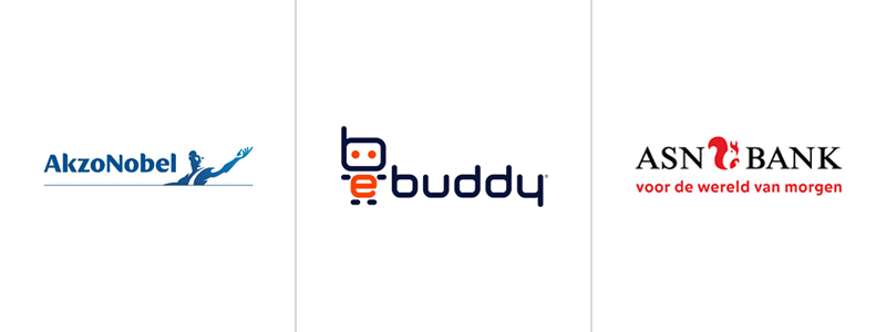
Home to varied landscape, preserved nature, and interesting cities, the country thrives in scenic beauty. As such, its design industry is inclined towards an individualistic, if not an anarchic approach. Dutch logo designers prefer minimalistic, clean designs; which is where the precursor of the Minimalist movement, the De Stijl movement, started in the first place. ‘Undesign’ is a popular design strategy and simplicity in logo designs is much appreciated with both the consumers and the companies. Dutch logos talk more formally to their audience than their candid western counterparts.
Most Dutch logos you would come across are modern and Dutch in essence, but incorporate natural elements and nature wherever they can.
Natural Elements in Dutch Logos
On the other hand, some avant-garde and revolutionary Dutch logo designers harbor a penchant for contemporary themes and conceptual art Dutch logo designers are famous for designing conceptually. Keeping in line with their predilection for out of the box designing, one notices a lot of custom typefaces in these Dutch logos as well.
Brainstorming vortex; And the Award for the Best Logo Design Industry goes to…
It wasn’t an easy feat containing the sprawling realm of logo design within just 10 countries. The global culture of logo design is so dynamic, ubiquitous, and constantly evolving, but logo design trends from these 10 countries, poles apart in culture and tradition, are a good starting point for anyone seeking inspiration and looking to expand their creative horizons.
For me, I have developed somewhat of a penchant for French logos. Granted they are unconventional in modern design terms, lack the refinement and minimalism of Swiss or Scandinavian logos, or the exaggerated characters and the vibrant hues of Japanese designs, but they are certainly loaded in characteristic features that run the gamut from ideological, to philosophical and aesthetic. The French have always held a reputation for being chic and stylish, and the reputation has endured for centuries, reflecting now in their logo designs.
Now over to you! You just saw the world in a whole new design. What are your feelings and thoughts about the visual techniques and trends employed by logo designers around the world? Is there one that catches your eye in particular, or have you observed any recurring trends?
Feel free to leave your thoughts in the comments below!




Good collection, it would help me a lot.. Thanks
All designs fantastic. very helpful and interesting! Great and True Marvelous People who made this logos.