- SALES / SUPPORT : 855-752-5503
Now that drones are dropping packages out of the sky, the market has never been more primed for ecommerce websites to pop up. And, with a drag-and-drop website builder for web designs, even those with exactly zero programming knowledge can begin building their empire. But, of course you know that - it’s why you’re here. So, let’s get started.
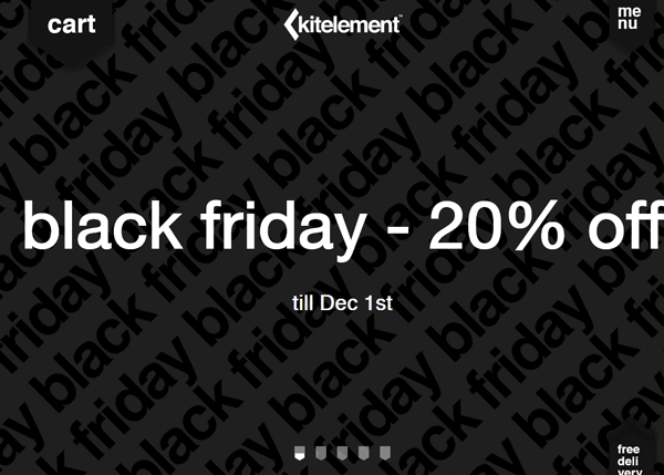
Image Source: kitelementshop.com
Before we start doing anything, we need to address the main concern. What do you need your site to do? And, what do users need it to do? You need to build a purchasing platform that links both together seamlessly, and beautifully. We’ll come to aesthetics in a little while, but first, let’s focus on the nuts and bolts.
Above all else, you need your website design to facilitate the sales of your goods. That means that you need an online store. But, of course, there’s lots of variance in terms of how that can look, and function. So, before we go any further, you need to decide whether you want it to be bristling with personality, or just a simple point-and-click user experience that gets them from the landing page to convert at the checkout page the fastest.
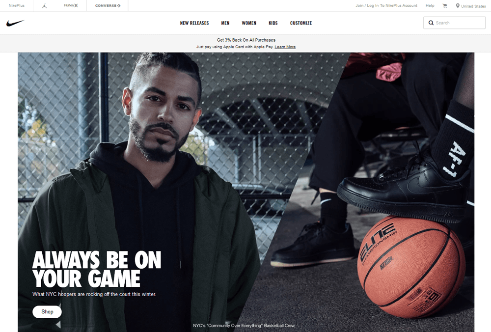
Image Source: nike.com
Unfortunately, even with the second, you need to find some way to entice them. You need to have the things that all ecommerce sites need to have, and that’s great products, at great prices, presented in a great way. There are lots of merchants that allow for secure payments, so you’ll definitely need one of those too, if you expect people to fork over any cash. But, beyond that, you need to capture users and keep them on your website long enough for your products to take hold.
Check out our:
Take Space Goldman’s site. It’s the perfect example of give and take. They need to generate revenue by showcasing products modeled by an adorable husky. This is the only function of the website. So, because of this, there’s an anchored scroll page that showcases the model in all her glory. And, at the bottom, there are the contact buttons and options. This site is a perfect example of simplicity and necessity, which follows the principle of user interaction design (UI) and usability. It gives the customer everything they need to know - evidence of the quality of the product, and a way to acquire it. So, even if you land up using a website builder with simple design, it’ll work out nicely for your ecommerce store.
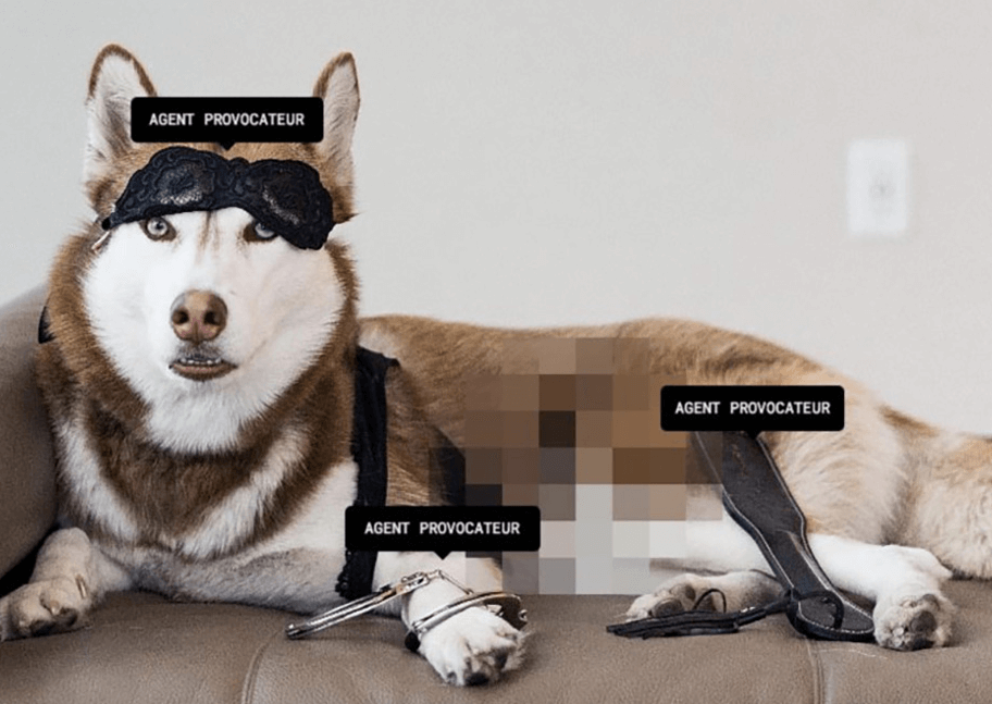
Image Source: spacegoldman.com
If we look at Larks Head, a fashion company that makes high-end loungewear, we can see again that they opt for this blend of necessity and aesthetics. You go to Larks Head to shop for clothing, so when you land, you’re shown their slogan ‘Wear What Matters’, and a button that says ‘Shop Now’. From there, it takes you to their clothing lines. And it’s as easy as that. There’s no question of why they’ve arrived at the page. There’s no fuss. They need to sell the product, and you’re there to buy, so why beat around the bush?
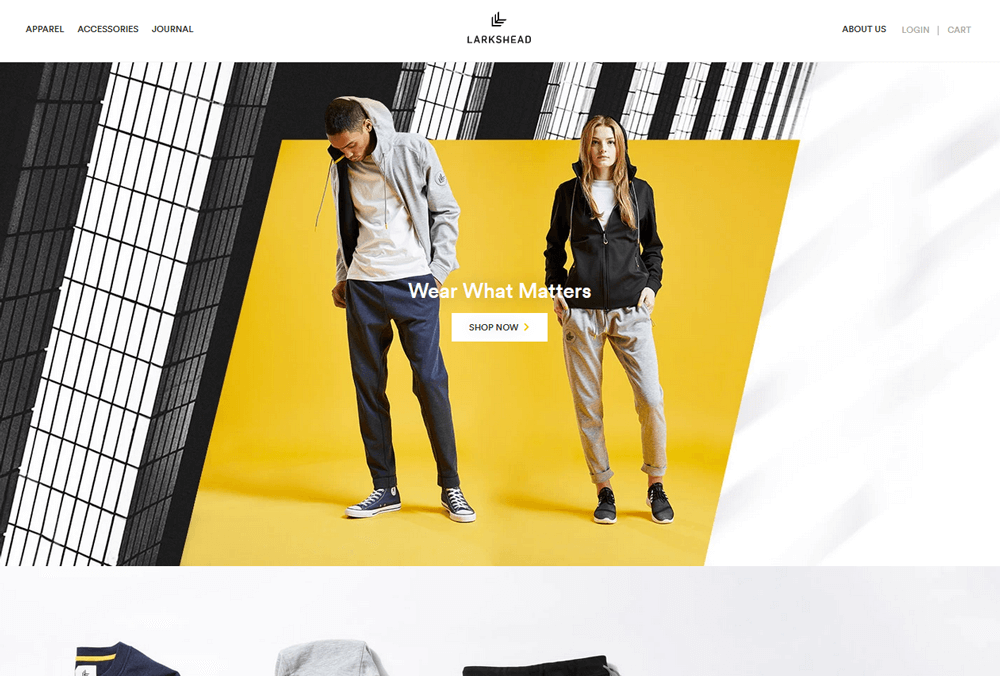
Image source: larkshead.com
User Experience is vital for a successful ecommerce store. Now, UX is one of those terms that gets thrown around a lot, but in essence, what it means is the experience that users have on your site (go figure). But, further to that, it focuses on the understanding of users, what they need, their abilities, and also their limitations. When you’re thinking about the UX design of your site, you need to weigh up who’ll be visiting, and what they’ll be looking for. If you’re selling golf clubs to older, less tech-savvy individuals, you may want to consider putting them on the front page along with your brand visuals such as golf club logo design, social media, product images, so they’ll not have to navigate or search for anything. If you’ve got a complex site that sells computer gear for programmers and other tech-driven firms and individuals, then you’ll have more rope to play with in terms of setting everything out in a way that gives the best representation of each product, rather than simply showing them the most popular.
When you come to put your site together on a website builder (or actually, before), you need to ask and answer some questions that will help make the functionality and design choices for your website design features.
Peter Morville created what’s known as the UX honeycomb, and it’s still just as apt and perfect now as it was the day it was made. There are seven sections to it. Is your site: useful, usable, findable, credible, accessible, desirable, and above all else, valuable? Yes, yes, yes, yes, yes, yes, and yes - but how? These seven questions will help you shape the way that your site functions.
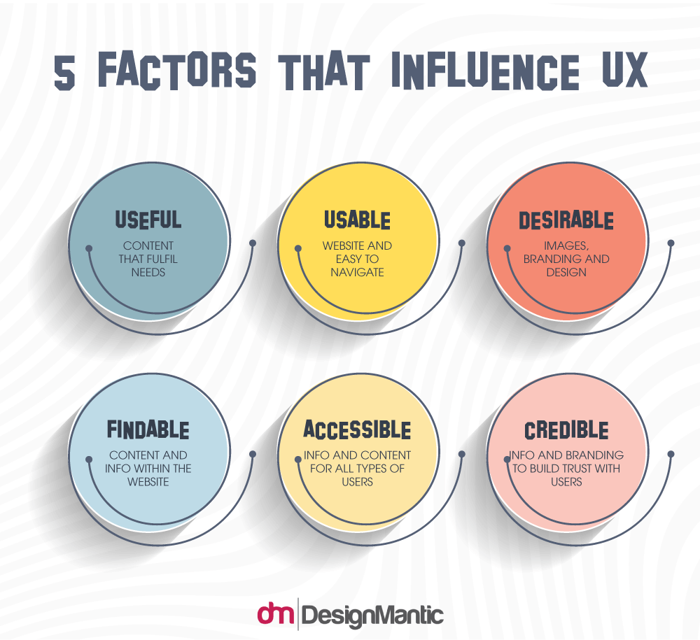
Sources: Prototypr.io, Usability.gov
Though, if you want UX inside tips (and this is just a little hint here), the best way to design the UX of your site is to deliver a front page that shows off your product categories. The funny thing with UX is that you can tell what works and what doesn’t by what the other companies are doing. And, if you check out ecomm.design, a site that brings up and ranks all the top ecommerce sites, then you can see that all the heavy hitters have that layout in common. UX design is about delivering time-value as much as product-value. That means that your customers need to land, and be able to click through to where they want to be immediate. All of the top sites have a big, gorgeous photo at the top, an understated nav and menu bar above it, and then dominating the middle of the screen, a button, or subheading, or something that drives users to the products. This is obviously a tried and true way to go about it, and when you’re just starting off, do you really want to be taking risks?
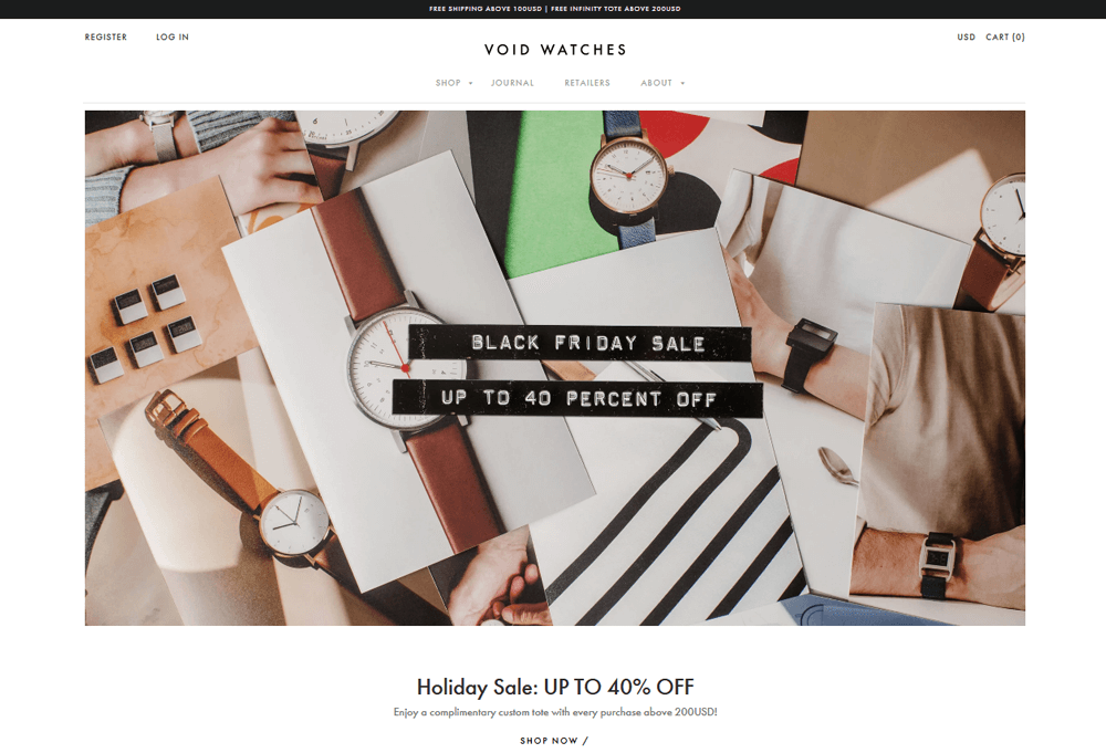
Image Source:voidwatches.com
Take Void Watches for example. Their website is the definition of simple and elegant, using the elements of minimal website design. White background, respectable serif font. The only color is that of the photographs. They make no effort to disguise or mislead. They just deliver from the get go. They make minimalist watches that are functional and stylish. Their pictures are all clickable links that take you to the different styles, but they work on two fronts as they also tell the story of the watches, showing how they’re assembled and how they’re packaged. This makes the UX seamless. The page navigation is utterly intuitive, and the checkout process mirrors the brand. Simple. Minimalist. No hassle.
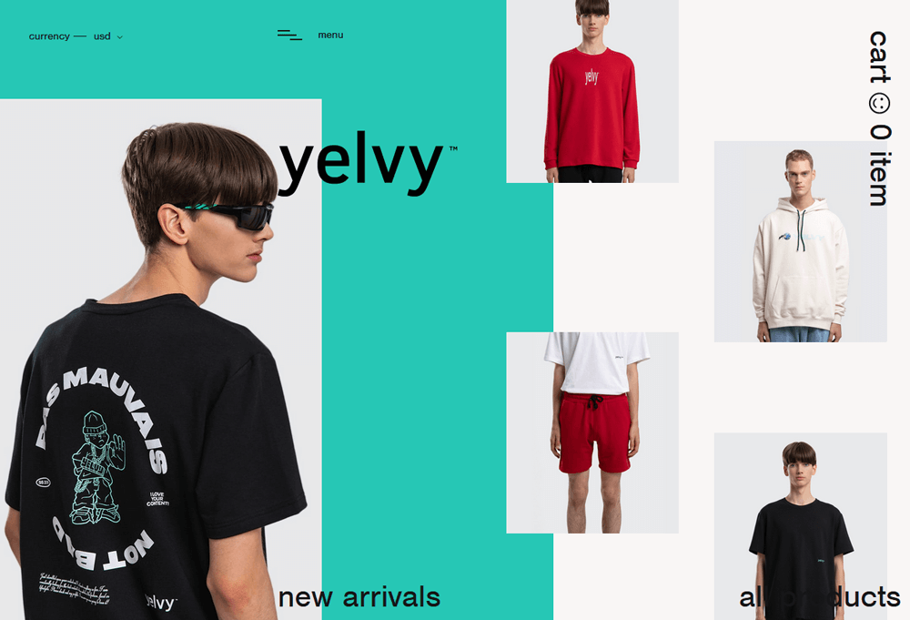
Image Source: yelvy.com
Yelvy is a more modern example of great UX. Their elements appear one at a time, giving you a step by step feeling. The product pictures show up last, and when hovered over show the categories of clothing they show too. A simple click takes you into their product, and a dynamic display lets everything move as you move around the page, helping you to find what you want without having to click through pages. This site is more focused on UX design elements than the products itself, which is why it’s both a great, and poor example of how to build a site. It’s very focused on a younger target audience, and assumes that they are the most tech-driven, and will be able to navigate the site confidently. However, this style of design also alienates anyone not comfortable with a website this daunting. As such, it makes a show of how UX can be tailored to a specific audience, adding to a feeling of exclusivity, because anyone outside of that demographic will have no hope of navigating it.
Check out our:
The question of conversion is bound to come up when designing an ecommerce site with a website builder. What conversion does is it turns visitors into buyers. And while the product and the UX will have a lot to do with this - do they want the product? Is it easy for them to find? - There are other factors and methods that can be utilized and employed respectively to bolster your conversion rates.
There are loads more tips, and we could likely do an article on conversion tactics alone (or three of them), but for now, let’s move on.
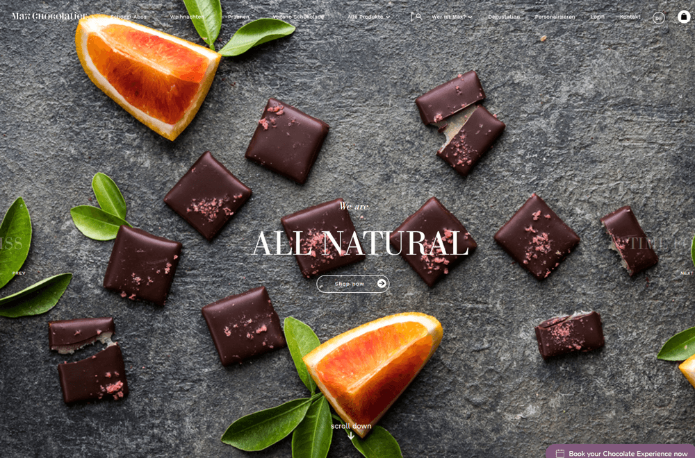
Image Source: maxchocolatier.com
Max Chocolatier website is a really great example of e-commerce store customer conversion tactics. Their scrolling gallery offers different options that are sure to appeal to different people. Their gallery showcases, in order, that the products are Handmade, 100% Natural, Unique, and Made in Switzerland. There’s no arguing with the authenticity of this product, and those sorts of keywords appeal to the sort of people who’ll be buying high end chocolate like this.
Scrolling down takes you straight into seasonal gifts, so even if you didn’t realize you wanted a chocolate Easter bunny, you do now. The massive, gorgeous images of the products entice us, and the sales copy is precise, and plentiful. While the use of visual tools in the web design doesn’t push sale items, they don’t need to because they know that posting such fantastic pictures of chocolate is enough to make anyone crave a box. They’re playing to their strengths, and telling everything you need to know, and more.
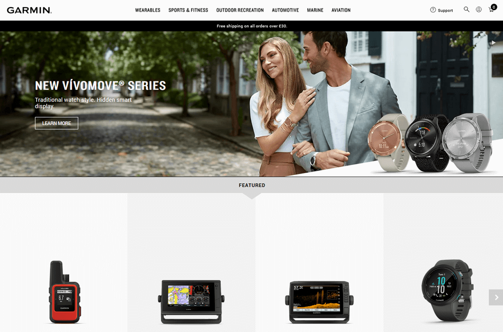
Image Source: garmin.com
Garmin is a prime example of the latter tips. When you land, the first thing you see is a banner advertising free delivery. From there, they don’t make any sort of effort to disguise what they do. They make high-quality technology from smart-watches to avionics displays. Their copy is lengthy, detailed, and comes with all the specs laid out for you. If you’re searching for avionics HUDs, then you don’t need anything other than all the information which tells you what it does. The depth of their sales copy is what sells their products, because they know that tech-buffs want all the information they can get before making a purchase. Knowing your market, and providing information where necessary is what can set your ecomm stores apart with an outstanding interaction design.
Check out our:
SEO is a fickle game at the best of times. SEO is the Holy Grail for ecommerce sites, and we just want to cover some of the basics here. Google Bot will crawl your website store for all written information and alt text, and will then index your site for search rankings. Dependent on how reliable and relevant your site is, it will either pop up on the first page, or the fiftieth. If, however, you’re not on the first page, then you might as well not bother. The number of people who click through the second page is very, very low. So, how can you combat this? It’s simple. Time. Care. Attention to detail. Great keyword optimization can be achieved with a web template from a web builder.
Choose some keywords, like ‘handmade wooden jewelry logo’, or whatever it is that you’re selling, and then make sure that it appears on every page, and every new block of text. That means that your landing page design splash text, your product descriptions, your image Alt Text, your meta tags, your blog posts, your social media posts. Everything. Everywhere. Google will be looking for words that recur, and will assume they’re keywords. You don’t need to do anything special except use them naturally, and often.
However, be aware that keyword stuffing will be detected and punished, so don’t think you’re clever by putting them in white so they’re invisible, and repeating the phrase fifty times in the footer. Google will know, and it will push you down the rankings.
The best way to boost your rankings is to post content consistently. Upload new products with new descriptions, post new blog content, and update the website frequently. All of these additions will help you climb the SEO ladder. With a website builder, it’s simply a matter of drag and drop content but it will make a huge difference to your ranking. Note, however, that simply removing a product and then re-uploading it will do nothing except confuse the Google Bot. New content that is both relevant, and unique is key. Think of those two words every time you’re looking to post content. It has to be pertinent to your site’s core function, and it has to be unique, so copying and pasting other product descriptions of keyword-heavy splash text will do nothing for you but take up real-estate.
Other than that, crosslinking is your best friend. Link from page to page, from your site to others, from your social platforms to your site, and get everyone else to, as well. Google finds links to be a signifier of a reliable site, so work on getting yourself out there, and get people talking about (and linking to) you.
Beyond that, it’s a waiting game. Slowly but surely, by following those core concepts, you’ll improve your SEO and climb the rankings.
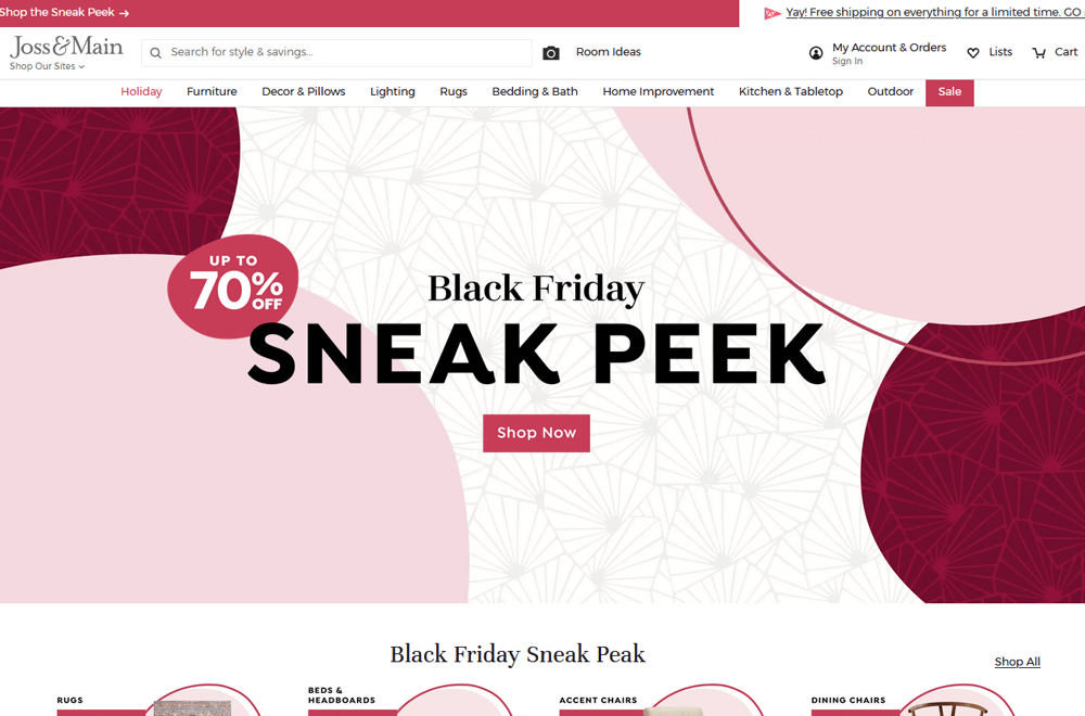
Image Source: jossandmain.com
Joss and Main is probably the perfect example of how to craft an ecommerce website design specifically for SEO. Count how many chunks of text they have, how many pictures, and how much content is spread across their pages. Their metadata says: ‘Visit Joss & Main to get picture-perfect styles at too-good-to-be-true prices. All orders over $49 ship FREE, because an amazing deal is a beautiful thing.’ Every single scrap of writing has the words ‘sale’, ‘deal’, ‘great prices’, or something else that stands for their value-for-money. Though the design is really tightly packed, they’re making that concession in favor of a strong SEO showing. All those images have alt text which Google crawls and indexes, making them the top hit for anything to do with the word ‘furniture’ or any other pieces of furniture, ‘sale’, ‘deal’, and of course, ‘Free Shipping’, because that appears everywhere on their site. If you want to pack your site out for SEO, then look at how Joss and Main do it, and follow their lead.
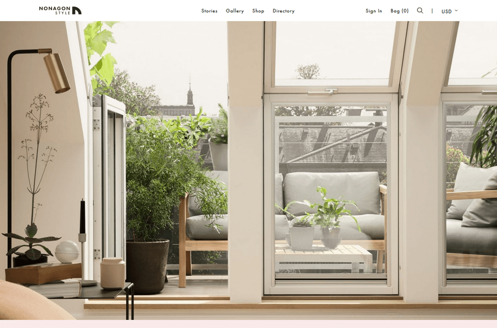
Image Source: nonagon.style
Nonagon is in the same industry, but employs a different tactic. Using a super-active blog and photo gallery, they capture users by stuffing their articles with keywords to catch traffic. You only need to look at their blog posts to realize that this is where they’re focusing their attention. On their menu, the order of categories is ‘Stories’, ‘Gallery’, then ‘Store.’ They entice users in with their SEO focused blogs, and then after they fall in love with the pictures and tips there, they drift over to the store because they now want their own houses to look like the blog posts. They rely on volume of traffic making that leap to the store without being pushed to do so. This means that their blog’s SEO is driving their store. It’s a bold move, but only stands to prove how effective their SEO strategy is. Check out their ‘Stories’ if you want to see how a blog can move product.
Check out our:
Though it’s number five on the list, you need to be aware that how your site looks is key. With DesignMantic’s drag-n-drop website builder, you can make your site look professional with ease. But, it’s also important not to make it look too generic. Head over to Awwwards.com/websites/ecommerce which is a site that literally gives awards to ecommerce sites (and others) for inspired and beautiful design. You can see that there are a lot of common elements in the best ones. Flatter, more pastel colors, big, glossy images with white or black text on them. Clear links to products. Well-designed nav and search bars. It seems like a simple formula, but you’d be amazed how many companies miss a beat with the initial design. It’s important to gain traction quickly, and get off to a running start. And apparently, there’s a pretty reliable recipe for doing so.
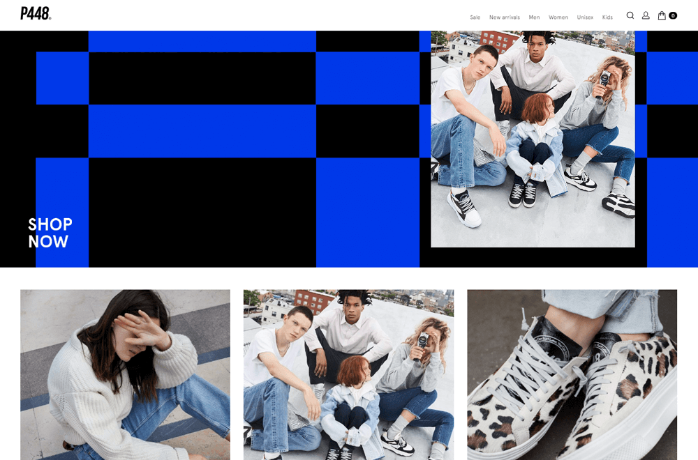
Image Source: p448shoes.com
The main thing is that as soon as they land, they see a big, high res image of a great-looking product, your brand identity, and your tag/hook line. Take P448 for example. Their page is the definition of simplicity, but there’s no mistaking what they sell. You can scroll down and all you see is pictures of shoes on a white background. All focus is on the shoes. They know what they’re selling, and they’re proud of it. This site is designed around those photos, and shows off a high level of visual cohesion. Starting with a goal in mind is key for creating something beautiful, and P448 prove that it doesn’t have to be complicated to do so.
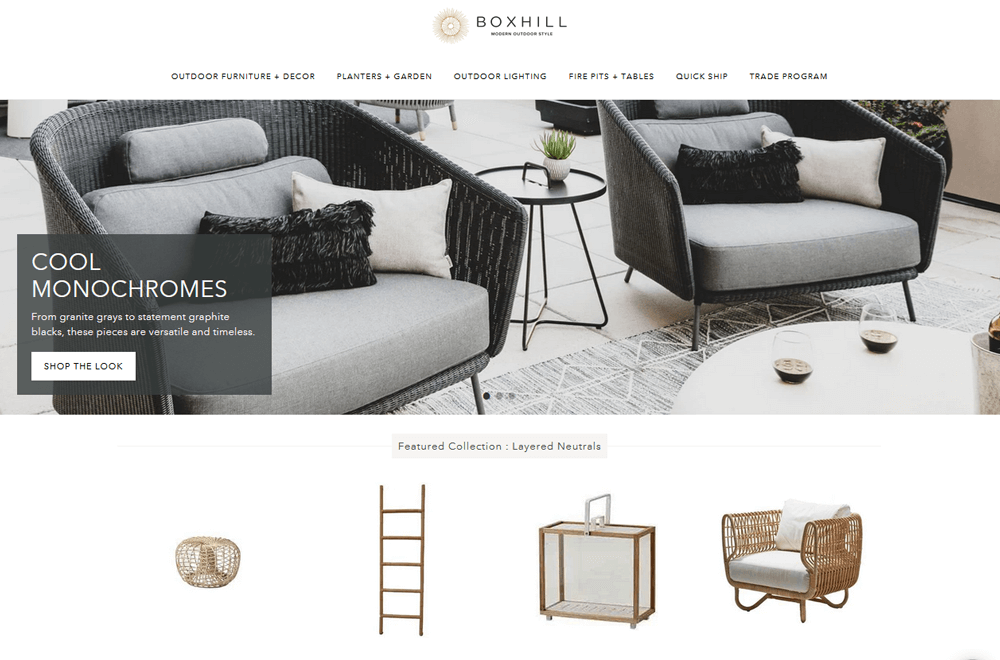
Image Source: shopboxhill.com
Our last tip for you is a big one, too. Communication and Distribution. What we mean by that is that customers need to be able to communicate with you in a real way, and they need to be aware of how distribution works.
Transparency is key in today’s modern age of cloak-and-dagger data mining, privacy violations, internet scamming. People want to feel like you’re a genuine person, selling genuine things, and that you’re not trying to screw them over. As such, a good and honest About Us page on a website is something you’ll want to have, as well as a solid Contact page that provides lots of ways to get in touch. Active and responsive social media accounts will help too, and when it comes to purchasing products, you’ll want to have several payment options that include big name merchants so that people feel secure. You’ll also want to be clear about how you’re shipping, and where you’re shipping from.
Image Source: iStock.com/filborg
On that subject, you also want to make sure that people know the products’ origins. Where and how they’re made, what they’re made from, and where they’re being stored. If you’ve got them boxed up on your kitchen table, then you can probably bend the truth a little and say ‘Storeroom’ or ‘Storage Facility’, and no one will bat an eye. Most ecommerce sites start up from spare rooms or home offices these days, but whether you’ve got a four by six closet for a headquarters, or you’re renting a huge facility stacked to the rafters with stock, it doesn’t matter. What matters is that you’re a real person behind the keyboard, and people believe that. Communication is key, and in the early days of an ecommerce site, every customer is vital for survival. Don’t do anything to hurt your chances of succeeding before you even start.
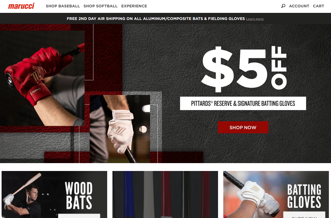
Image Source: maruccisports.com
Take Marucci, for example. There are pictures of people all over the site. Halfway down the page is a video telling their story. If you scroll to the bottom, you can see that they have six social media accounts. They have a community section, their own TV channel, a sitemap so you know where they are. They’ve got the returns policy right there too which asks you to contact their customer service team should you need anything. You can 3 them using one of three ‘Contact Us’ buttons on there. Or, if you want, just call them! They’re proud to offer these services, because they want to assure their customers that they're real people on the other end that are just dying to deliver great products to you - and it’s likely why they’re so successful.
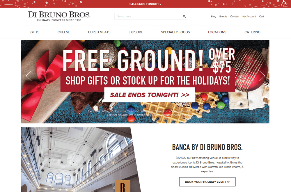
Image Source: dibruno.com
Di Bruno Bros. is one of those family run businesses that really push that to make people trust them. Their landing page design is chock full of smiling faces, pictures of their employees, and of the brothers too. Everything is ‘Our Story’, ‘The Community’, or ‘Contact Us’. In fact, it’s almost difficult to find out how to buy anything from them. And when you do, it’s categories in categories of things to click through. This is a website geared up towards communication, and they hope that you’ll be so sold on the brand that you won’t mind the sub-par UX design. They are optimized for mobile first design to ensure users can access their community, product and company any time.
All of these examples go to show that there are lots of ways to build a site. But, most importantly, it’s about knowing your market, knowing your target audience, and knowing how you want to sell it to them.
So, stick to these tips, and you’ll be giving yourself every opportunity to succeed.
Oh yeah, and good luck!