
The global digital population is 4.57 billion; slightly more than half of it is coming exclusively from mobile devices. According to internet usage stats collected by Statista, the total share of mobile internet traffic is 50.44% of the global traffic.
Creating websites for mobile or jumping straight to mobile apps is very economical. A large proportion of new startups have skipped the desktop phase entirely and gone straight to mobile versions. India is the country leading this trend. But this trend and these numbers have been consistent since 2017. And what does it mean for your business?
Simply put, it means that you need to pay more attention to mobile design than desktop design. More than half of your internet traffic is looking at your business website on their mobile devices. If your site is not mobile-optimized, you and your business are in trouble.
What Is A Mobile-First Design?
It is a design approach that emphasizes mobile architecture. In the words of Eric Schmidt, a former Google CEO, “…the answer should always be mobile first. You should always put your best team and your best app on your mobile app.”
The reason is simple. Google had long anticipated the surge of mobile internet usage. So, it prepared all its services to cater to the mobile audience first. Its search rankings also favor websites and pages that are mobile-optimized, instead of desktop. Therefore, as a business or AI software development company, not only a mobile-first approach makes sense for profitability, but survivability, too.
The mobile-first design approach also works in the sense that it lets you look at your UX/UI in a more user-centered way. Since you can only use so much content on a smaller screen, you only choose what matters the most. With the mobile-first design, your website and social media designs are focused on giving people exactly what they want. This focused-approach helps you stay centered on users. When you expand your content and design later on (on desktop version), you already know the heroes of your content and design: the pieces and features that matter the most.
Related: How Mobile Marketing Can Inflate Lead Generation for SMBs
Mobile-First Design Tips:
Designing for mobile-first follows a progressive advancement approach. Meaning, you will start from the basics and advance to more elaborate details of the design for progressively larger screens. The following tips will help you focus on the most crucial aspects of mobile-based browsing designs and will help you learn how to ace these functions without compromising on design integrity.
1. Mobile-First Design = User-Centered Design
User-centered design prioritizes design elements that work for the users. It teaches designers to approach the design philosophy from the user’s POV. What works for users is what will stay in the prototype while all else will be left behind.
The approach to mobile-first design is very similar to this.
Mobile-first design distributes the design elements and features into what is the most essential and goes from there. We keep the most essential aspects of design for mobile and leave the rest for larger screens. It is how progressive advancement work.
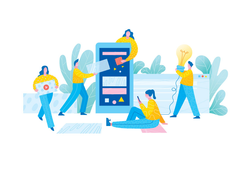
Image Source: iStock/miakievy
Why is it so? Because like we said above, a smaller screen (mobile) only gives you limited space. There is a finite number of functions, features, elements, and details that you can add in that space without overwhelming the layout, and possibly crashing the whole app. Therefore, we only focus on things that improve the usability of the produTherefore, we only focus on things that improve the usability of the product and don’t pay attention to unnecessary aesthetic decorations. When implementing mobile-first design principles, it’s beneficial to consider hiring a Vue.js developer who can help you create a responsive and user-friendly web application tailored to various screen sizes.
2. Streamline The Content
Once again, divide your content into categories. Look at your SEO trends, keyword research components, and analytics and prioritize your content based on what your customers are looking for when they access your business. It will primarily base on what your site’s or business’ goals are and help you improve your mobile SEO.
For example, if you are a retail website, you want to focus on products. If you are a news website, your focus will be the latest news and updates. So, distribute your content into tiers: primary, secondary, and so on.

Image Source: iStock/miakievy
For instance, a retail store’s desktop website may contain a link to its blog on the home page. But when thinking mobile-first, keep the content on your home page focused and streamlined. Display product pictures, prices, and Buy buttons. Links to blogs, About Us, and other such material can go into hidden menus.
3. Visual Hierarchy
The real estate on your mobile screen is precious. So make sure that your most prized elements are displayed prominently on the screen. It primarily includes all the visual elements such as your business name and brand logo maker. Display them on your navigation bar. The rest can either be inside the hamburger menu or navigation button, whichever you want.
Related: 15 Golden Principles of Visual Hierarchy
Next, your website’s main content. Is it news, products, services, blog? Whichever it is, make sure it is displayed front and center on your mobile screen for easy access. Why? Because most of us use only our thumbs to access the content on our phone. So the middle and center area on our phones is the most prime location. Make sure that the ‘meat’ of your business is visible in that area.

Image Source: iStock/miakievy
Also, ensure that frequently-touched buttons on your screen are placed prominently, and in appropriate places as well as sizes.
4. Keep The Navigation Intuitive And De-Cluttered
The rules of frugal design apply to your navigation bar too. You do not have enough space on your mobile website to include all the menu buttons that are typically present on a desktop website: About Us, Contact Us, Services, Products, etc. To optimize performance and scalability, you should consider getting started with Kubernetes, which helps efficiently manage backend services to support a seamless mobile experience.
Therefore, we will keep the buttons on the navigation bar limited: the brand logo/name, a major CTA (Buy, Search, Subscribe, etc.), and a collapsible menu button for all the rest of the items. This collapsible menu can be in the form of a hamburger menu button (most popular) or a navigation button, whichever you prefer.


The difference between Apple’s and Tesla’s mobile sites is that the former’s navigation bar also includes a pictorial ‘Add to Cart’ button. On the other hand, Tesla suffices with only displaying its most prized product in the center of the screen. Both approaches are workable.
Keeping the navigation minimal and purposeful, you have a lot of free space to display what your business is all about.
5. In-Content CTA
Call-to-Action buttons are a necessary part of any kind of web design. You need to tell your customers what actions you want them to take when they are on your website. Do you want them to buy from you, subscribe to you, search for something, know more, or anything else?
A great way you can make use of the limited available space is to include secondary CTAs within the content of your site. These could be in the form of hyperlinked text, suggestions, extended offers, and more.

Image Source: iStock/miakievy
Keeping in-content CTAs will ensure that your content (whether articles or products/services) is getting the necessary exposure it needs, without cluttering the design or overwhelming the audience. In-content CTAs encourage further action in subtle, more organic ways. Conducting a website content audit can help identify the most effective places for in-content CTAs, optimizing user engagement and ensuring that your content strategy aligns with your business goals.
6. Touch-Friendly Buttons
The size and placement of the buttons on your mobile website need to appropriate enough to be touch-friendly. As we use our thumbs to access most of the content on mobile phones, the touch-targets on any mobile website should offer easy accessibility with a single thumb-press/swipe.
It will also include using a legible font in a larger size, so reading what the button says is not an issue.
7. A Clean Layout
Your small screen design needs a lot of negative space to shine. The negative space (also called White Space) streamlines the visual content in a way that a lot of space separates each element, enabling an organic categorization and prioritization.
Contrary to popular belief, negative space does not have to be white. To make the design more impactful and attention-grabbing, you can add any block of color matching with your brand colors in the negative spaces to make the design pop.

Image Source: iStock/miakievy
When deciding the visual design details, include as much negative space as you can in the design and make the layout look elegant and clean.
8. Optimize For Mobile Connectivity
Every piece of design feature and function should be optimized to keep the page load speed at the minimum. Mobile internet users expect their websites to load in a fraction of a second. As your page load speed goes from 1 to 3 seconds, the probability of the bounce rate also inches up to 32%, Google reports.
There are a few sure-fire steps you can take to optimize your site’s content to suit mobile connectivity:
- Use a responsive website design theme
- Either let the pop-ups go completely from your mobile site or else optimize them
- Enable AMP (Accelerated Mobile Pages)
- Shorter content titles, shorter paragraphs, simpler words
- Test your mobile website with Google’s Mobile-friendly Test tool
The best thing to do for your mobile website, however, is to create an app, typically by partnering with a specialized mobile app design agency to optimize the interface for smaller screens.
Related: 10 Expert Advices To Make Your Website Mobile-Friendly
9. Easy, Clean, Readable Graphics
Avoid using complex and heavy graphics on your mobile website. They cause the page load speed to slow down, affect the readability on the website, and overall result in poor website experience.
Instead, aim for clean, optimized, and lighter graphics. This goes for image-heavy websites, such as online retail stores, as well as text-heavy sites that use images only sparingly. Moreover, if your images use a lot of text on them, such as websites like Buzzfeed, you need to be careful with your font color, style, and size.
If you are using a font color that clashes with the image background or the font size is too small or the style is illegible, you are hurting the overall image of the business.

10. A/B Testing
While all these design considerations will help you approach the mobile-first design in a very user-centric way, still you must not take these as the last word. Nothing in design is the last word. Therefore, invest in A/B testing. See which version works best. Create customer personas, invite focus groups, and invest in user research.

Image Source: iStock/miakievy
These data-driven approaches will help you nail the mobile-first design perfectly as you’ll be building on something solid instead of just advice of pros.
Conclusion
As we wind up for today, let’s come full circle and reiterate the role the user-centered approach plays in mobile-first design philosophy. If you are keeping your end-user in mind at every step of the way, you can create a design atmosphere that will aid your website goals.
So, only focus on elements that matter your mobile user and leave the rest for larger screens and more complex designs.


