
According to Paul Rand:
“To design is much more than simply to assemble, to order, or even to edit; it is to add value and meaning, to illuminate, to simplify, to clarify, to modify, to dignify, to dramatize, to persuade, and perhaps even to amuse.”
A website is more than a collection of related pages connected together by links. A website is an interface, a virtual space where myriad things- for instance, a company’s web presence and a person- affect, communicate, and meet with each other. That interaction establishes an experience for the visitor; one that they are likely to remember for a long time and whisper on about. As a web designer, your job is to make that experience as pleasurable and hassle free for the visitors as can be. And the key to that achievement is to always put your users first and design your UIs around a user-centric approach so that the visitors have a great time on your website.
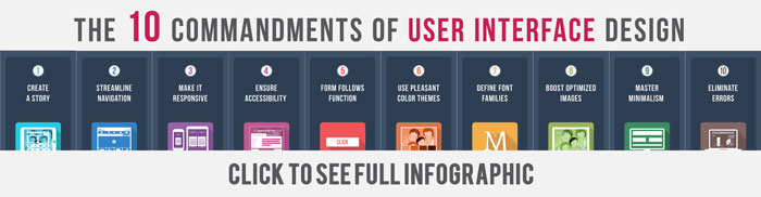
In this first part of our series of three posts, we are going to inculcate in you the most essential UI rules that should be your mantra as a designer. Overlooking even a single rule can ruin the web experience for the user. Since the success of a website is defined by its usability, let us peruse through 5 UI rules that can augment the usability of your site:
1. Strive To Achieve Consistency And Structure
While designing the user interface, it is crucial to be mindful of the interactions that take place between the screen you are designing for and the human cognition. It pays well to make things easier for your users by not thrusting the task of learning new toolsets or representations for each new task. Consistency helps customers make sense of hitherto unknown things and induces a sense of familiarity about certain things. Consistency also helps you introduce your own language inside the website or app. In addition, structure serves to make things more approachable to your users, without feeling overwhelming or messy.
Your users have a penchant for consistency since they need to be assured that once they take their time learning to do something a certain way, they will be able to it again. Design, layout, and language are just a few interface elements where consistency is needed. A consistent interface boosts the efficiency of your end-users by enabling them to have a better comprehension of how things will work. Structure and consistency make the users feel at home.
Take the example of Duolingo, a fun app designed to help people learn new languages. Not only does it fulfil its promise of making learning languages fun for all, it depicts how important styling consistency is for UIs. Navigation elements, typefaces, buttons, and even illustrations within the app are diligently and purposefully designed to appear visually consistent with each other. Shapes, lighting, and colors remain consistent throughout the app and even across their website to unite the myriad channels. It makes the app feel professional and branded, in addition to rendering it easier to navigate. Coupled with the adorable Duo, this makes the app aesthetically pleasing and fun to use, allowing it to evoke a positive, strong emotion.

Image: TechCrunch
Here Are A Few Things You Can Do To Ensure Consistency:
- Incorporate impactful visual hierarchy, with the most vital things bold and big
- Throughout the app or website, strive to use a consistent color theme.
- Introduce a system of visual order, such as aligning everything along the grid
- Navigation should be kept constant across all screens.
- It’s important to leverage the same fonts and types in your elements, especially when contending with form elements.
- Same elements should be re-purposed for different situations. For instance, the same sample notification can be color coded to serve in myriad situations.
- Keep all of your borders on images, galleries, selects, inputs, and buttons consistent with each other.
- Background images should not be changed frequently from page view to page view, or all hero images should at least be relatable to each other so that consistency across pages is maintained.
- Commonly used UI elements, such as radio buttons, scrollbars, and icons, are typically consistent graphic elements and have representations that are known and understood by users widely. For instance, we use radio buttons when users are afforded only one option, while checkboxes are employed to offer multiple choices to a user.
- When deciding on a layout, it’s prudent to factor in well-established convention. Humans have a strong memory when it comes to where things are visually located on the screen. This characteristic should be capitalized on by placing various graphical elements on commonly used locations, such as having the exit icon on the top right, search field on the top right, and logo on the top left.
- Make sure that your website incorporates all the functionalities and features that users are expecting to find on your website. For instance, a music sharing site is expected to have an embedded media player, while a website for airlines should have a viable ticket-booking system.
2. Define How People Use Your Interface
You need to define how you intend for people to use your interface before you get down to designing it. With the onslaught of touch-based devices, this factor is becoming ever more crucial. If you look at Tinder, the user experience of the app is defined by the impulsivity and ease of a simple swipe.

Image: RewindAndCapture
Similarly, people use apps and websites in two ways: indirectly by consorting with a third party element, or directly by using an element of the product.
Examples Of Direct Interactions
- Drag and drop an item with a fingertip
- Swiping a card
- Tapping a button
Examples Of Indirect Interactions
- Using shortcuts/ key commands
- Pointing and clicking with a mouse
- Drawing on a Wacom tablet
- Typing into a form field
A knowledge of your end-users and the devices they use to access your website should impact your decisions here. If you are designing for people with limited manual dexterity or seniors, swiping shouldn’t play a major role in your interface design. On the other hand, when designing for coders or writers, who primarily use keyboard to interact with websites, your app or site should incorporate all the well-known keyboard shortcuts to help them reduce time working with the mouse.
3. Ensure Usability And Clarity
UI designers often overlook the fact that their interfaces form the link between the end-users and their device or product. Effective UI designs are easy to comprehend, recognize, and use by users. Working with the principle of clarity in mind helps to achieve an effective and well-loved design. Keep in mind that users should never experience a moment of confusion when it comes to interacting with your design; they must be able to intuitively conjecture what may happen when they interact with an element or press a button.
When you design with clarity in mind, your users feel as though they are in control of the device or product, which lends them confidence to use it. The bane of every designer is to realize during the testing phase that people do not wish to use their device or product since they cannot understand its UI design.
When creating a user interface, usability and clarity must be at the forefront of a designer’s mind. UIs need to help users interact with products and devices, and your design should only include elements which augment usability. Refrain from adding extraneous buttons, elements, or colors, or anything that clutters up the UI design. Your UI designs shouldn’t hinder usability but make the user feel as if he is directly manipulating the product and is in control. An effective UI design only incorporates elements that ensure usability and clarity, make the interaction as natural as possible, guarantee a hassle-free experience, and deliver value.
For instance, consider the UI design of Virgin America. When it comes to aiding customers in completing the process of booking a flight, Virgin America wins the race in terms of clarity.

Image: Virgin America
Virgin America knows that users land on their website to accomplish a single task: book their next flight! So instead of beating around the bushes, Virgin America removes all content and simply asks the users where they would like to go. The question prompts users into action immediately so that they can start the booking process without further ado.

The user is constantly reminded of their selection throughout the entire booking process by a top bar displaying their current choices. By making this information perceptible at all times, the company goes the extra mile to ensure that their customers can always view and edit their choices on the go without having to recall the information themselves. This UI is industriously designed with a single task of helping users complete their task as efficiently and quickly as they can.
4. Navigation
A site may seem like a labyrinth to a new-comer until some bread crumbs are scattered out to lead the path. After all, it’s hard to appreciate even the most aesthetically pleasant of sites when you are exasperatingly trying to figure your way around, which is why viable navigation is a major part of great UI design. The cofounder of Envato, Collis Ta’eed, offers his cardinal rules of navigation:
- Users must always know where they currently are in a site. Known as orientation, this is indispensable to making your users feel at home on your site and streamlining the web app on their end. A few ways to orient your users include the use of headings, breadcrumb trails, and a highlighted menu.
- The navigation system should remain consistent. To put it in a nutshell, your menu bar shouldn’t move around as it is akin to streets signs switching between the sidewalks, the sides of buildings, and the posts.
To achieve consistency and context, your navigation needs proper placement to match the flow of content.
I. Content
The content of your site should be complete before you tackle the navigation part. Even the most enviable navigation wouldn’t be able to save your site if your content is lacking. The following content must be supported by navigation:
- Menus – menus are the default choice for users when it comes to finding the site content.
- Breadcrumbs – Orientation is vital since many users do not land directly on the homepage. Breadcrumbs serve to provide that reference point.
- Links – Links are beneficial for comprehending the complex connections between content that is related.
- Filters – Filters helps to manage content-intensive websites.

Image: UXPin
As can be seen from the example of Google Maps API, content must be revealed by navigation. Primary navigation is provided with a simple horizontal menu, while a lower priority, secondary menu lies to the right of the API. Most of the white space is taken up by the content. On the other hand, the primary navigation is kept understated with light colors and small fonts, letting the content speak for itself.
II. Placement
Do you want your users to click the back button or enter data? Scroll or click? Navigation offers users myriad choices within the confines of a two dimensional space that they must decide on without seeing the outcomes of the action. A usable site is able to provide the users with visual and organizational cues to aid navigation. The placement of those choices on the page dictates the responses of users.
For instance, users accustomed with languages that read left to right would automatically focus on the left side of the page, and vice versa for users who speak languages written from right to left. According to a study by Jakob Nielsen, people are prone to scanning web pages in an “F” formation, skimming across the top for an instance before perusing the entire page vertically. Such behavioral patterns entail that the most visible places to locate your menu are horizontally and vertically.

Image: 99Designs
As a great example of a horizontal menu, the REI 1440 site is an epitome of a minimalistic menu, offering merely 3 choices to users. In fact, the menu is even smaller than their corporate logo. A horizontal foundation supports the entire navigational structure of the website, and content cycles in a left to right motion, as the user filters by activity, location, and time. This is what we meant by how navigation should be able to reveal content.

Image: Spotify
When users need to navigate between different sections of a website, but limited space hinders designers to show all this information, vertical menu fits the bill. Using vertical menus, such as the one shown above for Spotify, the important sections of the UI can be depicted as a list and the user can simply scroll through to get to where they want. This frees up the footer and header of the website for more “universal” navigation.
5. Strong Visual Hierarchy
Visual hierarchy is a fundamental characteristic of a great web user interface design and is achieved when elements on a screen are organized in a clear viewing order, allowing users to fish out the most important information before focusing on the less vital one. The primary information, such as the company name, logo, and the navigation menu, should be placed in the center position and rendered in design elements that stand out to make the vital information instantly conspicuous to users.
“When everything is bold, nothing is bold”
To grasp the importance of visual hierarchy, look at the image below and tell us which element captured your attention first and guided your eye? The answer is probably not any single element since they all look alike!
Which one did you see at first? Maybe the first circle, or the middle one or all of them. The point is that nothing guided our eyes because all the circles look the same.

On the other hand, look at the image below and think of where your eye was instantly diverted to?

The answer must be the red circle as it stands out the most and is hard to overlook. This is the power of visual hierarchy!
Several factors affect how humans perceive information and how they rank the hierarchy of the content within the website layout. Some factors that have an impact on hierarchy include:
Factors Effecting Visual Hierarchy In Web
- Size: Compared to smaller elements, larger ones elicit more attention and draw the eye of the users. Notice how the headlines of Newspapers dominate and goad you to find out what the piece is all about.
- Color: when compared to dull and drab shades, vibrant and perky hues capture the eye, followed by darker and richer ones. Lighter tints follow in the spectrum as they seem distant and washed out, proceeded by muted or subdued/greyscale colors.
- Contrast: If you want to draw the eye of the user to an element on your website, dramatically contrasting colors fare much better than slightly contrasting hues. Contrast helps to highlight the most important parts of your site. Everything else is relative.
- Alignment: Alignment helps to lend a semblance of order to design elements. For instance, placing a sidebar column next to content creates a priority for the user.
- Repetition: Repetition in style gives a feeling that parts of content are related. For instance, since most of the content is presented in the same style on this page, parts that aren’t such as boxed text, instantly capture attention.
- Proximity: According to Gestalt, The closer the design elements are placed together, the more related they appear to users.
- Whitespace: The space around your content can be used to draw the eye to specific parts of the content. For instance, white spaces break up content into easily digestible parts and allow the eye to zero in on various parts of the page.
- Style and Texture: The use of styles and textures can help to prioritize content for users. They can be used to set the tone of the design like fonts.
As an example of great visual hierarchy in web design, check out the website of Blik.

Image: Blik
Blik is a mecca for garnering art supplies and with such a wide array of materials and media to accommodate on its site, it needs to ensure that its creative patrons have a hassle-free experience on the site and find what they are looking for on the go whenever inspiration strikes. Their strong informational hierarchy ensures that visitors are never left wondering about what they should focus on first within the content. With a kaleidoscope of patterns, lines, shapes, and colors innate to their wide array of products, maintaining a rigid, and clean grid structure lends a sense of orderliness in the site and prevents it from becoming a cacophony of unharmonious visual elements. In addition, instead of overtly cluttering the page with unnecessary information, the user can find more information about a product that they are interested in by hovering over it.
Similarly, check out the neat layout of the Boston Global site:

Image: Boston Globe
This widely-popular news website has been turning heads with its web design overhaul by embracing positive design methods. Since being a newspaper website, text is the most important content to the company, meticulous attention to detail has been paid to guarantee a great reading experience, using ample white spaces to lend an airy feel to the site and prevent it from appearing cluttered. Since articles incorporating images are more eye-grabbing than those without, the website emphasizes this rule by propitiating the size of the accompanying images with the importance of text on the page. The website shows a great use of mega-menus by revealing only some of the text contained within each post and leaving it to the readers to read on the ones they like.
Are there anymore UI principles that can boost the usability of your website? Do let us know in the comments below while you wait for our exciting upcoming sequel: UI principles to boost the aesthetic appeal of your site! Are you excited!


