When considering potential problems and drawbacks in your website design elements, it’s prudent that the first place you look is your landing page. Landing pages have an indispensable role to play for your sales funnel and website. Whether the goal of your website is to get people to request a free sample or sign up for your newsletter, make sales, or increase Downloads, your landing page is an important factor which dictates whether you lose a potential customer, or acquire a new lead. Unfortunately, a plethora of websites fail to optimize their landing pages and drive away potential customers due to issues and problems with this page.
If your landing page conversion rates are lower than what you had in mind, believe it or not, the design of your landing page may be a major culprit. A single design flaw can wreak havoc on the customer experience and ruin the viability of your landing page, even if you think you have followed all the principles of User Interface design!
Here are the 5 most common landing page design mistakes that companies make and how you can remedy them:
- Website Not Designed To Be Responsive
- Cluttered Web Design
- CTA Button Color Fails To Inspire Action
- Lack Of Inspiring Imagery
- Visual Distractions
1. Website Not Designed To Be Responsive

Image: FreshSparks
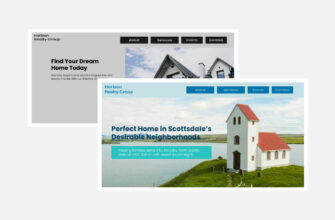
Our lives have changed considerably since mobile phones have been weaved intricately into our routines. People use their tablets or smartphones on the go, and cannot seem to part with their beloved devices even in the bathroom or in beds. The number of people who access the web on mobile devices has long surpassed the number of people on desktop computers. In the midst of 2017, the importance of responsive web design cannot be overlooked, unless your business goal is to leave potential customers feeling exasperated. Unless your website is designed with responsiveness in mind, you cannot hope to target the tab and mobile users, not without cost to usability and overall user experience. Responsive design isn’t a savvy luxury anymore; it’s the thin line between success and obviation, especially considering that Google now factors in a website’s mobile presence in the search engine algorithms as a ranking signal.
A responsive web design offers an optimized browsing experience as it enables a single site to adjust and accommodate to the size of a user’s device- with one source content and one URL. The flexible and fluid layout of responsive websites adjusts according to screen size, so that the best user experience is guaranteed across a wide array of devices without compromising the features of the website.

Image: DesignModo
For instance, the Foodsense website above adapts its content from a regular left-sided blog-style magazine layout replete with a plethora of drool-inducing pictures to a rudimentary block by block layout as the website is viewed across different screen sizes. The responsive behavior creates an aesthetically pleasant visual appearance that doesn’t lose its creativity and charm of originality even as the screen size gets smaller.
Related: 5 Snafus of Responsive Web Design to Banish
2. Cluttered Design
Can you stomach a bit of bad news? Hardly 16% of landing pages are rid of the nuisance of navigation bars? Even worst, 48% of landing pages are actually crammed with multiple call-to-actions or offers. If you are wondering why it’s depressing, it’s because companies are known to see a 100% improvement in conversion rates when landing pages are designed to be focused on a single action and the navigation bar is eliminated.
If you scrutinize any good landing pages closely, you’ll notice a couple of similar traits; they are all clutter-free, well-organized, and clean. They are singularly focused on only one action and ensure that people intuitively know what they are expected to do on each page. In a book on usability, titled “Don’t make me think,” web designers are instructed to design obvious and simple to use design elements so that websites are easier to use without users having to think over. A clean, simple web page designed to augment usability is devoid of distractions that prevent users from needlessly hunting around or analyzing, enabling them to comprehend the substance of a page and what they are supposed to do next, in a heartbeat.
Consider this Hubspot example:

Image: Hubspot
The bold and big primary headline is pretty conspicuous and it’s rather hard to miss the enormous orange CTA button. The lack of a navigation bar keeps the users from getting distracted away from this page. While the page does seem to be on the content-intensive side, the copy is organized so that it is easily scannable and flows logically.
Similarly, pore over this homepage from MailChimp.

Image: MailChimp
While the website has a navigation bar (considering it’s a homepage), the rest of the website embodies zen to perfection. Stunning imagery is centered on the page in a way that it points our attention to where the objective of the page lies. The website makes awe-inspiring use of white spaces to highlight a simple yet effective copy, while the blue call-to-action button stands out, letting you know what you are expected to do.
Infographic: The 10 Commandments of UI Design
The most viable landing pages are seen to follow a template of some sorts, to stay to the point and avoid unnecessary clutter. To put it in a nutshell, they incorporate the hero image, the primary headline, the CTA, the social proof to tout the credibility of their claim, and the benefits of the service or product.

Image: Unbounce
The landing page above is the epitome of an effective and converting landing page.

Illustration: Freepik
3. CTA Button Color Fails To Inspire Action
While the internet is teeming with all-too-convincing theories of which colors are the most suitable for conversion, even leveraging recommended color philosophy and system in web design cannot be a sole guarantee of success. However, as a first rule of thumb, your CTA button should have a viable contrast with the background design so that it stands out. For instance, if your website is green-hued, your CTA won’t fare well in another shade of Green. On the contrary, an orange, red, or blue CTA button would get noticed.

Image: PageWiz
While the color of the CTA button varies from website to website, depending on the context and the emotional response to be invoked from the customers, some colors are seen more often than others, for instance:
BLUE: Most websites incorporate a hint of blue here and there, especially for their CTAs. According to a study, Blue was found to be the favorite color of 57% men and 35% of women because of its association with security, loyalty, trustworthiness, and reliance. Blue is perceived as an intellectual color, deep rooted in coolness, logic, and communication, while a darker shade of blue is considered a highly professional color. Due to the trust it radiates, blue is preferred by social media website and especially used by software and financial institutions.
For instance, do you ever install a software on your website that doesn’t have a sense of built in trustworthiness? Crazy Egg not only incorporates blue in their call to action button but also outlines the box where the URL is inserted with the color blue. Not to mention, the Blue CTA offers a nice contrast with the green-hued background and stands out.

Image: Crazy Egg
GREEN: Being a relaxing color, Green is one of the easiest colors for the eyes to process. It promotes restoration, refreshment, health and balance, and is associated with the environment. In addition, being the color of money and wealth, this hue seems like an obvious choice for financial and banking websites. This is why the color works best for budget-conscious shoppers too. Green serves well as a good CTA color due to its association with the word “go”, which is a motivator for many customers. Customers find it mentally easier to click on green than other colors, which is why you would find most “Download now” CTAs in the color green.

Image: Spotify
RED: The color activates the pituitary gland and causes our hearts to beat faster, inciting them to action and making them behave in unprecedented ways. This physical color packs quite a punch and stands for defiance, excitement, urgency, warmth, strength, courage, passion, and energy. Since this eye-catching color promotes urgency, it is often used for sales and warnings.
Related: From Rage to Romance, Red is the Color of Passion!
For instance, StitchFix is all about clothes and their landing page also concentrates on a sole focus. While the rest of their branding takes a more understated look, a single red button in the center of the header really stands out and incites the reader to take action and head down the road to getting fixed every month.

Image: StitchFix
4. Lack Of Inspiring Imagery
When customers arrive on a landing page, they need to be persuaded to stay on, and a landing page should have a riveting anchor to hook them to the page. The most sure-fire way of making your customers curious for more is to offer them an appealing or enticing image on the landing page. Failure to deck out your landing page with an interesting and high-quality visuals make your service or product seem extremely uninspiring and boring. For instance, the imagery of a smiling and happy-looking customer, especially women, fill your audience with a sense of trust. Even better, visitors pay more attention to your CTA when the people in the imagery are shown to be looking in the same direction.

Image: KissMetrics
These heat maps highlight areas where people are more likely to look at the screen. Observe that viewers tend to look at the CTA more frequently when the baby is looking at it as well.
Consider this well-designed landing page for a business that solicits renters for its properties and manages rental property.

Image: Rentify
The landing page above depicts a company employee showing a renter some piece of property. This image is downright boring and un-inspiring and does nothing to create an exciting user experience. They would do better to show happy renters on their page to motivate clients to list their properties with the organization. Even worse than not showing any imagery at all is using stock photos. For something that wreaks havoc on your pockets, they don’t work well at all. Using people in real photos can boost your conversion rate by 35%.
To glean the best results, the visuals on your landing page should:
- Offer people a sneak-peak of what they’re going to get with the company
- Depict your service or product in context or in use, in the best possible light
- Portray that ‘after’ end result so people can imagine themselves in the situation.
- Make sure the before and after transformation is visible
Top athletic brands have taken to following all the rules of landing page imagery, like this example from Lululemon:

Image: Lululemon
They have excellently depicted their service in context of use, which shows users what they can expect to find. This original, and high quality photograph sets a tone and creates a mood that does justice to the words used in the subhead and headline. Together, the copy and the accompanying picture makes a powerful statement that immediately resonates with the audience.
Here are the most common landing page image mistakes that you need to avoid at all costs:
- Distracting images: While images can be used as visual cues, make sure they don’t steal the limelight from your CTA.
- Irrelevant images: Your image should narrate a story pertaining to your product or service and highlight the merits of your offering.
- Small images: Always strive to go for high-resolution images
- Untrustworthy images: Your hero image should ignite trust and positive emotion
- Boring images: Make sure that your landing page image narrates an interesting and captivating story that piques interest.

Illustration: Freepik
5. Visual Distractions
Once your landing page looks like it offers all the important information that a potential lead needs to convert, every extra element that you add to the page is nothing but a distraction that lowers the importance of everything else on the page. By keeping distractions to a bare minimum, you make sure that people focus on what’s most important. Way back in 2009, Twitter touted more than 7 actions on its homepage, and this is what the busybody looked like:

Image: Twitter (Old)
Even though Twitter was giving you so many options to choose from on their homepage, they actually wanted you to accomplish just one of two tasks: sign in or sign up. The rest is just a side-road. One of the factors that has really amped up the conversion rates of Twitter over the decade was to obliterate all the extraneous elements, while increasing focus on the two primary user behaviors that actually count. Here’s what their homepage looks like now in 2017:

Image: Twitter (New)
Seen from the perspective of your visitors, it all really boils down to the question of “What am I supposed to be seeing here?” Warding off all visual distractions that would thwart your customers from accomplishing the task or taking the action that you wanted from them, could really boost the conversion rate of your landing page.
Related: 15 Golden Principles of Visual Hierarchy
We have outlined a few of the most common mistakes in responsive website design and landing pages, that we have observed across many sites. Your landing page is where you get a chance to woo your potential leads and leave a lasting impression, so it is vital that your landing page is optimized for maximum conversions. In addition to your landing page, the entire design of your website should be driven towards boosting customer experience and making sure that customers don’t bounce off into the welcoming arms of your competitors. Download our effective and comprehensive guide, titled Web Design Mistakes That Are Killing Your Conversion Rate, and learn the secrets of rectifying hidden mistakes and errors which may be raining doom on your conversion rates!!