Figma used to be a tool built by designers, for designers. If you weren’t part of that world, it could feel like you didn’t belong. However, that’s no longer the case. Over time, Figma has expanded its reach. Today, developers, marketers, and writers use it too, turning it into a space where entire teams can build together. The brand had outgrown its “designer-only” identity, and the old look didn’t quite fit with that kind of growth. However, the new redesign reflects that shift.
With this shift, the platform is making way for Figma’s new and more inclusive redesign. The best part is that it’s not just about new colors or shapes, but it’s about building a brand identity that feels like it belongs to everyone.
The Figma Shift – Why Does The Redesign Matter
Unlike most brands, the Figma redesign and visual language is not just about aesthetics. Instead, it is a sign that shows the world where Figma is heading. For years, the brand was a dedicated tool for designers. Its tools offered clean lines, geometric icons, and precision, which are all essential for the design world. But much like all great tools, Figma has decided to cater to the needs of a wider audience.
Now that more teams have started using it, it was only fair that Figma be redesigned and more welcoming to new audiences. Figma now allows marketers to pull assets, developers to review specs, and writers to see their content in action and fine-tune it to fit the design better.
The redesign matters because identity shapes perception and conveys loudly that creativity doesn’t belong to one group, but to everyone on the team.
The Foundation Of Figma Redesign
For the redesign, Figma did not just swap fonts or add colors; it was built on principle. The team had four big ideas, which shaped a niche design tool into a creative ecosystem.
Let’s take a look at the four pillars of the Figma redesign.
1. Versatile Primitives & Dynamic Compositions
The core of Figma’s redesign revolves around primitives, the building blocks for illustrations.
Leandro Castelao, the brand designer at Figma, says, ‘The primitives are intentionally varied, like the hands that made them.’ Each shape has its distinct personality and accurately depicts the team behind it.
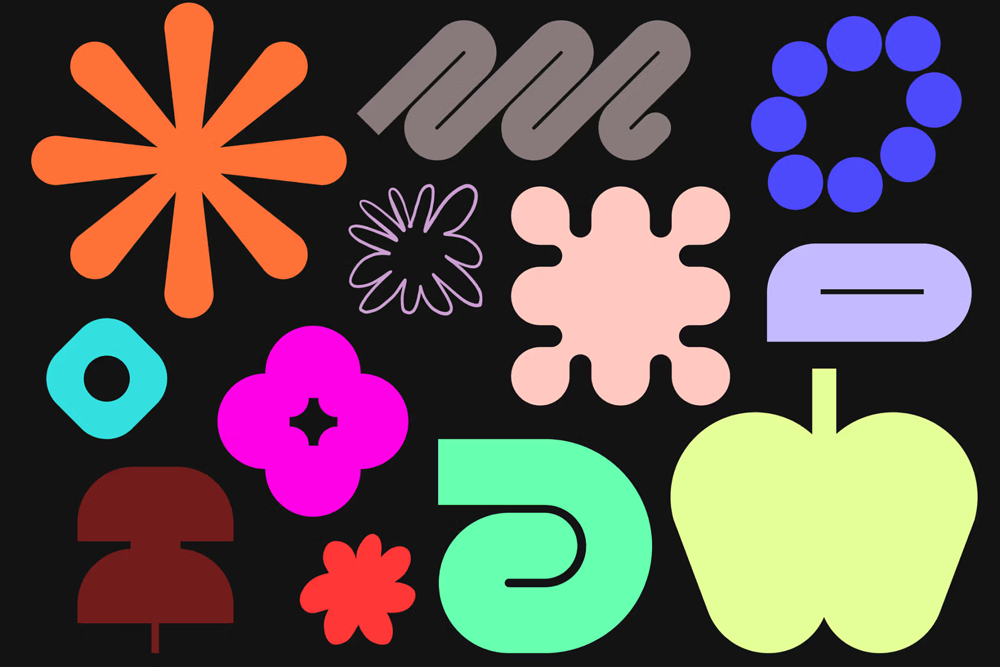
Image Source: figma.com
But that’s not all, the primitives also interact, overlap, and combine dynamically. This allows users to form compositions that can reflect the workflow of teams.
To give some consistency while keeping things playful, the team defined four core “moves” that guide how these shapes behave:
|
Move |
What It Means |
|
Overlap |
Shapes casually stack on top of each other, showing that collaboration is rarely neat, but always meaningful. |
|
Reveal |
One move uncovers another, reminding us that ideas often come alive when hidden layers are finally exposed. |
|
Clustering |
Shapes gather in freeform clusters, like sticky notes crowding a FigJam board during a late-night brainstorm. |
|
Multi-move |
Groups of shapes merge and evolve, creating something far bigger than their individual parts. |
With these principles, Figma’s visuals capture the essential collaborative and messy energy of teams working to build a product where everyone involved can tell their stories.
2. Colors That Do The Speaking
Figma believes that colors are not just for show; they tell stories and unite people. With that in mind, Figma created a new color palette on the maximalist side. It is vibrant and bold, including bright primaries, neon pops, and soft, earthy tones.
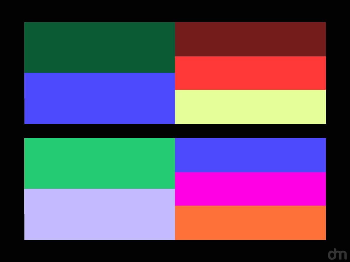
The new colors also align with Figma’s diverse community and all the new features on the platform. Figma kept the signature purple, but the spectrum is flexible and adaptable. They’ve used color variables, and these hues can easily shift from light to dark modes. So, these colors are not just stationary; they move around, interact, and adapt to your design.
Figma built three hero color schemes, each with its own personality:
|
Scheme |
Personality |
Color Mood |
|
Core |
A balanced, versatile mix for everyday work. |
Bright primaries with a touch of neutrals. They’re flexible for any project. |
|
Warm |
Energetic and playful, perfect for brainstorming and collaborative visuals. |
Neon pops, vibrant oranges, and bold pinks that are full of spark and energy. |
|
Cool |
Calm and professional, ideal for clarity and focus. |
Soft blues, greens, and earthy tones that are soothing yet focused. |
In addition, Figma has removed the heavy black outlines, so the colors do the heavy lifting for color and contrast. When a shape is activated or hyperactivated, it can display a wider spectrum of colors, which can signal interactivity and draw attention.
|
|
|
3. Figma’s New Voice With New Type and Dynamic Compositions
This redesign has introduced Figma Sans in partnership with Grilli Type. The typeface is bold but friendly, and it has structure without being overly stiff. This is a perfect font for a constantly evolving platform like Figma.
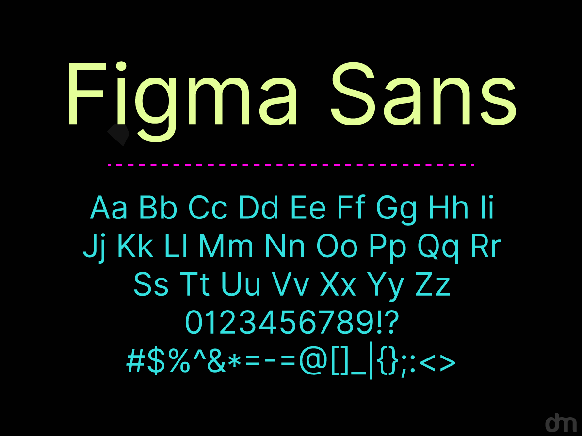
But Figma didn’t just stop at Figma Sans.
The type system also includes:
|
Typeface |
Description |
|
Figma Sans Condensed |
Compact and versatile, ideal for tight spaces and creating clear hierarchy. |
|
Figma Mono |
Functional and precise, mirroring the perspective of developers and engineers. |
|
Figma Hand |
Playful and handwritten, bringing a human touch and casual energy to teamwork. |
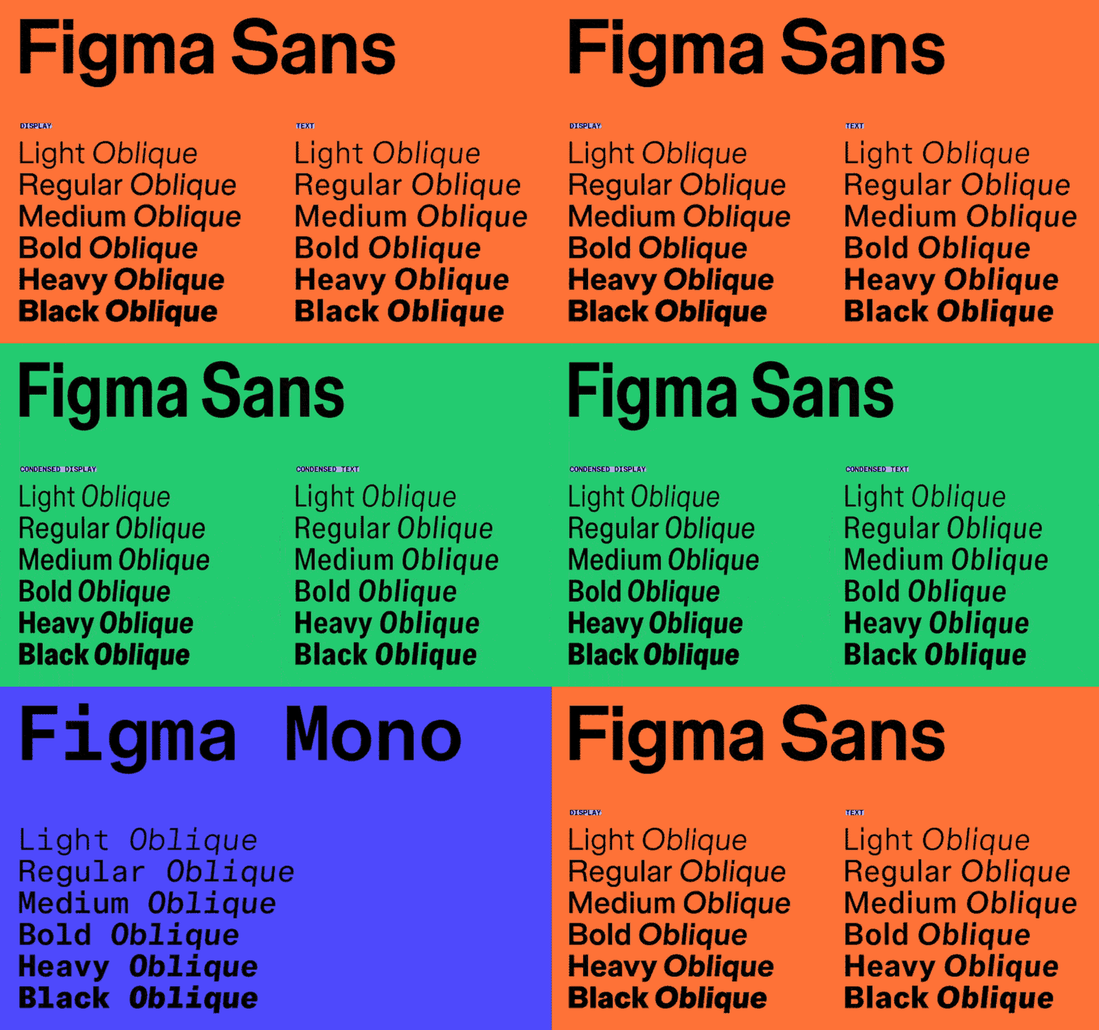
Image Source: grillitype.com
These typefaces work hand in hand with the new dynamic compositions built from Figma’s new primitives. Each composition illustrates the different processes of the creative project, such as ideation, designing, testing, and finally building.
Now, the typeface meets composition, which allows annotations and labels to match and follow the rhythm of the shapes. They can layer on top, align and this makes the visual and verbal language look and feel alive.
4. Integrated Motion and Interactivity
The most thrilling aspect of the redesign is that it is not static anymore. Motion and interactivity have breathed life into the platform, so collaboration feels more intuitive and playful. If your team wants to move around and communicate purpose, they can do so by selecting a primitive and activating it. The shape can then expand, change colors, and move around to present its role in the workflow.
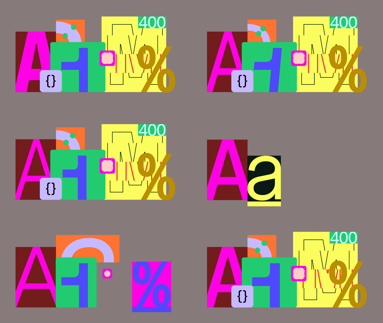
Image Source: grillitype.com
Additionally, the UI components, transitions, and even feedback can all make the product feel alive without overwhelming users. Figma can clarify relationships, guide actions, and create rhythms with animations.
The Figma Logo
Despite the many core changes, the new Figma logo stays true to its previous version. But that does not mean that it wasn’t tweaked. The new logo’s colors are much more vibrant and enhanced to give the logo a revamped look to match the energetic vibe of the rebrand.
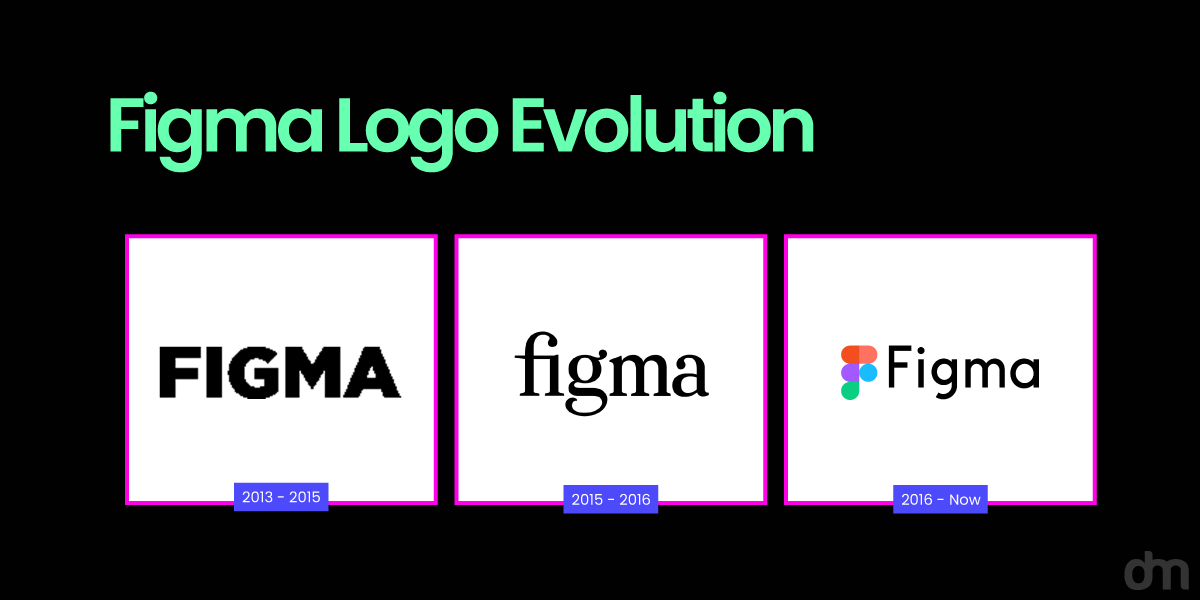
Another prominent change is the wordmark set. The previous logo used geometric sans-serif and has now been replaced with Figma Sans. This gives the logo an even cleaner look and makes it more adaptable to different digital applications.
Although the logo itself does not show many changes, the rebranding uses several new elements, such as color palettes and fonts, and even the vibe has been updated.
Inspiration Behind The Figma Redesign
The redesign began with a spark of inspiration, and that spark was collaboration. Figma was getting tired of its narrative centering on the myth of the Lone Genius and didn’t want designers to take all the attention. To them, it takes everyone on the team to turn a good idea into a great idea. That’s when they phoned Collins to draft a brand story with a campaign pushing everyone in the hierarchy to collaborate on Figma.
But more ideas have been piled on to redesign Figma into what it is now.
• The Figma Playground
The team looked high and low for inspiration, and they pictured the Figma canvas as a playground. They wanted it to resemble a space where multiple ideas could move around, interact with each other, and grow together. The physical inspiration was the playgrounds of Isamu Noguchi and Mitsuru Senda.
Using all the new features on the platform has served as a sandbox for the team. Brand Studio Director Damien Correll says ‘The canvas allows people to interact with objects in different ways. A developer might look at something as simple as a rectangle one way, through inspection mode, while a designer may see it from an alternate perspective.
• Storytelling Illustrations
The shift in Figma’s visual language from geometric shapes to primitives is inspired by the idea that Enduring visual identities should be thought of as languages, not systems, as Damien said. To achieve this, Figma’s Brand Studio has developed primitives that range from ambiguous blobs to representational forms. Crafts from both the digital and physical world inspired the primitives.
The redesign has embraced flexibility over rigidity. Figma has evolved from a strict visual system with fixed rules to a living language that adapts to your communication. With this approach, the brand and users grow and develop together using the dynamic collaborative nature and modern creative work.
The Philosophy and Future For Figma
The Figma redesign is a mindset shift. The brand has moved away from the old and exhausted ‘for designer only’ image and has moved into something bigger. Now it is a tool that belongs to everyone who can help bring ideas to life.
At the heart of the philosophy is the idea that collaboration is not just a trend but what the future needs. The team is working together, with the designer sketching, a developer inspecting, the marketer planning, and the writer adding words to the mix, but all of them are telling the same story. Figma wants the story to feel inclusive, unified, and flexible.
The redesign sets the stage for growth when talking about the future. The tool is ready to evolve and boost creativity with changes such as adaptive typefaces, motion-driven visuals, and bold colors.
At Designmantic, we see this as more than just a rebrand. It’s making a living, breathing ecosystem where ideas converge and grow into something greater. That’s the philosophy pushing Figma forward, and it’s one every creative team can take inspiration from.

