
You wouldn’t pack an amazing gift in a newspaper, or put a blank front cover on your new book. To really add wow factor, presentation is just as important as the content itself.
So why would you make the same mistake with your blog or newsletter?
Inbound marketing via your own blog, social media or newsletters is a popular way to engage your existing audience, and draw in new eyes while offering real value to the reader. This type of marketing also builds a community around your company or product, improves SEO (Search Engine Optimization) ratings, increases reach through shared articles. This is especially important for companies who sell one-off or ‘un-sexy’ products like SAAS. Proving a steady flow of interesting content gives users a reason to visit your site regularly, not just when they want to buy or update your product.
Aside from developing an engaging content machine, it is important to focus on delivering the best possible impression at every customer touch point, making your logo design consistent with the brand and developing an engaging visual brand. Every time you have a set of eyes on your content, it is a chance to promote your brand, clearly communicate your unique value proposition and make an emotional connection.
We looked at the design of four SAAS blogs for inspiration on how to best wrap your content to make your brand stick in people’s heads and nudge people in the right direction:
HubSpot

Image: Hubspot
HubSpot is an inbound CRM and email marketing tool that helps enterprises attract visitors, convert leads, and close customers.
The company offers a regularly updated blog which is split into two section: sales and marketing. The blog is regularly updated with three to five new articles in each section daily, offering a steady flow of interesting, and actionable content for its readership.
When it comes to design, the site is simple but effective, there is no visual clutter such as images or other info except for first fold to create a memorable impact. The landing page includes a lot of whitespace to allow users to focus on the content that is useful to them.
Effective SEO strategies ensure that a well-designed, clutter-free website ranks higher in search results and enhances user experience. By optimizing landing pages with relevant keywords and clear content, businesses can attract and retain visitors. A strategic approach to design and SEO improves visibility and engagement in social media marketing.
The clear segmentation of interaction points –split into marketing and sales– points users in the right direction right from first fold of the web page layout, and call to action points (CTA) are presented in visually prominent colors –striking orange and blue– which jump out at the viewer.
The subscribe button is deliberately made unobtrusive yet placed in a prominent place in the first fold, and users are offered further opportunities to subscribe under the marketing and sales columns. Viewers are naturally drawn to these subscription points, but are not forced to do so.
The site’s branding is consistent, the company’s logo colors of orange and blue are used consistently throughout the blog which denotes energy and trust respectively.
FreshBooks

Image: FreshBooks
FreshBooks is cloud-based SMB accounting software which makes everyday accounting tasks faster and more secure.
The company site features a varied blog featuring customer stories, actionable advice for small business owners and accounting and business recommendations and success stories.
The blog follows a conventional layout with top navigation and a right bar but differentiates with bold blue article titles to make them visually prominent and clickable. Readers in search of a general read can scroll down to find an article which catches their fancy, or use the sidebar for a more detailed content search.
The recurring theme of a blank white background allows users to focus on relevant content.
CTA points for the FreshBooks product are unobtrusive while CTA for blog subscription is prominently placed on clickable location at the top of the page.
The blog features images which portray a feeling of calmness and trust. Green — the color of money– and blue — a color which expresses security– have been used throughout which resonates with the industries of accounting and computing.
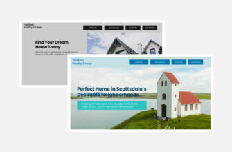
Shopify

Image: Shopify
Shopify is an ecommerce solution which allows users to set up an online store to sell their goods or sourced products through tools such as Oberlo, and then streamlines the whole ecommerce experience from them, from cataloging to sales.
The Shopify blog features a range of topics which could be useful for small business owners and vendors, from marketing and company culture tips, to case studies, ecommerce accounting solutions, and success stories.
The blog page uses a lot of whitespace to attract the reader to the content itself, however the use of images for each article could detract from this.
The huge wealth of content is organized into clear themes according to their target audience such as conversion Rate Optimization, business Ideas and how to Sell Online, and readers can browse all of the newest articles on the landing page, search within sub-categories, or do a word search.
The most popular articles are also listed on a right bar. The majority of the articles offer clear take-aways and actionable advice which small business owners can use in their day to day working roles.
The subscription box is placed right at the top of the main page and is hard to miss, aiming to get users to interact immediately when they land on the blog by either subscribing to receive blog posts or for a trial subscription of the product.
There is consistent visual branding using predominantly the bright color green — the same color as the logo– which portrays renewal and knowledge which are both linked to e-commerce and business growth. A Shopify agency could also help businesses make the most of the platform by offering specialized services tailored to unique ecommerce needs, aligning with the platform’s focus on growth and efficiency.
Crazyegg

Image: CrazzyEgg
Crazy Egg is a conversion rate optimization and heat map tool which allows companies to really understand which parts of their service consumers are engaging with.
The company provides an engaging blog which offer it’s community insights on a range of topics from site optimization, marketing and design, with a focus on real actionable advice for startups and small business owners.
The design of the blog is simple, but it gets the job done. The blog landing page features plenty of whitespace with an emphasis on blue CTA on right bar which allows users to subscribe for more content. Rather than trying to push sales, there is no CTA for the product itself, instead focusing on the content and offering value to the client.
Consumers are drawn to Crazy Egg original content guides by using different vector images which are bolder than as seen with other posts from contributors.
Categories are listed for specific interest topics at the top of the left column as well as on the right bar, and the most popular content is listed below.
The visual branding is on the blog is consistent with the main site, using blue and green colors to portray feelings of trust and growth. You can also try crazyegg alternatives for better conversion rate optimization.
Important take-aways
- Split the blog into relevant content sections so consumer doesn’t have to search for the information they need.
- Highlight trending and most popular blog posts
- Avoid visual clutter and use white space to draw eyes to the important parts
- Make subscription buttons subtle but give users various opportunities to sign up.
- Offer content which is focused on actionable advice and targets specific readers.
- Use consistent visual branding
Developing an advanced content machine requires time, effort and dedication. While the direct ROI is hard to measure, the fact that some of the world’s most successful companies are focusing on content marketing suggests that it is a useful way to add value to existing customers, and attract new ones. However, while the focus should be on the content itself, it is essential to wrap this content in a way which draws attention to the most important articles, while also subtly driving subscriptions and in the long run, sales.


Nice tips. Really useful Content. I am really enjoyed reading this article, Thanks for posting.