Are you in the middle of launching a SaaS startup? Chances are, you’ve got a dozen tabs open—product demos, pricing plans, investor decks—and somewhere in that chaos, your logo is quietly waiting for attention. In today’s digital-first world, you can’t treat your SaaS logo design as another box to tick off.
Your SaaS logo is your startup’s first impression, the very thing that will make people decide in three seconds whether you’re worth remembering. A strong Software as a Service logo design can quickly communicate innovation, trust, and simplicity, the three things every digital product lives or dies by.
But we get it. Hiring a designer for a professional logo design can be pricey, time-consuming, and a bit overwhelming when you’re still trying to get your product off the ground. So, we decided to make it easier. We’ve handpicked 50+ SaaS logos to fuel your imagination and save you the hassle. Whether you’re after something sleek and minimal or bold and futuristic, this collection is packed with startup logo inspiration to help you shape your brand’s visual voice.
Common Types of SaaS Logos
When it comes to software company logos, there’s no one-size-fits-all approach. Each style tells a different story; some rely on clean typography, while others use bold symbols or creative combinations to stand out in a crowded market. Understanding the main logo design professional styles can help you figure out which one fits your SaaS brand’s personality best.
Here are some of the most popular SaaS logo types you’ll come across:
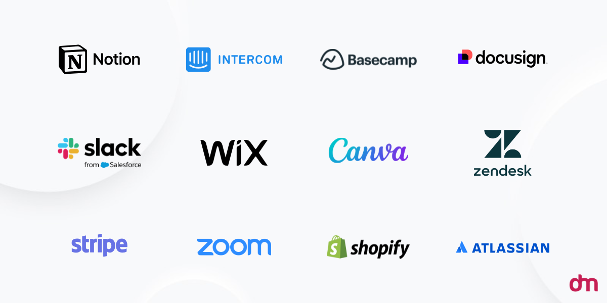
- Wordmark/Logotype: This style focuses purely on the company’s name, using typography to do all the talking. For instance, Mailchimp or HubSpot logos are simple yet powerful, instantly recognizable, and perfect for brands that want their name front and center.
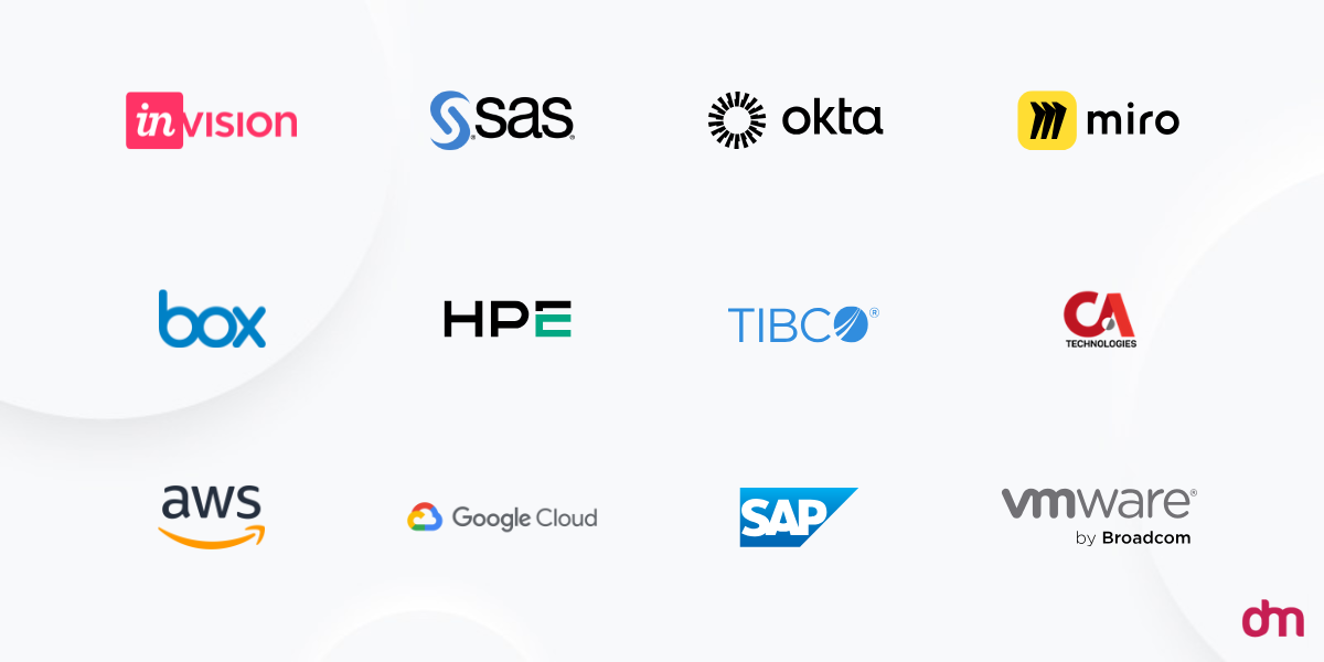
- Lettermark/Monogram: When your company name is long or complex, a lettermark trims it down to memorable initials. Zoom does this brilliantly — short, clean, and adaptable across platforms. It’s a smart choice for scalability and modern minimalism.
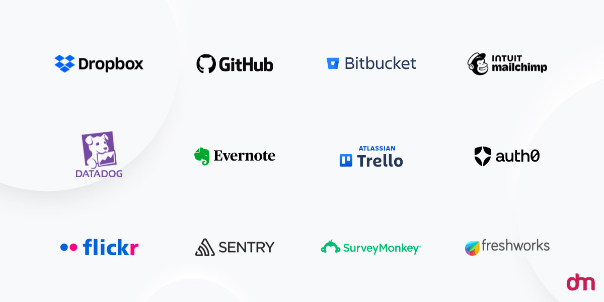
- Pictorial Mark/Brandmark/Symbol: These are graphic icons or symbols that visually represent the brand. Shopify’s shopping bag logo, for instance, says everything about what the company does without a single word. Pictorial marks work well once your audience already knows your brand name.
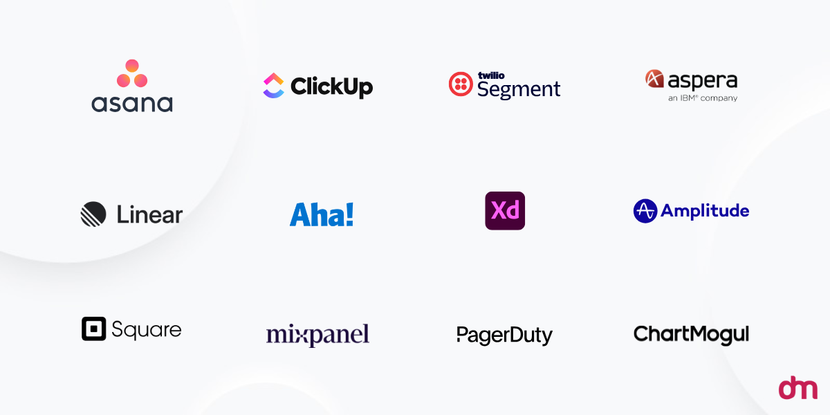
- Abstract Mark: Instead of a literal symbol, abstract logos use shapes or unique designs to capture a feeling or concept. For example, Typeform’s abstract form communicates creativity and flow, which is ideal for SaaS brands that value innovation and individuality.
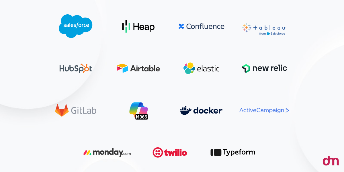
- Combination Mark: The best of both worlds; text paired with a symbol or abstract element. Many SaaS brands prefer this type for flexibility, as it works across apps, websites, and marketing materials. Slack and Dropbox are great examples of combination marks done right.
50+ SaaS Logo Designs for Your Startup: Get Inspired!
Creating a standout SaaS logo design is all about finding that sweet spot between simplicity, creativity, and tech-forward energy. Whether you’re launching a productivity platform, a data dashboard, or an AI-powered service, your logo sets the tone for your entire brand experience.
Here are a few ideas to jumpstart your inspiration.
Software as a Service Logos
SaaS logos typically use clean typography and abstract symbols. They’re designed to convey trust and modernity, aligning with the digital-first nature of software-as-a-service platforms.
1. The Futuristic Flow
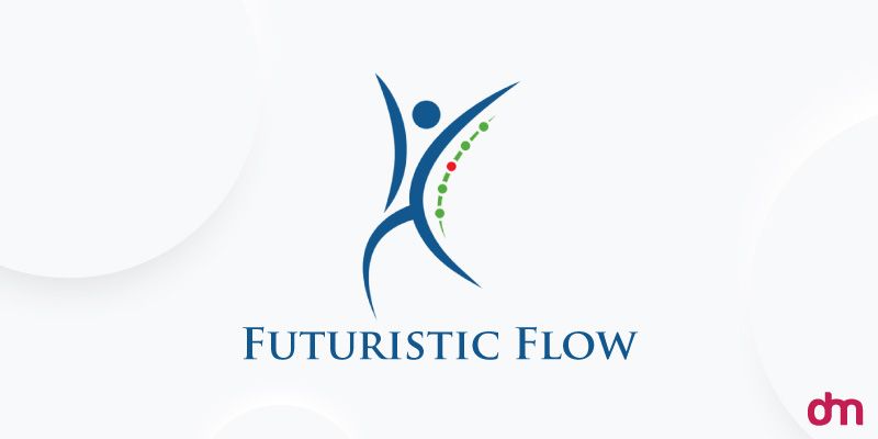
Image Source: DesignMantic
Modern and minimal, this logo blends sleek lines with a subtle abstract symbol that feels dynamic yet grounded. Perfect for SaaS brands that want to project innovation and reliability without overcomplicating their look.
2. The Mobile Money Mark
Image Source: DesignMantic
Featuring a smartphone icon with a bold dollar sign, this logo is a perfect fit for fintech or payment SaaS startups. The floating currency symbols ($, €, £, ¥) instantly convey global reach, while the green palette hints at growth, wealth, and reliability. It’s clean, clever, and straight to the point.
3. The Fintech Brain
Image Source: DesignMantic
This creative concept merges a human brain with global currency symbols, symbolizing financial intelligence and smart technology. Ideal for finance or analytics-driven SaaS platforms, the design uses a strong green hue to represent trust, prosperity, and forward-thinking innovation.
4. The Swift Falcon
Image Source: DesignMantic
Sharp, sleek, and fast, this logo captures motion and precision through the image of a falcon in flight. The orange accent adds energy and confidence, while the layered geometric wings create a sense of progress and speed. It is a great match for cloud services, data solutions, or automation startups.
5. The Trustworthy Touch
Image Source: DesignMantic
This logo features a hand holding a dollar sign, a symbol of trust, service, and financial care. The serif font gives it a more traditional and dependable feel, making it an excellent choice for SaaS companies. If you need tech logo ideas, this is it!
6. The Modern Matrix
Image Source: DesignMantic
Featuring a clean sans-serif font paired with a geometric emblem, this logo radiates confidence and clarity. It’s a perfect choice for growing SaaS brands looking for a tech logo that establishes authority and a modern digital presence from day one.
7. The Chat and Code Icon
![]()
Image Source: dribbble.com/Jowel Ahmed
This logo cleverly marries a speech bubble with a “< />” code snippet, signalling both communication and software development in one compact mark. The bold blue-purple gradient gives it a smart, tech‐savvy edge.
8. The Atomic Tech Sphere
Image Source: dribbble.com/Fozlay Rabbi
This logo uses a geometric sphere composed of tiny orbiting dots to represent atomic technology, combined with a sleek sans‐serif logotype. The dark green palette and minimalist styling give off seriousness and scientific precision. It’s a great match for a SaaS platform focused on advanced tech or research.
9. The Precision Gear
Image Source: dribbble.com/Artex
This design for “Quater” by Dribbble features a stylized gear-like shape with an arrow motif embedded within, suggesting forward motion, precision, and process optimization. The purple-pink gradient color scheme brings a fresh, modern feel, while the logotype stays clean and professional.
10. The Mindful M
Image Source: behance.net/Ahmed Rumon
A soft, flowing “M” mark paired with gentle curves and calming hues makes this design ideal for a wellness—or mindfulness-focused SaaS. The typography is light and welcoming, which helps the logo feel less like tech and more like a human-first service.
11. The Tech Monogram
Image Source: behance.net/Masum Billah
Here, the “M” is constructed with clean, sharp lines and minimal embellishment—very modern, very SaaS. The bold sans-serif wordmark complements the mark nicely, giving this a high-contrast professional feel perfect for a software product prioritizing clarity and performance.
12. The Forward Arrow
Image Source: behance.net/Sparkline Studio
Clean modern logos never go out of style. This one uses an arrow-like shape or progression mark within the typography, which also translates to an F, suggesting growth, movement, and forward momentum. The design keeps things simple, but the directional cue gives it a narrative.
Tech Logos
Tech logos usually incorporate sharp lines, geometric shapes, and futuristic elements. These designs aim to communicate precision, advancement, and a forward-thinking approach in the technology sector.
13. The Friendly Bot
Image Source: DesignMantic
This playful yet tech-forward logo features a robot in calming blue tones, instantly giving your SaaS brand a friendly, approachable personality. It’s ideal for AI, automation, or customer support platforms that want to look smart without feeling intimidating. The rounded edges and simple design make it instantly approachable.
14. The Cloud Connector
Image Source: DesignMantic
A modern green cloud is accented with small blue squares drifting outward, suggesting data flow, connectivity, and seamless integration. This design is perfect for cloud-based tech solutions, storage platforms, or collaboration tools, as it communicates innovation and reliability in a minimalist style.
15. The Digital Pixel
![]()
Image Source: DesignMantic
Sharp, geometric, and instantly recognizable, this professional logo design leans on a clean modern aesthetic to convey digital intelligence and innovation. The abstract design is perfect for industries such as technology or analytics.
16. The Digital Cube
Image Source: DesignMantic
This 3D logo presents a cube composed of connected blocks that represent technology, structure, and scalability. Ideal for software, blockchain, or data management SaaS brands, it communicates both innovation and organization with a sleek yet modern aesthetic.
17. The Bright Idea
Image Source: DesignMantic
This is a great pick if you need professional logo designs emphasizing idea generation, productivity tools, or tech innovation. It features a bold red and black bulb with the company name neatly placed below—simple yet impactful.
18. The Momentum Mark
Image Source: DesignMantic
A sleek blue arrow in motion creates a sense of progress, direction, and momentum. Arrow logos like these are ideal for SaaS companies that focus on growth, analytics, or productivity. This design communicates confidence and a modern, results-driven approach with clean, minimalist styling.
19. The Tech Prism
Image Source: dribbble.com/Rakibul Design
A sleek, geometric design that combines abstract shapes with a futuristic style. Its minimal yet striking neon logo color composition communicates innovation, precision, and modern technology.
20. The DigiZen Sunrise
Image Source: dribbble.com/Fahim Khan
This logo integrates a sunrise and a mountain in the letter “D” to represent innovation, stability, and brand identity. The vibrant blue tones convey trust and technological sophistication. If forward-thinking solutions are what you offer, this logo might be your best choice.
21. The Connected Circle
Image Source: dribbble.com/Masud
Featuring a minimalist "C" intertwined with a circular motif, this SaaS logo conveys unity, connectivity, and modernity. The clean lines and professional design suit technology-focused platforms aiming for a sleek and contemporary brand presence.
22. The Data Helm
Image Source: behance.net/Multiple Owners
This bold mark features a stylized helm or half circles of varying sizes, projecting the idea of control, navigation, and data orchestration. It’s a strong fit for SaaS platforms that serve enterprise tech, dashboards, or analytics tools, bringing structure and clarity to complex tech.
23. The X Edge

Image Source: behance.net/Rakibul Islam
Here’s another professional logo design that revolves around a sleek “X” monogram crafted with sharp angles and clean lines. It suggests precision, power, and cutting-edge performance. This design is ideal for software and SaaS brands looking to project confidence, sophistication, and a hint of futuristic vision.
24. The Insight Lens
Image Source: behance.net/Multiple Owners
With a circular mark that evokes a lens or portal into technology, this logo gives the impression of deep insight, intelligent systems, and forward-looking tools. It’s perfect for SaaS companies in AI, machine learning, or data-driven services where the brand wants to communicate depth and clarity.
Internet Logos
Internet logos often utilize symbols like clouds, networks, or digital grids. These elements represent connectivity, accessibility, and the vast reach of the online world.
25. The Network Grid
Image Source: DesignMantic
This logo design features a stylized grid-like pattern that symbolizes connectivity and data flow. It’s ideal for SaaS or internet-based startups focused on networking, digital communication, or online collaboration.
26. The Blue Cloud
Image Source: DesignMantic
This internet logo design highlights a clean cloud icon with arrows pointing upward, paired with a crisp sans-serif type that gives off a sense of movement and global connection. Perfect for internet or cloud service providers, it represents information constantly in motion.
27. The Wired Hub
Image Source: DesignMantic
A purple mark centers on a grey box wrapped by a cable-like ring, clearly nodding to internet connectivity and a protected endpoint. The logo is an excellent fit for ISPs, networking tools, or IoT platforms. It’s technical but approachable, with a tactile “plugged-in” vibe.
28. The Connected Dots
Image Source: DesignMantic
Circular dotted lines weave together in this logo design to represent digital interaction and seamless communication. It’s a great choice for internet-based apps, cloud tools, or social platforms aiming for a smooth, connected identity.
29. The Clean Spiral
Image Source: DesignMantic
A clean blue spiral sits above a simple, modern wordmark, suggesting continuous movement, growth, and smooth data flow. Minimal and elegant, it works exceptionally well for cloud services, analytics, or any SaaS brand that wants a refined, trustworthy look.
30. The Network Arc
Image Source: DesignMantic
This design spotlights an elegant sweeping arc wrapping around a base icon, suggesting connectivity, reach, and digital coverage. It’s a strong pick for internet services, unified communications, or network-platform SaaS looking to make a stunning visual impression.
31. The Hosting H
Image Source: dribbble.com/Ahmed Rumon
A bold letter “H” forms the heart of this design, encapsulated in cloud-shapes, server-lines and subtle gradients. Ideal for web-hosting and reseller hosting, VPN or cloud-service startups, it delivers the “H” icon so your brand message (hosting, hub, help) is instantly clear.
32. The Signal Arc
Image Source: dribbble.com/Arafat Mahmud
A minimalist Wi-Fi-style icon that uses clean arcs to signal connectivity and reach. It’s perfect for internet services, network tools, or SaaS that want to communicate reliable access and simple user-first tech.
33. The Tricolor Data Wave
Image Source: dribbble.com/Jisan Branding
A smooth, stylized wave mark blending pink, purple, and teal tones to convey motion and digital flow. The vibrant palette gives it a fresh, modern edge — ideal for internet or SaaS platforms built on connectivity and innovation.
34. The “P” Signal
Image Source: behance.net/Nesar Uddin (Rahid)
This internet logo cleverly merges the letter “P” with WiFi-signal arcs to instantly communicate connectivity and name recognition all in one. It’s perfect for an ISP or internet-café brand that needs a simple icon with strong symbolic value.
35. The Network Atom
Image Source: behance.net/Mayara Mosmore
This minimal logo design uses abstract node-shapes linked in a configuration that evokes a network, hub or atom-like structure, hinting at both connection and infrastructure. Ideal for an ISP or broadband brand positioning itself as modern and foundational.
36. The Speed Swirl
Image Source: behance.net/Multiple Owners
This logo concept features a swirling motion or dynamic loop in its mark. The gradient color palette takes the spotlight here, suggesting speed, agility, and forward momentum for internet startups or service providers.
Technology Logos
Technology logos blend innovation with simplicity, using sleek fonts and minimalistic icons. Such designs emphasize efficiency, reliability, and cutting-edge solutions in the tech industry.
37. The Digital Apple
Image Source: DesignMantic
What to do when you want to merge health, learning, or innovation with digital transformation? Go for the extraordinary. This red apple logo breaks the mold with tiny pixels bursting from one side. It’s a clever mix of nature and tech.
38. The Circuit Twist
Image Source: DesignMantic
Sleek and fluid, this SaaS loo design screams network, data, connectivity, and flow. The swirl is made up of connected lines and nodes that feel alive with motion, all that a modern tech or SaaS brand wants to be known for.
39. The Rocket Phone
Image Source: DesignMantic
A smartphone taking off like a rocket, talk about lift-off energy. This logo symbolizes growth, innovation, and limitless communication. Great for app developers or mobile tech ventures with bold ambitions.
40. The Tech Tree
Image Source: DesignMantic
Nature meets innovation in this logo design where branches turn into digital dots. It’s a beautiful nod to growth, connection, and the evolving balance between technology and sustainability.
41. The Cyber Bug
Image Source: DesignMantic
We’ve already seen trees and apples. Here’s a stylized beetle rendered with geometric precision that represents both technology and system integrity. It is ideal for cybersecurity, AI, or software maintenance brands seeking a sharp, modern mark.
42. The Global Connect
Image Source: DesignMantic
A globe inside a smartphone with a tiny Wi-Fi signal on top—it doesn’t get clearer than that. This technology logo is all about seamless connection and global reach, perfect for IT, telecom, or networking startups wanting to stand out.
43. The S Circuit
Image Source: dribbble.com/Rahid Rehman (Nesar)
This one uses a bold letter “S” interwoven with circuit lines, a smart way to say “software,” “services,” and “systems” all in one. The clean geometry, soft gradients, and tech-feel make it ideal for an AI-powered platform that wants to look sharp without losing approachability.
44. The Neon Grid
Image Source: dribbble.com/Logo Hub Branding
A striking visual where dark charcoal meets neon green and bright silver — the palette alone screams high-tech and precision. The logo’s subtle grid behind the main mark hints at structured data and digital architecture, making it a great match for enterprise tech or hardware startups.
45. The Modular Atom
Image Source: dribbble.com/Artex
This design plays with modular blocks orbiting a central core, creating a playful and potent visual. It’s a strong fit for any tech brand working around platforms, integrations, or system-building. The mark communicates complexity without being chaotic.
46. The Digital Prism
Image Source: behance.net/Multiple Owners
This mark uses a faceted prism or polygon to reflect light in multiple directions, showcasing versatility and refracting possibilities. It is ideal for tech brands that want to communicate adaptability and multi-dimensional innovation.
47. The Tech Glyph
Image Source: behance.net/Multiple Owners
With bold, minimal forms and a sharp, futuristic edge, this tech logo feels like a visual shortcut to “modern tech.” It’s perfect for startups that want a sleek and clean mark that still packs personality.
48. The Enterprise Circuit
Image Source: behance.net/Multiple Owners
This design blends a business-style wordmark logo with subtle circuit or web-node elements, hinting at digital infrastructure beneath the surface. It is best for tech companies serving enterprise clients who want to look both professional and innovative.
49. The FinTech Leaf
Image Source: behance.net/Multiple Owners
Here, a tech-flavored twist on a leaf or organic shape suggests growth, evolution, and sustainable innovation. A strong fit for fintech, green tech, or any tech brand that frames itself around growth, ethics, and long-term impact.
Software Logos
Software logos frequently feature icons that symbolize functionality, like gears or screens. These visuals aim to convey the software’s purpose and user-centric design.
50. The Cloud Signal
Image Source: DesignMantic
A crisp blue cloud with a WiFi signal nestled inside—this one speaks digital service simply and clearly. It’s ideal for a SaaS platform offering connectivity, hosting, or cloud-based tools.
51. The Hexa Framework
Image Source: DesignMantic
This software logo design features a brown and yellow hexagon icon—a shape often used in software diagrams and data visuals—giving off a grounded, structural feel. Great for middleware, backend systems or software tools that power business processes.
52. The Blue Stream
Image Source: DesignMantic
A cloud icon from which lines, dots, and arrows emerge—this visual symbolizes motion, expansion, and information flow. It is ideal for software that manages, visualizes, or streams data dynamically.
53. The Earth Engine
Image Source: DesignMantic
A globe icon in earthy brown tones suggests global reach with serious software muscle. Perfect for platforms that operate internationally, manage global systems, or support large-scale deployments.
54. The Green Bot
Image Source: DesignMantic
A friendly green robot with antennae gives this software logo a personable, modern edge. It is perfect for bot services, automation software, or AI assistants where the brand wants to feel approachable and forward-thinking.
55. The Pixel Workstation
![]()
Image Source: DesignMantic
A desktop screen and keyboard icon peppered with tech-pixels on the screen—this one conveys “hands‐on software”, tools you use, workflows you build. Great for productivity apps, creative software suites, or developer tools.
56. The Clustered Cube
Image Source: dribbble.com/Nusrat Jahan
A compact cube made from interlocking blocks that suggest modules working together. This one’s perfect for software platforms built on interoperability and plug-in architecture, visualizing “many parts, one system” without being cluttered.
57. The Letter S Circuit
Image Source: dribbble.com/Sajal Saha
It’s a bold, stylized “S” that doubles as an electric pathway or circuit board. Simple but clever, this blue mark gives software brands a symbol that’s equally readable and tech-savvy.
58. The Portal Ring
Image Source: dribbble.com/Zaid Shuvo
This logo concept is a clean ring or portal-shape that opens up in one direction, suggesting ingress, access, or launching into something. Ideal for software companies offering dashboards, platforms or gateways—everything you launch through.
59. The Digital Interface
Image Source: dribbble.com/khadiza begum
Here, we have overlapping shapes and subtle gradients, giving a layered screen or interface feel that shows software you live in, not just use. This mark works for visual-intensive apps, dashboards, or tools where UX is front and centre.
60. The Dev Arrow
Image Source: behance.net/Polina Pencheva
This logo cleverly uses a bold triangular “play” symbol tucked into a word‑mark to suggest action, development, and forward momentum. With its clean lines, blue tones, and grounded typography, it’s a smart fit for software brands.
61. The Dev Helix
Image Source: behance.net/Mst. Asma Siddika Asa
This mark twists lines into a spiral that resembles both code and biology, pointing to software that evolves, adapts, and grows. It is ideal for agile development tools or platforms with a living ecosystem of integrations.
62. The Tech Triangle
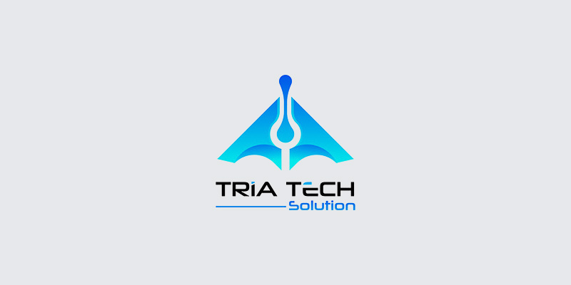
Image Source: behance.net/Milon Akando
A sharp triangular form layered with subtle angles and shadows, communicating structure, stability, and forward motion. It can be a strong choice for software brands dealing in frameworks, structured platforms, or enterprise apps.
63. The Technology Suite
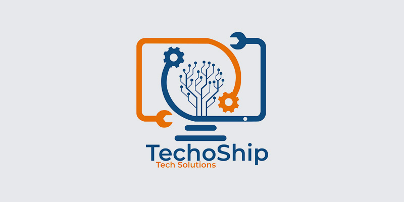
Image Source: behance.net/Mussadiq Hafeez
This logo blends geometric precision with a sleek digital emblem, giving it a distinctly modern software feel. The clean typography and subtle colors make it perfect for tech companies that value innovation and professional polish.
Get Ready to Build Your SaaS Logo!
There you have it — 50+ professional SaaS logo designs to spark your next big idea. Each one shows how design can define a brand’s identity, from tech-forward icons to sleek minimalist marks. Now it’s your turn — explore, experiment, and create your own SaaS logo with DesignMantic’s free logo maker today.

