The global security services market is a multibillion-dollar industry. According to figures released by Statista, the USA security services market was valued at a staggering $49.2 billion last year. It is one of those few economic markets that flourished even during the pandemic. In 2021, experts predict it grow at a pace of 0.2%. These growth predictions are consistent in Europe and Asia as well, the other two big players of this industry.
The top private security companies in the world are powerful and rich organizations. Thriving on government and military contracts, these companies have influence not only in their regions but internationally, too.
For such a mighty and influential industry, the branding of most of these firms is laughably weak. While some can argue that these firms need not bother with nice logos as they thrive on secrecy and an understated perception, the truth is less sensational.
Fact is, while these firms may not need a lot of commercial marketing, a strong and powerful visual identity such as those enjoyed by Brinks and ADT, serve as confidence-inspiring tools.
Come; let’s take a look at 5 of the worst designed security logos of famous international companies. And see examples of great logos in similar styles.
1. ICTS International NV
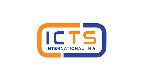
ICTS is an international security company that specializes in aviation, homeland, and transportation security. The firm is headquartered in the Netherlands and was formed in 1982.
Its logo is essentially a wordmark wrapped in a rectangular container. I’m not sure if the kerning is appropriate here. The letters look unbalanced for some reason. When we look at colors, orange and blue do not seem like smart choices here. These particular shades of both colors are more clashing than contrasting. The font is respectable but we want more impact here.
I’m not going to call this logo bad, just weak.
A Good Logo:
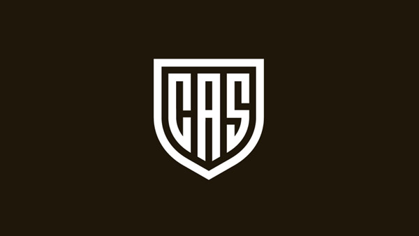
Image Source: Dribbble
Why Does It Work?
The brand has chosen an icon container that is well-recognized and which the audience can easily connect with a particular industry: a shield. What’s more, the style of the shield is simple with no trimmings. Therefore, it acts as the perfect container and even gives off a strong vibe.
The fonts chosen are jagged and have exposed edges. This signifies fearlessness and confidence. I especially love the rich brown used in the background. The undertone is gold/yellow which adds warmth to the overall design. This is a logo that nobody will have trouble associating with a powerful international security firm. This logo on the side of a security van speaks of professionalism and authority.
2. Northbridge Services Group
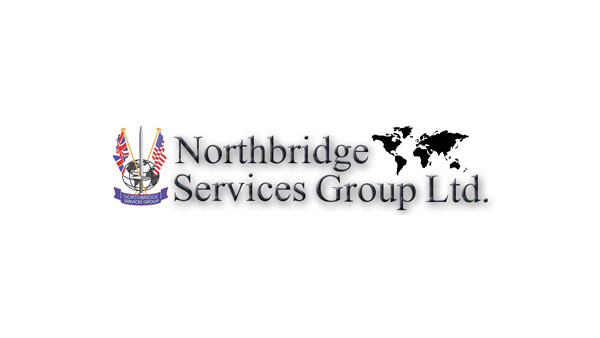
There is no way around it. This logo is just bad. Not good at all. What’s sad is that it doesn’t even seem to be trying. It’s cluttered and clunky with too much going on.
There are flags, a globe, and a banner. Still, the company apparently thought it wasn’t enough and went ahead and added another icon – a world map – on the other end of the logo. When I see these many icons in a single logo, I think of a business that has no direction or focus.
This is not the perception that a security company would like to be associated with.
In addition to too many icons, the shadow work in the company name is making the design even worse. This logo needs a makeover ASAP.
A Good Logo:
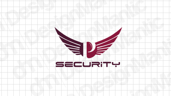
Image Source: DesignMantic
Why Does It Work?
Right of the bat, it uses a single icon. They are open wings in full-flight mode. The openness of wings makes you feel confident and powerful. The sharpness of the wings is also in complete harmony to the effect of strength and valiance that a security logo should communicate. I also love the interplay of the monochromatic colors used in the logo. The shades bleed naturally into each other.
Lastly, the font is emphatic. It’s Dodger by Iconian. It is sturdy, well-built, and strong. It gels beautifully with the sharpness of the logo icon.
3. Allied Universal
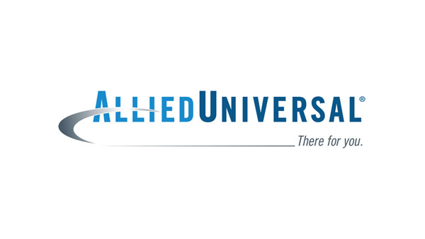
Allied Universal was founded as Andrews International in 1988 in California. Today, the firm boasts offices in Mexico, Colombia, Canada, and India. The firm specializes in providing armed and unarmed professional security guards to businesses, governments, and defense offices.
While the company’s website is modern and professional, the logo lacks a certain feel and standard. The shades of the colors do not work that well. There’s a lot of shine in them without any substance. Plus, that weird swoosh adds confusion to the design. What is its purpose? Is it supposed to signify ‘around the globe’ operations of the company? It’s not entirely obvious.
Let me also point out the mistake of using italicized fonts for security logos. Look, you are going for a look of control and command. Italics remove that sense of control. Instead, they make the design look casual and carefree. Not something you want your security company to be, is it?
A Good Logo:
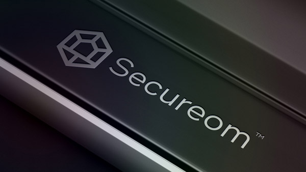
Image: Dribbble
Why Does It Work?
The font is something that leaps out at you. It is stable, sure-footed, and in complete command of the space. There is a perfect balance in every curve and edge. Similar to Allied Universal’s logo, it also has shine in the design. Plus the icon is another strong element of the logo. The overall effect of the logo is tough yet sleek.
4. International Intelligence Limited
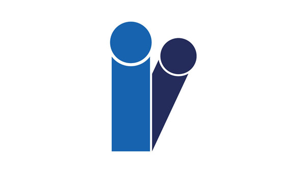
So, this is another logo that has a lot of room for improvement. The two small case Is look less like the alphabet and more like people silhouettes. The darker blue is peeking from behind the lighter blue and makes you think of a scared child or a child’s playtime. Not sure if this is the effect the designers wanted to evoke for this logo.
One of the reasons the tilted alphabet doesn’t work is that it removes the balance from the design. The I that’s peeping looks like on the verge of falling. The colors are also too simple. The logo needs some much-deserved creativity.
A Good Logo:
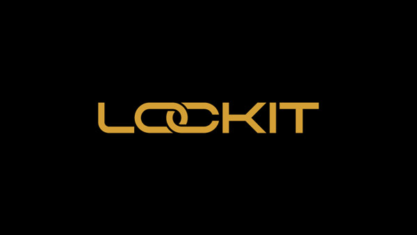
Image: Dribbble
Why Does It Work?
This is a logo that uses alphabets in the wordmark – like the logo above – to communicate critical information about the brand. The letter O entwines itself with the letter C and the effect is of a chain. Both edges of the C are so close together that it looks like it’s about to shut down, forever enclosing the O.
This is the kind of creativity that takes a simple wordmark and transforms it into a brand logo that you won’t forget easily. The font used is sturdy and confident. It’s spacious as well as self-assured. And I really like the shade of gold used. The shine has been removed which renders the logo even more meaningful. This signifies a brand that doesn’t hesitate to show that it has influence but knows how to keep it understated.
5. CACI
So, CACI’s logo isn’t as bad as some of the others on this list. Yet, for an international security enterprise dealing with information technology that supports the American government and military, the logo seems lacking.
It’s too simple; to the point of looking bland. If that’s what the organization was going for then I guess that’s fine. However, for a security firm of its stature, the emotions that its logo must illicit should be of confidence, command, and authority. Which this logo fails to provide.
What’s missing here?
Everything. The font is uninspiring. The red accent added to divide the logo from the tagline lacks any luster and oomph. The overall effect is just lazy.
A Good Logo:
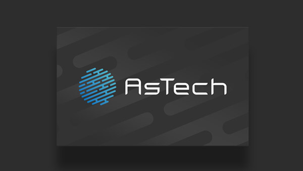
Image: Dribbble
Why Does It Work?
This is the logo of a security company that heavily relies on advanced technology and provides next-level IT security solutions. And you can glean all of that from this logo. The globe is shaped in network-pathways. You can see the connections everywhere. There is also a subtle blue gradient in the logo which adds another dimension to the design.
The font also looks technical and digital and is the perfect amount of modern plus professional.
The Takeaway
The three main emotions that a security company wants people to associate with itself are strength, protection, and power. When you are designing a logo you want the general effect to be similar to these emotions. Three simple ways you can achieve that:
- Use fonts that are strong yet simple.
- Use icons/symbols that people usually associate with security agencies and law enforcement.
- Use rich and deep shades of colors, nothing casual or light.
Follow these rules, and creating a security logo will not be a complicated procedure anymore.

