When it comes to marketing or advertising branding, abstract styles are the dominating logo shapes you’ll find in this realm. The subtlety of abstract designs and the variety it offers are the primary factors that drive this trend. Plus, the industry itself is always looking for something new and something more. To quench this creative thirst, and to make sure that the advertising agency you are representing has a cutting-edge logo that is putting everyone else’s branding into the shade, makes the designers look for adventurous ways to create advertising logos.
There are a few ways that you can introduce abstract images into your advertising logo design. You can transform the brand name into abstract typography. You can also convert some traditional advertising logo images such as the ‘play’ button into a solid abstract shape. Patterns, textures, and using the negative space are some other nifty ways to create stunning advertising logo imagery using abstract design principles.
In this collection, we are showcasing 20 unique abstract logo designs for creative marketing and advertising that can inspire your next project. So, let’s start the show.
1. An Organic Abstract Shape
The advantage of using an organic or natural shape in your abstract design is that it lets the audience decode and understand the design easily. If you are designing a marketing logo for a new company, this strategy will go a long way in creating a positive association with the brand.
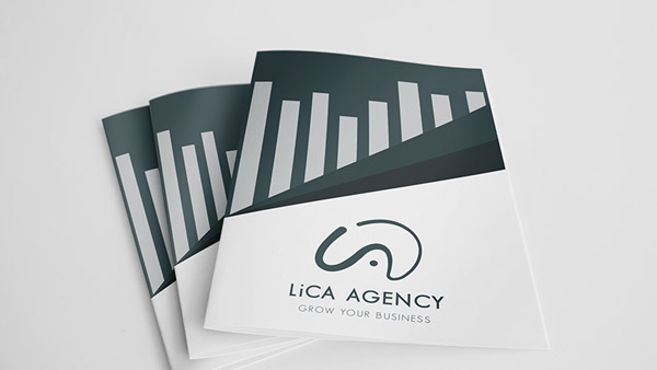
Image Source: Behance
2. Line Art + Abstract
Make your ad company logo doubly impactful by merging the techniques of two different logo styles into one design.
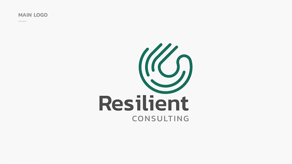
Image Source: Behance
3. Turn Typography Into An Abstract Shape
It is a great tool in the designer’s kit to turn a simple font into a solid abstract shape or to use typography based advertising logos and turn them into abstract icons. This way, you can make the brand initial easy to recognize but also give it something unique to be memorable.
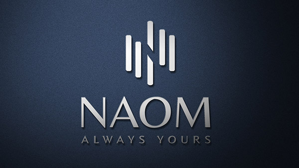
Image Source: Behance
4. Same Shape With Different Angles
On a lazy design day when you want something simple but stunning, take your abstract logo shape and use it in different angles to make your marketing logo look clever.
Image Source: Behance
5. Use Recognizable Shapes
The abstract design doesn’t have to be unreadable. You can also use some easily recognizable shapes and give them a twist to add subtlety of abstract designs into your advertising logos.
Image Source: Behance
6. Abstract In Negative
You can create abstract images by using the negative space in your marketing logo. Here, the design also uses some bright colors to make the white space more prominent.
Abstract logo with different colors
7. For A Music Marketing Brand
Take the most recognizable shape of the niche industry you are going to represent and feature it in the throes of some solid abstract marks.
Logo with music note in blue background
8. An Electrifying Advertising Logo
Make your advertising logo interesting by using colors and shapes that make people pause and take notice. In this example, images of electric bolts in contrasting colors are doing the job well.
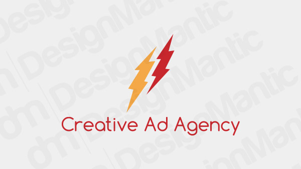
Electric bolt logo in red and yellow
9. Use Monochrome Colors
Monochrome colors can make your simple abstract design look meaningful. For an advertising agency logo that draws on classic patterns, this is a great strategy to use when thinking of branding strategy.
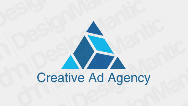
Triangle logo in blue tones
Related: 4 Fail-Safe Ways To Choose The Perfect Colors For Your Advertising Logo
10. A Dynamic Marketing Logo
Add a bit of motion and activity in your marketing logo design by using abstract shapes and icons that have a little movement in them.
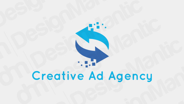
Two arrow logo with crossover pattern
11. Gradient Colors
Go all out on your abstract marketing logo by using gradient and other forms of adventurous color techniques to make your design look a class apart.
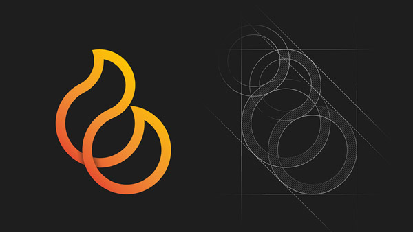
Image Source: Dribbble
12. A Bold Shape
Choose a bold design technique, such as bright, contrasting colors or solid, fuller shapes for your next abstract marketing logo.
Image Source: Dribbble
13. Timeless Advertising
If you want an advertising logo that remains a classic and not relies on the whims of trends, choose a simple, timeless shape that can remain solid throughout the years.
Image Source: Dribbble
14. Go All Out
Why not go all out when launching a marketing logo that you want to make go viral? Primary colors, heavy fonts, and modern typography are the way to do it.
Image Source: Dribbble
15. Take Inspiration From The Brand Name
A deconstructed abstract logo shape that uses your brand initials as the primary logo shapes are a popular way to create advertising business logos.
Image Source: Dribbble
16. Make Waves
There is no dearth of creative abstract imagery for advertising logos. The unique nature of the industry allows you to make your mark in any way you want.

Image Source: Logopond
17. Repeated Patterns
Abstract images routinely use regular patterns to create harmonized logo shapes. This design strategy is especially useful for new marketing business logos that want to create an instant impact.
Image Source: Logopond
18. Flip The Shape
An easy way to make your simple abstract design for the marketing company logo stand out is to use your logo shape and flip it on its head before joining it with the original mark.
Image Source: Logopond
19. Show Growth
Use the abstract shape of your advertising logo to add momentum and growth to your design. Let your audience know that you have what it takes to help them go places.
Image Source: Logopond
20. Use An Unmissable Background Color
Want something more besides a thrilling abstract design? Make your advertising logo really stand out by using a solid block of background color as the canvas of your design.
Image Source: Logopond
Summing Up
Abstract designs are popular in advertising and marketing logos. As a designer, you can give a winning edge to your clients by giving them a solid abstract shape for their ad company logos. Using other tools in your design knowledge, such as the creative use of colors and typography can help make your design go even further.


