A business logo serves as a company’s seal of identity, communication and trust. It is what helps a brand stay relevant with its target audience in order to conduct their various business operations with them such as selling their products and services.
But sadly, there will come a time when your logo design won’t be as effective as it was before for so many years. At that point, you will notice that your sales will begin to decline and the revenue stream will grow thinner if this keeps up.
You may be confused by all of this but we assure you that this is a common phenomenon that every business faces and there is a solution to it for which this article was made for. And you’ll also understand why logo redesigns are really the boldest but necessary decisions a company can ever take.
Consider the following reasons why your current logo is in dire need of a redo:
1. It’s Gone Old
There is no better way to put this, but the allure that your logo design had for so-and-so years has finally whittled away from the hearts of your target audience. Even companies with supposed evergreen logos need to upgrade sooner or later.
Your old logo is akin to that of expired milk – it’s gone past it sell-by date and is no longer consumable. A logo that hasn’t been updated to match the norms and trends of the present world will give an undesirable impression that your business is not only outdated but also unappealing.
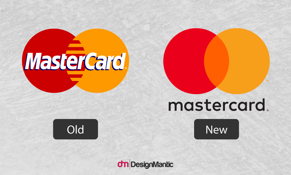
Take a look at what MasterCard did with their logo:
As you can see, the old design is on the left and the new one is on the right.
Therefore, it is pivotal that you design a logo that appeals to a newer generation of buyers in an era where technology and social media are the dominant norms. You can give your logo either a slight makeover or a complete overhaul if need be.
2. It’s Very Confusing
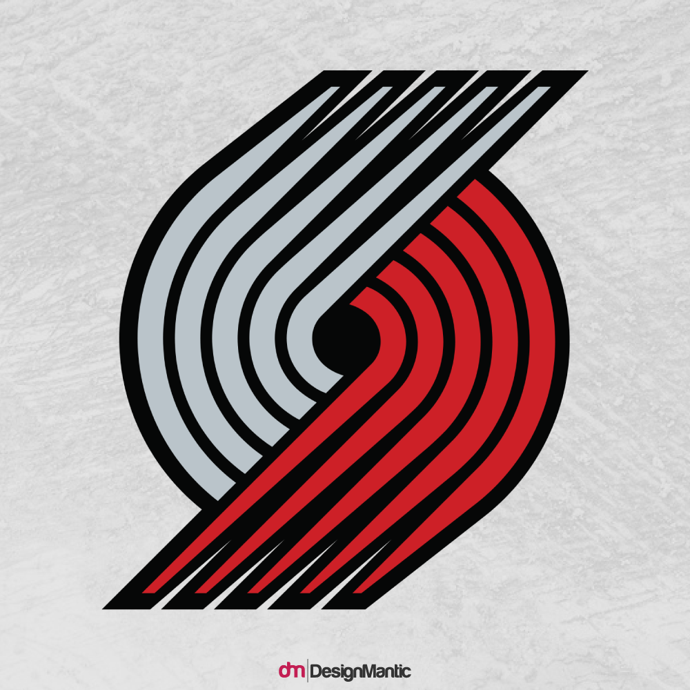
Take a look at this logo of professional basketball team the Portland Trail Blazers:
Can you make out what this is? Yeah, me neither. And THAT, is a grandiose mistake in business logos; confusing the audience. Your professional logo has to give meaning to your business’s ideals, goals and value the needs of your customers and a logo like the one above is the opposite of that.
Now look at these ones:
When you look at some of the world’s most renowned brand logos like Apple, McDonald’s, Google and BBC, you will notice that they all have one thing in common; simplicity. These days, a logo should not have to be incredibly detailed or have any fancy articulated fonts and names.
Simplicity works best nowadays because they are far easier to interpret, memorize and recall. Furthermore, it should look good on all mediums especially television, print and more importantly, desktop and mobile devices.
Related: Top 10 Rebranding Costs of Famous Logos
3. It Doesn’t Correctly Represent Your Brand
If you’re running a restaurant and your customers are looking to buy medicine, then that means your logo has failed to convey the right message and picture.
Your logo has to match your business identity and the niche industry that you specialize in. Everything from the colors, to the size, shapes and patterns you use to craft your logo, has to stimulate our mind and body to perform a desired action.
For example, why you think we get hungry whenever we see the McDonald’s logo, or even that of KFC, Coca Cola and KFC. Yes they are food brands, but their biggest strength lies in their warm colors of which the most dominant one is red.
Various studies have shown that the red color increases blood pressure and heart rate, which fills us with energy and passion, but stimulates our appetite. The same can be said about the color yellow. And that is why you will notice why fast-food establishment logos often use red and yellow to promote their brand.
4. It Doesn’t Stand Out
When you make or remake a logo, just ensure that above everything else, your logo needs to stand out from your competition. Though you must be cautious to put as best of an effort into it because many can tell the difference between a professionally crafted logo and an amateur one. Don’t be lazy and just randomly pick up ready-made designs that can easily be found online these days.
You have to opt for a logo design that is not only original and attractive to your target audience, but also ensure that it conveys the right brand message. You can choose to hire a professional logo designer or do it yourself if your budget is tight. Carefully choose the right set of colors, shapes, patterns and sizes that give your logo a truly unique and professional look.
5. It is Not Scalable
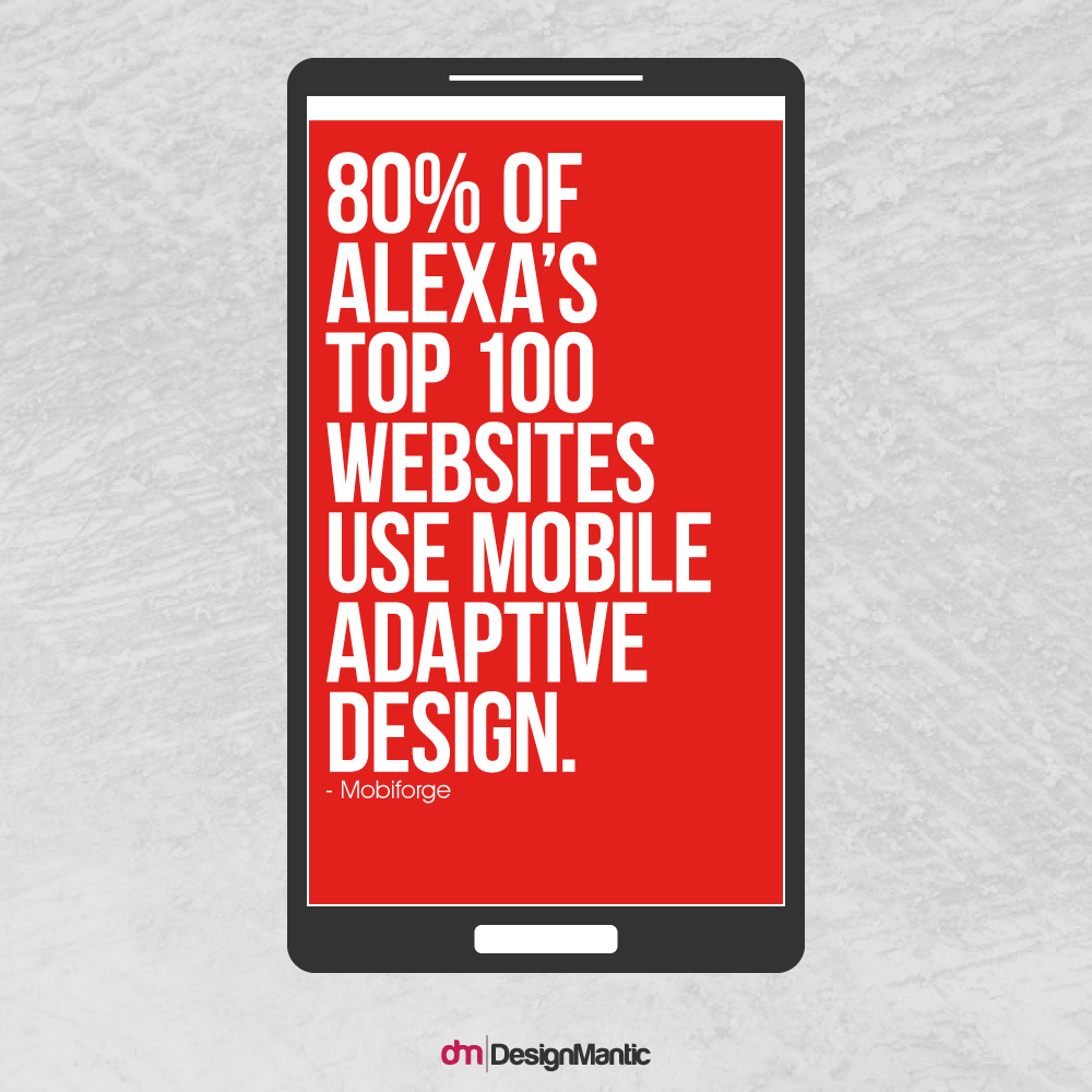
You’ll be thankful when you optimize your logo for mobile devices. GWI reports that 80% online users own a smartphone.
If you don’t optimize your logo for phone users, then your logo will appear blurry or pixelated. This is bad because a blurry image doesn’t pass off as something that can be shared on social media platforms. Thus, you will lose a large chunk of potential traffic and brand visibility.
So if we were you, we’d do the right thing and ensure our logo is configured to be viewed perfectly on all digital platforms.
Related: Design, Redesign & Design Again – When to Stop?
Conclusion
Creating the perfect logo depends on what you believe is in line with your company’s goals and value and the needs of your target audience. Through trial and error, you will eventually acquire a logo that is almost too good to redo. If you think this article is still incomplete, you can contribute your points in the comments below.

