I always think of hotels as some form of parallel universe. For some reason, in my mind, the rules of daily life do not apply when you are in a hotel. Sure, it could be a work meeting that has brought you to that hotel, but eating the ridiculously expensive food from the minibar and using the tiny hotel toiletries makes me feel giddy and childish.
And don’t get me started on experiencing the hotel have when you are on a vacation. Plus the branding of nice hotels, I mean *chef’s kiss* – talk about opulence and discretion!
How that is achieved, the balance of rich design with a welcoming brand message? Here are the 8 themes that help hoteliers pull off their unique brand identities.
1. Rich, Saturated Colors That Exude Indulgence
A simple but effective way in which you can make a simple logo look rich and exclusive is to increase the saturation in your colors. The more intense color is, the more impact it will have in communicating its primary characteristics.
For example, if you are using green in your hospitality logo design, using a saturated shade such as bottle green or forest green, will make your logo look absolutely nurturing, stable, and wealthy. In saturated shades, blue will look intelligent, tranquil, and highly dignified. And so on.
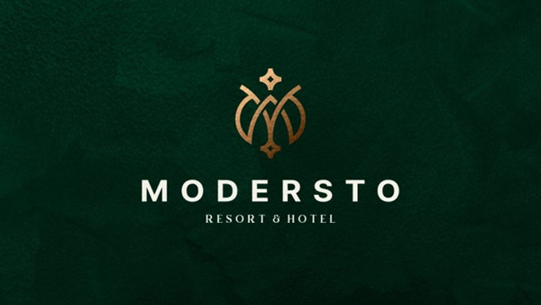
Image Source: Dribbble
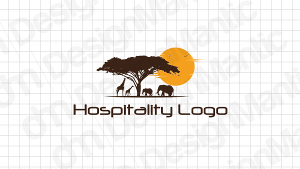
Image Source: Safari Travel Logo
Image Source: Dribbble
2. Golden Icons That Say Money Without Saying Money
Extravagant displays of wealth are not very attractive. Yet when we see logos of famous hotels like The Plaza or Burj Al Arab (Dubai), they somehow still look ridiculously expensive. How do they do that?
That clichéd adage, less is more, is at work here.
Designers use subtle and indirect cues to communicate the affluence of the brand. Hotel icons or letterings in gold color are one such cue. Marina Bay Sands in Singapore is a world-famous hotel; it uses a golden icon in its logo. The same is true for Hotel Sacher (Vienna), St. Regis (New York), and Claridge’s (London).
So if you want to make your logo look moneyed but not explicitly so, go with gold.
Image Source: Dribbble
Image Source: Hospitality Logo Letter
Image Source: Dribbble
3. Custom Lettering To Emphasize Originality
This is also a simple method but requires a higher level of creativity. While it may not be a big deal for a graphic designer to create some custom lettering but there needs to be systematic thought behind it.
Remember that identity designs are unique to most other forms of graphic design. Unlike a book cover, for example, a hotel logo has a limited space to say its stuff, and its meaning has to be multilayered.
Using strategic thought to create custom fonts that adorn your logo is how you emphasize the originality of your hospitality brand.

Image Source: Dribbble

Image Source: Dribbble
Image Source: Dribbble
4. Shield Designs For A More Together Look
Logos that are encased in seals, shields, emblems, and badges are a recurring theme in hospitality logo images. People associate a shield design with stability, reliability, and organization, and these are important performance metrics in the hotel industry.
Therefore, we see lots of badges and emblems when we start looking for hotel logos.
Keep in mind, though, your hotel shield logo does not need to be too serious. You can convey a sense of order and organization with fun colors and wonky fonts to make it look playful, yet in control.
Image Source: Dribbble
Image Source: Hospitality Logo Badge
Image Source: Dribbble
5. Typographical Hierarchy To Guide The Visual Attention
As I said above, a hotel logo has precious little real estate to play in. So, we see a lot of hotel logo designs using typography as a vital way to communicate visual hierarchy in the layout.
Using fonts of different weights and sizes, and even styles, designers successfully guide consumer attention across the logo and help audiences understand the design and its message a little bit better.
Image Source: Dribbble
Image Source: Dribbble
Image Source: Dribbble
6. Meaningful Symbols That Invite More Engagement
Making the most of the design brief provided, creative hotel logos use their icons as brand message vessels.
We see logo icons in line art, symbology, and illustrations conveying all sorts of meaning just through the choice of the icons. A location symbol, for example, is a great way for a hospitality brand to invite audiences to consider their property as ‘the’ place to arrive at and be in. A room key logo used as the brand icon is another clever symbol that communicates hospitality and can be used by travel agents, hotel booking software companies and Airbnb type of startups.
Using such meaningful symbols not only augments your brand message but also encourages audiences to look at the symbol for a bit longer and decipher the icon to get to the hidden missive.
Image Source: Dribbble
Image Source: Location Icon in Hotel Logo
Image Source: Dribbble
7. Logo Illustrations For A Rustic & Romantic Vibe
Whether you use neutral shades or something bright and sunny, you can make a hotel logo look beautifully romantic by adding illustrations to it.
Since an illustrative logo is more detailed in its appearance, it conveys an old-world charm. It speaks of lazy nights and late mornings. In other words, it communicates that there is all the time in the world to take things slow and appreciate the drawing in front of you, or lounge around the beach and look out at the sea in a more mindful way.
Bed and breakfast logos, holiday cabin logos, and beach resort logos usually go with these vibes in their designs.
Image Source: Dribbble
Image Source: Sun and Beach Hotel Logo
Image Source: Dribbble
8. Playful, Fun Logos For A Laidback Atmosphere
Continuing the point above, sometimes we are looking for a hotel logo idea that is even more casual and laidback than an illustration design. We are talking mascots in your hotel logo, local cultural icons, and funny and funky animals. Think of pelican logos or duck logos or even crow logos.
If you are creating a holiday logo design for a beach resort that wants a playful and low-key vibe, using cartoon imagery or naturalistic drawing is a great way to accomplish that.
Image Source: Dribbble
Image Source: Hotel logo with Pine Tree Icon
Image Source: Dribbble
The Verdict
Hospitality logo ideas run on some common themes. While they make a strong case for minimalism and contemporary luxury in their logos, we also see more intimate vibes with natural shades and everyday visuals.
So give it a try. Use one of these themes in your next design project and see if you can recreate the magic.


