If you are here, chances are you love typography at least as much as we do, if not more. That is why we have collected this list of our favorite 25 info graphics here. To share with you the history, evolution, and practical applications of type in web design and print.
Typography has been around since the very first time man (or woman) picked up a rock and chiseled the image of the thought that they did not know words for. As humans evolved and they made up symbols and gave them meanings, typography evolved too. One word said in hundred different contexts can mean so many different things. And same is the case with letters.
Each of these little icons have their own identities, personalities, and styles. The way they stand, move, tilt, and lean…all of it can convey different emotions and sentiments. These unique voices and sensations that each different style of letter provides is the reason that different typefaces and matching fonts are used as representations of different feelings.
It is the reason that some fonts look serious to us while others more fun and exciting.
So, without further ado, let’s dive in to this treat of amazing typography Infographics.
1. First, A Little History.
To truly understand something, we should always look at its origin. The following chart represents the history of typography and shows when and how each type was born and how it travelled through the years.
You can see from this graph that Script has been the most ancient typeface, and with its modern applications even today, we can appreciate how strongly it has stood the test of time.
Decorative fonts are the most modern ones, and only over a century old.
The graph also sub-categorizes all the important typefaces and shows the origin of each individual font style as well.
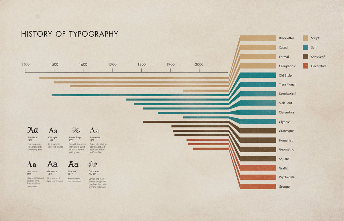
Image Source: Ricochilds
2. History of Western Typefaces
In addition to a more general history of typography, this next Infographic is more focused. It showcases the historical origin and progress of the Western typefaces that started in 100 A.D. After Gutenberg invented the movable type with the printing press in the 15th century, the first form of Italic was developed only a hundred years later.
As is consistent with progress in any other area, type also improved more rapidly with each passing century with ever-shortening gaps. In the next three hundred years, a Greek typeface was invented, Sans Serif was introduced, and Benjamin Franklin argued with a certain British person over ‘blindingly thin strokes’ of John Baskerville.
As you can see, the typography aficionados have been taking it too seriously since the 1700s.
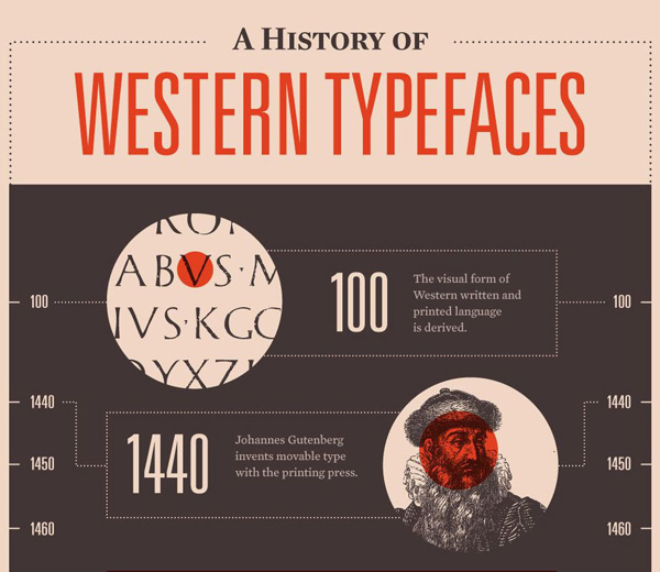
Image Source: Mashable
3. Evolution of Typography
Before we conclude our history lecture on typography, we have to show you this one chart that describes the evolution of different typefaces based on their unique characteristics. Isn’t that really interesting?
The four major typefaces it addresses are Serif, Sans Serif, Blackletter, and Script. As you can see, some of these types were founded on the basis of unique characteristics they represent, some on shapes like geometry, and others on calligraphy.
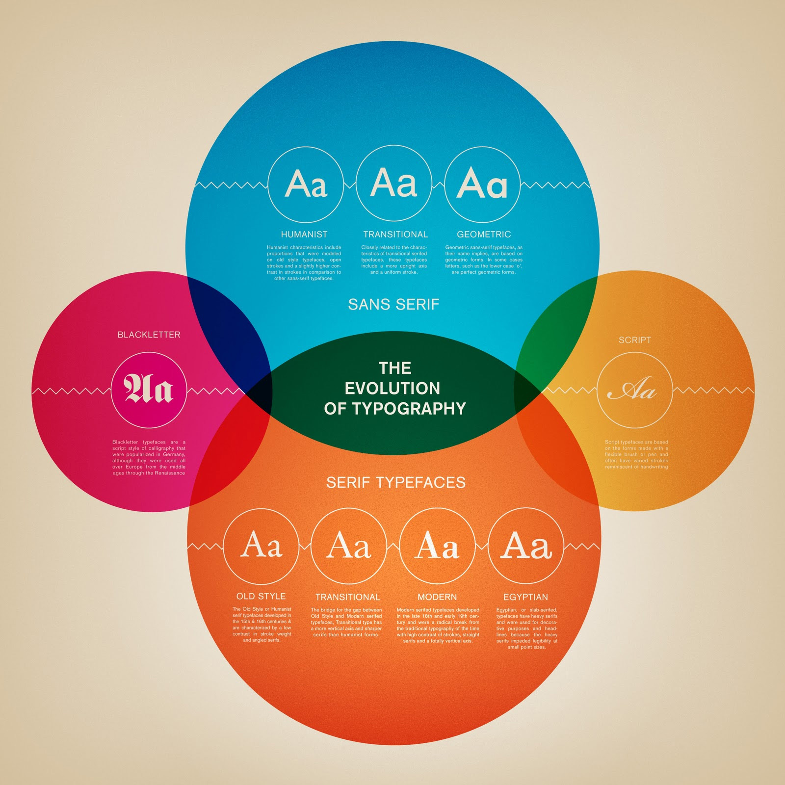
Image Source: Web Design Ledger
4. Essentials of Typography
Now that you know the history and origin, let’s see the essentials that make up typography. This information-rich chart not only talks about the vernacular of typography but also talks about principles of combining fonts, varieties of typefaces, and how each different font even from the single typeface family can represent different personalities.
It’s these intricacies that make typography such a fascinating study. That by using a different font, you can completely alter the message you are trying to convey or affect the mood. It is not only a powerful thing to learn but a highly effective asset that will always help you whether you are into design or marketing.
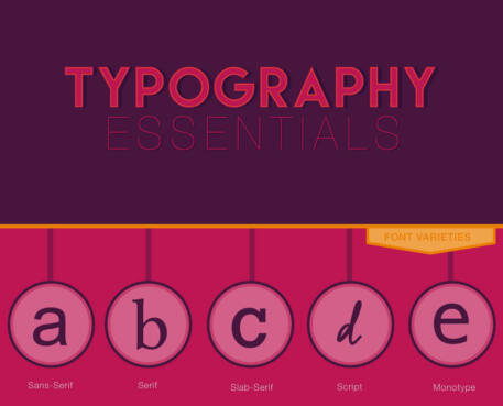
Image Source: The Jellyfish
5. Anatomy of Typography
We have been talking about personalities and emotions of typefaces, but did you know that letters also have unique anatomies? This chart talks about the anatomy of different parts of letters. As a design or marketing expert, you may think it isn’t really necessary to learn the anatomy of different parts as long as you have a firm grasp over what types to use and how to match them when constructing a design.
Truth is, with such surface knowledge you can always know the ‘what’ of type but never the why. If you have mastery over even the basics of why then you can really experiment with your designs and really gain a demonstrable edge over your competition.
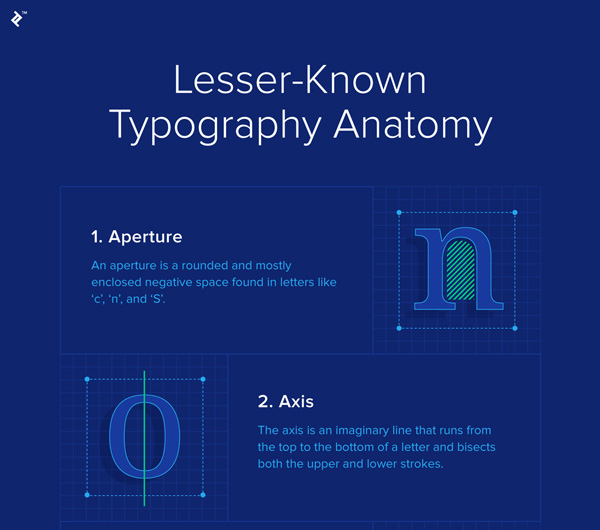
Image Source: Toptal
6. Ten Most Famous Fonts
In this Infographic, we are going to take a look at what the 10 most famous fonts are, and the timeline of how they developed. This selection not only focuses on fonts that look good on digital products, but also adds those that have worked extremely well in print.
And that is why, the Garamond of Harry Potter’s title is rated at number 1. This list includes typography or letters based logos, movies, music, apps, retail, and technology. Looking through this exciting knowledge, you can also see which typeface has been most popular with which industry and if any font shows its present in any of the other industries.
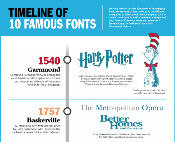
Image Source: Mines Press
7. A comprehensive Type Guide
Now that you’ve learnt all the basics, here is a quick and comprehensive guide for you to master type. In this guide, you find out ways to use styles depending on their meaning, you can also find pro-tips (like you should never use more than 3 contrasting typefaces in your text), and the most common styles used today.
Armed with this comprehensive knowledge, it’ll be much easier for you to navigate the many tricky fields of typography in design, and help you avoid some common pitfalls. If you want to become a designer expert in typography, this guide can be your starting point.
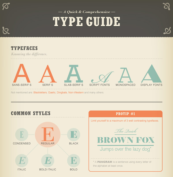
Image Source: Fast Company
8. An Intro to Typography
This brief intro comes with not 10, not 50, but a grand total of 100 best typefaces of all time. Why 100? Because 10 sometimes just not have enough variety. Or perhaps what you want your text to convey is requires more depth than the top 10 can provide.
But this intro also comes with a classification bar. How different typefaces are characterized into classes and families, the common characteristics they share and how they are distinct from others. In addition to a historical timeline, you can also find some book titles here. Books that have been written about typography.
Plus you can also learn about the height, weight, and positional significance of every letter.
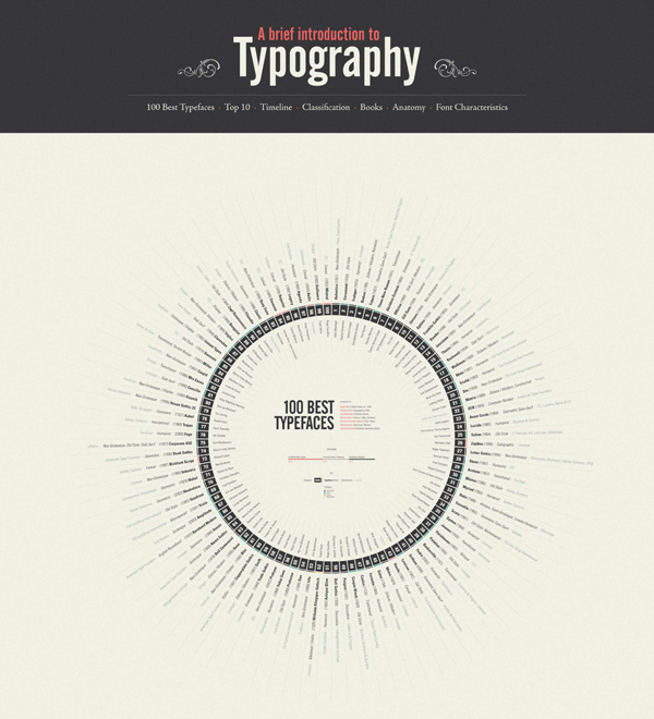
Image Source: Downgraf
9. The Psychology of Fonts
You didn’t think fonts are chosen and used at random, did you? No, a lot of psychology goes behind each selection and each pairing. How designers choose typefaces is based on psychological principles that guide our understanding of the unique characteristics that each style represents.
Why do all capitals look loud and shout-y, or why cursive looks more intimate and elegant? The answers to these questions, and many others concerning the science of font selection, are rooted in psychology. There’s a definite yet subtle science behind why we attribute certain meanings to certain styles of lettering.
That is why our next Infographic addresses the psychological aspects of typeface selection.
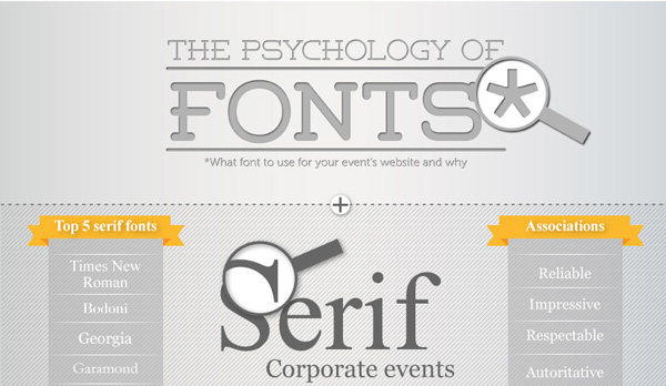
Image Source: Visual.ly
10. Fundamentals of Web Typography
As people become more visual and image-centric and designers go minimalist, there’s a lot of emphasis on image-rich website design. A challenge of such designs is that very little space then remains for the text, and it has to make the most of that little space to effectively communicate the message that it wants.
These restrictions have given birth to creative and novel uses of web typography. Not only the ad copy has become tighter, concise, and wittier, the fundamentals have emerged that guide our use of sparse space with meaningful use of types and letters.
This Infographic talks about those fundamentals in the most visual way possible, with lots of textures and contrasts.
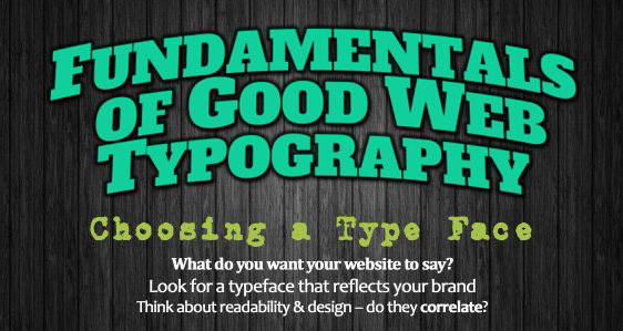
Image Source: MarkITwrite
11. Classification of Type
Classification is the grouping together of certain elements under consideration on the basis of the similar characteristics they share, and the ways in which they are different from others.
There are multiple classifications of type. Old Style, Humanist, Transitional, Slab, Modern, Geometric, and Script are some of the most common ones. Classification not only helps us understand typography better, but it also gives a point of reference to the designers.
Designers interested in learning how to create custom designer fonts will especially learn a lot from these font classifications.
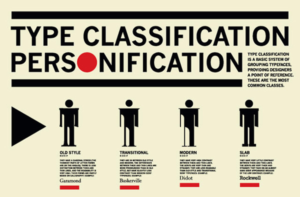
Image Source: Ladd
12 a). Best Typeface For Official Use
A business, no matter with how laidback a vibe, must maintain at least some level of professional presence in the industry to inspire decorum within its operations. That is why Google, with slides in its office and colorful furniture everywhere, still chose a somewhat professional looking font in its corporate logo.
Remaining within the professional lines of boundary, here is a chart of business-appropriate fonts that you can use in your official documents, logo choices, and marketing material without being overpowering or overbearing.
In other words, you can still maintain and exude a sense of friendliness without going all cursive or Comic Sans on your customers.
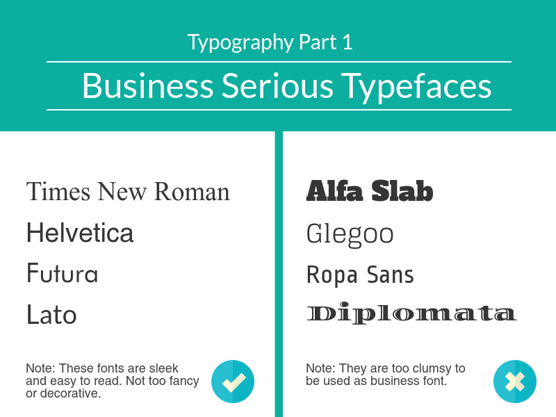
Image Source: Piktochart
12 b). Fun And Creative Typefaces
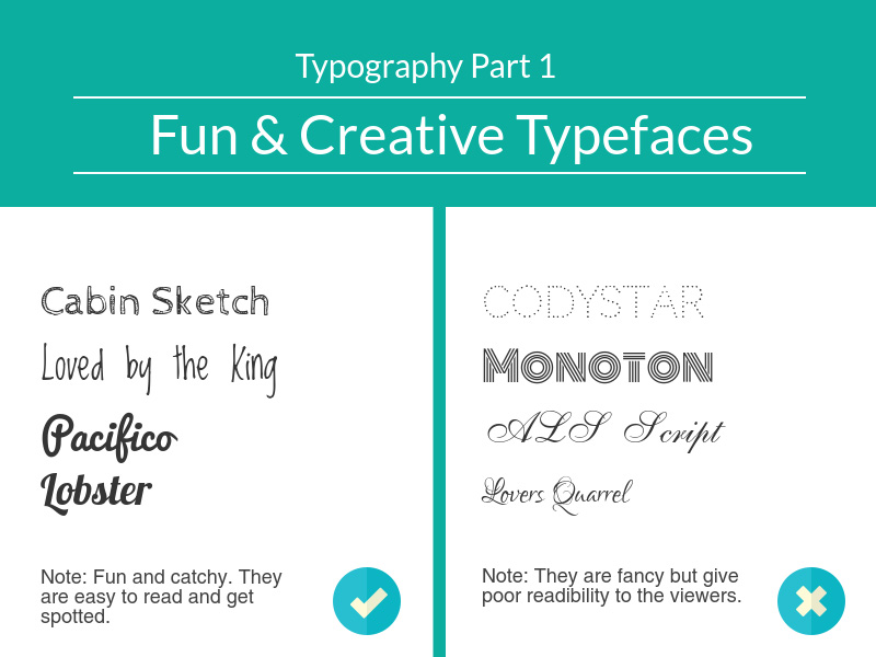
Not all cursives and textures were created equal. While some look friendly, creative, and fun, others just miss the beat. Take a look at the right column of the chart below, concluded with the Lover’s Quarrel. Now, this is a list of fonts that you may want to stay away from.
If you want a casual vibe to be expressed through your logo, for example, you can do so by a fun logo that is casual but never lazy or sloppy.
Since most fun and creative typefaces are usually based on the Cursive style, you have to select a font that is easy to read. Never give up legibility just for design quirks. It is never worth it, especially in web design. Instead of figuring out what the many tendrils around your design are saying, your customers will likely move on and open another website. One that they can read.
12 c). Minimalist Typeface
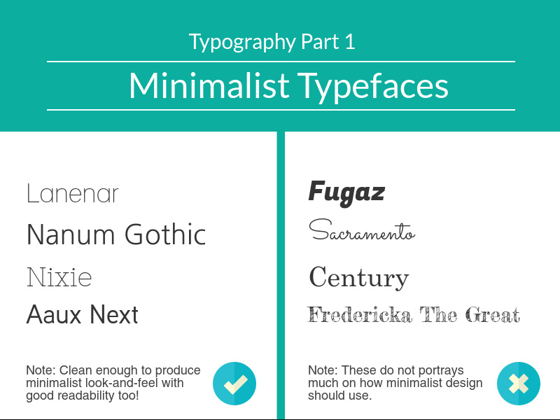
One of the modern design trends that offers really nice, neat, and appealing web designs is Minimalism. It is spacious, uses utilitarian approach, and enticingly clean. And so it requires font styles that complement is spacious feel and neat looks.
In the Infographic chart below, you can see a list of chosen typefaces that fit well with minimal design and lend a coherent and organized appeal to your overall product. In this list we can see clean lines of Lanenar, the intended style of Gothic, and the Nixie with a Silicon Valley feel.
Like with any other typeface decision, readability must always be a factor when choosing fonts for your minimal design.
12 d). Typography For Personal Websites
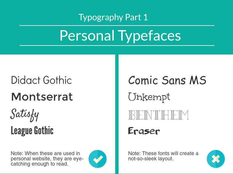
People mostly go for casual and quirky fonts for their personal logos and websites. The intent perhaps is to showcase a distinction from the more official and business websites, and to invite more readers in. While most cursive fonts look casual, they can also look quite clumsy and non-serious.
Hence, you need to strike a balance. From the chart below, you can learn how. While Comic Sans MS usually features in ‘fonts-not-to-use’ list, you’d probably not use it anyway. But if it wasn’t featured here, would you actually use a font that’s titled ‘Unkempt’ for your personal website?
Let us know in the comments!
13. Web Designers’ Favorite Fonts
If it is becoming difficult for you to know which fonts to choose in your web design and which to forgo, here is a selection of top 10 fonts that web designers from all over the world have declared as their favorites. Do you want to know if your favorite made the cut?
Scroll down to find out.
But wait, make a guess now (without looking at the Infographic!) about which one is on #1 and see if you’re right. Honestly, no peeking.
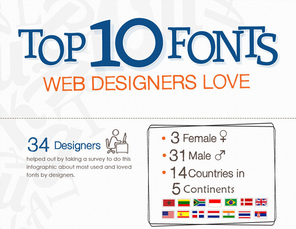
Image Source: Hongkiat
14. Google Fonts Mixing Guide
A lot of designers choose to use Google fonts in their web designs. As these were created especially for web, it makes sense to use them as your font pool. But even within these typefaces, you need to have some ground rules before you start mixing and matching the fonts.
This ‘cheat sheet’ contains twenty Google fonts that you can mix and match to create a stunning web design. It also tells you which combinations never to attempt. So take a look below and find out which combination you will be choosing for your next design project, and which you had almost chosen before you saw it here in the black area.
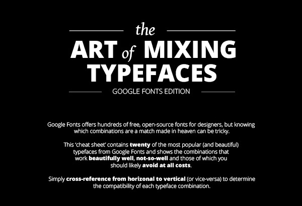
Image Source: Fast Print
15. Typography Accessibility
In website design, not only does topography need to look absolutely amazing, it must also have accessibility. What is web accessibility? It is a practice to ensure that websites are accessible to people of all socio-economic classes, of different physical or otherwise disabilities, and those who may not afford high speed Internet connections.
Keeping this practice of inclusivity in mind, the following graph discusses ways to make the text more legible on websites without compromising on design quality. Once you look at the graph, you can see how by just emphasizing the dots on ‘i’ and ‘j’ and by lowering the junction in ‘r’, and working on similar other small details, we can create more accessible web type without ever reducing any design element.
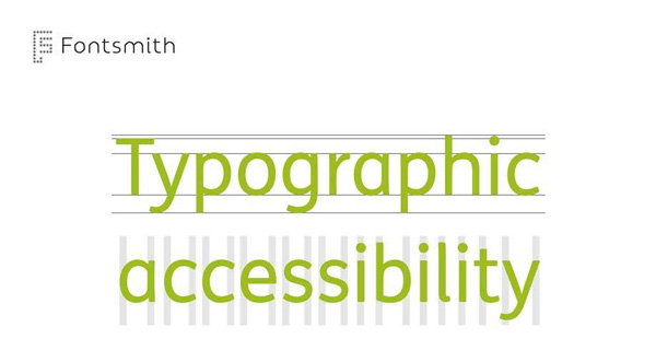
Image Source: Dowitcher Designs
16. Typography Affects Conversions
Now this is an Infographic that all of us have an interest in. we all want to convert our web traffic into repeated, loyal customers. Whether we are selling shoes, foods, or blog, we want everyone who visits us become a lifelong supporter.
While great products, even greater customer services, and timely web download time sure help conversions, what about a great typography design on the website?
The fact is, typography helps give our design focus, hierarchy, and makes it easy to understand the message of the business.
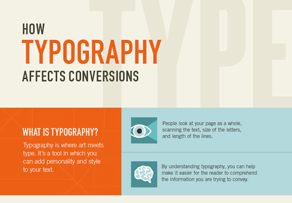
Image Source: Quick Sprout
17. Typography Equals Branding
Typography is an important branding essential. Just by changing the positions, style, and alignment of letters, we can send a totally different message through our text. Whether you are launching your brand for the very first time, or are working with a client on a brand transformation effort, knowing the critical part typography plays in establishing a brand’s identity is crucial.
A lot of work goes on as we sit down and attempt to convert a business into a brand, and every little detail matters. It pays to focus on those details and to make sure we get every single one of them right.
Image Source: Iconic Fox
18. Wedding Typography
Wedding typography is a whole new ballgame than everything else we’ve been discussing over here. When designing material for wedding stationary, wedding logos or invites etc. your approach as a designer is completely different than when selecting fonts for a tech website.
Wedding typography needs to be more intimate, with a lot of depth, meaning, and connection. It does not need to be cursive, unless that’s what your client wants. A lot of modern weddings use bold, modern, and hip typography styles. Most clients will come prepared with a list of typefaces that they like. Your job will be to sit with them and pick one that represents them the best.
Image Source: Roland DGA
19. The 10 Typography Commandments
These 10 commandments very clearly lay down the guidelines for font selections in a variety of design challenges. Whether it is contrast you’re going for, or you want to portray a certain mood, there’s a commandment here that helps you walk down this rocky road.
Through this chart, you can learn the fonts that give the perfect style when combined, and also those that destroy a design to its very core when you force them to mate. So as you prepare to start your holy grail of font selection, make sure your 10 Commandments are saved in your phone gallery to lead the way.
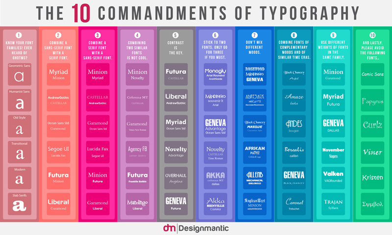
Image Source: DesignMantic
20. Typefaces 10 Tips
If the 10 commandments were not enough for you, we have sourced these ten tips to further ease your design woes. These tips talk about what to look for in a heading font versus the paragraph font; it also warns against forcing italics on an unsuspecting font, and also shares the key to a successful typography choice.
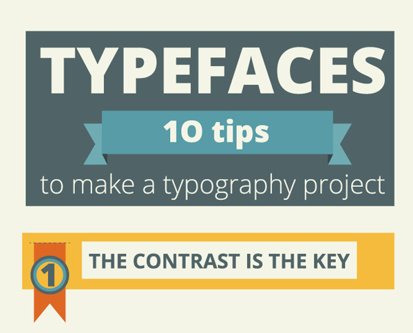
Image Source: Silo Creative
21. Serif vs. Sans Serif
As a designer and typographer, you are well aware of the raging battle these two fight all the time. While these two are fundamentally suited to different media forms – Serif for print and Sans for Web – the battle still rages.
The following chart provides a workable compromise. As you will see shortly, both these fonts have strengths and weaknesses that can be complemented and adjusted both for print and web. Serifs can be used for paragraph body on web, while Sans can be incorporated into children’s book as they are much simpler to read and comprehend.
So without talking more about it, let’s see what the Infographic has to show.
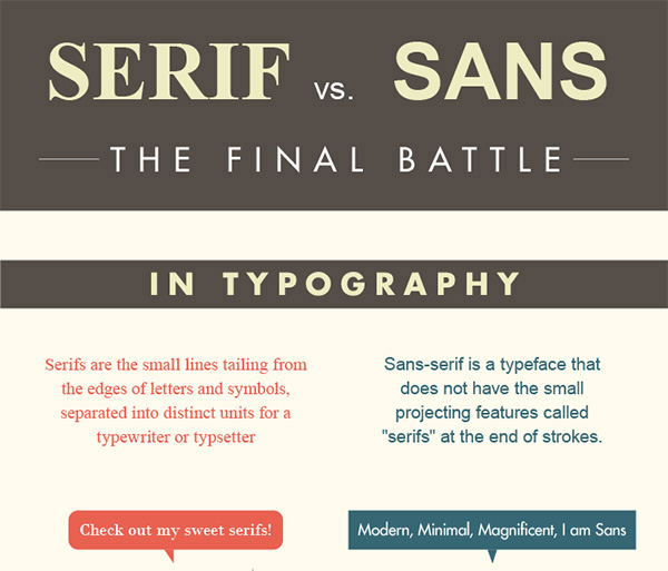
Image Source: Urban Fonts
22. What You Want Fonts To Do Vs. What They Actually Do
To conclude this amazing display of typography history, culture, and instruction, there’s nothing better than Cracked’s sarcastic (and hilarious!) take on what you want a font to do vs. what it actually does.
For example, when you use Papyrus font to illustrate how authentically Eastern your herbal medicines are but they tell the customers that they’ll be sicker in the morning than ever before. Or when you’re trying to showcase your company’s hip culture but end up with a font that gives away how you’ve filed for Chapter 11 for more times than anyone can care to remember.
For more, have a look.
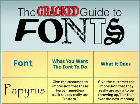
Image Source: I Love Charts
23. So You Need A Typeface?
This is a very interesting, fun, and engaging take on the question, ‘How to select the most perfect typeface?’ This is less of an Infographic and more of a flowchart – it’s an inflowgraphic! (Hehe)
If you are not sure on your choice of type for a particular project, or are not even sure where to start from, this flowchart poses some very simple questions to you, and as you answer each question, you start navigating the complicated web of typeface selection with increasing ease, till you arrive at your destination.
This flowchart is loosely based on the top 50 of the 100 best typefaces chosen by Font Shop.
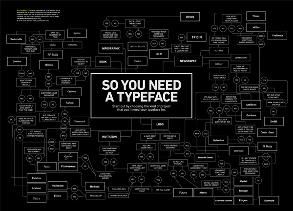
Image Source: Julian Sonne Hansen
24. Glossary of Typographic Terms
The world of typography is a whole civilization in itself, complete with a history, culture, and language. To communicate with the natives and to learn from this vibrant and complex world, you need to have a mastery over the language.
Consider this Infographic below your first lesson and see what arm, leg, and bowl all mean (they definitely don’t mean limbs and dishware in this world). As you start learning these basic terms, it’ll become easier for you to decipher the wider language of this interesting world. Soon you’ll be able to combine, mix, and merge different parts of letters to create custom fonts, new designs, and unique styles.
But first, the a, b, c.
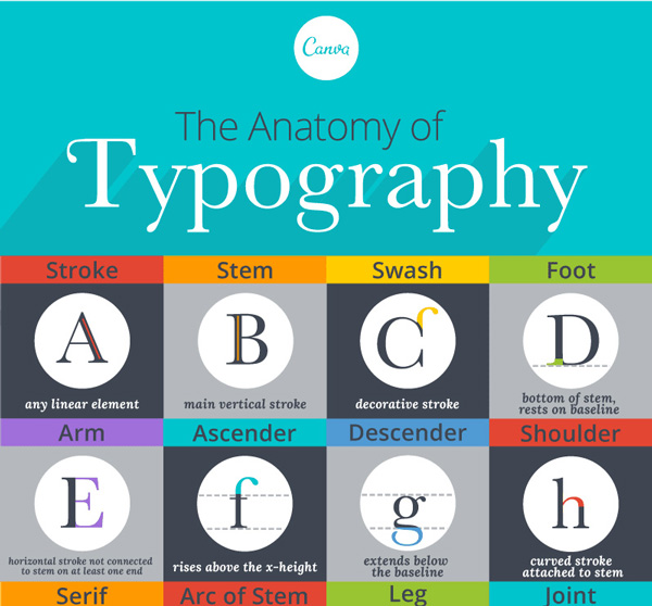
Image Source: Canva
25. The Type Glossary for Noobs
If you are looking for a type glossary that is a bit more advanced and technical, well, we have just the one for you. In this chart you will not only see the basic terms explained, you will also see the vernacular that expert typographers communicate in.
As an aspiring designer or typographer, or just an enthusiast for fonts, this glossary breaks down the individual typeface elements and explains them in visual detail. You will learn about kerning, glyphs, and measures. You will also see how hierarchy is achieved in type, and how size and tracking are connected to produce stunning type designs.
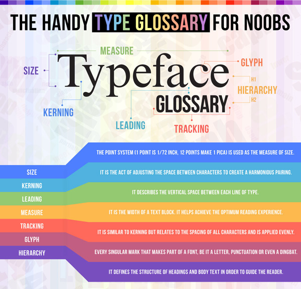
Image Source: DesignMantic
Over To You
So tell us which of these Infographic spoke the most to you and how you plan to use what you’ve learnt from these rich sources of information for your own brand’s success! Also, how much did the last one made you laugh.

