In businesses that deal with aesthetics, fashion or visual appeal products, visual branding becomes especially important. This is because the logo design or other branding elements convey your taste, creative side, resourcefulness and ingenuity. If you are in jewelry business, you either make it or break it with visual branding. It will either tremendously support and buoy your image to greatness or drown it into mediocrity.
If you’re thinking of taking the path of effective and creative visual branding for your diamond jewelry business, there are some commandments of a successful logo design that you need to keep in view. First of all, your logo should convey aesthetics and styles you aim for in your jewelry design. Secondly, your logo should be self-evident about the specific jewelry niche. So for example, if you are into diamond business, your logo should speak for it.
In this article, we have put together some tips that will help you set your diamond store logo apart from others. Let’s see what you can do to break away from the typical styles and make your diamond jewelry logo a bit more fresh and unique.
Go For Dynamic Branding
Dynamic branding is the cutting-edge present and future of logo design. If you have not heard of it already, now is the time to explore it. To put it simply, dynamic branding keeps changing with time. A dynamic logo shifts and grows with time, with seasons, and with occasions.
A dynamic logo will primarily have two kinds of elements. One is stagnant element that allows you to anchor the rest of the design and make it recognizable. Apart from this, the rest of the logo might change. There might be a change in the color, texture, text, font – anything!
There are many benefits of a dynamic logo for your diamond jewelry store. Here are some of them:
- Your Business Becomes Relevant To the Surroundings:A dynamic logo enables you to be very relevant to whatever is going on around you. You are able to connect to your surroundings. You can change the logo for a special occasion, for a special season, for a special product line – anything and everything basically. This makes your diamond jewelry logo very relatable, fresh and something people will want to associate with. Because it is relevant to their environment!
- It Expresses Your Creativity:A dynamic logo enables you to express the creative side of your jewelry business. Because you are going to churn out something new every now and then, it is a testament to your immense creativity, and people are going to get drawn to your jewelry line as well.
- It Shows Your Business Is Evolving:Let’s face it, a piece of jewelry is a fashion statement. However, just as with any other kind of fashion, jewelry designs and styles can quickly grow out too. There might be a trend that sticks for a time and then is left to go stale.
When you opt for dynamic logos, you are telling your customers that your jewelry line is constantly evolving and will always be relevant. That your designed pieces are timeless, and are as dynamic as your logo. And this is the best message your customers can ever receive – because it also means you are providing value for their money!
Conejo Valley Jewels
Now let’s look at an example of a dynamic logo used by a diamond jewelry store:
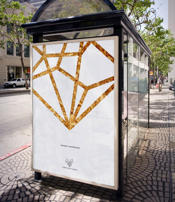
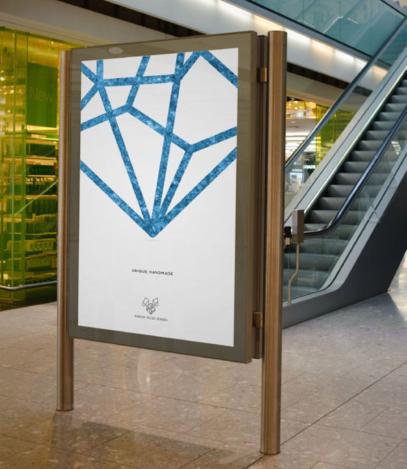
Image: Behance/Wy Branding
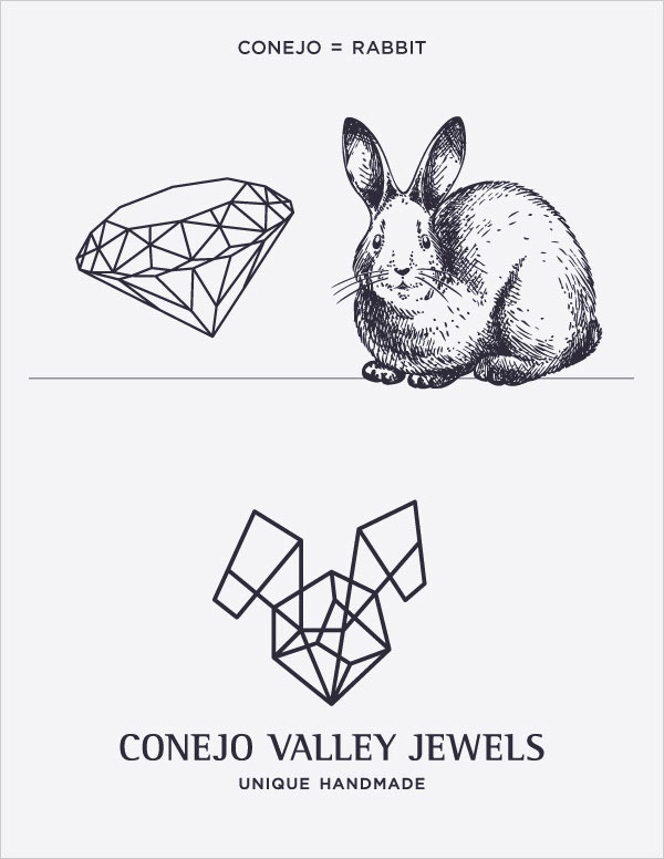
Conejo Valley Jewels is a jewelry store that provides unique handmade designs of diamond jewelry. They have gone through a dynamic branding that works for them in so many situations.
First of all, how they have broken free from the typical diamond store design is by infusing the structural makeup of diamond with the form of a rabbit, because Conejo is a Spanish word for rabbit. The end result is a visual icon that looks like a face of a rabbit set in a diamond.
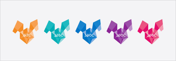
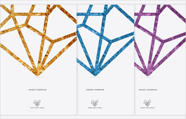
To make the logo dynamic, the jewelry store keeps on changing its colors and textures. Sometimes the logo appears in full solid colors, at other times it appears in a wired structural form. Sometimes the logo appears as a whole imagine, while at other times it appears as a part of the image.
Related: How To Design A Website, Logo And Other Computer Graphics
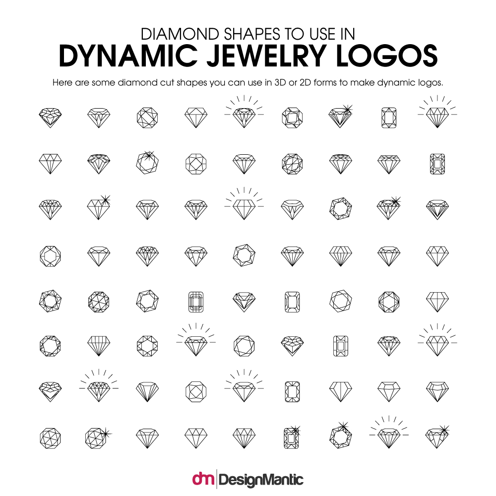
Here are some more examples of dynamic shapes that can be used for a diamond jewelry store logo.
You can use such arrangements with diamond forms and color them in different recognizable themes from different angles.
How To Convert Typical Logo Design Features Into Unconventional Styles
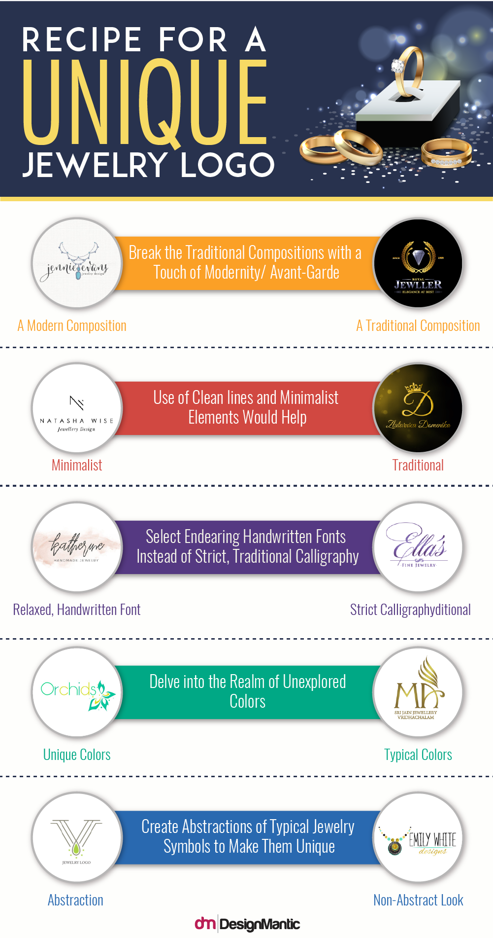
If you don’t want to go for dynamic logos, there are some other design techniques you can employ to change the look of typical diamond store logos into unconventional ones. Here is a comparison of the typical elements versus the edits you can make.
It is important to know the typical stylistic elements so you can refrain from going into that area, and steer yourself toward more creative styles.
1. Typical Diamond Jewelry Logos May Use Victorian Emblems
Typical diamond jewelry logos radiate a very Victorian feel. This is because the Victorian era is associated with luxury and elaborate craftsmanship. If you are not a traditional diamond store and want to venture into the realm of unconventional jewelry designs and styles, go for an unconventional logo. Here are some examples of the Victorian emblems used in the traditional diamond jewelry logos.
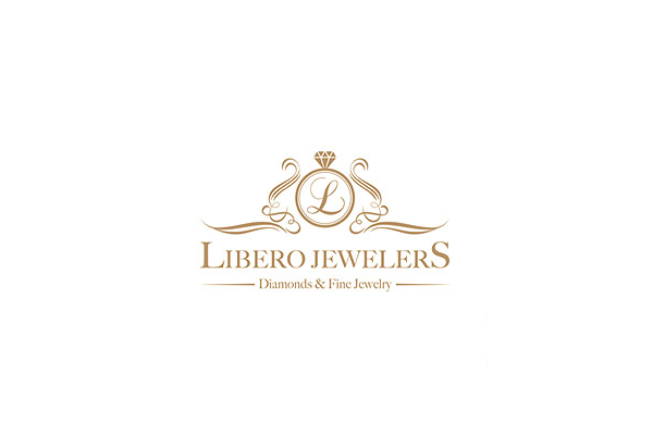
Image: liberoJewelers
The above two logos use the Victorian crest, vegetal patterns, Victorian font and the dull gold color that is typical of the Victorian style.
What You Can Do Instead: Go For Modern Compositions
If you want to appear different, go for modern compositions and minimalistic styles. You may even use the same colors and font styles, but if the logo has an overall modern composition, it will look different and new!
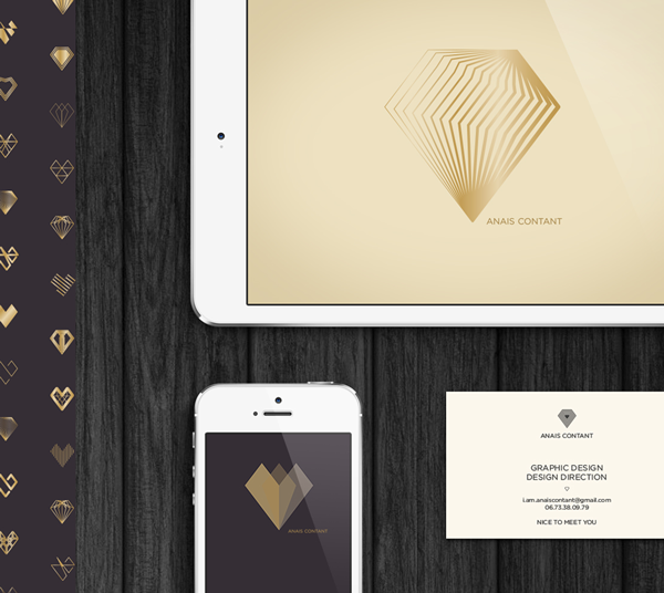
Image: Behance/Anais Contant
The clean cuts, clear lines, and sans-serif fonts give the above mentioned logos a modern, minimalist look. However, if you notice the composition, it has a linear arrangement. This is another defining element which helps in giving the overall logo a minimalist and modern look.
2. Traditional Calligraphic Fonts
Calligraphic fonts appear luxurious. That is the reason why calligraphic fonts are the prime choice for jewelry logos or any other thing where the designer wants to convey a sense of opulence. However calligraphic fonts are also run-of-the-mill when it comes to jewelry logos. Because they have been done so many times, they give a typical, traditional look to your diamond jewelry logo.
Unless you can use these calligraphic fonts in a unique way, it is better to stay away from them.
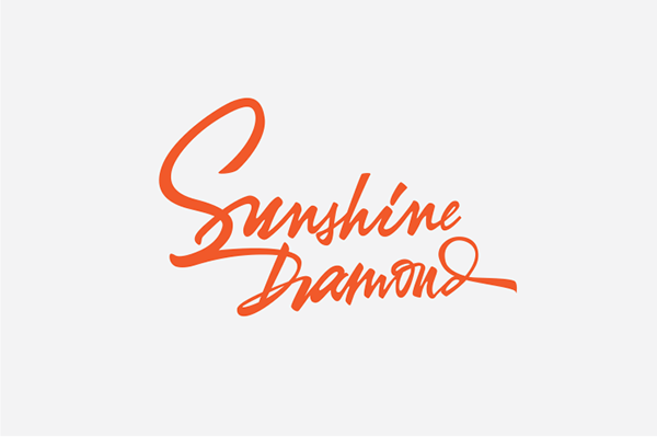
Image: Behance/Hermanto Lim
What You Can Do Instead: Use Unique Fonts
You don’t necessarily have to use a sans serif font to give a different and modern look. Sometimes, you will come across minimalistic, modern looking calligraphic fonts which can be used in a very nice way in your diamond jewelry store logo. For example, you can use handwriting fonts such as these:

Image: Behance/Monika Šakauskaitė
3. Typical Use Of Colors
Logos associated with diamond jewelry businesses often use run-of-the-mill colors. The most common colors used in such logos are black, white, blue, and gold. This is because these colors convey specific emotions. Blue, white, black and gold have the ability to give off a serene and tranquil touch. Just the kind that is reflected in a diamond. However, these colors will invariably give your diamond jewelry logo a very typical look. Here are some examples:
Image: Behance/Heba Yassin.Q
What You Can Do Instead: Use Distinctive Shades
To give your logo an out-of-the-box feeling, opt for the colors that radiate a distinctive feeling. Or even different shades of the typical blues, blacks, and golds. Here is an example of a distinctive look created by different color.
Hark Jewelry
Image: Dribbble/Jason Feltz
Instead of the typical shade of light blue, Hark jewelry uses a deep shade of the hue for their logo, and it makes all the difference. Not only does the logo look unique, it also looks more attractive and fresh. Instead of the typically subdued jewelry logo, this one makes its presence felt.
4. Typical Symbols Of Jewelry
Diamond jewelry logos mostly utilize some sort of symbols to portray their business niche. Apart from text-based diamond logos, logos with symbols are more popular. Usually, these logos make use of some typical symbols which are associated with the jewelry business in general and diamond jewelry business in particular. The most recurrent symbols you see are diamond shapes or symbols of different items of jewelry. For instance, a diamond jewelry logo may make use of an image of a ring which has a diamond atop. Similarly, images of necklaces and bracelets are also common. All of these are pretty typical and concrete symbols that refer to the jewelry business. If you do not make any effort to make these symbols look unique, your logo will look like just another brick in the wall.
Here are some examples of the typical usage of these symbols:
Image: DiamondAndGoldWareHouse
Image: fifthCJewelry
All of these logos make use of the typical jewelry symbols. If you want to appear different, your logo should not utilize these symbols in the same way.
What You Can Do Instead: Unique Use Of Symbols
To appear different from the cookie cutter diamond jewelry logos, you can use the same symbols in a different way. This will have a twofold advantage; using already established symbols allows the viewer to identify and recognize your business niche quickly, however using a creative design technique to do so will make your logo look different and unconventional. Here are some examples of logos where the usual jewelry logo symbols are used in a different way:
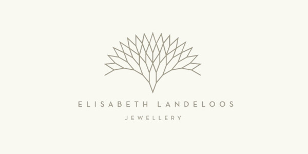
Image: ElisabethLandeloos.Be
The Elisabeth Landeloos logo gives a unique look to a diamond cut. The symbol looks like a tree or a vegetal image, however, it is actually a diamond. This makes the logo appear fresh, unique and new.
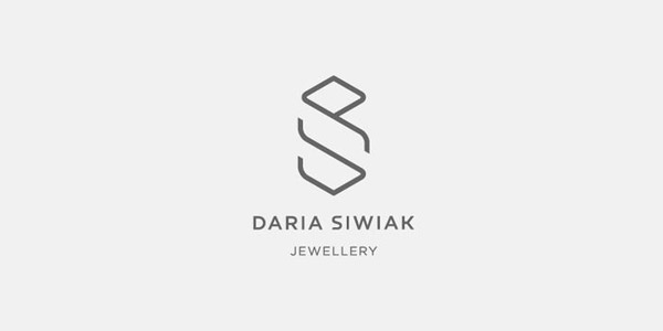
Image: DariaSiwiak
Want to replace the traditional ring with a stone symbol? Give it a different stylization like in the logo above! The line drawing in rendered in a very linear, geometrical way, which gives the image of a ring a different and new look. It looks both different and creative at the same time.
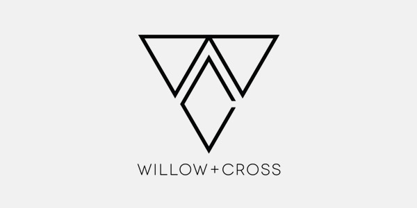
Image: Behance/ Zack Baldwin
Similarly the Willow + Cross jewelry logo again plays upon the image of a diamond and renders it in a different way. Here are some other examples of rendering the typical diamond image in a unique way:
There are plenty of ideas you can use to make your diamond jewelry logo more unique and unconventional. You just have to keep things straight and let the creativity flow. Which of the ideas in this post inspired you? Let us know!

