Everybody has a particular brand of beans, ice-creams, cookies, and even salt and pepper. When ambling through the aisles of supermarkets, our eyes rove around until we spot our desired brands. While to a greater extent, taste and quality of food define our choices, the logos for food brands have a major role to play when it comes to making the food brand memorable. If you are in the throes of launching or revamping your own food brand, we offer you commendable tips and techniques using a few categories of food brands, to help you get to grips with the design of a palatable logo for food businesses.
- Designing Logos Of Mouth-Watering Chocolate And Coffee Treats
- Color spectrum Of Famous Chocolate And Coffee Brand Logos
- Logo Designs Of Top Snacking Brands In USA
- Colors To Kick The Hunger Pangs
- Seasoned A Dash Of Typography
- Snacking Logos With An Undeniable Power
- Logo Designs Of Drool-Worthy Ice-Cream Brands
- Color Swirls; Not Plain Vanilla
- Fun With Fonts
- Ice-Cream Logos Which Are Worth Melting For
- Custom Design Or A DIY Logo Maker: How To Decide?
- Using DesignMantic To Whip Out A Palatable Food Identity
- Takeaway For Food Brands
Designing Logos Of Mouth-Watering Chocolate And Coffee Treats
From grabbing chocolate bars off the shelves of supermarkets and clutching them close to the heart against the chastising gaze of mommies to delving into the exquisite bespoke hand-crafted delicacies shaped by Master chocolatiers, where the cocoa powdered perfections call to us seductively, promising moments of bliss that would melt on our tongues, there is no right age for indulging in our sheer love of chocolates.
From exciting kids fantasizing about the Whipple-Scrumptious Willy-Wonka crazy delights to chocolate connoisseurs relishing in Dark chocolate ganache with espresso, giving away a touch of kirsch and anise seed, chocolate manufacturers and brands know how to make the tongues reminisce the extravagant pleasure of rich chocolate with their scrumptious logos.
Similarly, coffee is another decadent luxury which is not just a magic concoction that you need to wake up; your average cup of Joe has meticulously evolved over the eons to become one of the most luxuriant beverages in the world. Given today’s astonishing range of options when it comes to coffee, from instant grounds perfected by 250 years’ worth of trial and error to hand-roasted civet-processed beans, the SCAA’s Flavor Wheel provides a comprehensive glossary of what coffee tastes like (apparently “good and “bad” isn’t an option when it can be warming, with notes of clove and cedar, or “sweaty,” and “horsey).
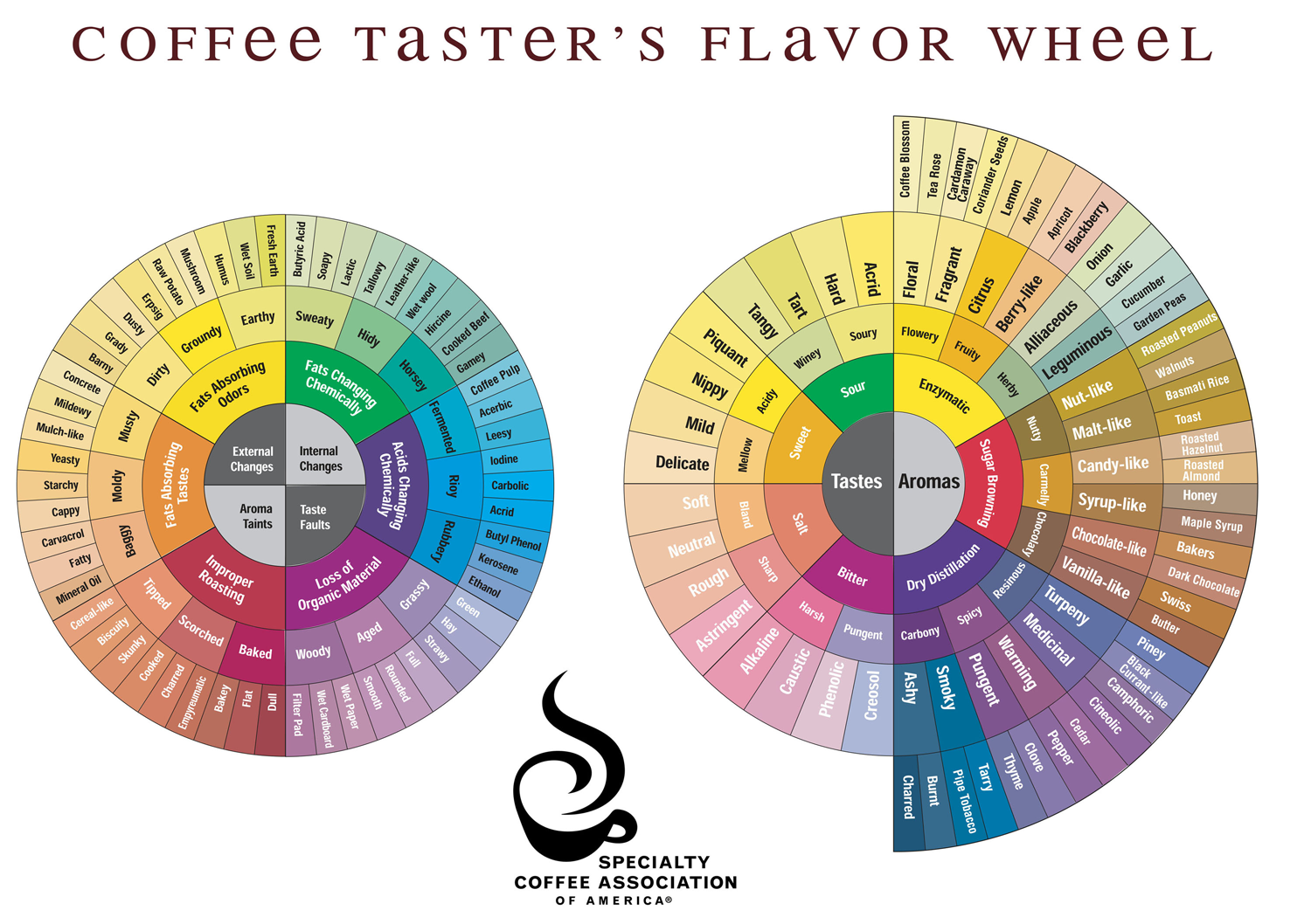
Source: Specialty Coffee Association
Whether you are a coffee sommelier or not, the aroma of a steaming cup of coffee can stop you in your tracks, turning back for a sip. Coffee brands are not oblivious to the power of seduction, and often leverage their exquisite logos to conjure up fond memories of decadence and sheer indulgence. Next time you enjoy a ‘damn fine cup of coffee’ like Special Agent Dale Cooper from Twin Peaks, think of why you were so inclined to choose that brand over its competitors which taste the same?
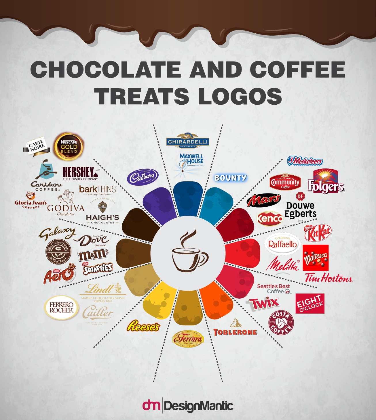
Color Spectrum Of Famous Chocolate And Coffee Brand Logos
Choice of colors in chocolate and coffee brands is quite striking. While obviously shades of rich brown are seen widely, the variance of shades used is quite amazing. The clever use of tones ensure that the designs look appealing, smooth, and luxurious, rather than dirty and drab. In addition, incorporating the golden color identifies the chocolate or coffee brand as a premium choice and elevates the sense of sophistication.
When it comes to typography, scripted fonts- running the gamut from signature-esque designs to gooey, flowy font- are quite common in the industry. Many coffee and chocolate logo designs showcase the premium nature of their ingredients by capitalizing on rich colors and handwritten typography. Some logo designs also feature logotypes to highlight the brand, with their icons featuring a wide assortment of chocolate drops, coffee cups, cookies, and coco/coffee beans.
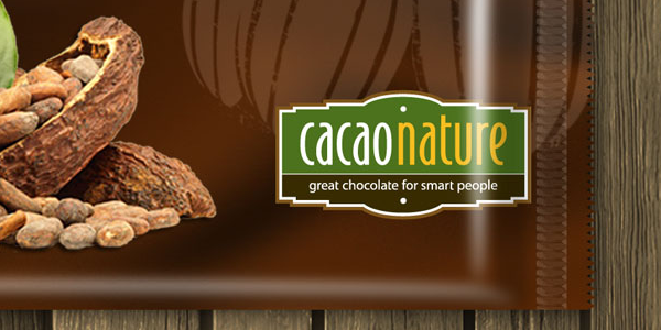
Cacao Nature sources top-notch ingredients from the origin to create a unique blend of taste and authenticity that is unparalleled in the industry. To help the company match its product promise and brand itself successfully, Cacao Nature collaborated with the design agency Spell Brand. Their design brief was succinct and simple; a simple logo that communicated the right kind of message and worked well on the various packaging mediums. The designers factored in the authentic nature of the company as well as the fact that they only use the highest grade ingredients from the origin to design an emblem like logo design that appeared modern and vintage simultaneously. After playing around with myriad font treatments and layout options, they settled upon a chocolate bar style of emblem with a modern font.
Bared of Embellishments, the emblem itself was the design. Even though a few of the initial design concepts contained images of hints of chocolate and cacao beans, the brand hardly needed such clichéd imagery to make it memorable. An elegant and simple design, accentuating the medley of modern and vintage was the key.
Just as the mere thought of a cup of coffee makes you feel refurbished, a coffee logo ought to be similarly refreshing. Coffee brands often use colors that symbolize a boost of energy, dedication, simplicity, trust, and convey a feeling of freshness and warmth, with icons that remind the patrons of coffee and its warmth. You can also seek inspiration from shades encountered in coffee shops to make your logo extra warm.
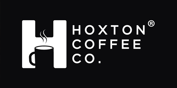
Hoxton Coffee came into being to bring organic, fair-trade, quality coffee from local growers around the globe to homes in the UK. Thus, they were in need of an engaging and fresh brand identity that encouraged trust and engagement. Hoxton Coffee needed a logo that would communicate the relaxation and senses of coffee, in addition to emphasize the brand and make it memorable. They achieved that by incorporating the product into the brand name. They finally settled on the name – Hoxton, an intricate weaving of a mug, and the associated steam of a comforting cappuccino.
Logo Designs Of Top Snacking Brands In USA
Most of us are infatuated with snacking products, grabbing armfuls of our favorite brands on each soiree to the supermarket, waiting patiently for vending machines to dispense out our favorite brand of peanuts or potato crisps while we sit it out in waiting lounges, or filling bowls at parties or before settling in for the night with an exciting movie. In fact, we are so enamored with munching on snacks at all hours, that we hardly stop to pay attention to how we have come to love the MR. Peanuts spokesperson, or the sun-kissed Cheetos icon, or the image of Julius Pringles, and how our eye hungrily seeks out these logos in the sea of products stocked up on the supermarket isles. This is the power of a viable logo design.
Colors To Kick The Hunger Pangs
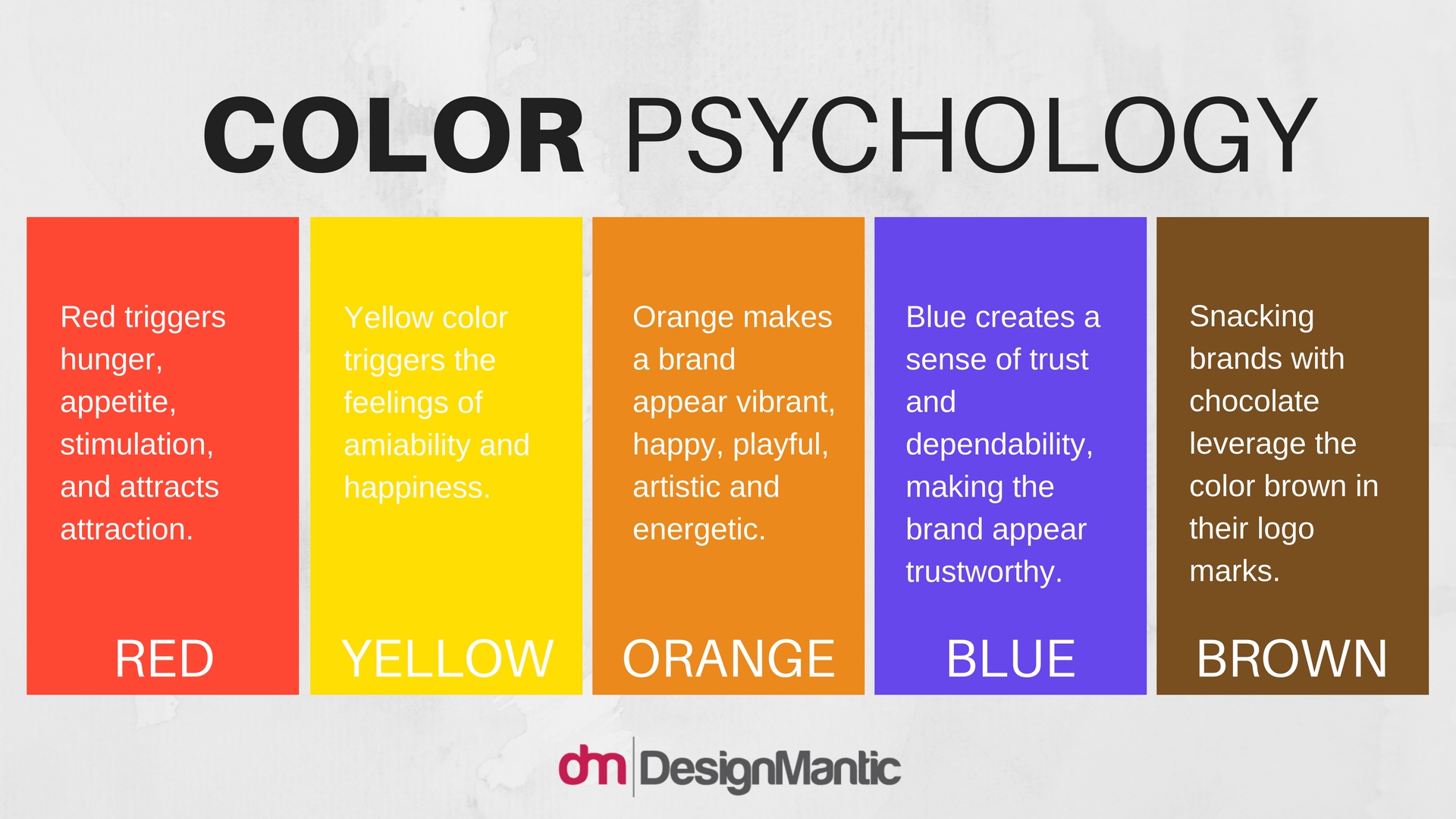
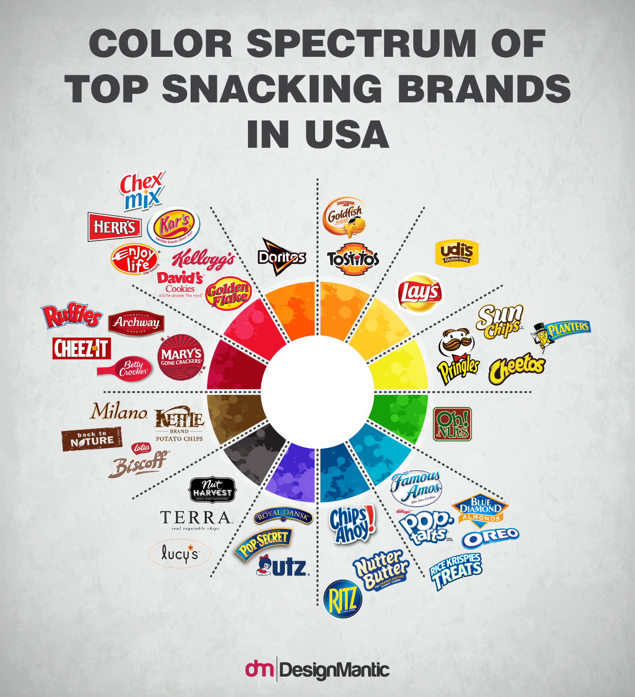
When you think of the logos of snacking brands, mostly colors like orange, red, and yellow come to mind. This is no accident, since the feelings and emotions elicited by these colors work wonderfully in making them appear appealing and irresistible to the target audience.
Looking at the positive psychological qualities of these colors in relation to the snacking industry.
Seasoned With A Dash Of Typography
When it comes to the typography of most snacking brands logos, casual and informal fonts and styles are leveraged to excite the audience and make them associate these brands with happiness and fun, especially targeted to millennial. Look at any snacking, and be prepared to be bombarded with out of the box shapes, crazy renderings, vibrant color palettes, and typography that makes the heart jump with joy.
Snacking Logos With An Undeniable Power
When you amble through the snacks isles in superstores, why do you instantly reach for your favorite snacks? While many people assert that it is that distinct flavor they can’t resist, only marketing consultants and logo designers know how having an effective logo with a cohesive brand can work wonders at once. Here are a few winning brands with mesmerizing and industry relevant logos that instantly make die-hard snackers fall head over heels in love!
Logo Designs Of Drool-Worthy Ice-Cream Brands
I scream, you scream, we all scream for Ice cream! Simply thinking of the decadently rich, velvety smooth, heavenly flavorsome globs of goodness makes the mouth drool in a yearnful anticipation. Not only is it a perfect after-meal dessert, some of our happiest childhood memories are deep rooted in a brimming pint, dripping over with a hot fudge sauce or a lip-smacking salted caramel crème. Be it a celebration, a reason to rejoice in a happy news, or simply when the sweet tooth kicks in, Ice cream is the best companion. Being mindful of the exultant and joyful feelings evoked by the simple sight of ice cream, ice cream parlors, stands, and companies aspire to make their logos echo the happiness invoked by their delicacies.
Color Swirls; Not Plain Vanilla
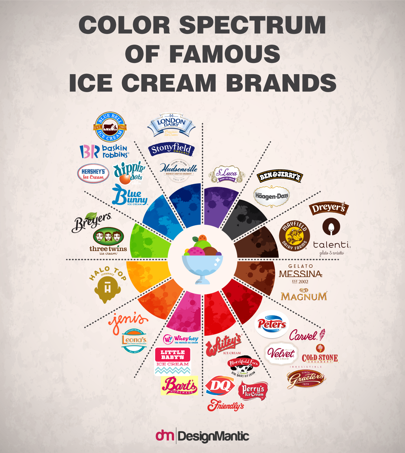
The use of vibrant and positive colors are replete in the ice cream industry, colors which instantly make the customers reminiscue all the positive associations they have with these delectable treats. The use of color red is dominant in the Ice-cream industry as it incites hunger pangs and makes you more suspectible to those sweet-tooth nudges.
From the iconic cone at the neighborhood scoop shop to Slow Churned family moments, ice cream brands aim to leverage the nostalgic appeal of the treat. In order to appeal to all demographics (after all, there’s no right age for Ice cream), ice-cream brands design timeless logos that spell fun, creative, and whacky, and portray the uniqueness of the brand. Whether your specialty is artisan ice-cream, slow-churned creamy heaven, fresh and locally sourced ingredients, boast-worthy array of flavors, or whacky combinations, your brand logo should reflect what makes you different from the other ice-cream blokes down the street.
Ice Cream Social is a small company focusing on made-from-scratch, locally-sourced ice cream. Since they wanted a logo that is not overly feminine or cutesy, the Mahoney design team decided to go with a hand-drawn type to best portray the craftsmanship and quality invested into each batch of ice cream. The designers have extended the type to create an artsy illustration of an ice-cream cone.
Fun With Fonts
When it comes to typography, chososing the right fonts for an Ice-cream brand logo isn’t an exact science. From flowy and casual fonts to more sophisticated serifs, the choice of fonts directly reflect the offering of the creamery; on the go, Exotic fun flavors with a laid back ambience or classic gourmet fare, served in artisan cones and topped with rich, decadent nuts. In addition, brands which tout traditional goodness and honor age-old legacies, such as Graeter’s, have logos that reflect their rich heritage with more vintage fonts and colors.
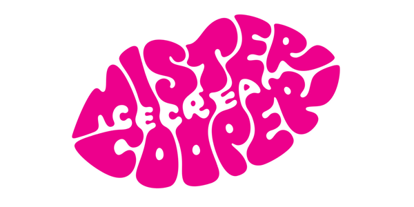
Specializing in gourmet and alcoholic flavors, Mr. Cooper’s treats cater exclusively to grown-ups and they required a brand identity to reflect their approach. Iconic branding firm Johnson banks developed the idea of a typographic lipstick mark to portray the hedonistic nature of the product in an appropriate form. A beautiful and eye catching hand-lettered mark was created, leveraging both negative and positive space to spell out the brand name within the lip shape, in order to create a voluptuous and unified identity.
Ice-Cream Logos Which Are Worth Melting For
When the sweltering summers strike, few things make the heart as happy as an ice cream cone, pint, or a sundae. If a brand of ice cream has a refreshing and fun logo, they can be assured that people will stock on that brand. Here are some of the best ice cream logos from well-known establishments that cajole customers with their use of image, shape, and color.
Custom Design Or A DIY Logo Maker: How To Decide?
Meticulously designed logos can speak volumes about your food brand and communicate consistent messages to your customers that help foster your image and exude a clear impression of your food brand. However, the actual process of designing a logo can be mind-numbing since the design industry is replete with the diversity of options, styles, and design inspirations, making the designers pull their hair out in confusion. Furthermore, designers have to contend with the smallest of details such as leveraging the psychology of colors to elicit the right emotions in their audience, using the right images to reflect the nature and goals of the brand, making sure that their symbol is not misinterpreted due to cultural and geographical boundaries, and capitalizing on typography to reflect the nature and quality of goods offered.
Despite being mistakenly construed as an innocuous graphic detail, a logo could entail months of struggling, hassles with designers, splurging a fortune on revisions, desperate tries to stay abreast of the current design trends and industry fads, and sleepless nights reading between the lines, trying to make sure your logo won’t rub clients the wrong way. Not to mention, since you must have your own notions about how you want your final food logo to look like, which may not align with that of your designer, the logo design process could be stretched incessantly.
Using DesignMantic To Whip Out A Palatable Food Identity
People are often of the notion that splurging a fortune on an over-the-top famous graphic designer to design their brand identity, allows their brand to be as ingenious as possible and makes their brand stand out amongst the competitors with a stellar logo design. However, when it comes to affordability, faster turn out rates, and a promise of a hassle free navigation, one cannot deny the irrefutable power of an online logo maker. Which is why, leveraging the DesignMantic logo maker is one of the most viable ways of creating an effective logo for your brand; one that makes people stop over in their tracks.
People are increasingly creating symbolic, inspired, and artistic logo designs using pre-made online logo templates, which allows food brands to put on their creative hats and explore an ever sprawling array of design options and ideas in a cost-effective manner. Even for businesses operating on a shoe-string budget, online logomakers are the most viable options to create a stellar logo without turning out your pockets. When you consider the perks of instant industry compliance, vast libraries of symbols, and super-fast editing, designing your food ideas with DesignMantic would help you fortify your brand’s image and come up with a design solution that reflects your brand’s individuality.
Takeaway For Food Brands
Defining the face of your food brand is the first step towards standing out from your competitors. A plethora of food businesses may offer the same delicacies in the same niche, but how they brand themselves and make an impression set them apart. However, staying abreast of the latest developments and trends in the logo design industry, keeping up with the essential principles of logo designs, wrecking your brains to come up with a logo that resonates with your customers, and splurging a fortune on hiring graphic designers to design your logos can prove to be too bothersome, exasperating, and time consuming for most start-ups and small brands, and like most others, they give up and maintain a low profile.
On the Other hand, DesignMantic offers a complete branding package for food brands that allows them to define their entire marketing strategy using viable tools available at affordable costs. Be it food logo design, business cards, letterheads, business envelopes, and social media covers, DesignMantic software takes care of all. Since you are designing all your branding elements on the same platform, you can rest assured that consistency and integrity will receive a paramount position.

