Welcome to another super-interesting debate on Creative Branding, where we leave no stone unturned when it comes to scrutiny of designs by brands big and famous. Previously we took a stab at Coca-Cola and its logo-less branding. Do check it out for some creative and business-minded responses from some of the industry’s greats.
Do no evil. That has always been the mighty (and debatable) mantra of Google since its inception in 1999. Over the years, the beloved search engine of choice has grown by leaps and bounds to become one of the titans of the tech industry alongside the likes of Apple and Microsoft. Pretty nifty for a company that was just born at the turn of the millennium.
- João Garzón de Albuquerque, Founder & CEO at Workaboutdesign, always looks for the deeper meaning behind design.
- Sean B. Jamshidi, Founder and Creative Director at DesignFacet
- Henk C. Meerhof, specialist in visual communication and independent designer
- Geoff Cook, Co-Partner @ Base Design
- Martyn Hayes, associate creative director at brand design consultancy Elmwood
Google is, but it is not, now is Alphabet yet some of Google will remain Google and share A will be… and C… err messy that’s what it IS. Sorry Google or former Google now Alphabet, anyway please re direct this to whom it may concern. MESSY period.
Don’t want to sound like an old bat, averse to change by concept, I am all but that I have always been for the new and renew by nature, when it clicks, this doesn’t. I deeply cherish Lego’s “click” ceaselessly made me trust the result.
Yes I know there’s more to it than meets my eye, of course, something probably shares market and investors related, all way beyond my security clearance.
But! Yes, but, brand wise this brand new, new brand, sends the GOOGLE, although not to the bin surely to a bad trip, if it was a horse it had just caught a big limp I would say. It’s somehow Prince some years back when the artist formerly known as Prince was born. But Prince is an artist and that comes with the territory.
Does the Alphabet name makes sense? I won’t even get to that, the fact is you are not to trash or confuse the brand message by concept. There’s probably a reason why companies buy established brands sometimes even overlapping their market and products.
Again, if it must be done and my gut believes in so and not in a caprice nor impulse, although I’ve also been proved wrong, they should not have made news of it. For the good of the Google brand the Alphabet should have been written just and only in business papers, not at loud.

Image Source: converse.com
It’s a Converse Chuck Taylor by… Nike yet no big fuss the thing is about the new Chucks.
It is not hard to see where Google is heading with this evil idea. Branding each individual service with a new name is appealing and to their advantage for disguising their world dominance. Marketing each business even if it fails also does not tarnish the image that original Google brand symbolizes. The name Alphabet makes no sense other than Google trying to brand all their services from A-Z. Get used to the idea of Big Brother Watching You. Google is slowly taking over the world and everything will be controlled by them. Privacy and private information will be stripped away from societies regardless of boarders and cultures. Small and medium size businesses will be gobbled up by A-Z and its parent company Google. Only a few will remain. Luckily this will not happen in our life time and surely not right-away but they are setting the grounds for a takeover. Human greed is more dangerous than the possibility of an Alien life attacking us.
The only thing that has changed using the ‘new’ Google is that its logo is getting back to more educative roots. I don’t know about how education of written language in early life is conducted in the USA. In general, one will choose a typeface that has as little ornamentation as possible. So I expect to find classics like Gill sans and Futura or modern offspring of those.
Maybe Mr Page is right, or maybe he is wrong in saying
“Google is not a conventional company. We do not intend to become one”.
One statement is clear though G is for Google, so that is a big relief. It would be so much different when Alphabet was saying M is for Google. Because we all know M, M is for James Bond of course.
So everything has changed and nothing has changed, Google will be the old Google, and people looking for the commercial ventures gathered under the name Alphabet will just Google, Alphabet.
Not quite, did you try it too? It will lead you to something, but not Mr Page’s Alphabet. That one is filed under abc.xyz, are you still with me? Because I can’t find the logic.
The answer could be found in Wikipedia, as there is a decent definition of what an alphabet is. Mr Page and all his Googlers must have missed this. It says, one of the main characteristics of an alphabet is the order it creates to make sense of filing and finding things.
The only explanation I can think of is that Google used an alternative order instead of alphabetic, something in line with an alcoholic order.

Image Source: catawiki.nl
‘I not understand, I not English’, and also I am from that time where we still learned letter shapes and sounds with our reading board. The new generation, learn reading in a book (let), was indicating the end of that era already. It seems we are entering the next era, is there sense after the book? Do social media have something to do with being social at all? Google could find out, but does it?
Would a trend setting company like Alphabet Inc. not go for a new alphabet? The new alphabet could have been a challenge for a change.
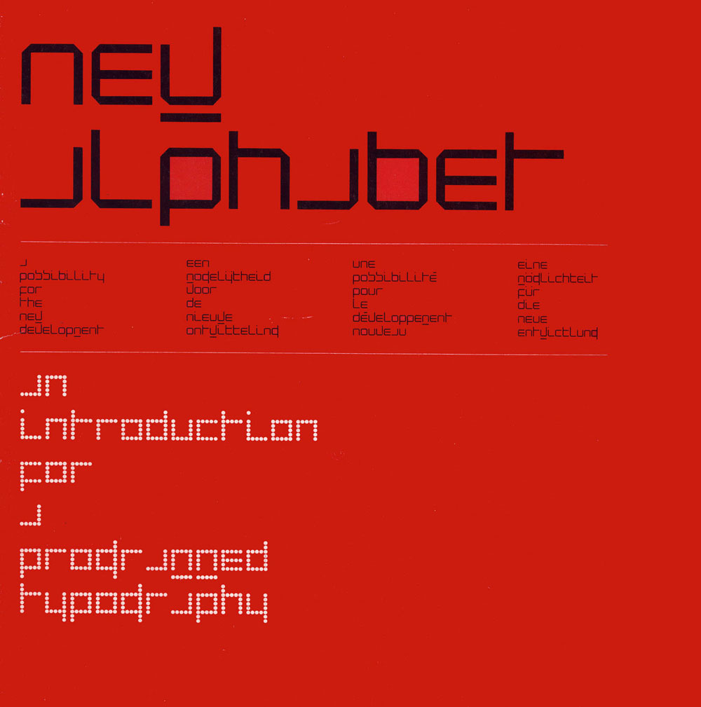
Image Source: EyeMagazine.com
No, instead of going boldly where no one gone before, Alphabet Inc. uses Google Maps to find the safest way home. We could say an investor’s abcxyz saving 20 letters for a better ROI, including the G for Google.
What is clear is that the new identity is not about a logo but rather a smart system–a visual language–that enables us, the users, to connect the dots across the Google ecosystem. With the advent of Alphabet and the promotion of Sundar to CEO, Google now stands for product, and the new visual language will make for a more seamless experience from desktop to mobile.
What is fascinating is the way in which Google launched the new identity. Every move was coherent with the Google’s personality, with equal parts simplicity & clarity (through their rational explanation on their initial blog post) and color & humor (the erasing of the old logo on the search site). Their actions are in keeping with the brand and moreover, consistent with the way people converse in the digital and social space. These actions, as opposed to a more “corporate announcement,” will help Google to have the identity be more readily adopted by the public.
Most of all, the evolution of the identity signifies that Google embraces change. Design at its core is about function, and with this purposeful identity system, Google is putting a stake in the ground that they are about design first, a mindset that will reinforce the brand and position them well in the years to come.
It’s a simpler more grown up mark that works well on all platforms. It seemed inevitable that Google would follow the likes of Microsoft in evolving to a modern sleek brand mark, with lovely animated transitions.
However I can’t help feeling a little sad that the quirkiness of the old mark has been lost and replaced by, dare I say it, blandness.
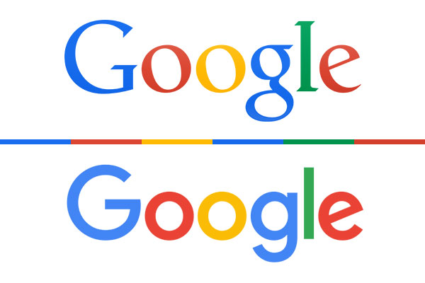
In with the New, Out with the Old? How does it all stack up?
Technical folks tell us that Google’s new logo occupies just 300 bytes of memory to render, a smashing achievement for compression. Design wise the new logo looks cleaner and bolder than ever, making Google’s reorganization into the Alphabet group of companies a lot more seamless and appropriate. There’s a lot of debate going on still about the logo redesign, since Google is to the internet what Starbucks is to coffee lovers everywhere. Chime in about what you think of the new direction by the house that Page and Brin built.

