Feeling burdened with a 130-year-old visual legacy that wasn’t doing much good to the brand, Johnson & Johnson has redesigned its logo. The new logo has abandoned its signature cursive font, swapped it with a cleaner (though, a bland) sans serif, and for good measure, brightened up its color palette too.
While we’ve always championed the much-needed change to Johnson & Johnson’s logo, the recent redesign has been extreme. How truly smart, for example, was it to throw away a legacy logo? Imagine if Coke does this. Abandons its classic, lovable logo in favor of a flat, uninspiring font.
![]()
But Johnson & Johnson in its official statement has said that instead of throwing away its legacy, it’s building on it. Their new logo is intended to ‘showcase healthcare innovation in a way that’s inclusive and brings the Company’s warm, caring nature to life.’
Why couldn’t it do that with its old logo intact, we’re going to find out. But first, let us unpack what the new J&J logo has brought.
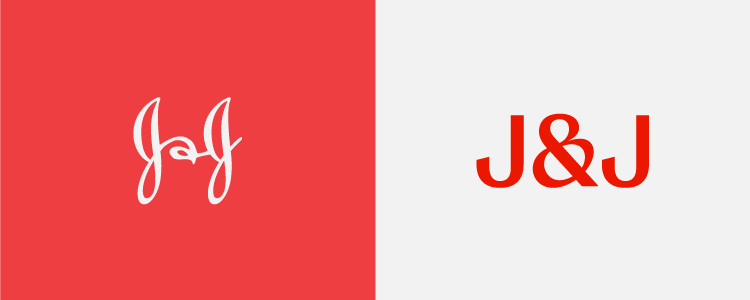
Johnson & Johnson’s Logo Redesign: What’s New?
Three main changes herald the new brand identity for Johnson & Johnson.
• The font has changed.
The signature cursive font that Johnson & Johnson had used for more than 130 years has been replaced by a clean and simple sans serif font. The idea is that a cleaner font will help the Johnson & Johnson logo look much more appealing on smaller digital devices, and will also be easily legible.

• Ampersand has changed.
Johnson & Johnson previously used a handwritten stylized ampersand in the logo design which fit perfectly with the brand’s traditional and personal appeal.
The new ampersand is much more modern, globally recognized, and readily accessible.
![]()
• Lettermark is getting the top billing.
Johnson & Johnson has always worked with its full wordmark logo. While it was a legacy logo and recognized around the globe, it truly didn’t help the brand lend a legible, accessible, and modern identity in the digital space. The long wordmark squished into tiny app containers rendered the brand absolutely invisible and dated.

The new short-form J&J logo is going to change that. The brand is planning on using this shorthand version more, building more brand equity around it. In digital spaces, this decision is going to change things around for the company, visually speaking.
• The color red is brighter.
Since colors carry the bulk of emotional associations with a brand, Johnson & Johnson hasn’t made any drastic changes to its color palette. Staying loyal to its signature red, it has only increased the light in the color, making it brighter and more welcoming.

While healthcare logo design best practices do support cleaner and simpler fonts, these fundamental redesigns in the J&J logo have been a lot to take. So the question emerges, why did they do it?
Johnson & Johnson’s Logo Facelift: But Why?
What has triggered Johnson & Johnson’s logo redesign? As we have talked about it before, logo revamps can done on three major grounds:
- To reflect some core changes that your company is going through.
- To refresh your visual identity when the current one has become dated or irrelevant.
- To fix a subpar logo design or correct mistakes that are preventing your brand identity from reaching its fullest potential.
With these reasons in mind, let’s see which one has propelled Johnson & Johnson to reconsider its classic logo:
- Illegible Font: Even though the brand name Johnson & Johnson was recognizable on products, the cursive font wasn’t legible. Using illegible fonts is one of the 7 deadly sins of typography we talk about in our design basics. Plus, Gen-Z kids aren’t being taught cursive in schools so why have your logo carry a font that emerging consumer groups don’t recognize?
- Space Constraints: The script-based wordmark didn’t look all that neat on smaller digital spaces.
- A PR Move: The company wants to distance itself from all the negative press it received when multiple lawsuits were brought against its talcum-based baby powder, alleging that it caused cancer. The company always denied the claims and has since discontinued the product. It now hopes a new logo will further erase any lingering negative brand associations.
- Core Changes: The company now focuses on pharmaceuticals and medical devices and needs a modern identity for that future.
- Emergence of a New Brand: All the rest of the popular consumer products by Johnson & Johnson such as Band-Aid, Listerine, and globally-known baby shampoo will now be available under a new brand name, Kenvue.
History of the Johnson & Johnson Logo
The classic Johnson & Johnson logo was based on the signature of the company founder, John Wood Johnson. Taken from a cheque he had signed in 1886, the design featured large and loopy Js and a custom ampersand. In the true vintage logo fashion, the design looked hand-lettered and promoted a sense of authenticity.
The logo originally had a black and white color palette for all official purposes, but used a blue and white color combination for its baby products like its world-famous baby shampoo or the now-discontinued baby powder.
Whereas black and white communicated professionalism and prestige, blue and white conveyed trust, approachability, and calmness.
In the 1950s, however, the entire brand color palette was updated with a dark red color, highlighting life and vitality.
![]()
Along the way, the design didn’t go through major changes. The digital revolution did motivate the brand to create a shorter version of the logo that could fit into tiny digital spaces, inspiring the logo favicon, ‘J&J’. For the most part, the brand remained committed to its distinct visual identity.
Johnson & Johnson’s New Logo: Hit or Miss?
The new J&J logo hasn’t received much love from the public. People have decried the super simplification of the iconic logo and believe the original cursive font carried nostalgia and personality. The new one, they believe, lacks both.
The main reason J&J has chosen to part ways with its script logo is fundamentally because, per the brand, Gen-Z consumers aren’t familiar with the type format. So the company may have looked for a way to strategically rebrand and attract a younger demographic of audience. Schools aren’t teaching it and kids today don’t know it.
The truth, however, is that in design schools countrywide, script fonts and hand-written typography are gaining popularity. In a sea of forgettable minimalism, customers strive to look for a personal connection and meaningful design.
Reflecting their sentiments are these handful of social media responses regarding the J&J logo redesign.
1. “Hard-earned brand nostalgia value washed down the drain.”
2. “Not safe nor effective.”
3. “Typographic blunder… and a massive branding gamble.”
The new Johnson & Johnson logo is more than a typographic blunder. It’s also a massive branding gamble with a high risk strategy.
— I Love Typography (@ilovetypography) September 17, 2023
4. “Losing…appreciation for a great brand.”
I don’t think anyone cares anymore. Brand and the equity of that brand built over decades is fleeting. People are losing a sense of history, and a sensibility or appreciation for a great brand. When I say that, I’m referring to modern day advertising executives! They’re lost.
— Eric Streiff (@ericstreiff) September 23, 2023
5. “Personality removed, awful.”
6. “Cursive is better.”
The Takeaway
When you are redesigning a 130+ years old visual legacy, don’t sacrifice the meaningful visual details that lent your brand credibility and character.