When it comes to anything to do with logo designing, colors reign supreme. They are the cornerstones of branding strategies and the most prominent and permanent identifying markers for any brand. And that remains true whether you go for big, bright colors in your logo design, or show subtle handedness with grey, whites, and blacks.
While designing the actual business logo – experimenting with shapes, lines, forms, and sizes – may truly be an art form and must largely rely on creativity, the selection of color is based on strong scientific evidence. And isn’t it good to know that such an influential part of the design – color choice – need not be a wild experiment, but can depend on the sweet stability of science?
So what is this science?
Well, to put it simply, it’s called the psychology of colors. How different colors make us think, behave, and feel. What influence, if any, they have on our moods and emotions. Can they be used as triggers or tools of association? A need to find answers to these and many other fascinating questions have fueled the budding area of research: the psychology of color.
Related: Mastering Color Theory For Web Design
Color psychology says that while it is undeniable that colors have highly subjective interpretations – the color red can look passionate to some, and a sign of danger to others – it is equally undeniable that there are proven universal patterns of associations that certain colors display across cultures, races, and genders.
Color psychology says that while it is undeniable that colors have highly subjective interpretations – the color red can look passionate to some, and a sign of danger to others – it is equally undeniable that there are proven universal patterns of associations that certain colors display across cultures, races, and genders.
Blue has a decidedly calming and soothing effect, therefore, blue logos are dominant over the internet. Green always signifies nature, eco-friendliness, and growth, hence, green logos are popular in healthcare and eco-centric brands. Black, for some reason, looks serious and has an air of mystery, brands such as Channel, Puma, Adidas, and Nike, etc. – All feature a black logo version. The color gold in logo design is a sign of premium brand. And so on.
And it is this psychology behind colors, these common, shared interpretations that designers and marketers use to link meanings with their brands. To give a brand its visual identity, and send a message about its character to the wider world. The strategic color theory is the reason that certain brands look lively to us while others are more reserved and professional.
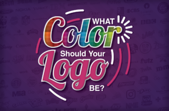
Through this infographic, we are going to give you a visual presentation of what different colors mean, what they mean across countries, cultures, and genders, and are there any certain colors that are industry-favorites?
Related: The Big Bang Theory of Colors
Use this graphic to its maximum advantage. Bookmark it on your browser, download and save it for later, and get it printed and displayed in your collaboration space as a guiding tool for designing colorful logo designs. We hope it’ll lead to many sudden moments of inspiration that all of us live for!

Embed in your site:
Try Our Personalized Logo Maker Tool: