For decades now, from architecture to web design, minimalism has sat atop the pinnacle of what’s modern, sophisticated, and stylish should look like. It’s supposed to be clutter-less. Bare minimum. Barely there.
Go to any Pinterest minimalist board and you’ll see. The aesthetic is negative space. Empty. A few elements here and there, silhouetted against a highly limited color palette, but mostly a blank slate of background. Colors, too, are predominantly neutrals. You may spot a pop of bold red or plum occasionally, but that’s it.
And don’t get me wrong. Back in the 70s and 80s, when graphic design’s obsession with minimalism first started, we all were there for it. I mean, do you even recall the original Apple logo? That gaudy, over the top illustration of Einstein under an Apple tree with that large ribbon around the graphic? It was not design’s finest moment.
So, eventually, when minimalism took over and gave birth to clean, sparse, and modern brand logos, we all rejoiced. An era of identity design was born where we created logos that were simple but creative, minimal, but not without meaning.
In 2022, however, that’s not present anymore. Everywhere you look, it’s more of the same. It has become difficult to identify logos, to look at them and figure out what they represent, to separate one design from the next.

The issue is simple: minimalism isn’t bad but it doesn’t suit most brands.
Why Not?
The answer lies in the minimal design checklist.
- Flat design;
- Plenty of negative space;
- Limited color palette, and
- Fewer elements.
Combined, this list of requirements doesn’t leave a lot of room for logo designs to have distinctive details. And as a business logo’s recognizability and memorability goes, the god lies in the details. The revamped Apple logo leaves an impression because of that distinct bite. The Spotify logo becomes understandable because of the sound waves in its mark. When you sacrifice all these details at the altar of ultra-minimalism, you do a disservice to unique brands that may have other needs.

Exhibit A: Proof that Minimalist Logo Design Doesn’t Always Work
1. Lack of a Distinct Brand Character
If there is one thing that a logo design must do, even if it fails to do everything else, is to clearly communicate the brand’s innate character. That’s what brings attention to a new brand, that’s what drivers consumers’ interest. When you see a geeky, funny, nerdy brand logo, you immediately get a picture in your head about how the brand would be like. But if you see something really simple, like an arrow, a pyramid, or a star – even in bright colors – you fail to really connect with the brand on an emotional level.

And that’s the biggest drawback of pursuing a minimal logo design for your business. too simple logos convey no character. There’s nothing in there for a consumer to identify with or feel close to. This translates to poor brand loyalty, difficulty in creating repeat clients, and ultimately poor profits.
what we recommend:
Keep things on a simpler side but do add some distinctive details that reflect what you stand for. Something that conveys your brand’s sense of humor or what you stand for as a company.
2. Absence of detail makes the design look forgettable
It’s details that stuck in our minds. While simple patterns may make the brain process the image quickly, but if it fails to leave an impression, human beings are equally good at forgetting the unimposing visuals too.
It’s the oddities and unique features that get stuck into our brains. Details. They help us remember stuff. When you strip a minimal business logo from all its details, you are left with a pretty image that has no identifying mark. No heart. To create memorable logos, you have to add details.
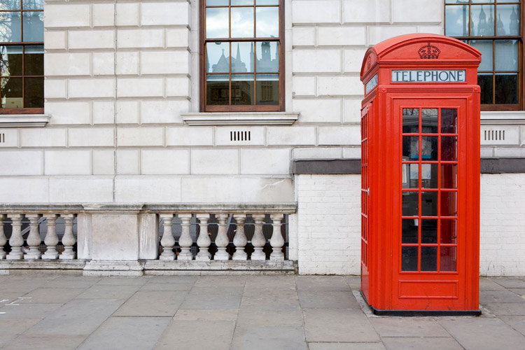
Think of the iconic red telephone box of the United Kingdom. Almost every Hollywood movie set in modern Britain has those. The design is beautiful – the color so striking. Plus, that lush serif font and the crown atop the box. Iconic.

Image Source: iStock/track5
Now picture the modern, minimalist atrocities they’ve been replaced by.

Image Source: iStock/Poike
The Guardian calls them “more vandal proof, more accessible and more modern (in the worst sense of the word), but … look(sic) plain nasty”. Oof.
When you compare them like this, it’s easy to see that charming details like a domed roof and a memorable, clear font render the design as more lasting and timeless while the modern take essentially makes the design regretfully forgettable.
What we recommend:
Don’t clutter the design detail, but don’t make it banal either with unremarkable straight lines or negative spaces. Leave some room for details that make the user remember the design for longer.
3. The brand message gets lost in all the reduction
Pizza Hut tried to revamp its logo a few years back. From a jaunty, shiny hat to small-case ‘i’ that looked like green chili, it went straight to a red-and-white generic splat that meant nothing.

Suddenly it wasn’t a design that makes you think of cheese, spices, and pizza but just a bad copy of it.
In food and beverage logo designs, when you simplify a logo to its utilitarian foundations, you damage the message. It happens in logo designs of all kinds and industries, but in businesses where the logo needs to stimulate our senses, stripping away details is a bad idea.
What we recommend:
To invoke specific emotions such as hunger or thirst, try to insert descriptive elements. Sheens and shadows are the details that can be let go.
4. It doesn’t communicate what the company does
Let’s talk about descriptive elements. While a typical minimalist logo design may not have space for it, such elements help people identify with the brand in clearer, closer way. They immediately tell the consumer what the brand does. In the Pizza Hut logo example above, even if you remove the words from the logo, the chili detail is sufficient to let people know that you are referring to a food brand.
Gmail’s logo rebrand is a good example of a bad minimal logo.

The original logo, still minimal and sophisticated, had a descriptive quality to it. The letter M was shaped around an envelope, indicating the icon was about a mail brand. The new multi-color M could denote anything. The only reason we know it’s the Gmail logo because it belongs to a larger global brand and we see it every day. Without that, it’s a vague M with no relevance to its industry.
What we recommend:
Get rid of hindered and stilted communication of the brand message by adopting a descriptive icon that clearly points to what the company does for its consumers.
5. Consumers find too-simple logos less likable and very unauthentic
A 2019 research on the influence of logo descriptiveness on brand equity revealed that ‘descriptive logos are easier to process and thus elicit stronger impressions of authenticity’. Meaning, if you are undergoing a rebrand and thinking of adopting a simplified version of your logo, giving up important descriptive details, think again.
The move can your brand appear less authentic and less likable among your audience. And it’ll make sense. If we cannot make sense of an image and cannot relate to how it’s supposed to help us, we tend not to trust it too much and not deal with it more.
If you are a newer, unfamiliar brand, having a non-descriptive logo being interpreted as less authentic than your counterparts is not going to be good for business. Established, successful brands may (and do) get away with it, though. Looking at your golden arches, McDonald’s!
What we recommend:
Keep your simplified design rebrands for established brands and make your new logo launches descriptive and elemental.
Moral of the Story
Minimal logo design isn’t bad. Not by default, at least. But it has been overdone and applied to brands where it did not work. Also, we are in the digital age where people do not want to deal with too many embellishments and unnecessarily heavy designs, so a simple logo makes sense. But there’s a way to do it creatively.
So, as long as you are not butchering the logo or forcing the design to be simple where it needs details to make itself identifiable and stimulating, minimal design can work. In all the other cases, refer to the title of this post.


