“For me, it (Minimalism) is a cleansing of the palette. It is a way of stripping back work to go against ornamentation and layers in Photoshop and busy, busy, busy.”
– Stuart Tolley, the author of the book ‘Min: The New Simplicity in Graphic Design’
While constantly eye-rolled at, minimalism is an overwhelming favorite for many designers working today. This design trend can be seen everywhere from fashion, web design, logo design, to advertisements. According to Tolley, Minimalism is a “barometer of social change”, that can come in and out of fashion pertaining to social factors, and not just another burgeoning fad that designers are jumping on the bandwagon to adopt. For instance, in 1915, the Russian Supremacist painter Kazimir Malevich painted the famous painting ‘Black square’ to revolutionize art and take it away from sheer representation. While in 1950, graphic minimalism ensued in response to the rise of consumerism, as a way to steer clear of the barrage of busy advertisements.
According to Tolley,
“Minimalism is a form of restraint that comes to the fore as a reaction to expressive and overtly ornate graphic trends, often during times of social flux.”
Our current obsession with minimalism is a reaction to the visual overhaul of the ‘90s and early 2000s’. In that era, the huge penchant for bling culture, and people obsessed with talking about themselves and flaunting pompously, was reflected in the very design; loud and decorative was the new hot.

However, the minimalism of today reflects the period of austerity that we currently dwell in, and quite rightly so!
Minimalism On The Web
Minimalistic web design has been riding the high waves since the last ten years. However, some designers have completely miscomprehended the notion behind minimalism and instead designed websites devoid of content and eye-grabbing visual elements. However, other great designers have embraced this concept to the core and designed websites that are not only aesthetically pleasing to look at, but also easier to navigate and follow.

While minimalistic design is not thematically possible nor practical for every instance of web design, websites that can use it should capitalize on its advantages. Minimalism works especially well in responsive environments, since their remains fewer elements to stretch, shrink, and consider in the code.
In addition, since less content entails faster loading times, minimalist websites are generally more convenient.

Minimalism In The Media
Ad campaigns, packaging, and brochures have all witnessed their quota of minimalist design. However, it is logos and posters that really leverage the concept. This streamlined design has been used for everything from ad posters, band posters, to movie posters by some designers.

Image: Behance/Sinisa Cikac
Minimalism helps to convey a strong message cleanly, quickly, and effectively. Minimalist posters, when designed correctly, employ each of its elements to send a unique message. The final result is a poster that is not only aesthetically pleasing, but also highly functional.

Minimalism In Logos
Since the purpose of a logo is to be associated with a company and easily remembered and recognizable, Minimalism in logos is a concept that cannot be ignored. Thus, minimalist logos remain the most popular type of logo design, since the simplicity and uncluttered nature of the design renders it highly memorable. The only tricky part is to design a logo that reflects the brand’s goals, while being easily recognized for the company simultaneously.
![]()
More and more brands are giving their logos a minimal facelift like the revamping of the Netflix logo.
![]()
Here, take a peek into positive side of negative space logos:
Minimalism In Business Cards
If a logo is the face of your brand, a business card is the initial customary greetings you usher to a potential contact. Even in the digital age, a diligently designed business card is a road map to opportunity and success. It’s astounding, how business cards are still leveraged by businessmen and professionals today in disseminating their services and products to customers. Not only do they help convey your contact details to clients, they are also effective in promoting your business.

However, in order to work perfectly, your business cards should be designed intentionally to suit your purpose. An effective business card is one that exudes the winning qualities of your brand (creativity, elegance, professionalism). As such, a cluttered business card, imbued with too many design elements and colors distract the recipients from the actual purpose of the business cards; the contact details! Minimalistic cards on the other hand, know how to funnel attention where it is needed, instead the letting the eyes of the recipients rove aimlessly on the card.

Embracing The Minimal Life
“Less is more” is probably the most popular mantra of the minimalist movement. Disseminated by architect Ludwig Mies van der Rohe in his depiction of the minimalist aesthetic, the catchphrase quickly caught on and became synonymous with minimalism. Most business professionals and marketers recognize the indispensability of creating top-notch visual content, to connect with their target audience, and articulate their business message effectively without overwhelming them. While minimalism is not hard to master, the key is to embrace the power and beauty of it. According to Nicolas Burroughs, “Minimalism is not a lack of something. It’s simply the perfect amount of something.”

Bared of its façade, minimalism is all about stripping down the design to its barest elements, imperative for the design to be functional. The no frills approach to design eliminates redundant design elements until anything else that is removed can interfere with the purpose of the design. If you are finding minimalism a hard nut to crack, here’s our guide to achieving the principals of minimalism right:
Forget Helvetica; Font Ideas For Minimalistic Designs
Moving away from the clichéd elements of minimalistic design, such as white over black and use of Helvetica font, designers these days are employing this style in unexpected and diverse ways. If you are seeking out a font that would work seamlessly across your minimalistic designs, chances are that you are proactively seeking out these characteristics:
- Crisp edges and clean lines.
- An Airy or open appearance: this can be achieved by peppering white spaces between or within letters.
- Design details that incorporate purpose or significance.
- Geometric shapes: This defines how the letters are formed.
- Good legibility: This usually distils down to easily identifiable letter shapes, moderately tall lowercase letters, and larger letters overall.
- Visual impact: This can either be in how you apply the font (in a prominent position or at a large size), or in the design of a typeface (for instance, uppercase or Bold).


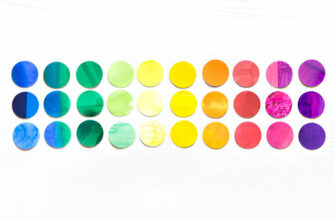
Classy With A Dash Of Chic; Designing With A Monochromatic Palette
A one-color palette scheme can do wonders for your design project, in addition to being highly versatile. It fosters a visually cohesive and harmonious look, and lets your content shine by not drawing attention to itself. Not to mention, a monochromatic palette helps associate a brand with a memorable, specific color. Here’s how you can be creative with this minimalistic design element:
• Tone Down A Busy Design
If you absolutely have to cram a lot of information in one space, a single color palette can make your layout look more organized and cleaner.

• Add A Color Overlay
Colors can benefit more than just graphics and text. Designs that feature colorful photography can appear unified by applying a screen or a transparent color overlay.

• Create Progressions And Relationships In Design
A single color can make different elements of visual design go together. Portraying how the various features of your design interact with one another and are related can help audience instantly comprehend the purpose and message of your design.

• Use An Intense Or Bright Color In An Understated Way
If you feel restricted on the choice of a color palette for a professional design, a monochromatic palette lets you throw in some variety to your usual color preferences by toning down your “louder” colors. This is normally accomplished by taking a bright base color, and designing a palette with less saturated variations, and primarily darker shades.

• Sophisticated Greyscales Are A Delight
Shades of grey are employed in this color setting to reproduce color variation. A color palette that features grey has an ability to lend a sophisticated, minimal look to your design.

• Dividing Up The Design In Color Sections
Blocks of colors can be used to break up your design into sections. This creates an organized layout that is an epitome of good visual hierarchy.

• Keeping It Simple
While every base color has an endless number of tints, shades, and tones, a monochromatic color palette shouldn’t have a lot of color variations. Only use as many variations as are needed to distinguish design elements. For instance, a background color, an accent color, and a text color.

• Breaking The Rules; Add An Accent Color
In addition to your monochromatic hues, a pop of color can add an extra visual interest and highlight important parts of your design.

• Color Palette From The Same Color Family
While not being strictly monochromatic, albeit minimal, drawing your color palette from the same color family can also ensure the organization and visual hierarchy of your design.

Breathing Room; Designing With White Spaces
Less is more! While fonts and images serve to communicate a message in a design, white spaces clarify and enhance the important information. White spaces allow your message to stand out by funneling the eye towards the content. Accepting white spaces as an important element of minimalistic design creates unity in your designs. Here are a few inspirations when designing with white spaces:
• Leave Empty Spaces
Don’t feel the urge to fill up every white space. Deliberate white spaces create a potent focus for your design.

• Remove Borders
Eliminating any unnecessary elements open up your design by achieving more white space. Remember that icons, shapes, and borders shouldn’t be used until they add value to your design.

• Use A Colored Background
In order to create more space around text, while adding an extra attention-grabbing element, use solid colored background.

• Make Only One Aspect Of Your Design Prominent
By enhancing the size and visibility of only one significant element within your layout, you can avoid design clutter. Try to keep other elements minimal to create more white space.

Image Source: canva.com
• Space The Letters
If you want to align your text in blocks and unify it as a single cohesive element, try condensing or expanding the space between letters. Not only does it enhance readability manifolds, but also makes the design appear cleaner.

Visual Harmony: Working With Contrast
Contrast helps establish a recognizable visual hierarchy and brings attention to certain design elements. When we talk about contrast in minimalism, a white background springs to mind as it makes for a perfect canvas for contrast, and one that minimalist designers leverage whenever they can. A hallmark of minimalist design, white or black backgrounds are overlaid commonly with a bold image or small colorful elements. However, rebuffing the established clichés, new designers are creating contrast with scale, location, shape, size, and color. Here’s how you can play around with contrast in your minimalist designs:
• Contrast With Texture
Textures of varying characteristics can play off of each other to generate contrast, for instance, flat vs. raised, soft vs. hard, and smooth vs. rough. Distressing or textures are great ways of adding some retro, vintage, or rustic qualities to your design, or making it look worn.

• Contrast With Size And Scale
In addition to adding a touch of visual interest to your design, effective contrast helps to prioritize and foster relationships between different design elements. If all the design elements are sized the same, hierarchy is undermined. Effective use of scale creates an interesting, dynamic layout, and adds drama to a design.

• Contrast With Visual Weight
If you want to point to a piece within your design and highlight its importance, visual weight is the way to go. It refers to the way an element stands out as compared to the rest of the design. The design with the greatest visual weight is the focal point. Visual weight doesn’t only entail sizing; you can make anything more conspicuous with shape, texture, color, or any other characteristic that sets it apart.

• Contrast With Font Compositions
If your design incorporates more than one font type, it helps for a successful design if the choices contrast sufficiently. Make sure that your fonts are visually distinguishable from one another, so that distinct jobs can be assigned to them within your design. One typeface can serve as the title or the headline, while another would fare better for the body copy. As a rule of thumb, use one Serif and one San Serif font within your design. This combination comes with a perfect blend of complementary and contrast.

• Contrast With Shapes: Corners And Edges
The element of shape can be subtly used in your design on the corners or edges of your design elements, whether buttons, boxes, or typography. Sharper shapes look crisp and ordered, while rounded shapes offer a friendlier and softer appearance.

Minimalism; A Feast For The Eyes
When it comes to a minimal design, only elements that contribute to usability and readability are deemed important; the rest is just frills. However, if you think working with minimalism is as simple as stripping the design bare of all pretenses, think again. Minimalism entails hard-won expertise and a sharp eye, and can backfire if handled improperly. When carefully applied, the commandments of minimalism can help you design better with fewer elements to make it easier on the eyes of your audience. When working with minimalism, try to work with the principals we have discussed in the post, and master each technique before orchestrating them into a stellar design.
Have we missed any important principals of Minimalism? Do let us know in the comments below.