Netflix’s team has recently dropped the ball by unveiling a new app logo; a simple “N” formed by a red band that folds in over itself with a drop shadow, like a red carpet, or perhaps a strip of celluloid film. No matter how the new letter mark is interpreted by the audience, it is here to stay and precede your Netflixing and chilling in the times to come!
![]()
@jjleedesign Nope! Just added a little flair with a new Icon. New piece of statement jewelry, if you will 😉
— Netflix US (@netflix) June 20, 2016
However one thing is clear; Netflix hasn’t completely ditched its old logo and feel. According to Netflix, it’ll continue using the arched, familiar, seven-letter wordmark that has been impinged on our minds. The new N is specifically reserved for social media accounts and mobile apps. In design parlance, it’s a “peelable”, with usable elements across a band. The logo makeover is the latest in a spate of redesigns by companies looking to revamp their visual brands in the mobile era; remember the recent curious case of Instagram logo making designers go “oh snap”, and Uber before that, and Twitter and Airbnb even before.
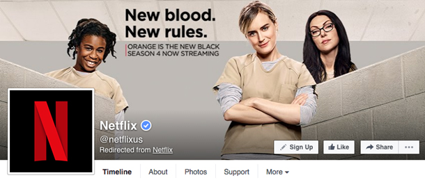
Image Source: Facebook/Netflix
Before this mysterious (and literally tiptoed) update, Netflix has been cramming all the letters of its name onto the tiny icon of its iOS app and social networks. This wide stance did not play well in a box and the full-word approach fared poorly at small sizes. Netflix decided to replace the word with one giant letter to better contend with everything else on your mobile screen.
“We are introducing a new element into our branding with an N icon,” the company said in a statement. “The current Netflix logo will still remain, and the icon will start to be incorporated into our mobile apps along with other product integrations in the near future.”
When débuting something as new and widely different as this design overhaul, Netflix is remiss for not coming out more confidently about the move and explaining why it is so different or where it came from, leaving the viewers in a conundrum. We can speculate at best that the act stemmed from a desire to move onto more platforms or pertaining to international expansion efforts; both welcome developments for taking Netflix to new places and to more users.
![]()
Other people venture that Netflix is apprehensive about repulsing loyal stick-in-the-mud users by the sudden change, like what happened with Gap a few years down the road, and is slowly trying to infuse change quietly, one icon at a time. Or maybe Netflix isn’t organized and has yet to decide what it is doing. However, without an explicit explanation, the motivation of the company behind this change reads murky and raises our suspicions inherently! Besides, for brands of Netflix’s influence and size, the “new” look can’t possibly be incorporated to “keep it fresh.”
When the original white-on-red Netflix logo was replaced by the previous red-on-white, it left the users in hysterics, and now there’s equal dismay and praise surrounding the new app icon. With such a barrage of mixed feelings about the new logo, a twitterati war was inevitable. One Twitter user pronounced it “garbage”, while another deemed it “SUAVE AF”.
N is for NOOOOOOOO!: Netflix just changed its logo https://t.co/6NkiaFQ5xH via @thenextweb
— Emma V Jackson (@evj) June 20, 2016
“Hey let’s change our icon so that we make finding our app as hard as finding a quality tv show/movie once they open the app” #Netflix
— Steve Johnson (@SJohnson831) June 29, 2016
Netflix’s new logo is ruining my home screen aesthetic, please bring the old one back
— GAY IS OKAY (@Itsgaytiss) June 30, 2016
DAMN #NETFLIX NEW APP LOGO IS SUAVE AF
— [Lē]ara Franklin (@KahlOtheWild) July 4, 2016
Netflix’s new logo is garbage.
— Matthew Lannister (@AddictedToServe) July 4, 2016
While the Twitterati have already passed their verdicts, our panelists for today discuss how adapting a new icon for their brand identity is going to fare for Netflix:
- Mark Wilson, Writer for Fastcodesign
- Liz Stinson, Writer at Wired
- Arsalan Lutfi, Creative Director at TriVision Studio

A Stroke of Genius
The streaming service has used the same ‘N’ as in the logo “Netflix” itself, with a rounded bottom that associates it with the main logo. However, the letter itself appears to be popping out from the screen in 3-D. The logo’s core visual metaphor is striking, leaving one to wonder if it is a celluloid film print, a red carpet, a ribbon, or a visualization of Netflix’s own stream, flouncing off from Netflix to servers, finally reaching your home, or perhaps all these things at once? For a company with astronomical ambitions, the metaphors seem quiet in place and can be construed as the blueprint for successful branding.
Another stellar feature of this logo is how adult the lettermark appears. If all Netflix logos to date are rated like the MPAA, the original logo would get a PG, the previous update would be PG-13, while the current lettermark with the murky shadows and the sharp lines, would wander close into the “R” territory. It seems as if Netflix has well thought out how the brand lives beyond our laptop and TV screens.
Mark Wilson, a senior writer for Fastcodesign thinks that the logo facelift is worth rolling out the red carpet and applauding for.
“The existing logo is fantastic. And I hope it’s not going anywhere. With a wordmark that pops out at the audience from an overwhelming sea of red, it embodies Netflix. There’s no mistaking it for YouTube, Hulu, Vine, or any other digital entertainment service that’s arrived since.”

Binge can’t be spelled without an N
The ever-evolving and creativity driven company revitalized their image last year with a revised rendition of their wordmark logo that shed the oversized, kitschy drop shadow for a crisper, cleaner look. The new, sophisticated, sharp lettermark is a bigger step in the company’s visual evolution.
While their existing wordmark logo is still here, the company realized that they might be able to exude a more digitally grown image, and boost brand recognition if they came up with a logo that better catered to the avenues through which a majority of their audience engages with them: The avatar next to their tweets, the profile picture next to their Facebook status updates, and the icons on their smart phones. For Netflix, this translated into tapering their lengthy wordmark logo down to a sleek lettermark. Liz Stinson (@Lizstins), Writer at Wired, has interesting views about the simplicity of the logo redesign:
“It looks to me like they’re betting that a bolder, simpler icon on your home screen will do a better job of capturing (and retaining) your attention. And fair enough. If a company can successfully claim something as universal as an “N” as its icon, it’s a pretty good sign that people know and care about the app. Twitter has its bird, Facebook has its F, Uber has its…whatever that is, and Instagram has its camera. Simplicity, it seems, is the ultimate status symbol.”
@nikhilwad Not a new logo! The N is an icon and a new creative element to live with our logo. The current Netflix logo is here to stay 🙂
— Netflix US (@netflix) June 20, 2016

Learning from Instagram’s Mistakes
With the vacillating trends in technology, throwing in a little pizzazz to your logo to lend it an air of life and vitality every now and then can do nothing wrong. After the Instagram meltdown episode, perhaps Netflix learned not to bring about a 180 degree alteration to their logo.
![]()
![]()
![]()
After releasing a new logo to complement its app redesign, Instagram received lots of backlash since the new logo was so at odds with how the people had started acquainting it with. For starters, Instagram chose to ditch its tan and brown color palette in favor of yellow and pinks, like a setting sun. At least Netflix has seen to it that the “N” in the new icon logo and the company wordmark logo have the same feel. Instead of being in the user’s face (hint: Instagram), the logo redesign is chic.
Paradoxically, while the new Instagram logo is designed to be loud, it surprisingly gets buried on your home screen. In contrast, the new Netflix logo feels like it has the ability to stand out against the pack of myriad other installed apps. According to Arsalan Lutfi, the creative director at TriVision studio,
“I personally love this new dimension to Netflix’s branding strategy. The ‘N’ is fresh, bold and iconic, yet maintains the same familiar color scheme we are so used to seeing. As a shorthand for Netflix to be recognizable at small sizes, it works! And as long as they keep adding great content to binge on, they can ribbon-ize the whole UI if that’s what they wanted.”
What’s It Gonna Be?
Netflix Revamps its logo, leaving people confounded in its wake. For some the new logo icon is a masterpiece, while for others, it is nothing but an ambiguous nuisance which had no reason to exist. However the logo is construed by the audience, even their disapproval is masked by the “it’s-okay-you-didn’t-mean-it” feeling. This is because despite this minor change in their branding manifesto, Netflix still stands for values of convenience and entertainment, and bringing us together in the process. Their unflinching devotion to providing a great experience will win back even the most disgruntled viewers! Fingers crossed!