Imitating real life, a good brand logo goes through many ups and downs. These changes can sometimes reflect a fundamental evolution at the brand’s cellular level or maybe more for the need for a fresh look. Whichever the case, a well-executed logo redesign will keep a brand’s visuals looking modern, updated, and fresh.
Brands that stick with their classic logos always run the risk of having a stale presence that can turn into an audience-disconnect at any time. While there are those evergreen logos that can survive the test of time, it is always good business to keep pace with the changes.
Why And When A Logo Rebranding Is Needed?
There are a dozen reasons to consider changing your logo design but let’s talk about the three major ones that cover all the rest of them.
– To Reflect Change
Consider a logo redesign when your company is going through a major change that’ll affect the business. It could be a merger, an acquisition, a change in the company’s core services, a website redesign, and stuff like that.
– To Remain Fresh & Updated
Design trends change every ten years or so. Remain relevant in the minds of the new incomers joining your target audience by redesigning your logo. Even slight tweaks can give your logo a whole new look.
– To Improve The Design
Sometimes a logo design is just bad. Don’t be afraid to accept or realize your mistakes and consider a logo redesign to present your brand in the best light possible.
Brands That Perfected The Logo Redesign Game
Not all brands rise to the challenge of a logo redesign (Gap, we are looking at you). But companies like Apple, Google, and Instagram not only rose to this challenge but forever changed the game. They defied the rules, challenged the norms, and set new standards.
• Apple: Sleek, Stylish, And Simple
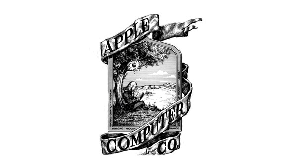
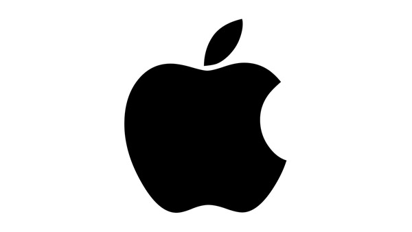
With every redesign in recent years, Apple has given all of us a master class in how to excel at rebranding. Their final look is simple and exceptionally stylish. As an innovative and modern brand, their current computer logo has all it takes to become a cult-classic. Not only it looks on Apple products’ sleek surfaces, but it looks beautifully elegant on its own too.
From a complicated illustration of Sir Isaac Newton sitting under an apple tree, the brand has come a long way. It has set new standards on how to achieve a timeless and classic look without being dated and boring.
• Google: Playful, Colorful, Helpful
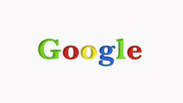
Google refuses to be boring. With every redesign, the brand has emerged more updated, more modern, and infinitely fresher. Even when it gets negative press, its logo remains a non-imposing and playful presence in your digital sphere.
It uses multiple colors in its design which is a big no-no among designers. But all the colors are in flatter shades which give the logo a soothing and playful appearance. The typeface is also modern and updated. Plus, branding for all of its products closely resemble each other and the parent brand, and thus displays interconnectedness.
Instagram has one of the liveliest, the boldest, and the most prominent presence – visually – in the tech logos lineup. It’s purple, pink, orange, blue, and everything in between. This rules-defying logo design confidently displays its brand promise of being a youthful brand, showcasing life at its most picture-worthy moments.
The thing we most like about the Instagram logo is its use of color gradient. Very few brands are brave enough to dapple with it. But Instagram, by the sheer virtue of being a youth-centered brand, has managed to make gradient its signature look. Other brands now look at it as a guide on how to use colors in more unique ways than before.
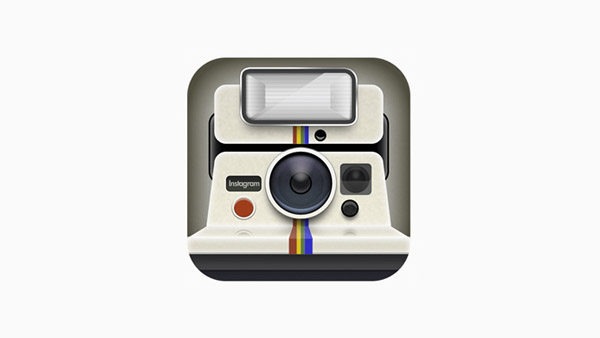
Its earliest logo was clumpy, cluttered, and just too complicated. This new logo launched in 2016 is anything but. Just look at the two logos below and see how perfectly Instagram has rebranded its identity.
Brands That Desperately Need A Logo Redesign
So, what are the ten brands that we think should immediately start thinking about a logo redesign? As the new year approaches, wouldn’t it be nice to see these brands with a fresh new face?
1. Pepsi
Image Source: Pinterest
A lot of people (perhaps correctly) have illustrated that Pepsi’s current logo looks like a bit pot belly. Pepsi has always struggled to get its logo design right but has never really succeeded. The icon doesn’t convey anything meaningful about the beverage brand and looks simply uninspiring.
2. Taco Bell
Image Source: Taco Bell
It’s no secret around our office that we just don’t like Taco Bell’s current logo. It’s just bad. Flat, uninspiring, and uninteresting. It’s literally just a bell. Try as you might, it’s hard to glean any meaning from this icon. The logo tells you nothing about the company or its vibe. What is its brand character? Why these specific colors? Is it trying to tell a story? It’s all a big mystery.
3. Shell
Image Source: Wikipedia
As an oil and gas company, Shell doesn’t attract a lot of love from the general public anyway. But its old and dated logo doesn’t do it any favors either. It is supposed to look like a rising sun but all that hot glare from red and yellow colors manages to do is remind people of the sweltering heat of an oil field.
4. Levis
Image Source: Wikipedia
Levis is one of the most well-known brands around the world. Its bat-(or butt)shaped logo is also a popular symbol. This modern fashion logo, however, is too simplistic. You cannot find any character or meaning behind it. As an apparel brand, the icon looks lacking. The font is one saving grace with its thickness and looks well-placed on a brand that sells denim.
5. Nikon
Image Source: Wikipedia
Too much is going on in this logo. Not only the logo is too in-your-face, but it is also just badly designed. The slanted letters fail to hide the fact that the brand name is displayed in a thick, stocky font that is as far away from modern as it can get. The white splashy lines on yellow that are supposed to mimic the flash of the camera are too bright and can increase your sensory overload. The brand needs to think of a major facelift if it wants to remain relevant to its younger audience.
6. Prudential
Image Source: Wikiwand
It is one of those logos that have lost its meaning over the years. The rock in the logo is the Rock of Gibraltar. The brand’s original declaration was that it was as strong as Gibraltar. In time, however, the brand itself has forgotten about it. No mention of Gibraltar on its brand or logo anywhere. Most people in the international market (or even domestic) have no idea that it is a famous rock. Time to think of a redesign.
7. eBay
Image Source: Wikimedia
People who created Ebay’s logo perhaps wanted to emulate Google’s example. But the risk didn’t pay off. The online store’s logo design looks lazy and unimaginative. It’s literally just letters with no spaces in between. The brand needs to think of more creative ways to add whimsy and playfulness to its logo.
8. Twinings Tea
Image Source: Pinterest
There is nothing wrong with the Twinings brand logo, per se. In fact, it is charming. It speaks of a simpler time and comforting moments. However, as an international brand operating on the world stage, the logo severely lacks in terms of a universally understood design. Perhaps ditch the emblem and keep the font with its accompanying twirls? Just make some changes, already. The design is limiting.
9. Johnson & Johnson
Image Source: Next Industry
Johnson & Johnson’s logo was modeled after its founder’s signature. While it is a famous symbol world over and well-recognized, the logo itself has become dated and old. Yes, it may play on people’s emotions of nostalgia, but in terms of spelling modernity for the brand, the logo does nothing.
10. American Airlines

Image Source: American Airlines
The logo design is so bad that the U.S. Copyright Office refused to register the design for copyright protection multiple times – for three years. Ouch. Their contention: the logo is nothing but a compilation of geometric shapes. And we agree.
Though the Copyright Office eventually agreed, do you really want to display a logo that isn’t deemed creative enough to warrant protection from infringement? Better think of a redesign.
Related: Who Actually Owns the Logo Design – The Client or Designer?
The Takeaway
A lot is at stake when rebranding your logo, especially for Custom eCommerce website development services. Change for the sake of change is never a good idea, but so is forgetting about your logo redesign for decades on end. A business changes year on year, and while your logo should remain more consistent than that, the rebranding allows you to underline any major change about your brand that you want to highlight.


