The early 1950s was the era of disruption in logo design. The era inspired many brands to go through a blatant logo upgrade and embrace contemporary approach in design. Logos became smoother and subtle with curves replacing the lavishly bold and angular shapes of the 1930s. While Pizza Hut introduced the artistic mastery of its time with a mascot logo, Shell evolved its iconic ‘shell’ logo to adopt the minimal approach that is still quite familiar. Coca-Cola also underwent a sleek redesign and the classic black and white wordmark logo was replaced by the trendy-looking red and white logo (and took the beverage industry by storm). These early ‘50s logo designs, still recognized and appreciated for their impeccable designs, laid the foundation for the timeless logos in design with their simplicity, versatility, and minimalism.
Visual identities like these turned out to be heavyweights of their times or all times for that matter. Company logos, websites, and other visual identities are no different. You don’t have to put your brain cells on exercise to remind you the Larry King’s dress, Michael Jackson’s dance moves or CocaCola’s popular dark red logo design.
Let us take a deep dive on logo design – the strongest vehicle of visual identity.
Why is that you are not bored with the ancient logo designs of Coca-Cola, Volkswagen, Nike although they have been around since ages. Chances are these type logos will continue to enjoy their supremacy for years to come and influence your kids too.
The point we are trying to put across is that these logos are as timeless as time.
You might be thinking: What is the mystery behind coming up with these creative identities? Is there are a process, trick, or tip? Or is it just a one-time artistic masterstroke not known to humankind?
We battled out with these questions too, which got us to finally write this post.
After chewing multiple books, blog posts, and video, we are finally sharing with you “the guidelines” to make your logo beat the test of times.
Here we go.
1. Simplicity Is The Ultimate Creativity
Open your wardrobe and ask yourself: Which shirt or top do you still like to wear- the evergreen white/ black or the multicolored stripes one? 9 out of 10 times you will want to wear the simple white and black one because you and others will not be bored with it anytime soon.
The simple minimalist logos resonates well with a wider audience with age, gender, ethnicity, religious, and geographic differences. Google’s vanguard logo radiates simplicity. This is what the digital giant offers to the digital world – making it simple for people to search for information.
Due to its simplicity, the brand can easily customize (doodle) itself.
The very famous Apple logo beautifully represents the philosophy of simplicity or to put it in industry terms: “less is more.” Something that many brand logos need to aim for these days. Due to the simplicity factor, the apple brand logo can be placed practically everywhere without devaluing its visual strength.
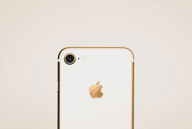
Image Source: Unsplash/Aleksander Vlad
Notice how apple logo is nicely embroidered on the iPhone back.
2. Make It Relevant – Avoid Time-Specific Trends
This is quite obvious. A corporation logo that becomes irrelevant after a specific time is pointless. Apparently, who wants to see old comic book characters in a visual identity now, unless they are still adored by a large bunch of people.
This point is still worth mentioning here.
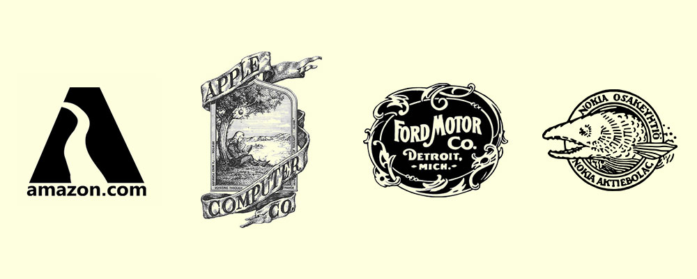
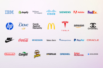
Imagine if the following big guns still carried their logo identity today?
Your logo should be relevant to your target market, industry but not too relevant with time-specific trends because it outdates the logo after a short span of time. Although trends do impact your design approach, you should not base your entire creative idea on that one trend alone.
For example, even if you have chosen a text logo, you can make a mesh of both the type and idea. This is where you need to scratch your head to start the creative flow and come up with a jaw-dropping logo. Wait before you give up. You can do it.
Pro Tip: When you brainstorm your logo ideas, think about how your logo would look like in 10, 50, and 100 years from now.
To reiterate the point, don’t base your logo’s identity on a specific event, trend, news, famous person, or anything that has the tendency to go out of the discussion.
There are some exceptions, though. Einstein has such a personality that defied age and time. In fact, Einstein’s hair is synonymous to a higher level of intelligence and creativity. But, we will take it as an exception.
3. Play Safe Using Classic Fonts
Earth-shattering, decorative fonts might be very tempting to use, but they date faster than simple, classic fonts. If you are a fan of a typographic logo, a surefire way to make it relevant for the longest time is to use the simple looking fonts. They are underdogs, as far as longevity is concerned.
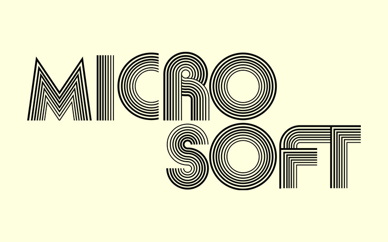
Still thinking about crazy fonts. Have a look at the Microsoft misadventures with the font type below.
Serif and Sans Serif fonts are perfectly ok to use as long as they conform to standards of creativity. If you or any other brand custodian do want to use these fonts, they have all the right in the world. It is justified too because just like colors, fonts also carry emotions. However, be ready for a quick change in the typeface design to synchronize with time.
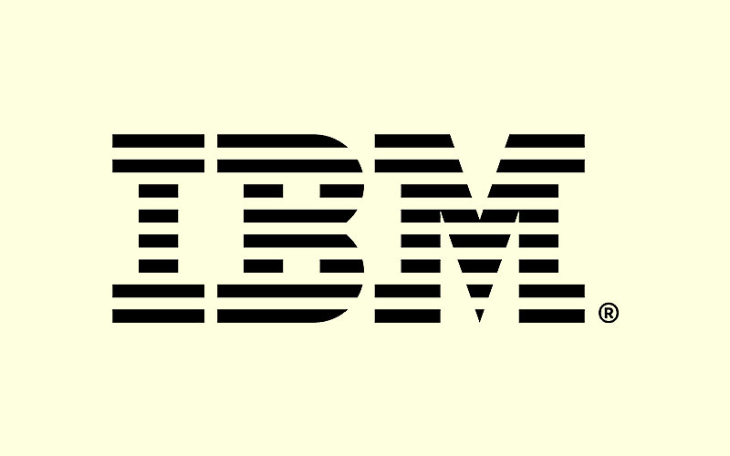
There are examples where big brands have used stylish type fonts and continued with it for a long time. One of the example is IBM. One of the world’s oldest personal computer manufacturer logo played out really well with horizontal line crossing the typeface which they openly boast about on their official website.
4. Color
What about the colors? Should you use them, abandon them or find a perfect mix of both the worlds? Before we settle on the answer, consider the use of color by none other than GOOGLE.
![]()
Image Source: Dribbble/Adam Lorry
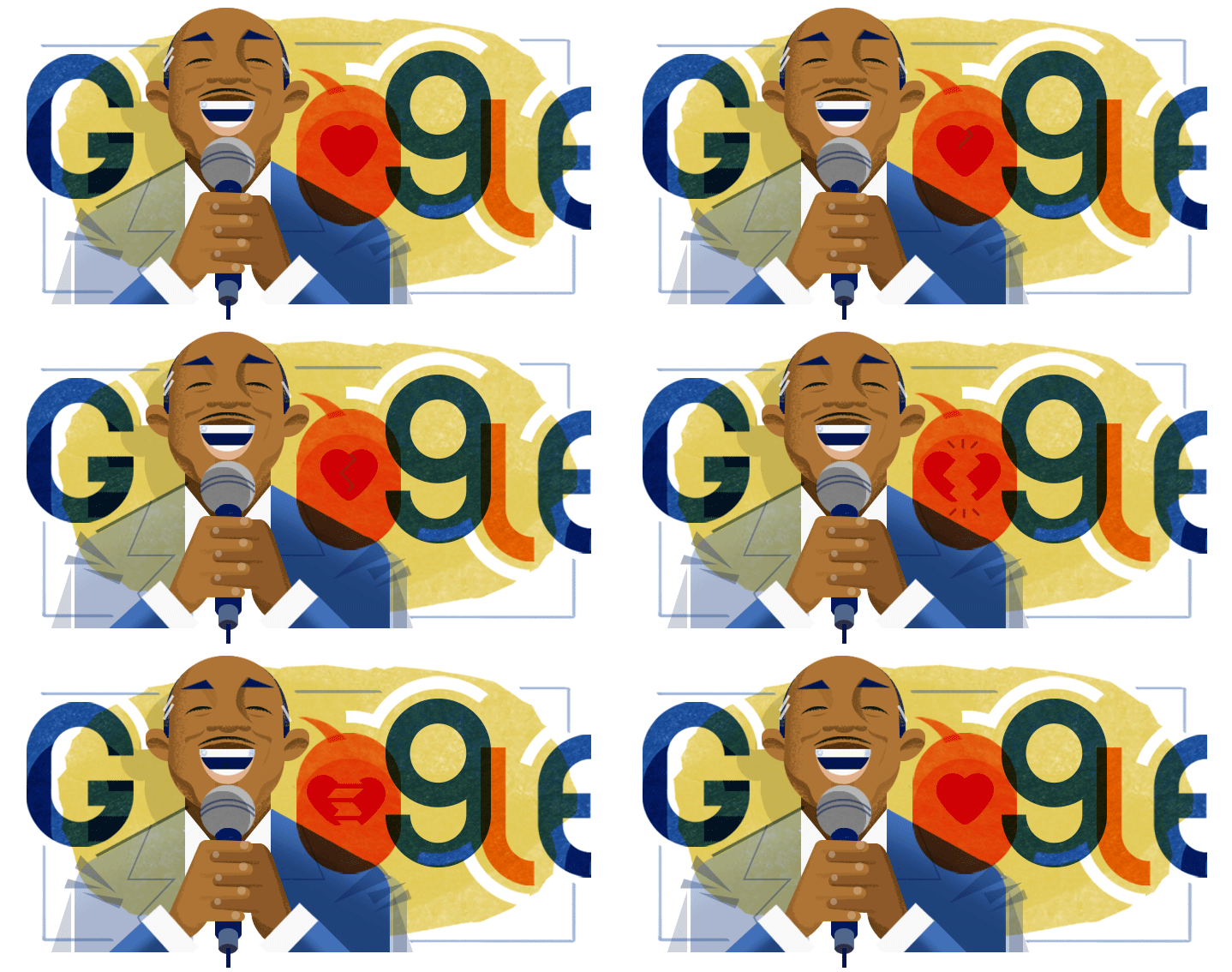
Ruth Kedar, the designer behind the masterpiece logo, used blue, red, yellow, and green because they were primary colors. They also deliberately used the green color to show that Google is an unconventional brand and may not always follow the conventional color rules. The colorful logo has been around for more than 20 years now.
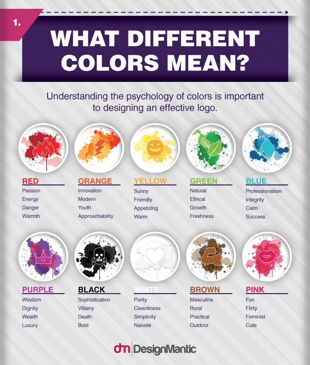
This should be enough to convince you that colors have the potential to make your logo timeless. Right? Wrong. Only use colors if you have enough reasons to do so. Design gurus say not to use more than 2-3 colors in your promotional business logo and avoid excessive use of gradients and other color adventures.
The colorless logo also resonates well with the audience for extended period of time. Logo color psychology is a real thing, and it does trigger human mood, feeling and emotions.
These guidelines are enough to give you a kick start in your timeless logo design project. If color scheming rules are done right, your businessman logo can resonate with your audience and their children for years. If not, there is no harm in tickling with your logo design to make it relevant for the specific time and audience.
A logo is one of the most effective ways for businesses to be recognized by customers. Companies invest a great deal of time, effort and money to create a logo that’s timeless and which people remember for generations to come. However, there are a number of factors to be considered when designing your brand’s logo. Simplicity, choosing appropriate fonts to reflect your brand, relevance in design and the right colors are important considerations to keep in mind while aiming to design a logo that’ll take the market by storm.
Try Our Online Logo Maker:
Create Business For Sale Logo
TimeShare Logo Design
Clock Hands Logo Maker
Logo Designs with Watch Symbols
Vision Logo Generator
Worldwide Logo Creator
Make Software Development Logo
Business Continuity Logos


