Taco Bell just ringed in the week with a new address and… a whole new look!
From their Kit Kat quesadillas to Doritos Locos tacos, Taco Bell has established itself as the master of reinventing Tex-Mex staples in pretty intriguing ways. Recently the fast food Grande has channeled their acumen for reinvention into revamping their logo; just in time for debuting their new Vegas Strip location! Ostensibly, the logo makeover was maneuvered to fit the chain into today’s multidiscipline, multimedia branding requirements better than the previous identity!
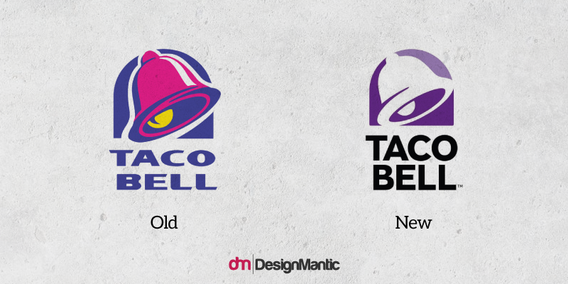
According to Taco Bell, the new logo takes after its predecessor, introduced in 1995. The logo design was completed in collaboration with TBD, Taco Bell’s internal design, and the creative consultancy Lippincott. According to Lippincott, by opening up the bell, the easily recognizable shape can be filled in with a wide array of textures, patterns, and colors. Pairing the icon with a modern, more approachable, and simpler expression of the name guarantees that the sans serif heightens legibility across billboards, commercials, and digital channels.
Taco Bell CMO Marisa Thalberg states,
“In this modern take, color makes a splash and allows customization through patterns and textures, giving usage flexibility while maintaining its iconic framework. The new look will hit digital assets first, followed by restaurants and packaging over time.”
The folks at @TacoBell have update their logo. Does this ring a bell? 😉 pic.twitter.com/quIuedRtPe
— Ron Ruggless ☕️ (@RonRuggless) November 14, 2016
A Shift To Minimalism
In essence, the logo facelift is a simplified, minimalized rendition of the logo we have all come to associate with Taco Bell, and features a flatter bell design devoid of the former yellow and fuchsia palette. The logo re-design is in line with the prevalent minimalism in logo trend permeating the design industry these days. Across the country, the design brief has become all about stripping logos down to their barest essentials needed to preserve their identity, so that the new logo can accommodate as many contexts as possible.
The brand changed its social avatars across myriad platforms to integrate the new look immediately. Almost as if waiting to pounce over the brand, fans began chiming in with their sentiments over the facelift. One fan wrote, “It could use one more color — maybe yellow — but overall, really nice and clean update!”, while another fan rejected the overhaul as rebranding “sacrilege.”
While the Twitterati has already passed their verdicts, our panelists for today discuss how adapting a new logo for their brand identity is going to fare for Taco Bell:
- John Brownlee, Design Writer
- Jessica Wohl, Food/Restaurant Reporter At Adage
- Dom Carter, Creative Bloq’s Staff Writer
Painfully Bland And Flavorless; Just Like Taco Bell Food
If the new Taco Bell logo is one thing, it is stark boring. The original Taco Bell logo appeared to be using the same font as the old Dell logo; weird, ’90s futuristic, and quirky. However, it is just a thing of the past now. While the new typeface isn’t Helvetica, it comes pretty close, which makes the logo appear corporate and stern. Akzidenz-Grotesk is used for the new logo, which is every designer’s favorite Helvetica-lookalike. The new logo retains the iconic bell but it has been stripped of all its punch. At best, the new icon resembles an emblem of a forgotten, old Albuquerque offshot of the Ma Bell Breakup!
Amidst the exaggerated typography, extravagant swooshes, and vibrant hues, the old logo was actually concealing the painful truth that there was nothing intriguing about the logo to begin with; which is what the minimal execution uncovered. In its sheer simplicity, what we are left with is a wordmark and a lackluster bell that looks like the logo was defaulted to a system font.
Here, the same minimal trend that yielded successful results for the rebranding forays of Subway, AT&T, MasterCard, and Microsoft, reveals that it’s not an infallible, bullet-proof solution. While we’ll grant that the new icon is easier and simpler to reproduce, it just as plain and insipid as the flavor of their products. It makes us think of the logo for the Professional Bell Association, resembling the logos for MLB and NBA, with the bell striking an action pose. As for the wordmark, we can’t even begin to describe how it could have been at least a bit palatable, so we leave it to our Twitterati.
@Josh_Barrage @FastCoDesign bad attempt on minimalism
— Dazar (@Dazarbeygui) November 17, 2016
The bell icon’s still there, but it’s been stripped of all its zing … 😞 #branding #logodesign #tacobell https://t.co/gikdDOvKTs
— Justine Castellon (@marketplace21) November 17, 2016
The new #TacoBell logo on the left looks like someone made it in Microsoft paint real quick 😂 pic.twitter.com/FdFaJnmmEt
— Bart Starr Mistrot (@bartmistrot) November 16, 2016
Makeover, @tacobell? Looks like refried beans to me. #designfail
— Menges Design (@mengesdesign) November 15, 2016
Taco Bell’s new logo is about as fresh is a stale two month old churro you found under your passenger’s seat #tacobelllogo #branding #why
— Stephanie Landry (@Steph_A_Landry) November 17, 2016
According to Brownlee, a design writer,
“The old Taco Bell logo was hardly sophisticated, but goddammit: it was proudly ’90s. The decade of Chester Cheetah, of Wayne’s World, of Clinton Sax, of OK Soda, and leopard-print leggings. It had a defiantly Double Dare aesthetic that double dared you to make a Run for the Border on Cheesy Gordita Crunches and Bacon Cheeseburger Burritos. It was joyful and colorful, fun and innocent, and it didn’t care if you were judging it—which is the perfect quality for a fast food chain in America to have.”
A New Look To Celebrate Vegas Strip Debut
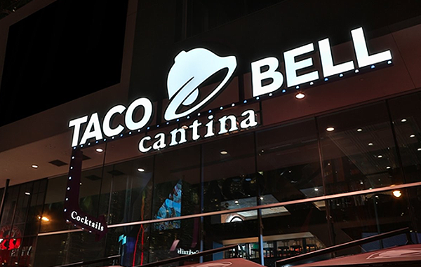
Image Source: Tacobell.com
The new face of Taco Bell will begin rolling out to packaging and stores shortly. However, if you don’t want to wait for it to hit your local Taco Bell, book your ticket to Las Vegas and see the design glorifying the exterior of the chain’s 7,000th location, that just opened on the strip to accompany the brand overhaul.
In the Taco Bell’s press release, the brand asserts that the new logo design mirrors the brand new strategy of the restaurant; “one size doesn’t fit all”. As Taco Bell CMO, Marisa Thalberg, puts it,
“If you’re going to throw a party to celebrate the growth and evolution of your brand, there’s no better place to hold it than Las Vegas. This flagship restaurant is our ultimate expression of the Taco Bell brand, and lifestyle.”
The company said in a statement:
“These latest developments represent the brands evolution and growth plan to become a $15 billion brand by 2022 while adding 2,000 new restaurants globally and 100,000 new jobs in the U.S.”
The Las Vegas location is the fourth in line of the brand’s so-called Cantina restaurants, following others in Austin, San Francisco, and Chicago. The trendy setting serves alcohol and food, boasting eight scrumptious flavors of “freeze” drinks, including Pina colada, cola, and margarita that can be prepared with or without booze. Regular Freezes and Twisted Freezes, ones which incorporate a pint of spiced rum, whiskey, vodka, rum, or tequila, are being sold in 32-ounce and 16- ounce souvenir cups.
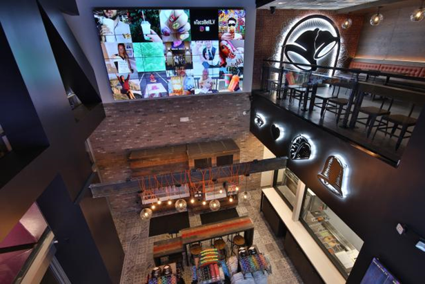
What happens in Vegas stays in Vegas. To touch up the place with a “Vegas” vibe, the location improvised with a VIP lounge, a DJ area, and serving alcoholic drinks around the clock. Along with beverages and food, the spot also features retail items for sale, such as bikinis, bags, shirts, hats, and bags. The restaurant’s modern look is complemented by 16 screens to show sports, portable ordering tablets, digital menu boards, and social media chatter amongst other entertainment.
According to Jessica Wohl,
“That being said, Taco Bell has always been famous for Mexican food, nevertheless a change in its identity triggers the fact that an organization would more often need to make alterations throughout its evolution to grow and be recognized a-midst tough competition. Between the new logo and its spicy new 24-hour flagship, Taco Bell is hoping that it’ll be able to energize the brand and bring in new customers. It remains to be seen if fans will find the new logo as fire as Taco Bell’s hot sauce.”
Connecting With Millennials
The revamped logo and out of the box location are the latest ways Taco Bell is trying to cater to hip, young diners. In an attempt to appeal to a millennial clientele, the new logo simplifies existing imagery to make it more relevant to the brand’s culturally diverse customer base. Rather than coming up with something entirely from scratch, the brand streamlined and tweaked the existing bell image, well associated with the restaurant chain.
The brand bids adieu to the palette of gaudy yellows, pinks, and blues, which might have been trendy once, in favor of a regal purple complete with a delicate gradient shading. The refurbished design celebrates the brand’s heritage with a gorgeous palette of 7 different color combinations to be used in different contexts.
The designers have updated the longstanding Taco Bell wordmark as well. While the previous font was a complex jumble of sporadic slants and embellished curves, the new, contemporary lettering is a forthright black version of the Gotham typeface.
According to Dom Carter,
“Thanks to its stripped back design, the new logo allows for more customization with colors, patterns and textures. These include variations brought to life with sparklers, toasted onto flatbreads, and other creative angles that will appear across Taco Bell’s digital channels first, before rolling out to their restaurants and packaging.”
Does The Bell Taco For Taco Bell?
As the rampant opinion has it, Taco Bell’s effort has made their logo as sickening, mushy, and gray as the beef slurry their employees happily dole out to customers. As little design as possible” shouldn’t mean that you drain your logo of its lifeblood. While the brand no-doubt sought to design something dynamic and iconic, it seemed to have unplugged the logo inadvertently. However, we can’t wait to see what Taco Bell has in mind for the new face of the brand!
Do you think Taco Bell’s branding overhaul is a huge mistake or a hidden stroke of genius that we are too shallow to see? Do let us know in the comments below.






Bland………..to put it mildly …… and to go a step further , I will be willing to bet that their sales go down because of it.