Once an uphill task, designing a logo has become quite simpler, thanks to all the tech advancements. But where the latest graphic techniques are benefitting the designers in a number of ways, the influx of plethora of design ideas has made the matters complicated somehow. While no one guarantees the success of a logo design, creatively designed simpler logos or wordmark logos are the safest option. WordMarks or text-based logos are effective in a way that they call for easier recognition as the brand name is clearly spelled out. The making involves the creative arrangement of letters and a set of dos and don’ts of wordmark logos. Though sounds simple, the process can be as innovative as designing a logo with complex graphic techniques.
Why Wordmark Logos?
Although there has been a drastic change in the graphic design industry, the technology has very less or no effect on the theory and approach to custom logo design. Same is the case with wordmarks. In order to make a lasting impact on customers’ minds and instant brand recognition, a wordmark logo is often the ultimate choice. By using a powerful mix of colors and fonts, various companies are turning towards wordmark logos because of the image distinction.
From Symbolic Logos To Wordmarks
One of the factors that might influence the companies to opt for wordmark logos is their readability and clarity. These are quirky and memorable and more often than not are an obvious choice for the brands when they opt for re-branding. Let’s skim through the list of the brands who let go of their symbolic logos for wordmarks for greater brand recognition.
Fujifilm
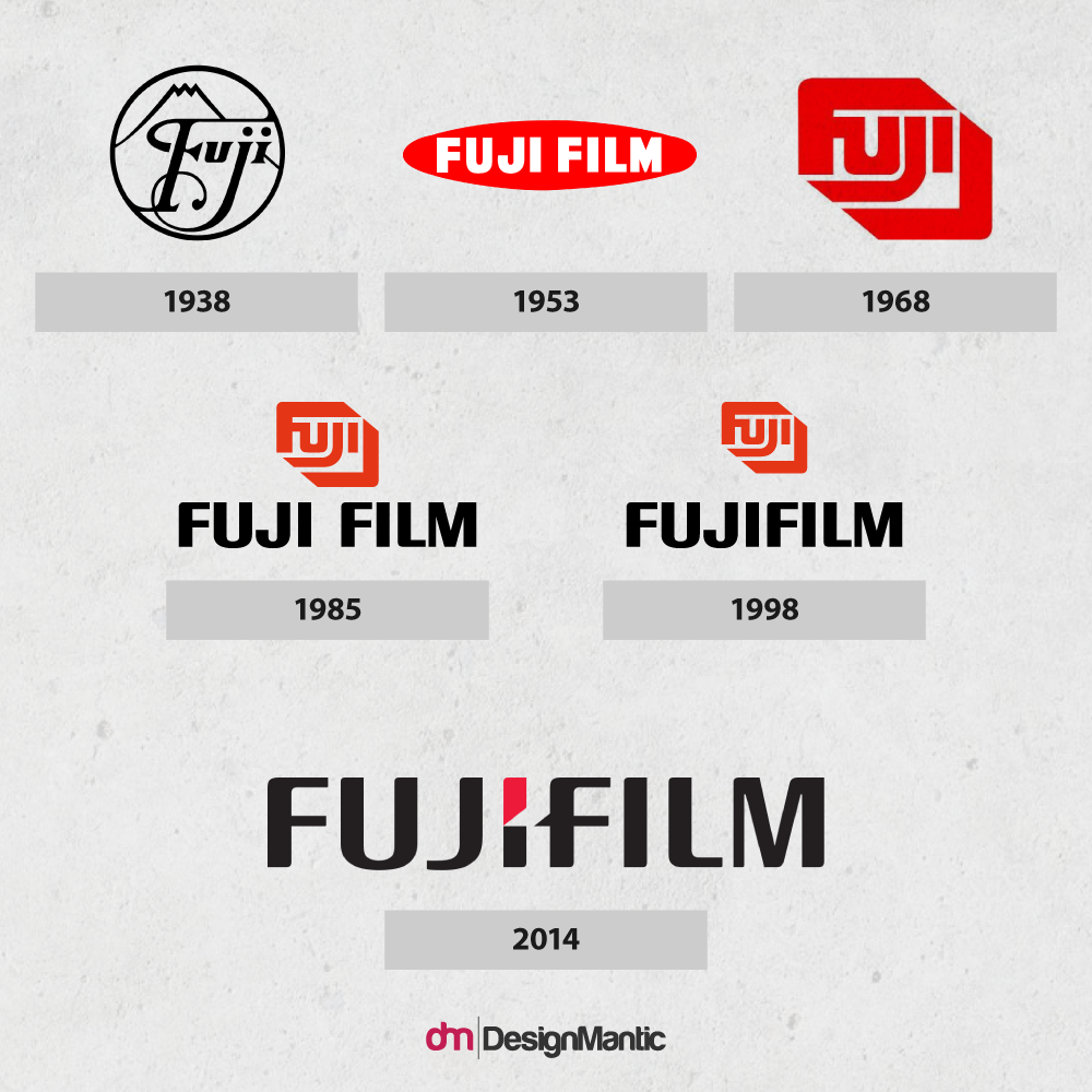
The Fuji logo is often cited as one of the most memorable logos ever created and has undergone numerous modifications throughout the years.
The current version of the Fujifilm logo uses a custom typeface and was unveiled in November 2006 and carries a wordmark, featuring a sharp design in the center which represents the company’s success and devotion towards advanced technologies.
Subway
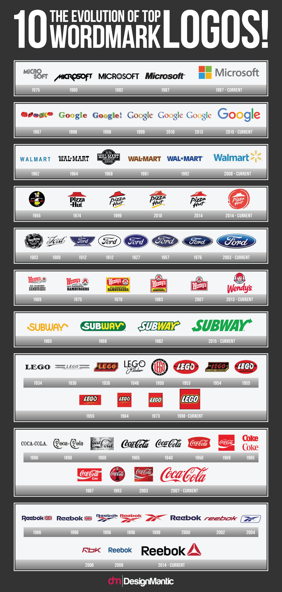
Subway adopted the arrows on the opening of its third restaurant in 1965 ‘Pete’s Subway.’ Since then it has become its most distinctive element. Since 1965, numerous amendments have been made to the shape and proportions of the letters but it has always retained arrows as its distinctive feature. In 2002 the logo was given a symbolic look (above). For most of the company’s history, the letter had somewhat unusual curvy lines. The current Subway logo redesign forayed into a facelift with a simplified version and hand-drawn typeface.
Philips
Related: 8 Brand Identity Trends to be Watchful Of
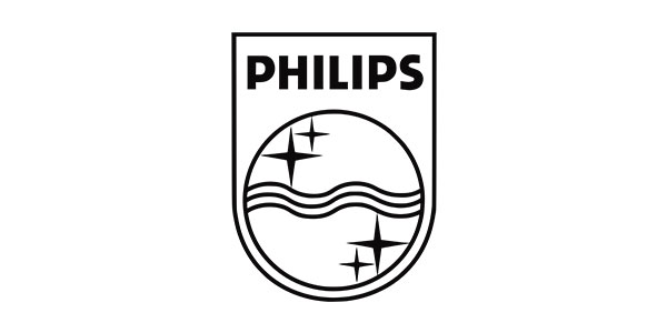
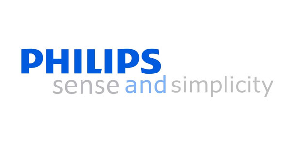
The original Philips logo, unveiled in 1938, was comprised of four stars hurling around waves enclosed in a shield. It was registered as a trademark in 1948. The shield emblem and the Philips logotype underwent a major change in 1968. The current wordmark was introduced in 1968 and features the company’s name in an uppercase sans-serif typeface. Since then it has remained largely unaltered apart from slight modifications in fonts.
Reebok
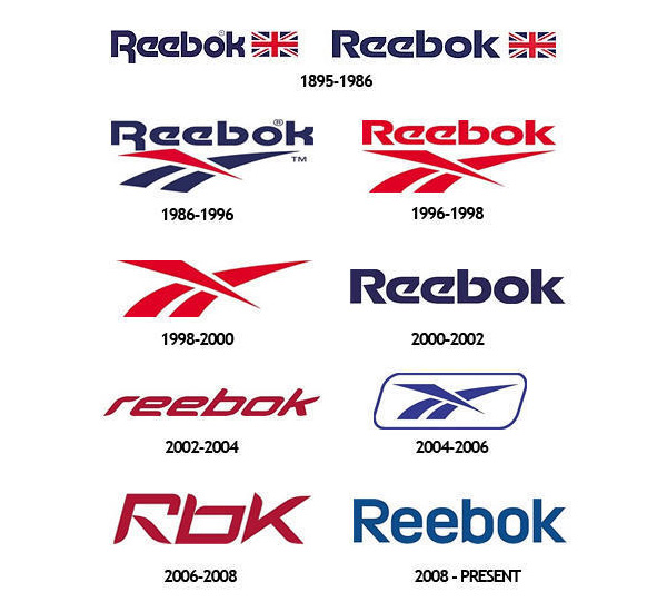
Reebok is the best example of design, redesign and design again. The earliest version of the logo that featured Union Jack was unveiled in 1895. Reebok logo was given a nameless corporate identity in 1998, featuring only a “cross-check”. In 2000, Reebok resurrected its old logotype. And two years later it was improved even further. Seeing an opportunity to connect with the youth market in 2001, the company introduced a new logo ‘Rbk’, designed by New York-based design agency Arnell Group. In 2008, the company brought back its old identity from ‘Rbk’ to ‘Reebok’ that is comprised of a custom typeface.
Nokia
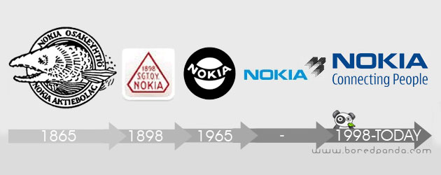
Nokia’s original logo was created in 1866, depicted a fish of Nokianvirta River, where Engineer Fredrik Idestam established a wood pulp mill. The emblem remained in use for over a century. In 1965 a new Nokia symbol was made, in which the company’s name was featured inside the round-shaped black-and-white emblem.
Upon merging with Finnish Rubber Works and Finnish Cable Works in 1966, Nokie had revealed its ‘Arrows’ logo. Once the ‘Connecting People’ slogan was introduced in 1992, it used Erik Spiekermann’s ‘Nokia Sans’ type. And in 2006, Nokia’s emblem color and type were modified just a bit. The latest modification in 2011 witnessed the slogan’s removal and a new font ‘Nokia Pure,’ that was created by Dalton Maag.
The Evolution Of Wordmarks
Prominent brands are in a never-ending race to achieve a unique brand identity. Instead of opting for symbolic logos, there are a number of brands sticking to the wordmarks, evolving them from time to time to add a hint of freshness. Whether to use serif, san serif, upper or lower case, color, size, etc… the graphic people at work are responsible for appropriate design decisions know how typography plays with consumers’ moods. Following are some famous brands, employing logo evolution techniques revamping the wordmark from time to time to survive in the ever-evolving branded world.
Nescafe
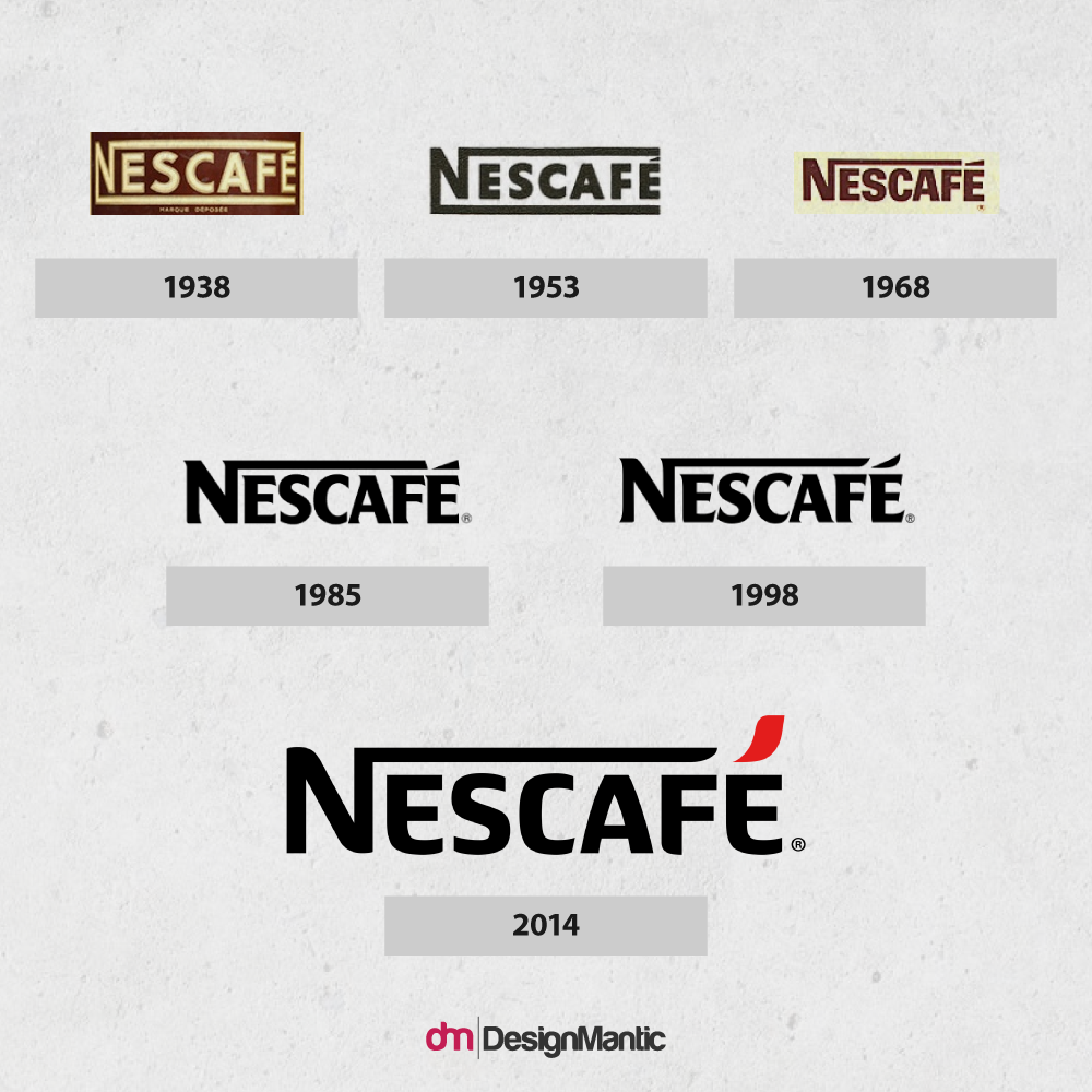
The first version of Nescafe wordmark came to surface in 1938 and featured a brown-and-beige color palette. Till date, the wordmark has been through several font types and color modifications. Most recently, Nescafe logo was modified in 2014 as part of a marketing campaign to tap the younger crowd where the serif font was replaced by a rounded sans serif font.
Barbie
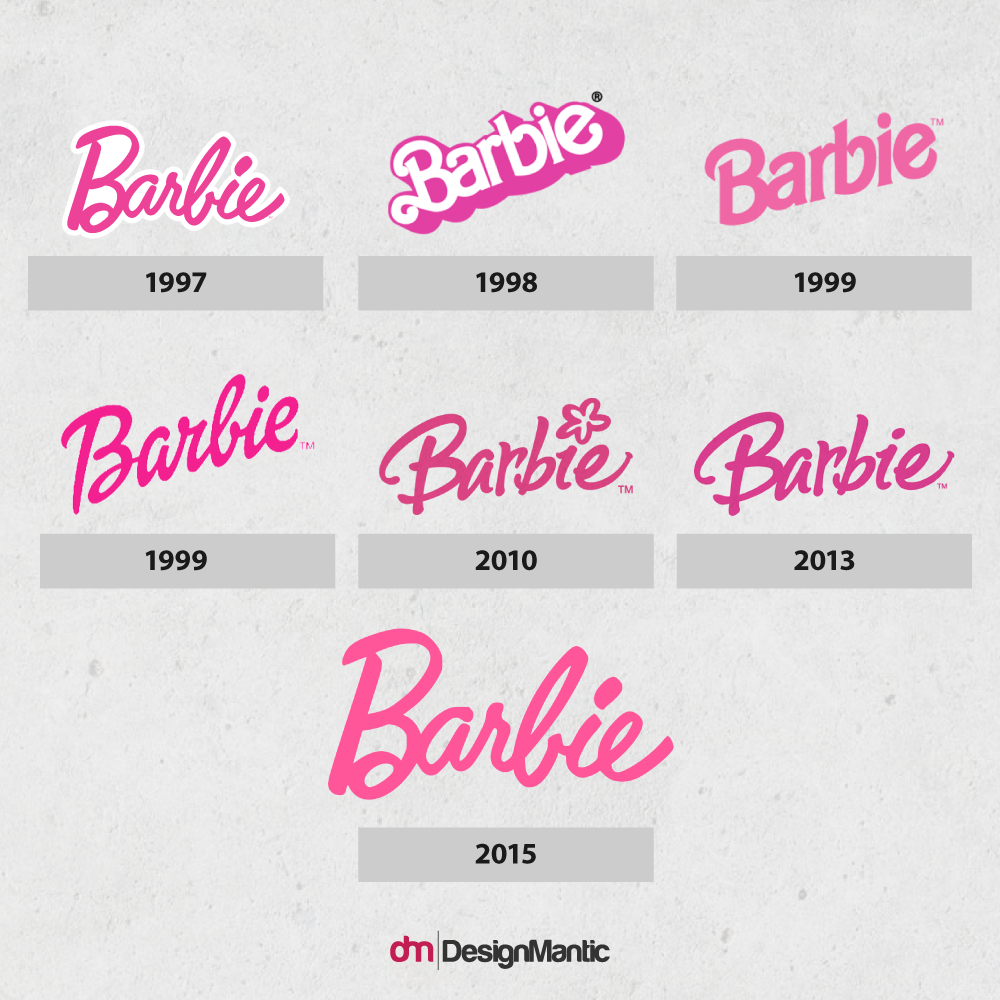
The Barbie logo got its name from Barbara, the name of the daughter of its founder, Ruth Handler. Keeping the minimalist style intact, the typeface of Barbie logo has witnessed numerous modifications since it was introduced to the world in March 1959 at New York Toy Show. It was in 2009 that the toy company reintroduced the original logo in celebration of its 50 year anniversary, featuring a simple wordmark with the brand name in an italic hand-drawn typeface.
Dunkin Donuts
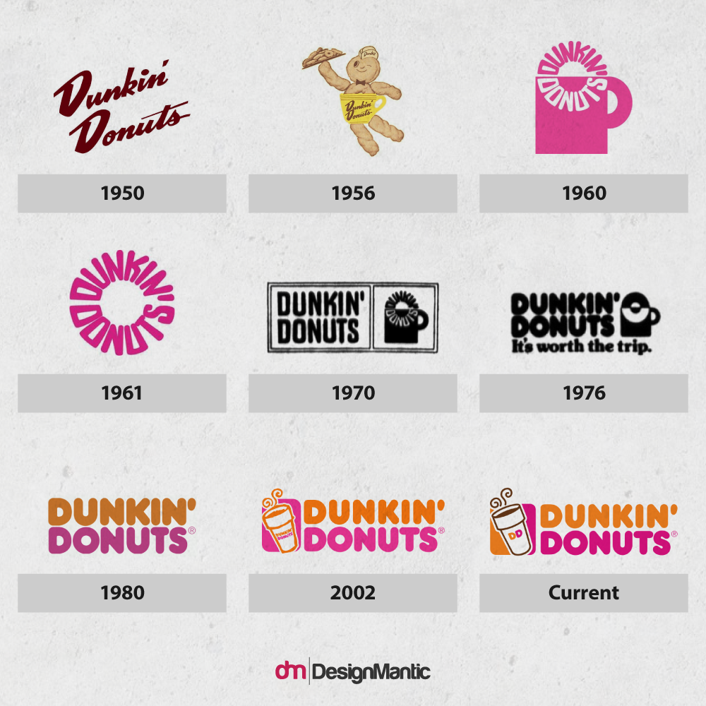
The food chain’s wordmarks have been through several modifications since 1950 when the initial logo surfaced using script version of the company name. Logo with a text donut dunked into a coffee cup was introduced in 1960 that was further modified after a year with the removal of coffee cup leaving only the wordmark.
Related: Fast Food Font Choices: What Goes Into The Making Of Scrumptious Logos!
The logo that we see today was created in 1980 and has been through slight color modifications with the plump lettering of Frankfurter and Debussy fonts. The current version that includes a steaming coffee cup with a “DD” monogram was adopted in 2006.
Microsoft
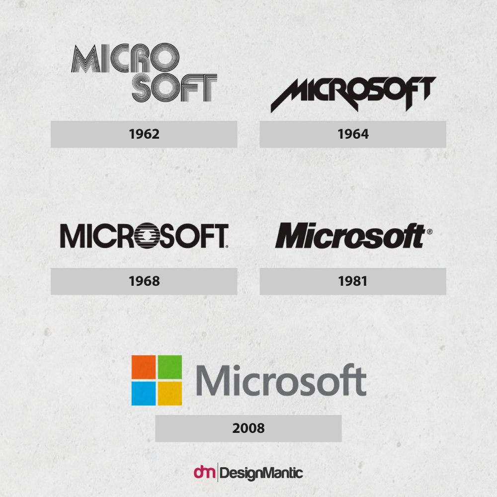
Till date, Microsoft has unveiled five versions of its logos. The first one that was introduced in 1975 was somewhat contemporary, groovy logotype while the current logo, created in 2015 shows a modern look where Helvetica Bold Italic was replaced with Segoe font.
Wordmarks That Refuse To Change
It is very natural to think that high-end brands invest in completely custom-made lettering for their logos or to redesign their logos. In fact, this is not always the case. Creating a wordmark on an existing font has somehow become a common practice irrespective of brand’s profile. Through following examples, let us show you how several wordmarks are going through slight modifications to be ahead of time. Check them out!
Kellogg’s
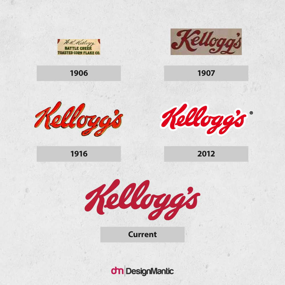
Ferris Crane was the man behind the logotype of Kellogg’s logo that uses the name of its founder, William Keith Kellogg. The company still uses the same insignia that it has been using since 1906 with the same custom typeface called Kellogg’s sans. Slight modifications in color can be noticed from time to time.
Twinings
Twinings is a perfect example of wordmark that has stood the test of times. Created in 1787, Twinings is a rare case of wordmark logos that still use the same timeless serif font.
Walgreens
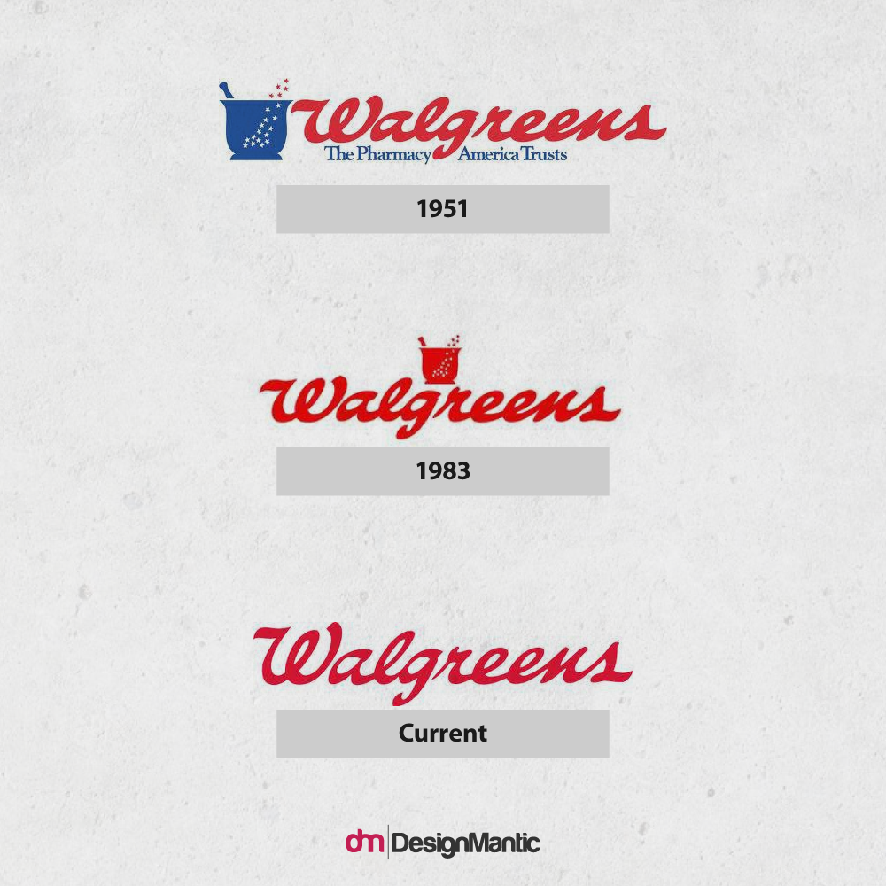
The Walgreens logo, featuring a custom typeface, is one of the most popular logos in the pharmaceutical industry. In 2006, the company decided to let go of the cup symbol featuring fifteen stars, a prominent feature of the old corporate logo.
Boots
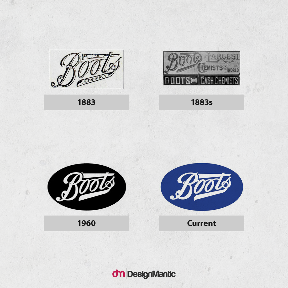
The Boots logo has been through slight modifications ever since it was created in 1883 but still depicts the original wordmark, a handwritten script that uses intricate cursive typeface. According to the company legend, the original logo was created by Jesse Boot, the founder’s son. The current logo might look almost the same as the original one, there has been a few slight alterations, which do not affect the overall look.
Estee Lauder
The Estee Lauder logo is a simple wordmark that features the optima medium typeface which was designed in 1953 by German type designer Hermann Zapf.
Good, Bad and Not-So-Bad – Wordmarks Revised For The Change
There are various factors to consider along with types of font combos while redesigning a wordmark logo. Let’s take a look on some of the biggest brands that give a facelift to their wordmarks only for the viewers to decide whether for the best or worst.
Logos That Garnered A Good Response
Charlie Rose
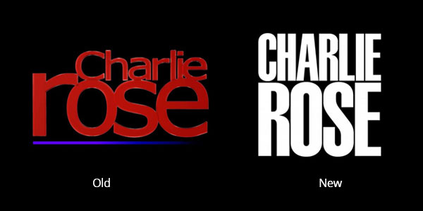
Design consultancy Pentagram revamped the logo for Charlie Rose’s PBS talk show in 2015 by making the 1954 typeface Schmalfette digitized that is set against a dark background.
Reaction
“Love the no nonsense approach, the boldness, the limited color palette. Says confidence, class and authority,” writes Matt Lehman, an art director, designer and illustrator.
Related: Rebranding Wins And Fails Of 2016 – For Better Or For Worse!
Walmart
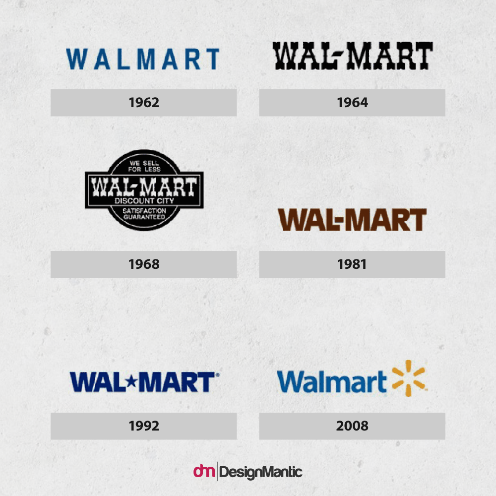
Walmart’s 1962 logo was written with simple letters. In 1964, the company selected the Frontier Font logo that remained the company’s logo until 1981. Since then the company’s logo has gone through numerous changes only to come up with a logo in 2008, which eliminates the break in the company’s name and incorporates a yellow ‘steric’ for a much-needed splash of color and design element.
Pitchfork
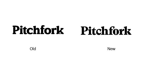
Pitchfork changed its logo to a different typeface using Swiss type foundry Grilli Type. “The new logo type walks the weird line between being edgy and classy. This one is more about the whole site overhaul. Beautiful type and UI / UX,” says Matt Lehman, an art director, designer and illustrator.
Logos That Garnered A Bad Response
Careerbuilder
The logo for CareerBuilder, a job site, was very simple, condensed watermark with a great color scheme. But, according to reports, their new logo is being hated for containing a lot of icons, colors, typographic styles and a mess of confusing concepts.
A poll on UnderConsideration showed the respondents’ vote on the new logo whether it was ‘Great,’ ‘Fine,’ or ‘Bad.’ 93% voted ‘Bad’ for the icon whereas 89% had voted ‘Bad’ for the wordmark.
Oh boy…possibly the worst rebrand of the year?: “New Logo for CareerBuilder done In-house: http://t.co/ijIjIGRdIQ“
— Laura Glenn (@LauraBielGlenn) September 21, 2015
Logos That Garnered A Not-So-Bad Response
Verizon
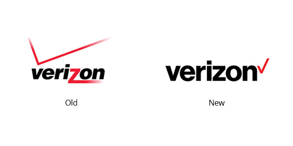
Verizon’s logo redesign garnered the reaction opposite of CareerBuilder’s. The original logo of Verizon was quite dynamic where italics and red lines gave it a feel of excitement and mobility. As compared to the old logo, the new one is quite basic.
This one got quite a number of mixed reactions. The average response was somewhere between bad and better. When asked about the new design, Gizmodo had this to say:
“The new logo is not particularly interesting – it’s part New York City subway, part nuGap, part check this box to accept terms & conditions. But who cares?”
I’ve lost all confidence in Verizon’s executive team since they approved this new logo.
— Evan Freeze (@evanfreeze) September 25, 2015
I think the new Verizon® logo is leaner and cleaner than the old one. http://t.co/JEMgP3GXjS #sponsored, #VerizonVIPs
— Kenneth Chevalier (@one_ch1potle) September 24, 2015
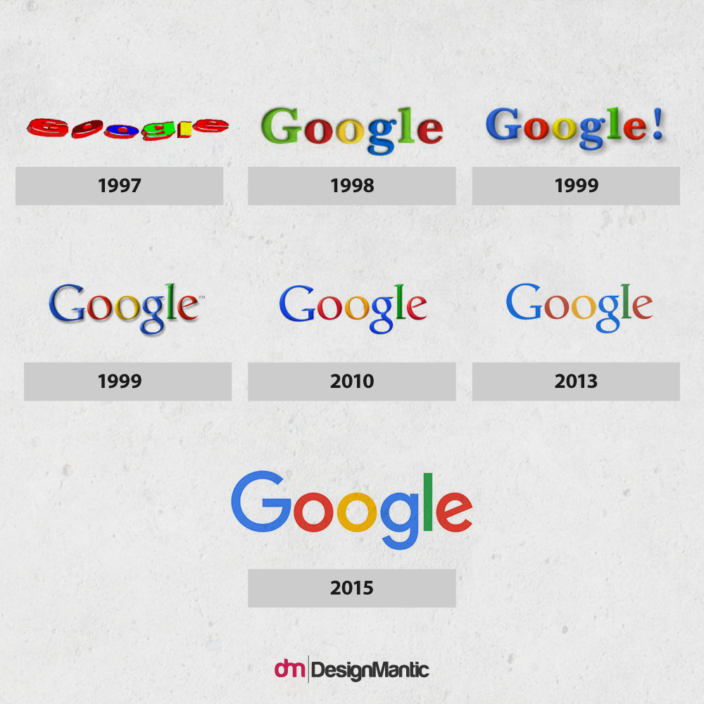
Google constantly works on improvising its logos and adding new innovative designs, commemorating different events and occasions, known as ‘Google Doodles’, an idea which was implemented in 1999. Google has experimented with various logos over the years. The current version of the Google logo was designed by Ruth Kedar and consists of a very simple but powerful wordmark which features the company’s name using the Catull BQ typeface.
Related: The Lollapalooza Over Google’s Rebranding And New Logo!
Reactions
WebDesignerDepot: The new design is a vast improvement aesthetically, but it’s unlikely it will stand the test of time because it’s too now, too of the moment. This is Google’s 2015–2016 logo.
Chances are pretty good you didn’t like the old Google logo. So if you don’t like the new one, the world is still the same for you.
— Jason Santa Maria (@jasonsantamaria) September 2, 2015
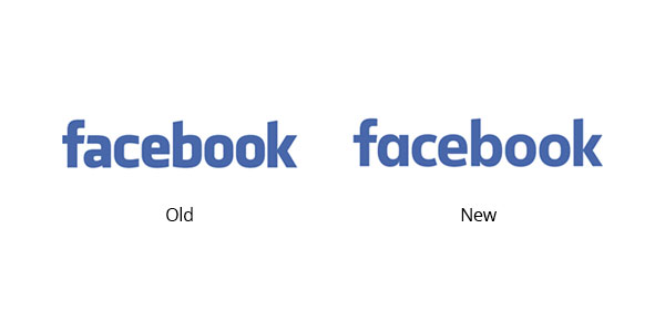
Facebook’s logo remains the same as it has been since its debut. In 2015, the logo had gone through only a bit of changes. In spite of the old logo’s quirks, it still had character, like how the slants of the ‘f’ and the ‘a’ interacted with one another. It features a slightly modified form of the Klavika Bold typeface.
Most of the tweets regarding Facebook’s new look was about getting users to notice the slight change in its font.
Can you tell the new Facebook logo from the old one? http://t.co/qFwWQ1NBDH pic.twitter.com/7iLJhLGWFK
— The Verge (@verge) July 5, 2015
Facebook unveils redesigned logo that features a new typeface http://t.co/uFvncprvFG pic.twitter.com/zLCHuHFKMf
— TAXI (@designtaxi) July 2, 2015
Future Of Wordmarks
Let’s cut the long story short, wordmarks are here to stay but with a drastic twist. The future holds some drastic amendments in wordmarks design variations unlike pictorial marks or symbolic logos. Also, there is a variety of fonts to teleport us into the future. We’ve collected some excellent examples that will demonstrate how wordmarks are going to change in the future.
Witty Wordmarks
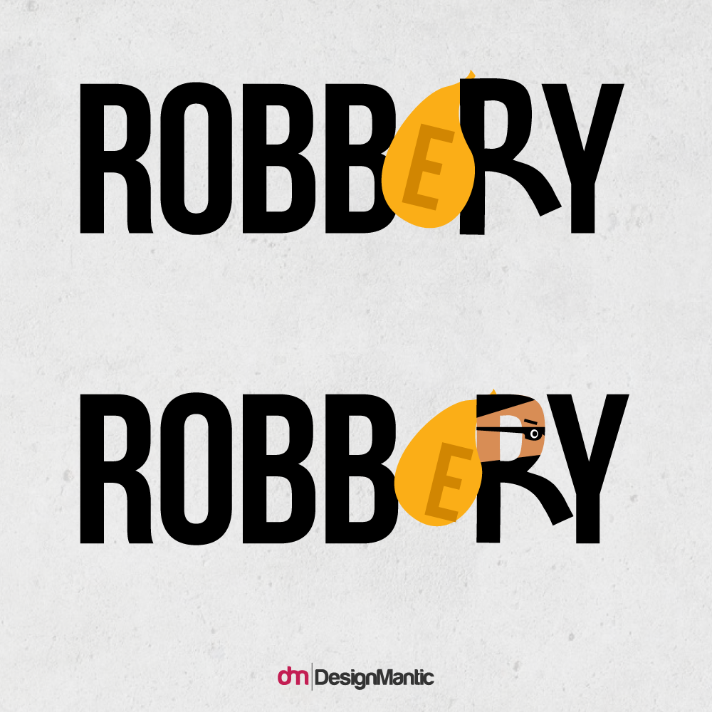
A clever wordmark logotype is on the cards for the future. As people show affection towards gracefully applied witty remarks, same is the case with witty wordmark logo designs. They make your brain work in a fun way thus ensuring a strong customer base.
Bright And Friendly
The future of wordmarks is bright and friendly. Mostly, the logos will incorporate universal symbols of joy and happiness like smileys, steric, flowers and friendly icons to attract customers.
Items To Replace Letters
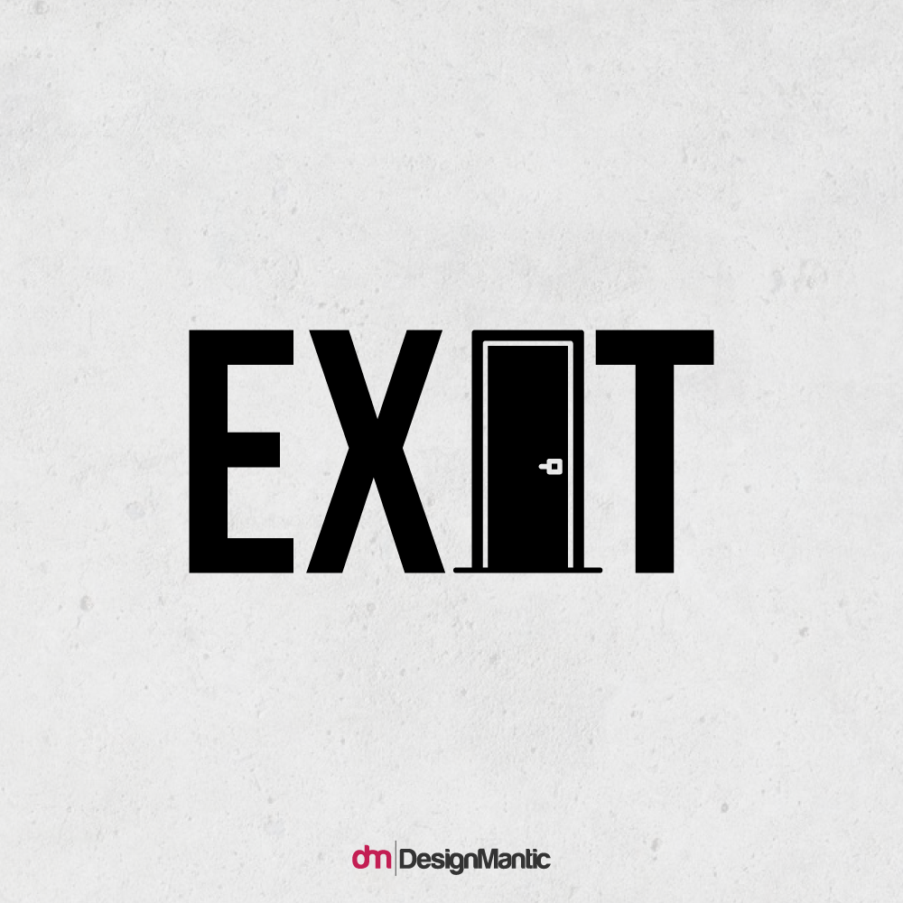
According to a research, people are more inclined towards brands that make the use of households in their logos, thus making them the IT thing for future wordmarks.
Sporty Image
Thanks to the versatility, the wordmarks will become an ultimate choice for sports brands. Slanted letterforms, sloping lines, and removal of parts of letterforms will be very much in vogue to show movement within a name.
Designing a WordMark needs a no-nonsense approach and not every brand name suits such a language-centric approach. It is just another tool in design arsenal that can be employed when the time is right. As the wordmarks offer simplicity to the logo, it also makes your design easier to recognize and the chances are great that it achieves timeless enduring quality. Think of the logos of large corporations like Samsung, FedEx, Sony, Yahoo!, TIME, and so on, one thing is common i.e. simplicity is the best policy.
Chime In Your Say
This is a small selection of many major brands that have updated their looks or restrained to the old looks so far using wordmarks. Chime in your say below and let us know which logo revamps come to your mind.
References
- Logo Design Love – A guide to create iconic brand identities by David Airey
- Brand Identity Essentials: 100 Principles for Designing Logos and Building Brands by Kevin Budelmann, Yang Kim, Curt Wozniak
- Matt Lehman – Think Design
- Gizmodo
- WebDesignerDepot


